This was the next set in my ongoing product photography test series, using everyday, recognisable brands. I’m building these shoots as triptychs because it keeps the work disciplined. Three images. Three clear jobs. One consistent look.
Marmite is a brilliant subject for this. The jar is glossy and dark. The label is bold and curved. The product itself is thick, shiny, and messy the moment you start using it. That mix is exactly what makes food and packaging photography tricky in the real world.
In this post, I’m focusing on the photography choices. Lighting shape, reflection control, label clarity, and how I kept the set cohesive from frame to frame.
Why Marmite is harder than it looks
At a glance, it’s a simple jar shot. In practice, it pushes a few problems that show up all the time in studio product work.
- The jar is a mirror. Every light becomes a reflection.
- Dark, glossy surfaces show dust, fingerprints, and tiny scuffs.
- The label wraps a curved surface, so glare loves to sit on the text.
- The yellow lid and seal pull your eye, so colour balance matters.
- The product itself looks best when it stays wet and shiny.
That last point sounds obvious. It still catches people out. Marmite can dull quickly under warm air and studio time. The texture changes. The highlights change. The “freshness” goes.
The triptych plan for this set
I approached this like a mini campaign. Each frame has a clear purpose. It also has a clear viewer question to answer.
Frame 1: Sealed jar hero packshot
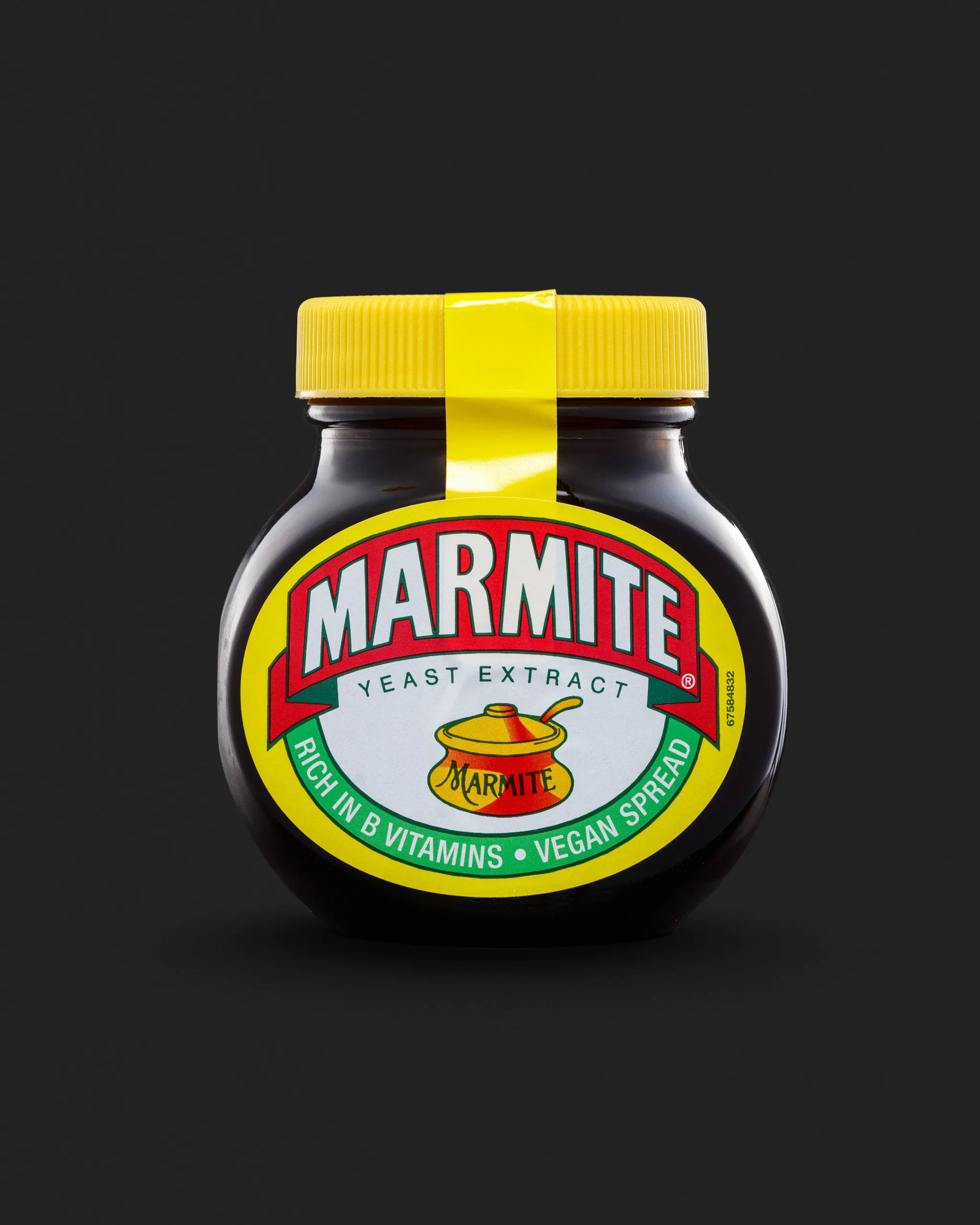
This is the cleanest frame. The jar is centred. The label is the hero. The seal line on the lid adds that “new product” cue. It also gives a strong vertical detail, which helps the composition.
The job of this image is simple. Make the product look clean, premium, and instantly recognisable.
Frame 2: Opened jar variation
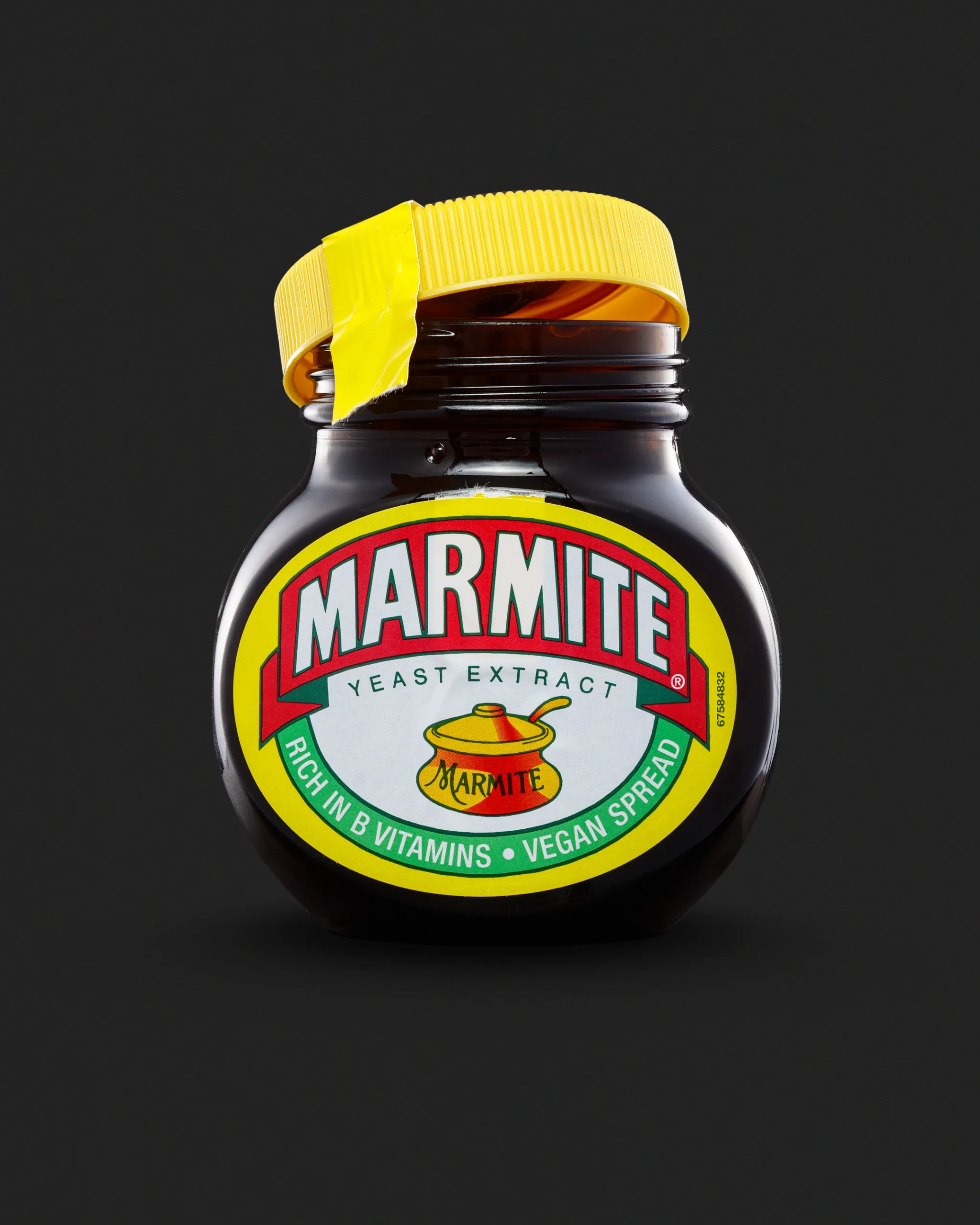
In the second frame, I shifted the story. The lid is loosened and angled. It suggests use without needing extra props.
This frame is all about still looking controlled while introducing a “real life” cue. Opened packaging is where the tidy, retail look can fall apart fast. The rim catches light. The glass shows more internal reflections. The lid throws its own shadows.
Frame 3: Serving cue with toast and product
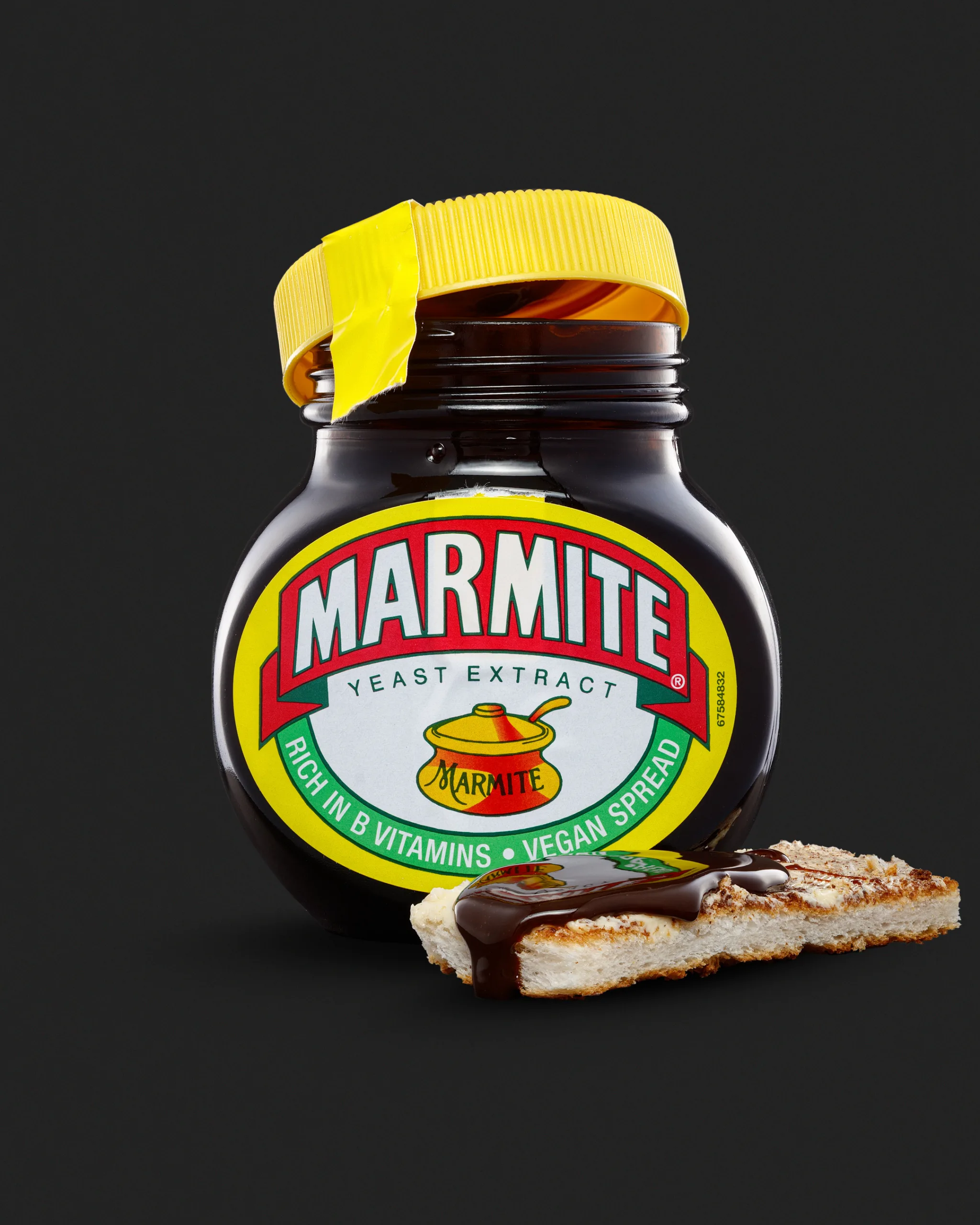
The third frame brings the product to life. Toast gives scale and context. The spread gives texture and shine. The drip adds movement.
This image is the one that sells the feel of the product. Not in a marketing sense. In a visual sense. It shows thickness, gloss, and that very specific Marmite look.
Background choice: why I went dark
After the Colman’s yellow set, I wanted the opposite challenge. A dark product on a dark background forces careful separation. It also forces me to think about edge definition.
With a dark background, you can lose the product shape in seconds. The jar can “sink” into the scene. The fix is not simply making the background brighter. The fix is shaping the light so the product has clear edges and a controlled highlight path.
I also like the way Marmite behaves visually against a dark tone. It suits the jar. It suits the product. It also makes the label colours pop without looking loud.
Lighting goals for this shoot
I didn’t set this up to be clever. I set it up to be repeatable.
These were my main lighting goals:
- Keep the label readable without flat, boring light.
- Create smooth, deliberate highlights on the jar shoulders.
- Separate the jar edges from the dark background.
- Control the lid shine so it stays textured, not blown.
- Keep the background gradient clean and intentional.
If you’ve ever tried to shoot a dark, glossy jar with one light, you’ll know how quickly it turns into chaos. You get random hotspots. You get a bright streak through the logo. You get a muddy edge that disappears into the background.
So the real work here is reflection management.
Reflection control: what mattered most
With glossy packaging, you are not lighting the object. You are lighting what the object reflects.
That means two things.
First, big diffused sources are usually your friend. They create broad, smooth highlights. They describe shape without looking harsh.
Second, flags are as important as lights. Sometimes more important. Flags let me remove reflections, not just add them. They help me stop a highlight from running across the label. They help me keep the jar shoulders clean.
I’m constantly watching for three reflection problems:
- A bright stripe through the wordmark.
- A hotspot on the shoulder that pulls attention from the label.
- A messy reflection near the base that makes the jar look grubby.
Small changes fix big problems here. A tiny angle shift. A small flag move. A slight change in diffusion distance. It all shows.
Keeping the label sharp and readable
For a packshot, the label is the contract with the viewer. If the label is compromised, the image fails.
There are three parts to label clarity.
Angle and perspective
I keep the camera level and the jar straight. A jar that leans looks careless. A label that curves oddly can look distorted. Even if it’s technically correct.
I want the shape to feel honest and premium.
Light placement
The label needs enough light to read. It does not need a bright reflection. The difference is subtle. It’s also the difference between “commercial” and “home studio”.
I look for soft, even illumination across the label. Then I shape the jar with highlights that sit on the glass, not on the print.
Depth of field choices
I want the key label text sharp. I also want the image to feel smooth. Too much sharpness can make tiny scuffs look brutal. Too little sharpness makes the label feel low quality.
So I aim for a balance. Crisp where it matters. Calm everywhere else.
The lid and seal: keeping yellow under control
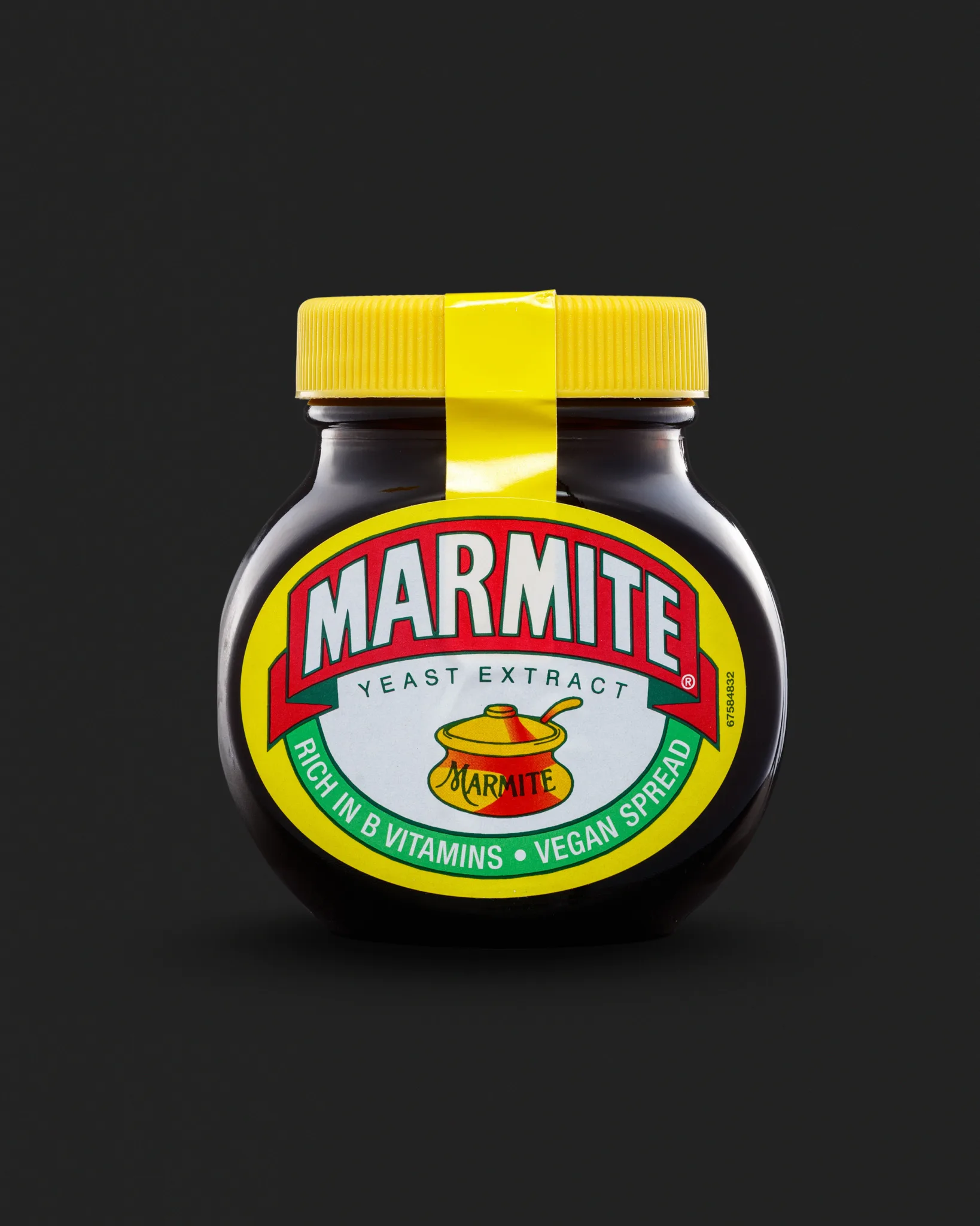
The lid is bright. The seal is brighter. On a dark set, that can dominate.
I treated the lid like a separate product. It needs shape. It needs texture. The ridges need definition. The yellow needs to stay believable.
If the yellow goes too warm, it looks dirty. If it goes too cool, it looks plastic and odd. So I watched it carefully in relation to the label’s yellow border.
The seal strip also creates a strong highlight path. That can be great for composition. It can also create a distracting glare. I kept it clean and deliberate.
The opened jar frame: more difficult than it should be
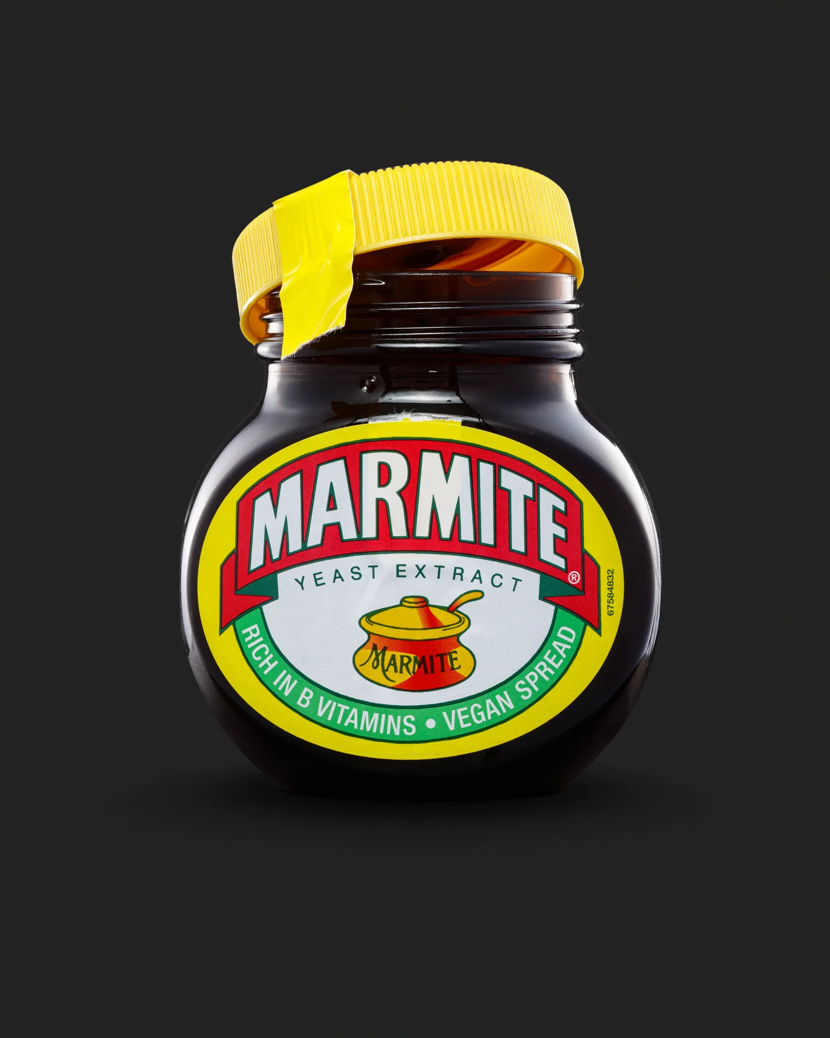
Once the lid is loose, new problems appear.
- The rim catches specular highlights.
- The lid throws reflections onto the glass neck.
- The jar looks more “real”, which means imperfections show more.
This is where prep matters. Before I shoot, I clean the jar more than once. I wipe. I look. I wipe again. Then I light it. Then I see new marks. Then I wipe again.
Dark glossy packaging has no mercy. Studio lighting turns invisible marks into bright lines.
I also watch the lid angle. Too far open and it looks awkward. Too neat and it looks staged. I want it to feel natural, but still controlled.
The toast and spread frame: adding texture without mess
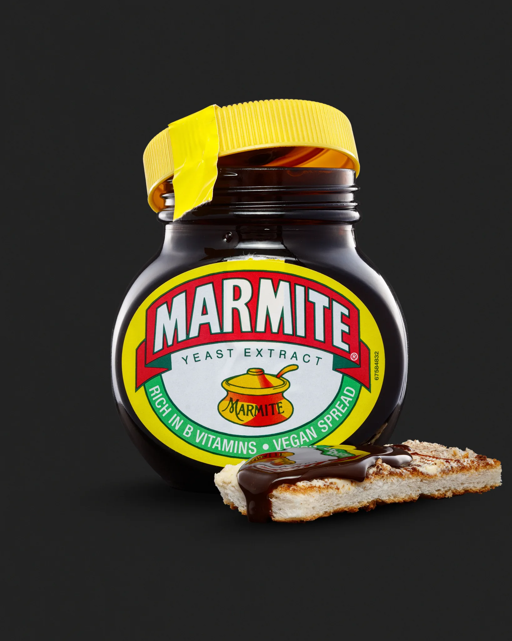
This is the most fun frame, and the easiest to ruin.
Toast is great because it’s familiar. It also adds a new surface that reflects light in a different way. It can pull attention away from the jar if I’m not careful.
The spread is the real challenge. Marmite is thick and glossy. That gloss looks brilliant when it’s clean. It looks horrible when it has stray crumbs or smeared edges.
So I kept it simple:
- one toast piece
- one controlled spread area
- one drip that feels intentional
The drip adds motion. It also tells you the product is sticky and dense. It’s a small detail, but it carries a lot of “feel”.
Lighting-wise, I needed the spread to stay shiny. If the light is too flat, it looks dull. If the light is too hard, it looks wet in a bad way. I aimed for a highlight that describes thickness, not oil.
Consistency across the set
Triptychs only work if the set feels like one world.
I kept these consistent:
- background tone and gradient direction
- camera height and general framing logic
- highlight style on the glass
- overall contrast and colour balance
I also kept the negative space generous. Not for design overlays. Simply because it makes the images feel calm. It gives the product room to breathe.
Retouching and finishing choices
Product retouching is where the “clean” look is earned. It’s also where time goes. Especially with glossy, dark packaging.
Here’s what I typically tidy in a set like this:
- dust and fibres on the glass and lid
- tiny scratches that catch light on the shoulders
- small label scuffs that look worse under studio lights
- uneven background gradients
- tiny edge distractions along the silhouette
Here’s what I tend to leave alone:
- the honest texture of the spread
- the natural variation in toast texture
- packaging details that are part of the product
The goal is a polished image that still feels truthful. If you over-polish food textures, they stop looking appetising. They start looking fake.
What I learned from this Marmite set
Every test shoot teaches me something, even when it goes smoothly.
This one reinforced a few truths I already know:
- Dark, glossy products demand patience and cleaning discipline.
- Reflection control is the whole game with jars like this.
- The label needs priority, every time.
- Adding “use” cues is powerful, but it raises the difficulty fast.
- A simple prop can add story without turning into lifestyle work.
It’s a simple set. It’s also a set that took real control to keep clean.
FAQ
Why do dark products take longer to photograph?
They show everything. Dust, scuffs, fingerprints, and messy reflections become obvious under studio lighting.
How do you stop glare on the label?
I control the reflection path with diffusion and flags. I also adjust angle and light size, not just power.
What makes a packshot look “premium”?
Straight perspective, clean edges, controlled highlights, and a label that reads easily at a glance.
Why add a “use” image like toast?
It gives context and scale. It also shows texture, which is important for food products.
Does the background colour affect the shoot time?
Yes. Bold colours and dark tones show gradients and edge issues quickly. They demand tighter control.
Would this approach work for other jars and bottles?
Yes, the principles carry across. The exact setup changes, but reflection control stays central.
See more about my product photography for Suffolk businesses.