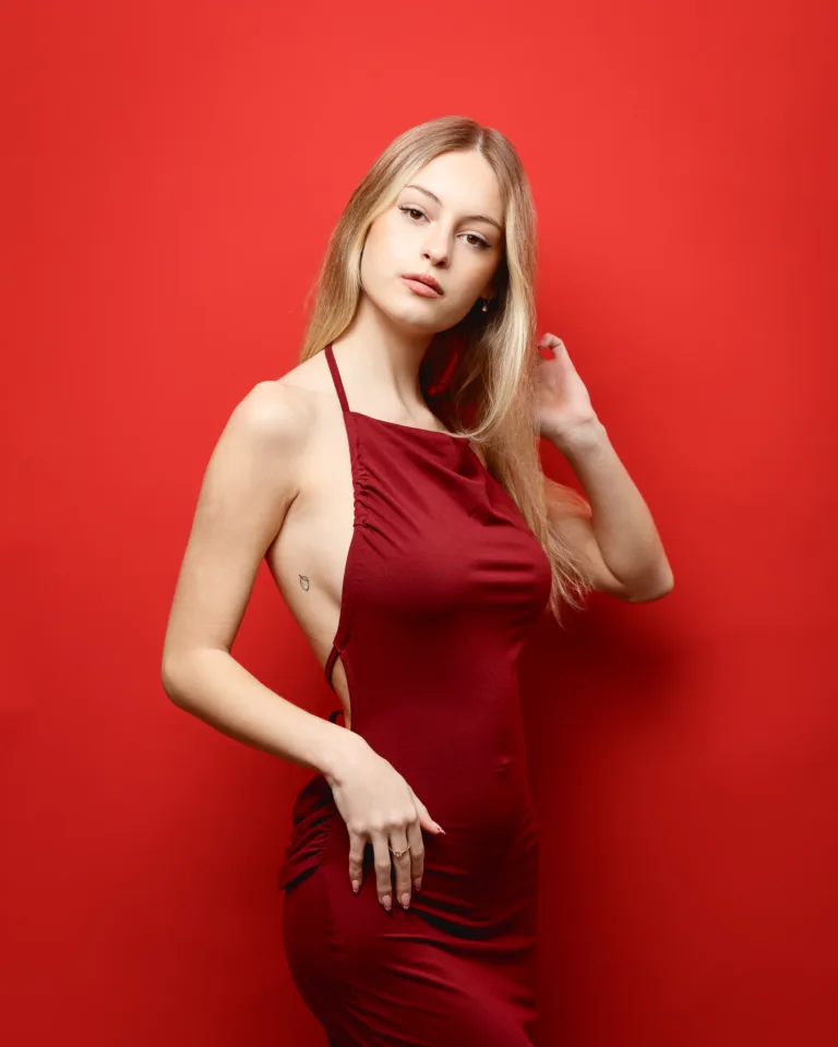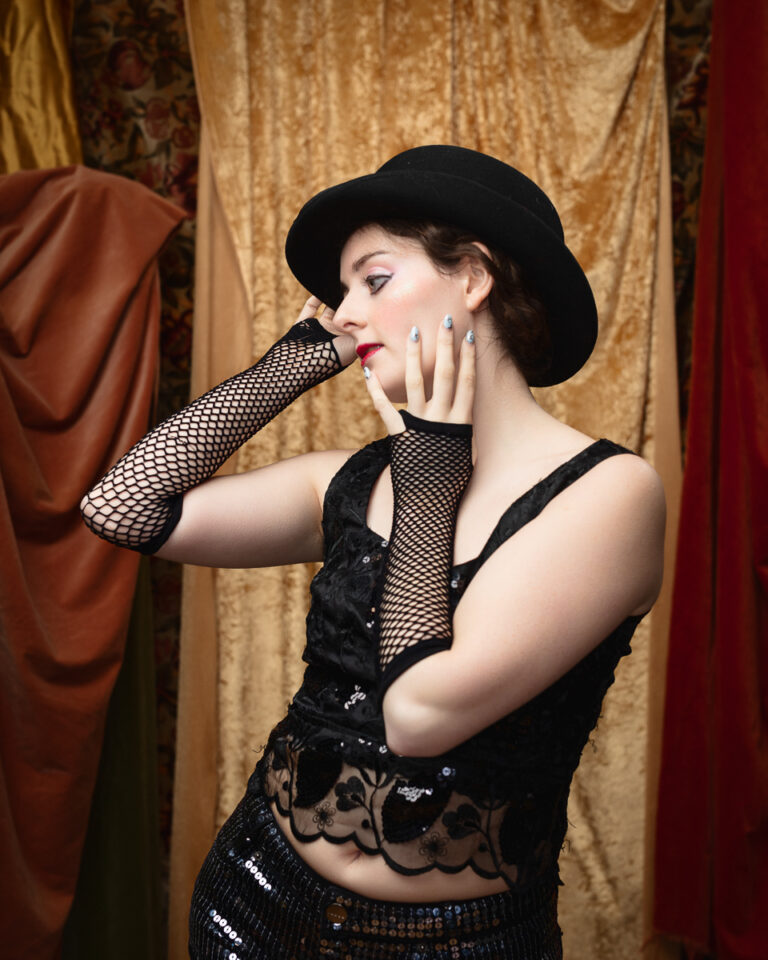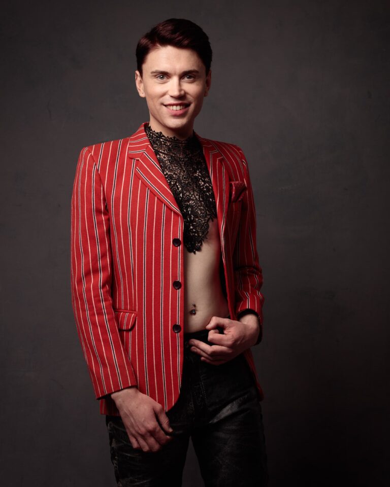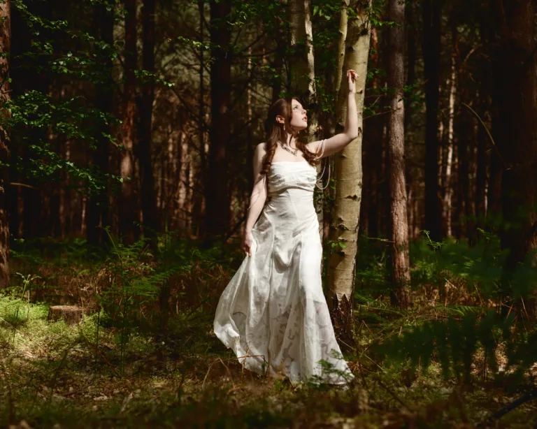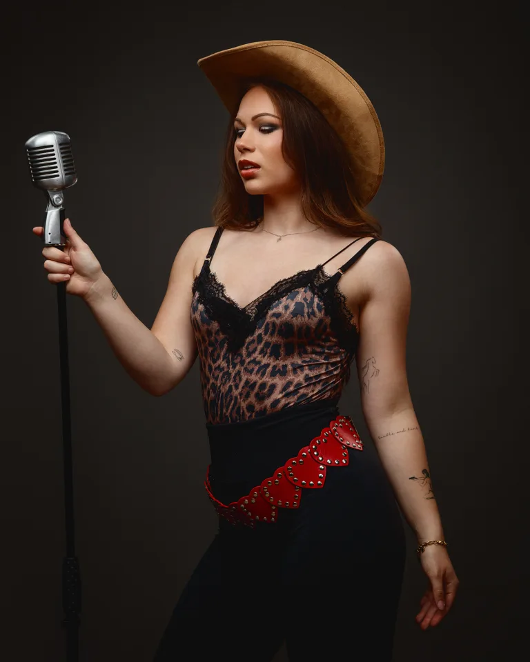
I put this studio session together as a personal project for Elegant Exposures. Susan Hardy styled it, and Sophia modelled. The brief was simple on paper: Valentine dresses, clean studio portraits, and backgrounds that stayed quiet so the clothes did the talking.
That simplicity is the point. When I strip a shoot back to strong styling, controlled light, and uncluttered sets, I can see what truly works. It also gives me space to play, take risks, and spot ideas I would miss on a paid brief.
The core idea: simple backgrounds, strong styling, honest light
I kept the sets clean because this series is about shape, texture, and colour. A busy background would compete with the dresses, and the eye would have nowhere to rest. With simple backdrops, you see the silhouette first. Then you see fabric behaviour, stitching, and movement.
On a shoot like this, I want three things to stay consistent:
- A dependable lighting base that flatters skin and fabric
- A background tone that supports red without contaminating it
- A pace that lets styling and posing develop naturally
That gives me a repeatable baseline. From there, I can vary mood with small changes: a turn of the face, a prop, a different shoulder line, or a slight shift in contrast.
Why test shoots matter, even when the lighting is already “sorted”
People often talk about test shoots as a technical playground. That is true, but it is only half the value. For me, the real benefit is creative clarity.
A test shoot lets me explore questions that do not fit neatly into a job brief, such as:
- Which styling details photograph better than they look in person?
- How does a fabric hold shape under different modifiers?
- What happens when I simplify further, not add more?
- Which poses suit a garment’s structure, not just the model’s lines?
- Where does the story appear when I stop forcing one?
That creative testing feeds everything else I do. It improves my client work because I am not experimenting for the first time on someone’s deadline. It also helps Susan and I refine our shared visual language. We learn what reads as “period”, what reads as “costume”, and what reads as timeless.
A quick note on creative collaboration
Susan Hardy’s styling always has intention. That matters in studio portrait work. When the wardrobe is thoughtful, the posing becomes easier. When the accessories are chosen with care, the model’s hands have a purpose. It stops being “what do I do with my arms” and becomes “how do I hold this story”.
Sophia brings calm focus to the set. She can switch from soft and reflective to playful and direct without it feeling forced. That range is one reason I enjoy building personal projects with her. It gives room for subtle choices, not just big gestures.
Dress 1: Late 1700s peasant-style dress, with a heart pattern and a gold locket
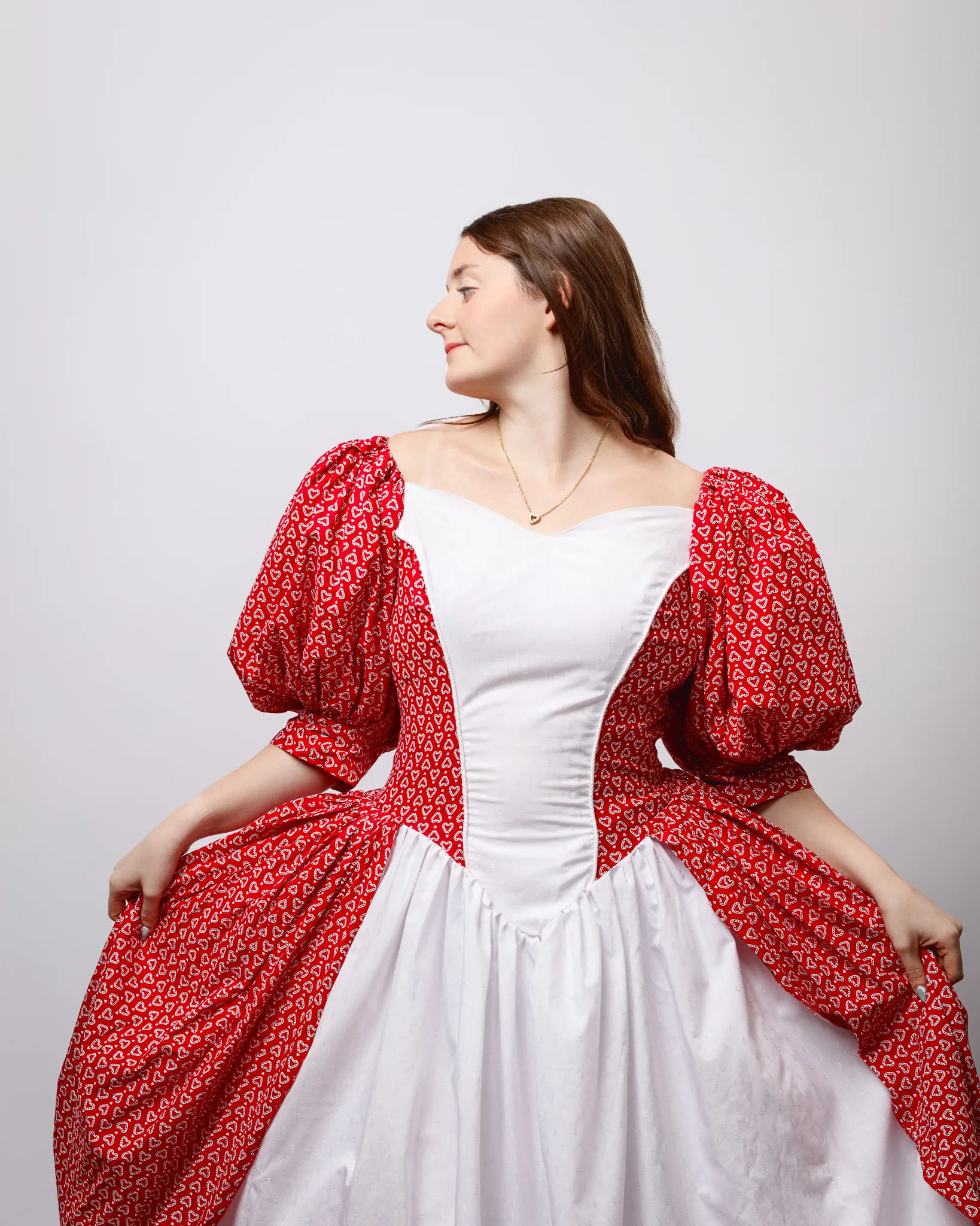
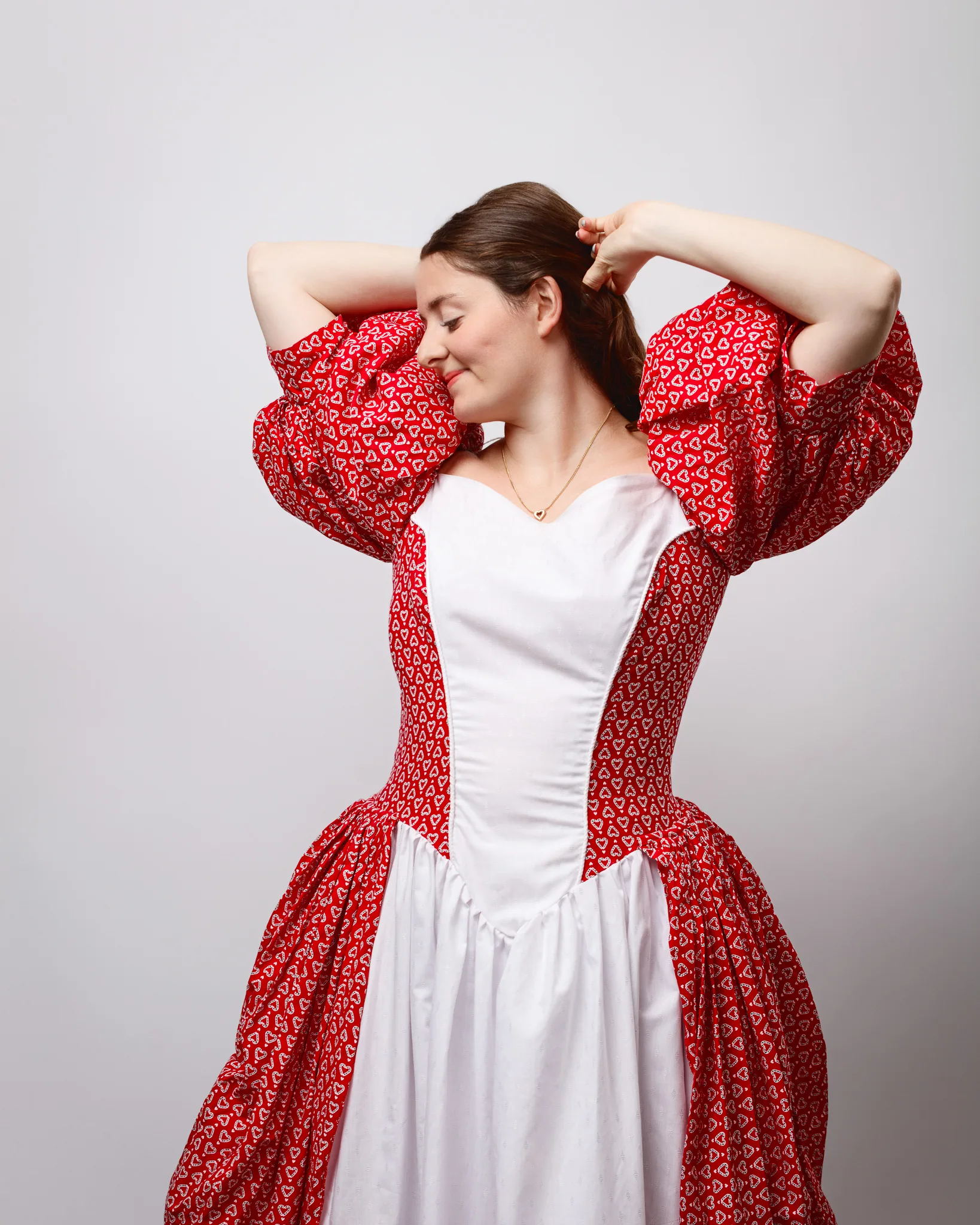
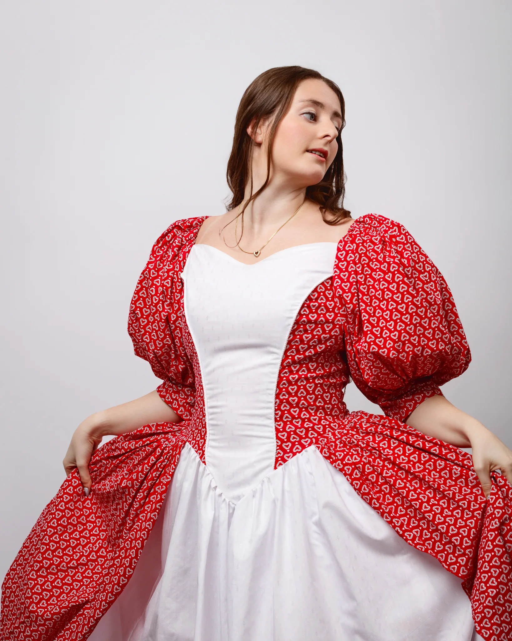
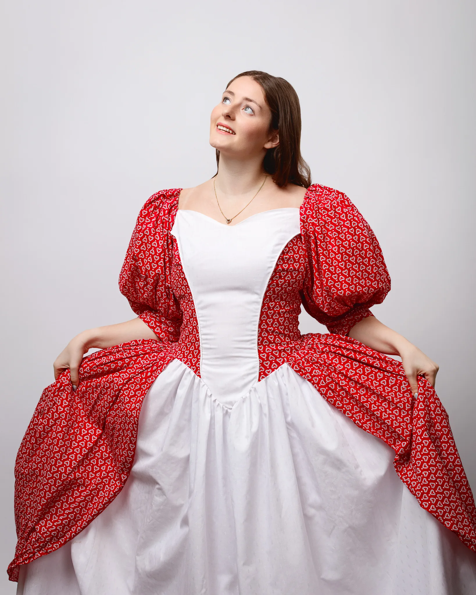
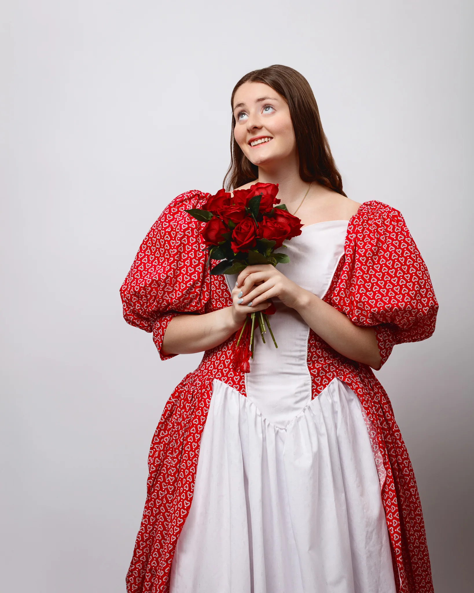
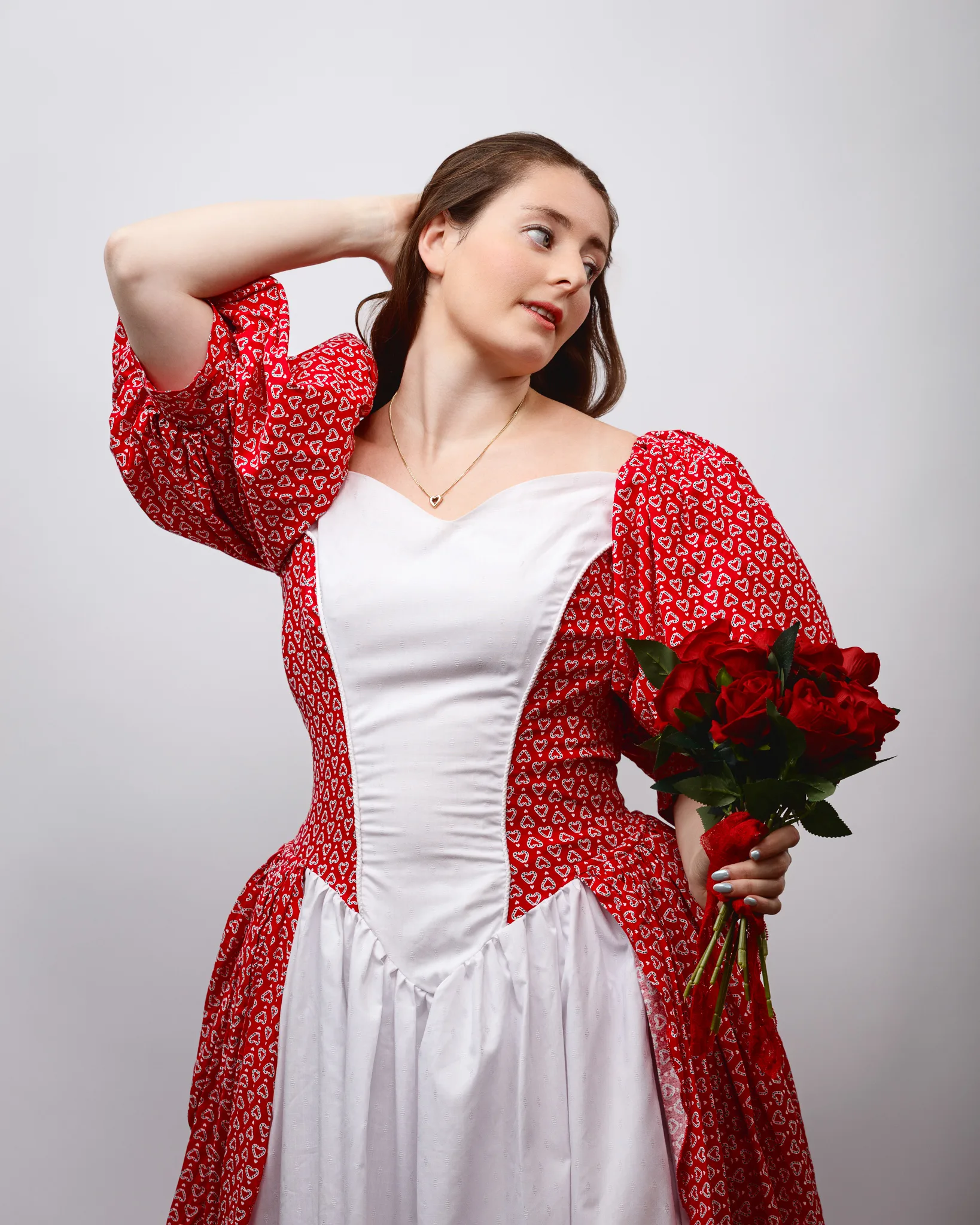
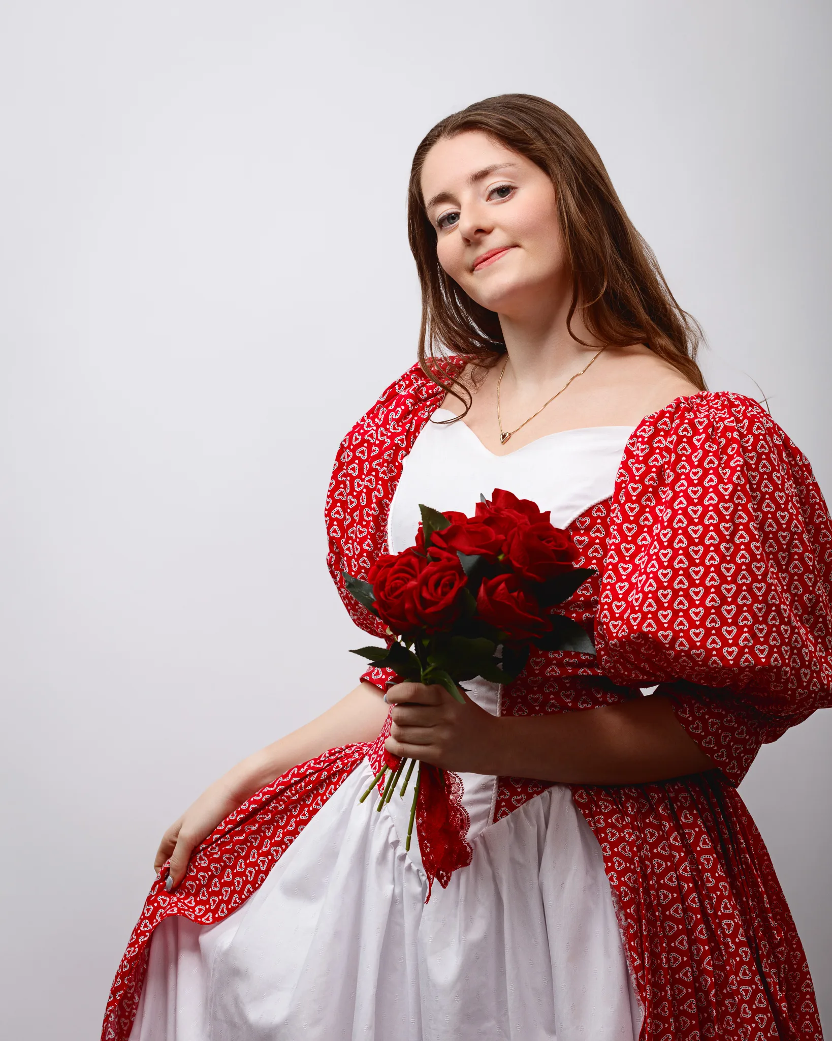
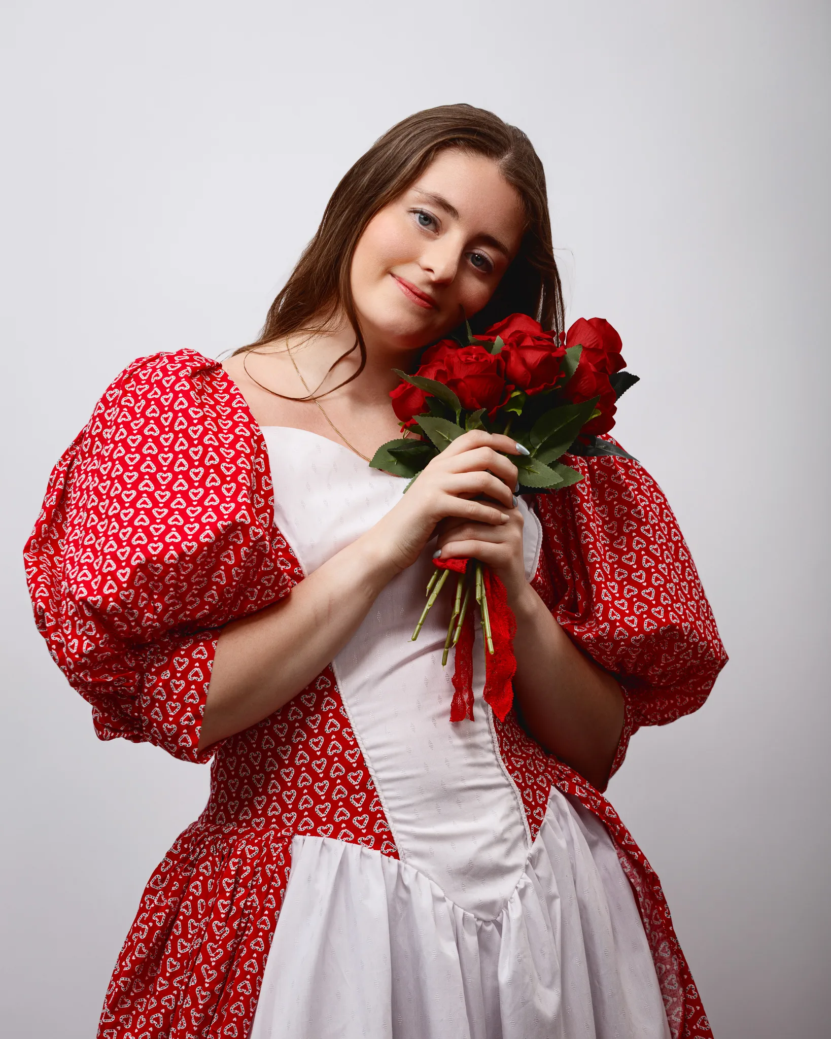
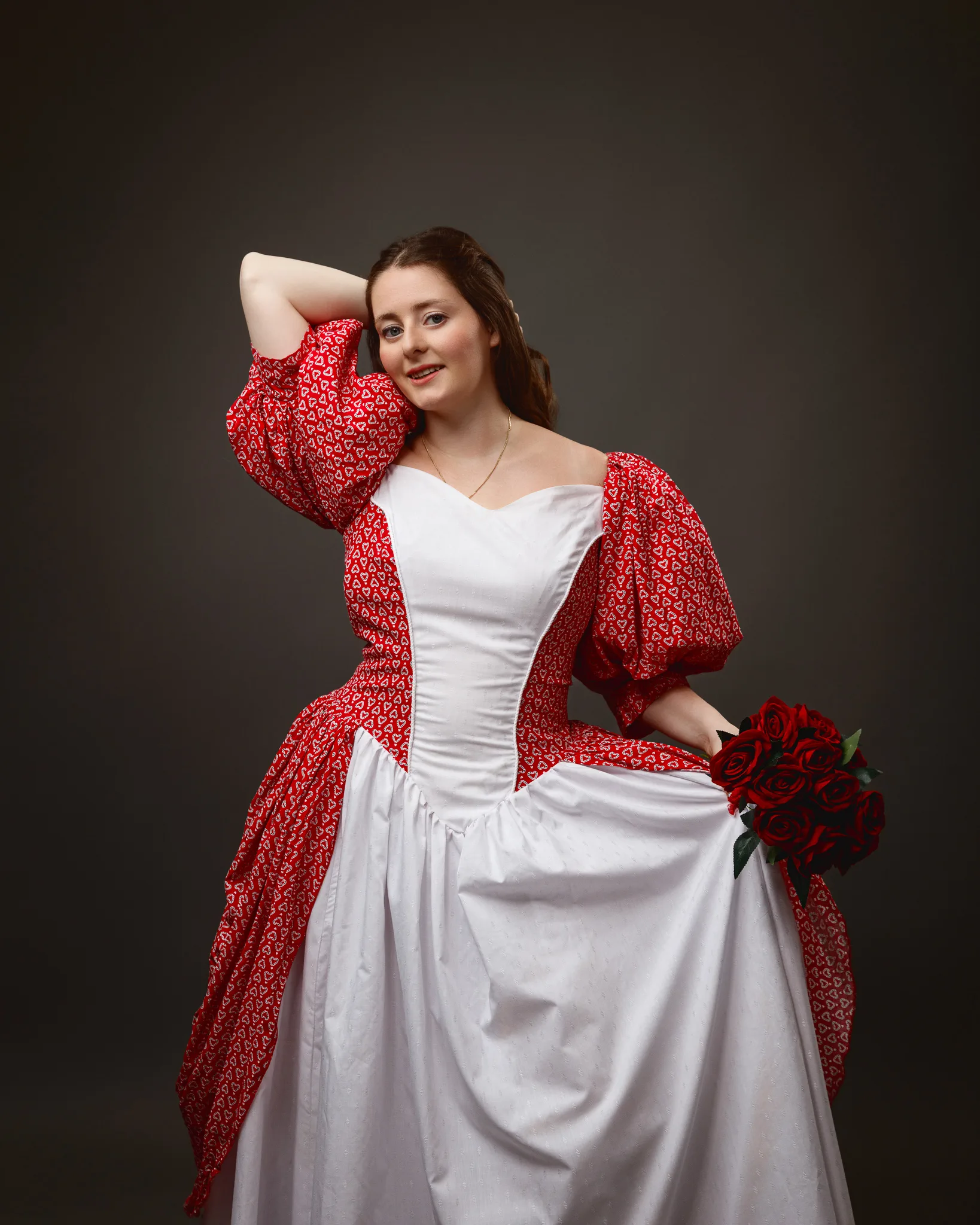
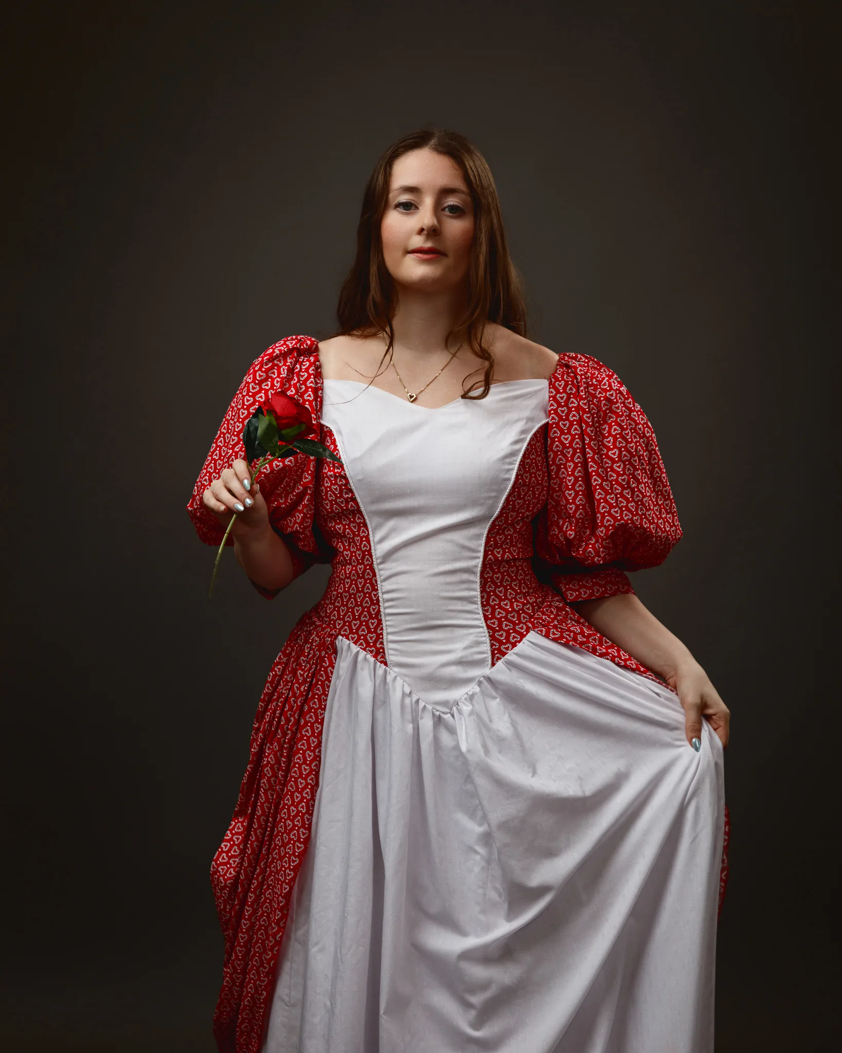
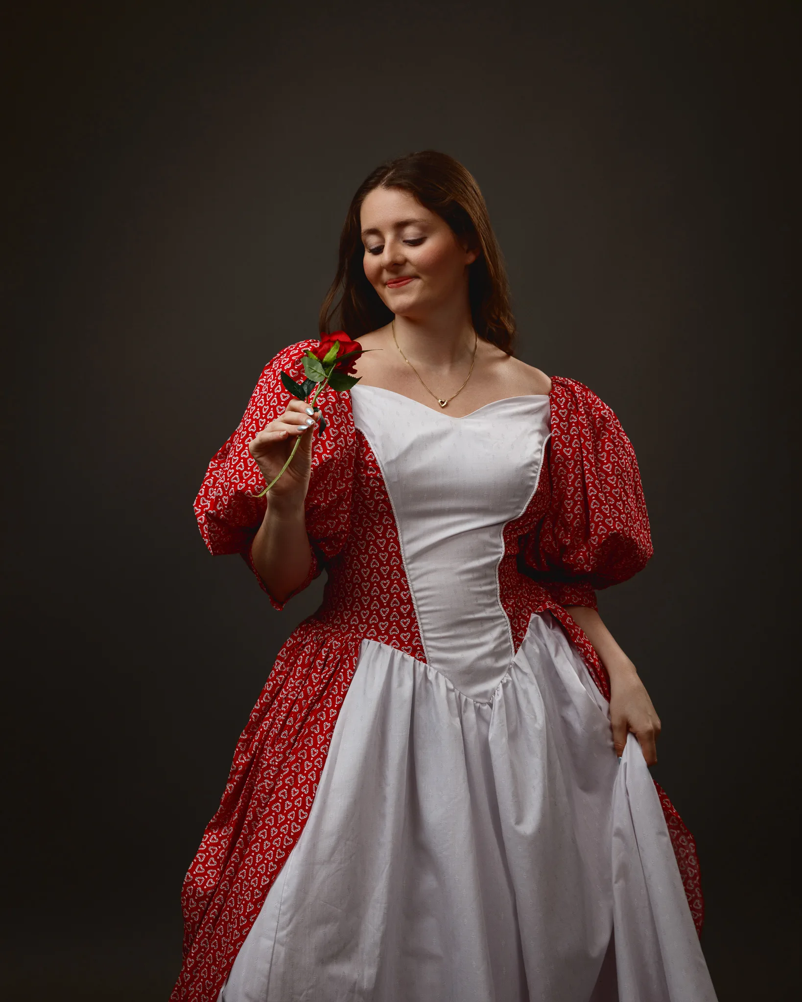
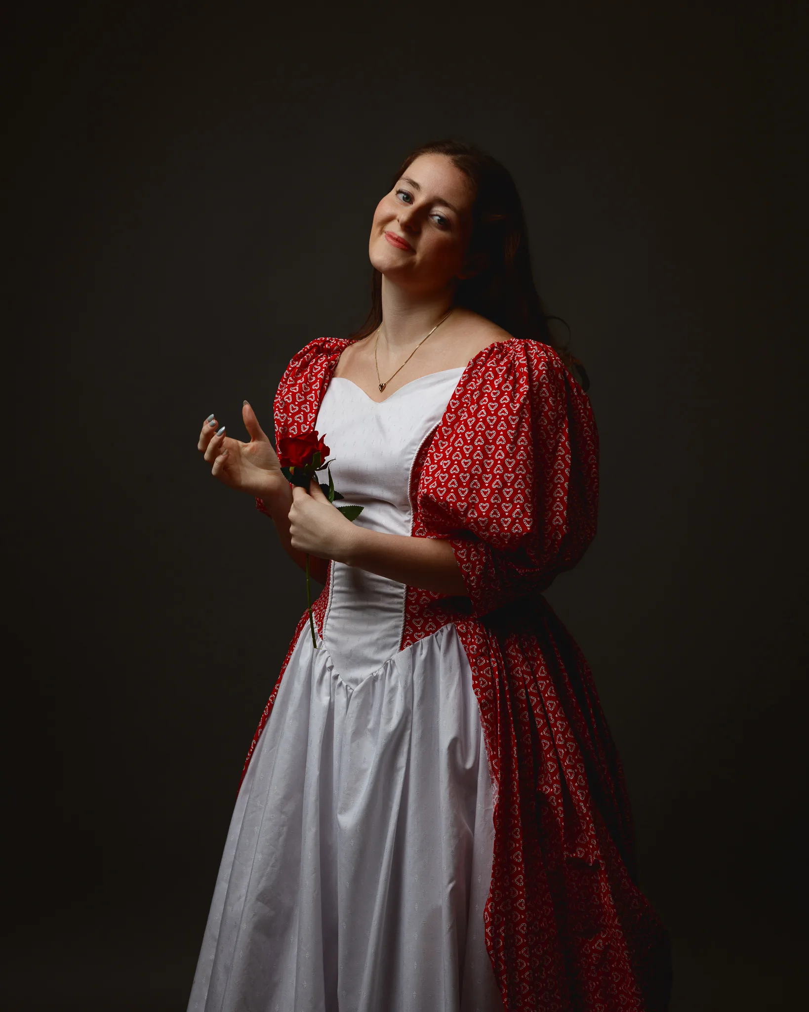
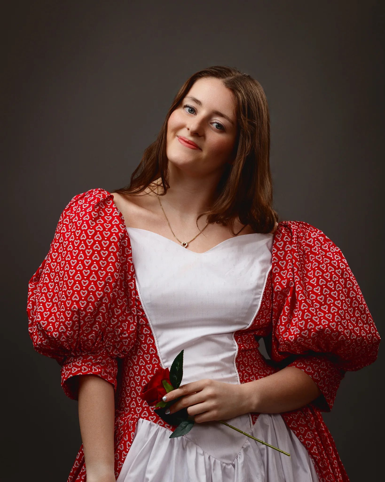
This first look set the tone for the whole day. The dress has a late 1700s peasant feel, with white and red cotton, and red heart detailing on the sleeves and side panels. It is lined with petticoats, so the skirt holds its shape and gives a gentle, authentic volume.
Sophia wore a simple gold heart locket. That tiny detail mattered more than you might think. In a studio portrait, a locket gives the viewer a place to linger. It also creates a natural hand action when the model touches it lightly.
Visually, this dress does a few useful things:
- The white panel holds highlight detail without blowing out too quickly
- The red pattern breaks up the sleeves in a way that reads well on camera
- The petticoats add form, even in still poses
The background stayed bright and minimal for this set. I wanted a clean, airy feeling that matched the cotton and the period styling. That approach also keeps the reds honest. On darker backdrops, red can skew deeper and moodier. On a light background, it stays vivid and romantic.
In terms of posing, I kept it simple. Shoulder angles, gentle turns of the head, and soft hand placement. Period-inspired clothing often looks best when the pose does not fight it. If the posture becomes too modern, the dress starts to feel like fancy dress. If the posture stays calm, the look feels believable.
Dress 2: Red cotton dress, net petticoats, patent shoes, and bold red accents
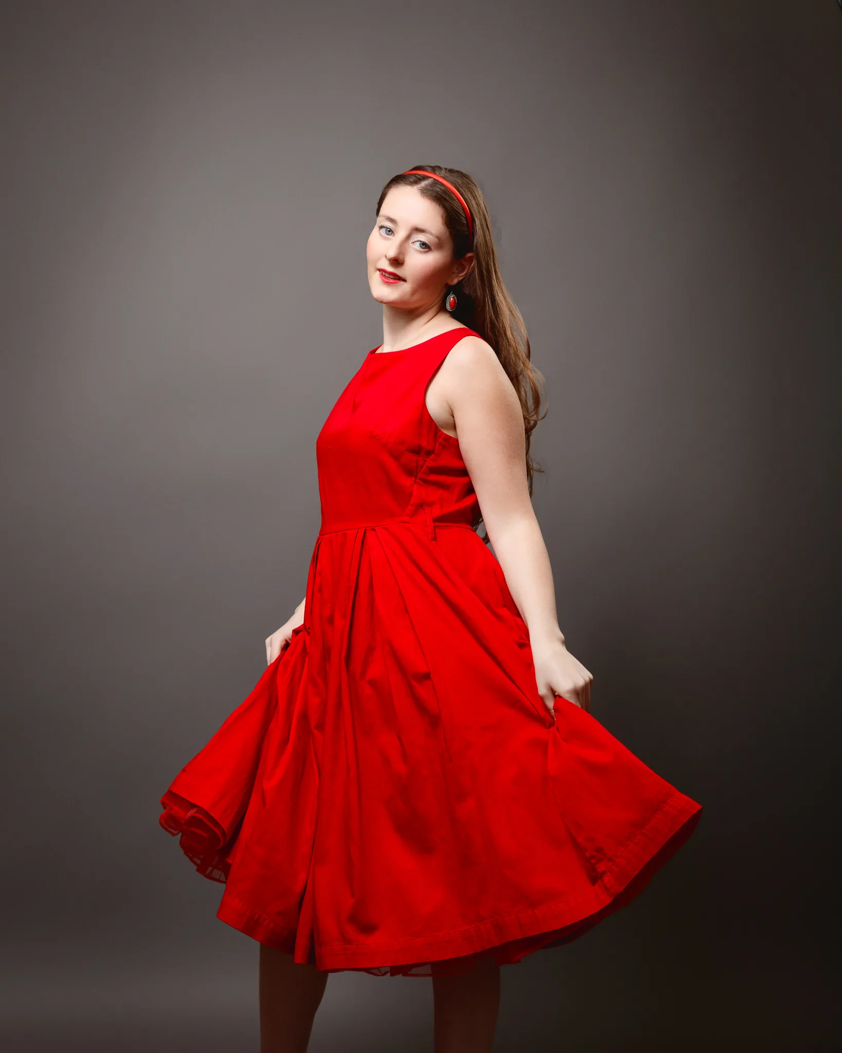
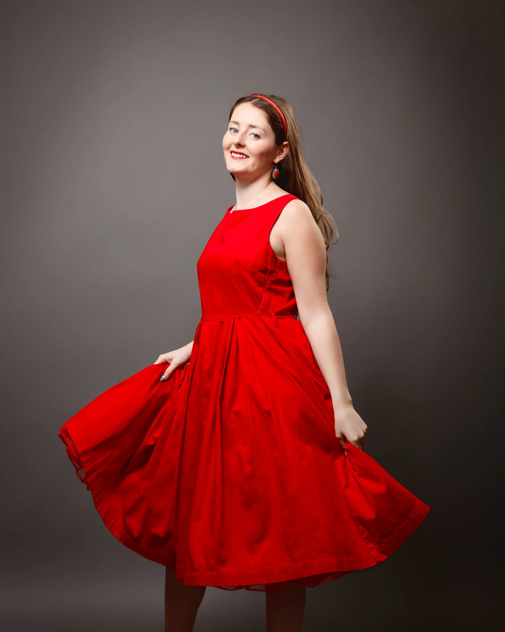
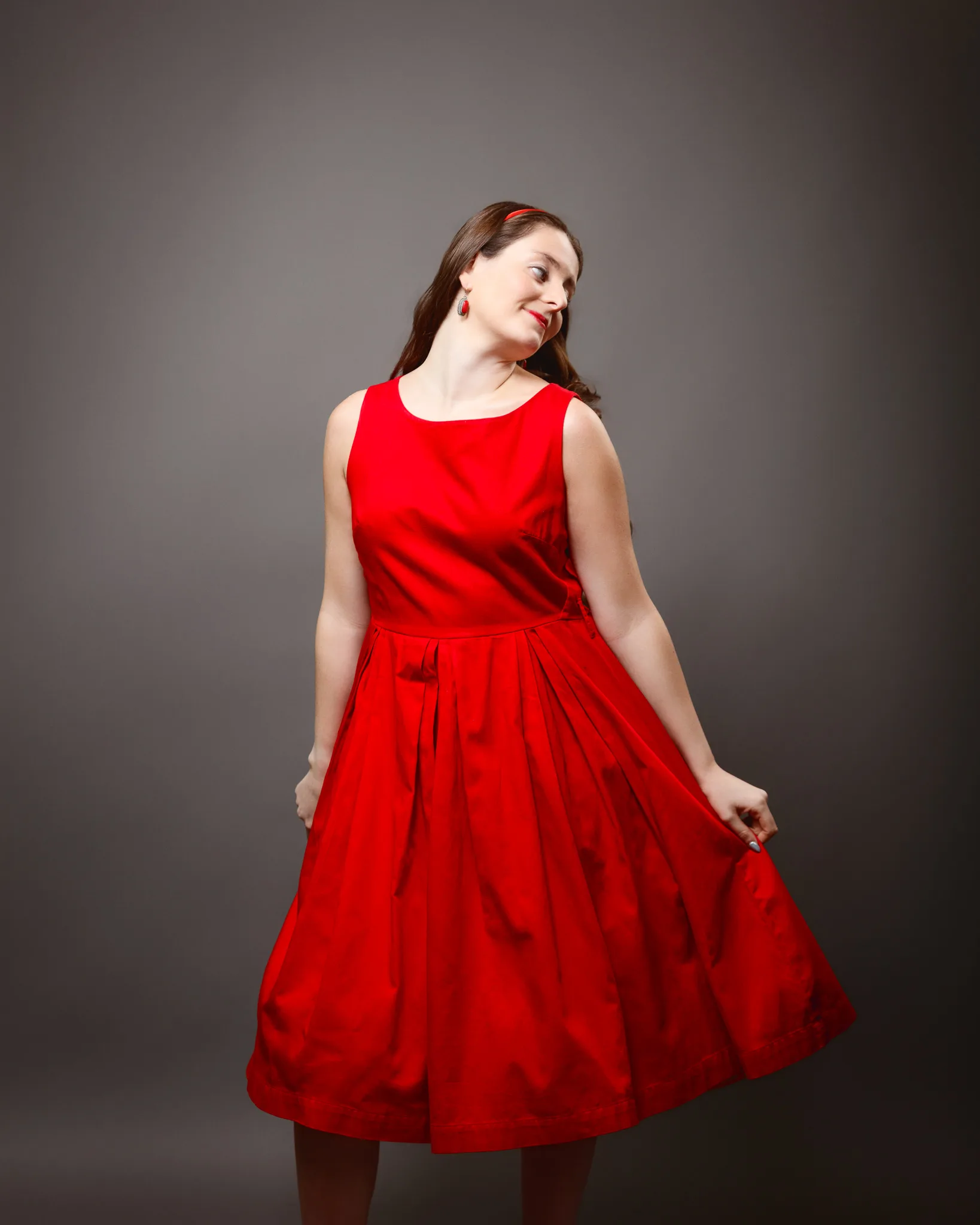
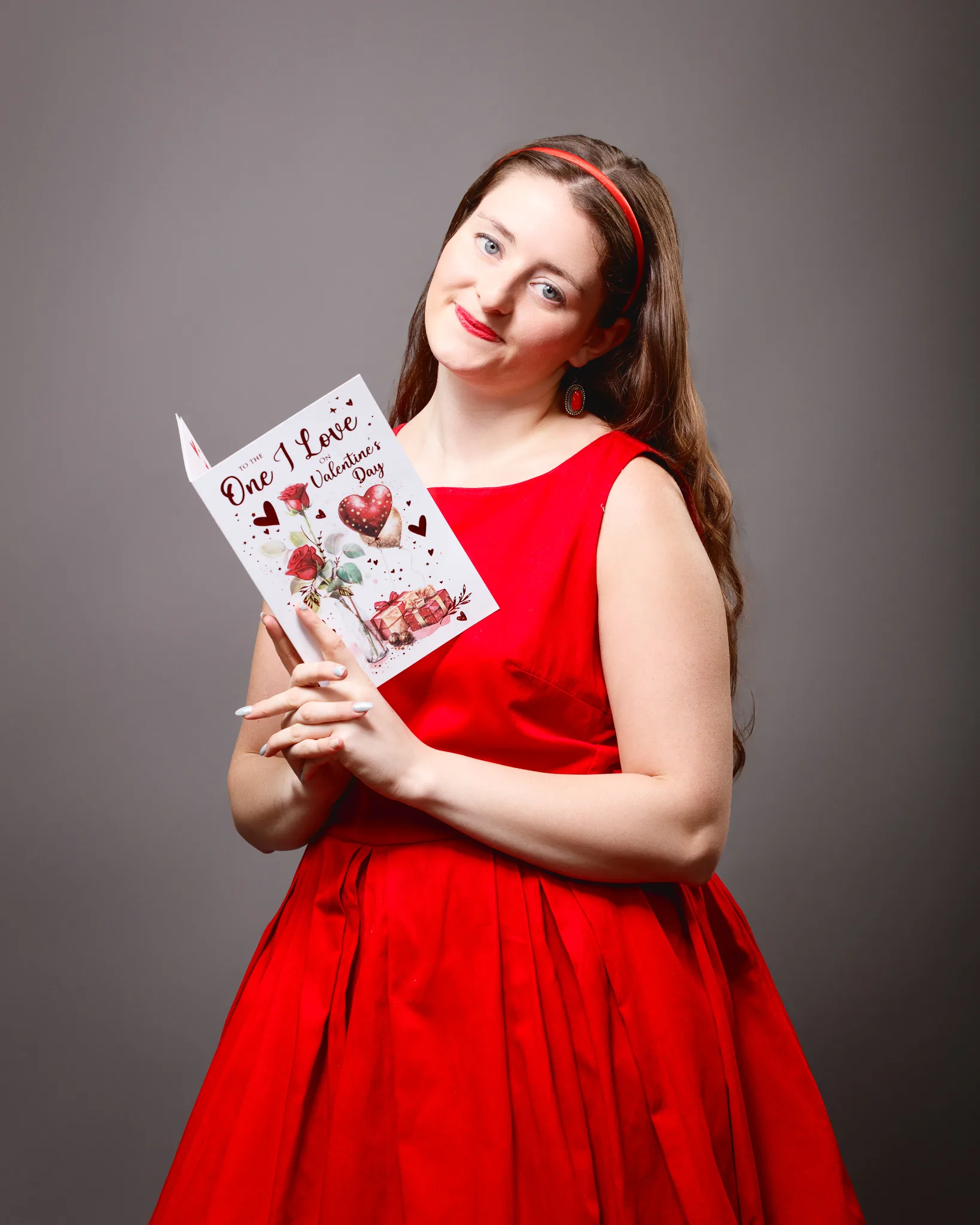
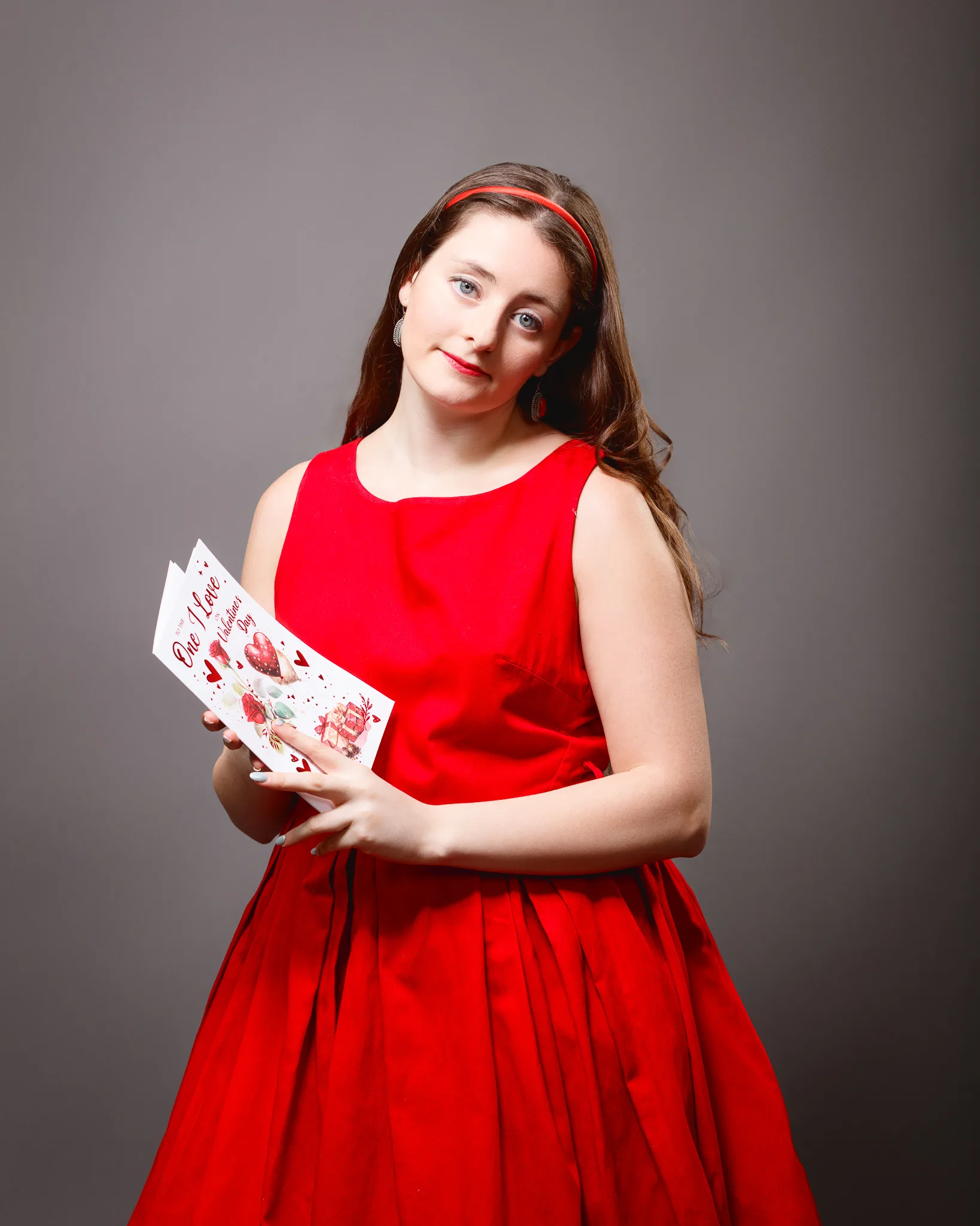
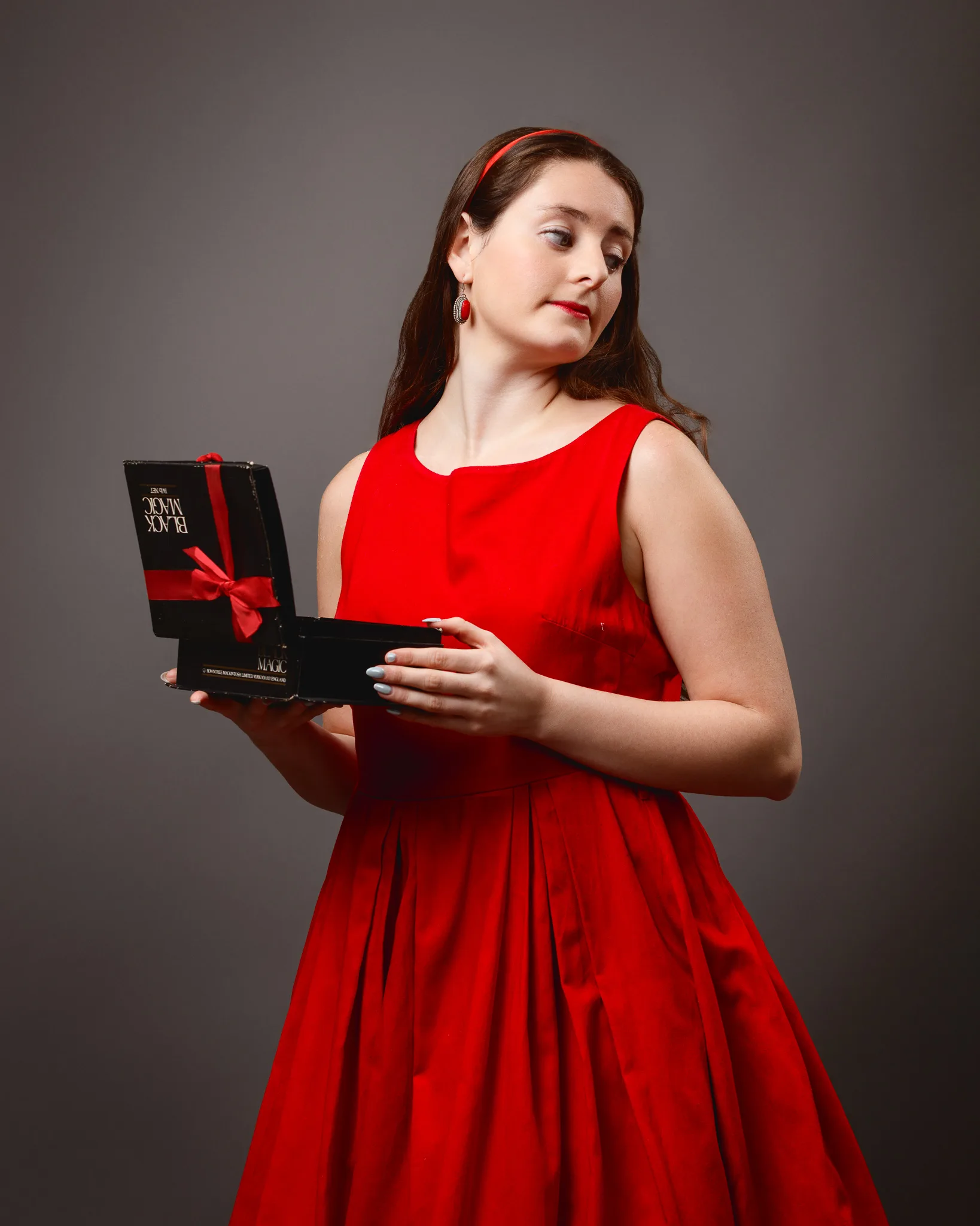
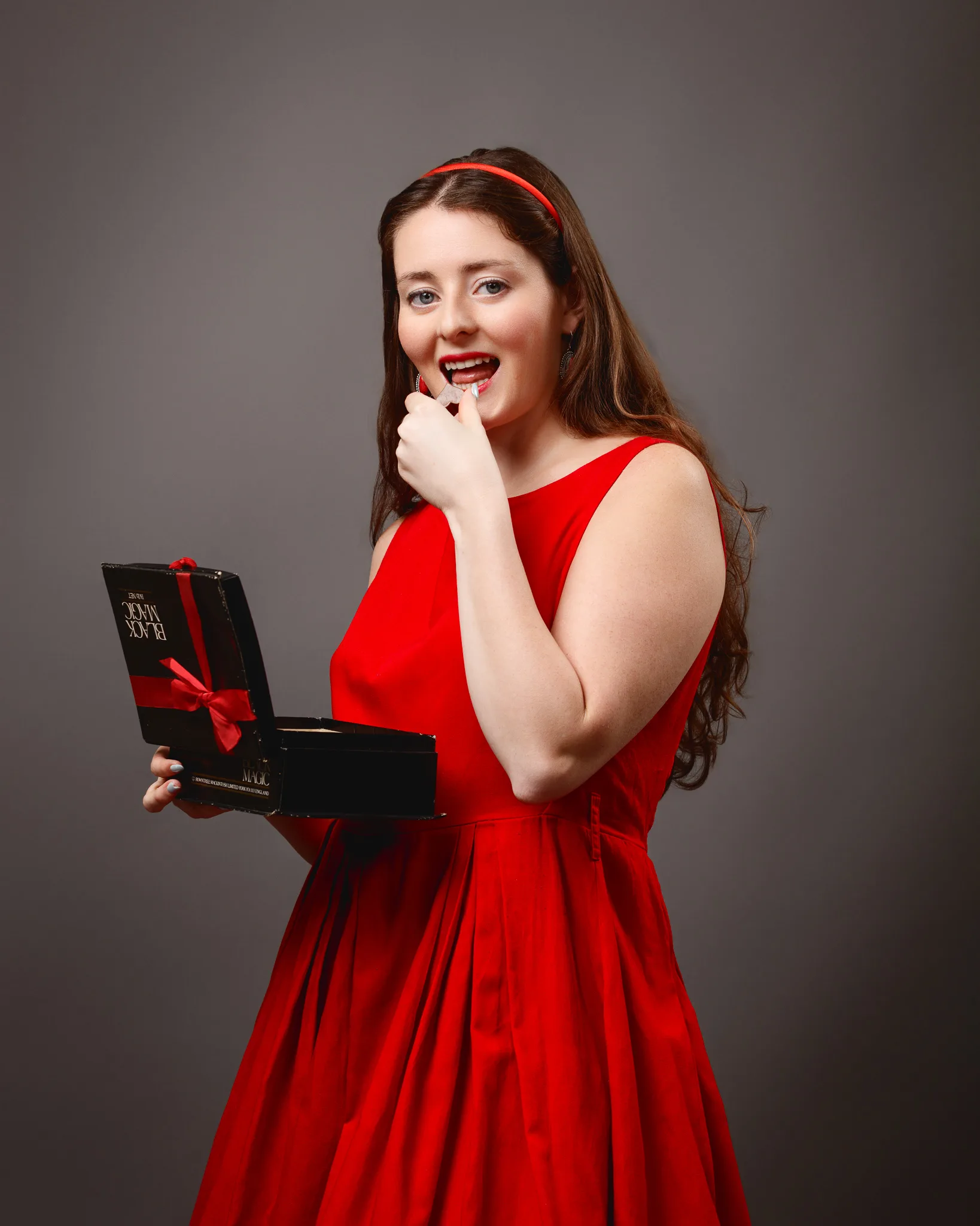
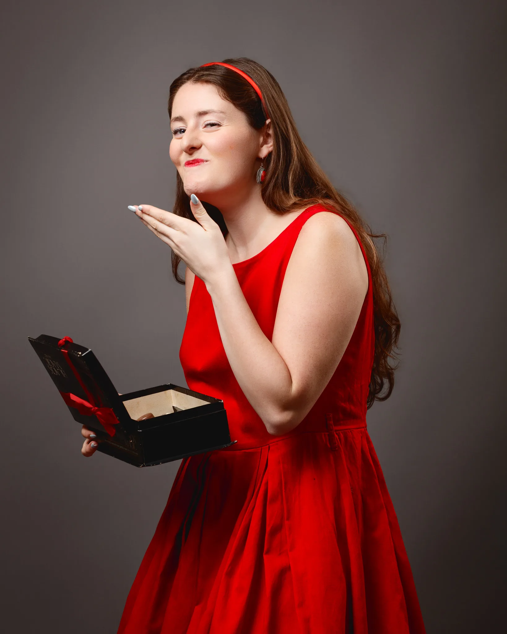
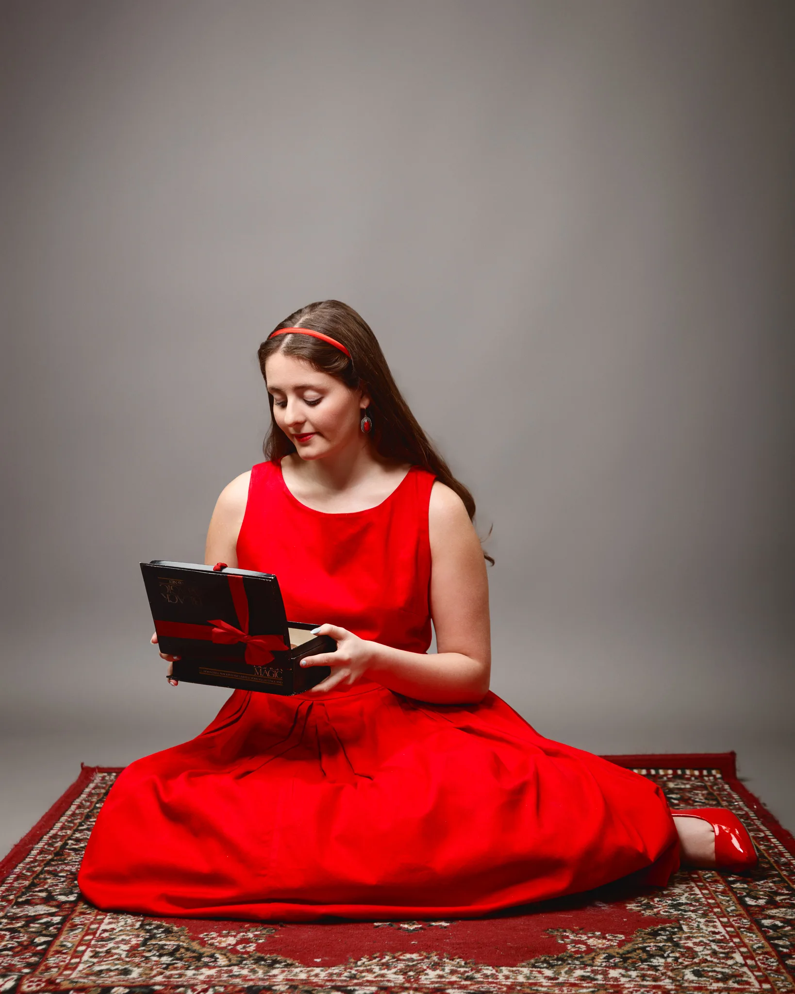
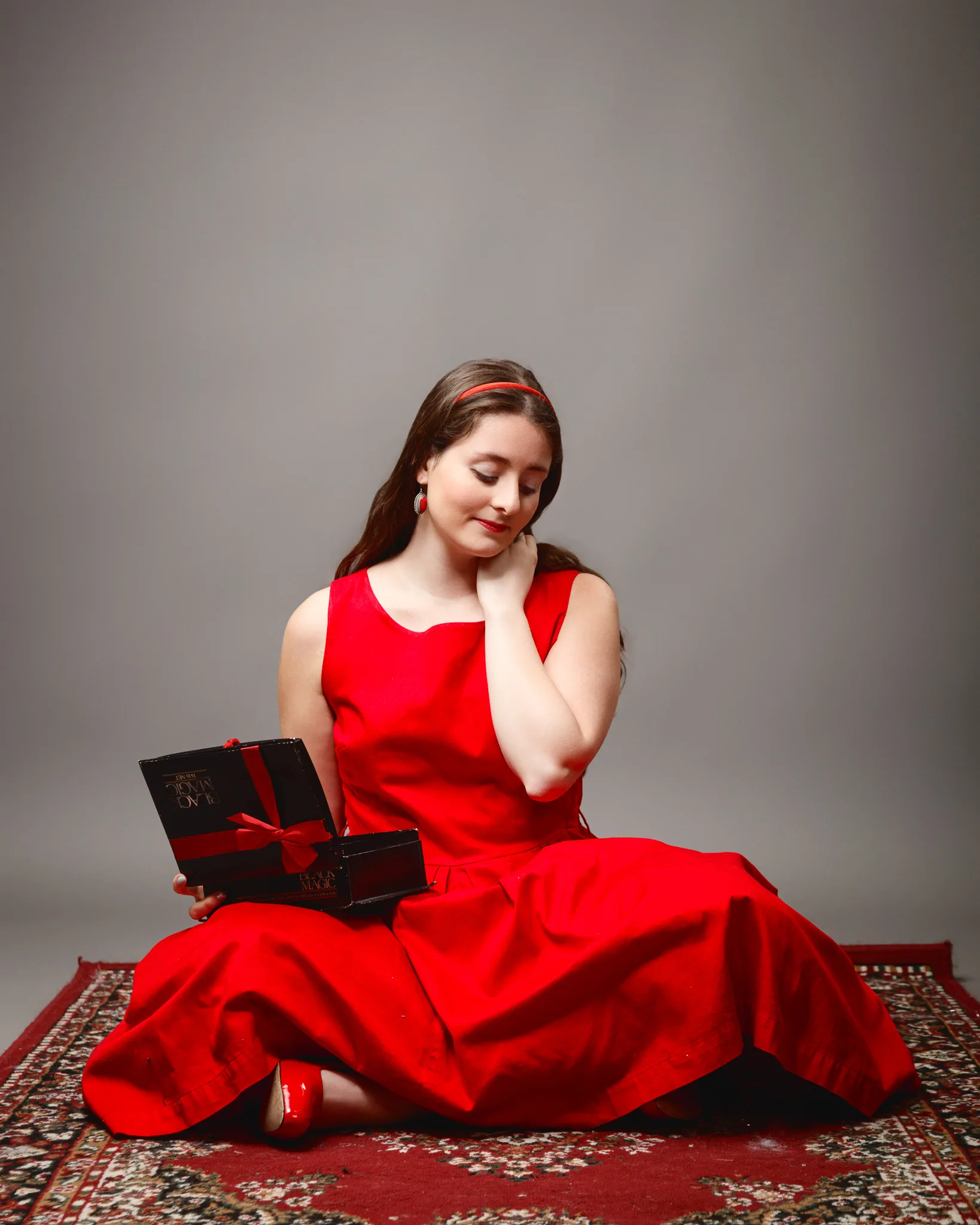
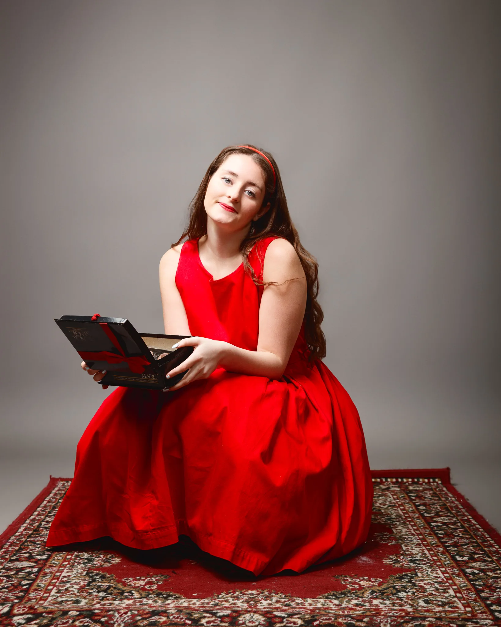
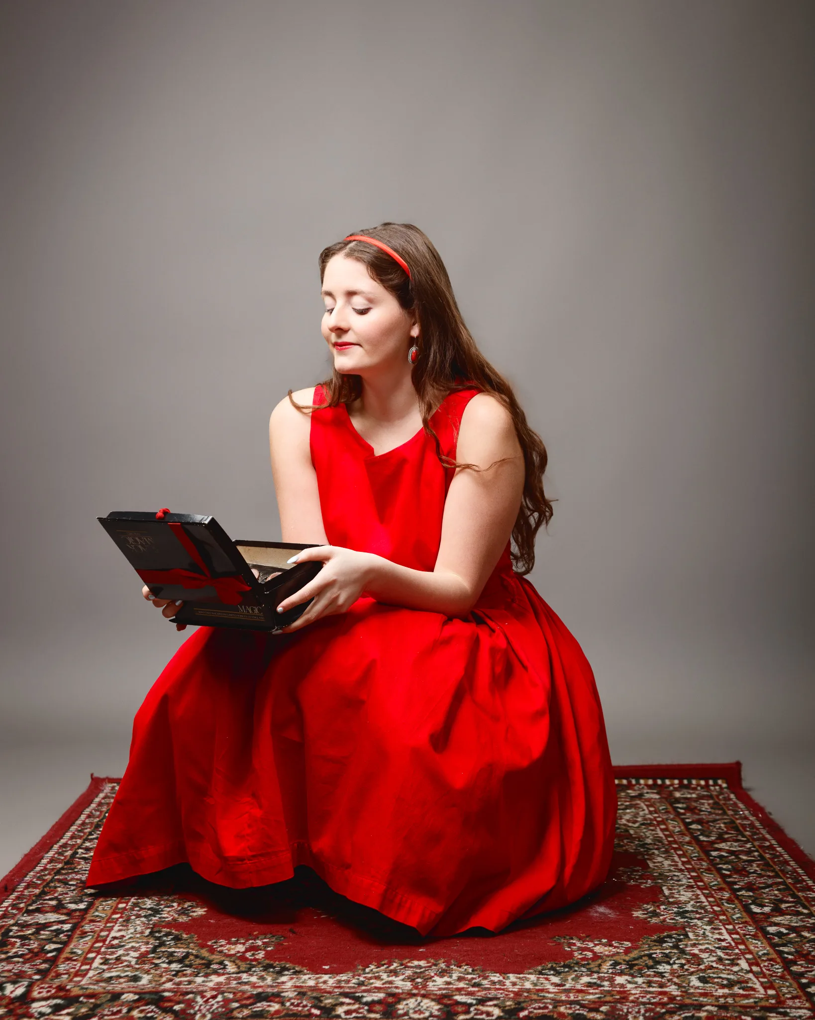
This second dress shifts away from period styling and into something more playful and modern. It is a red cotton sleeveless dress, with net petticoats underneath. The netting changes how the skirt photographs because it creates separation and lightness. You see layers. You also get a slight suggestion of movement even when the model is still.
Styling details for this look:
- Red court patent shoes
- Red stone drop earrings
- A red hair band
This is the type of look where small colour echoes make the image feel “finished”. The earrings and hair band are not there to shout. They are there to keep the red theme coherent from head to toe.
I used a clean, light background again for part of this set, because it keeps the cotton texture visible. Cotton can look flat if the light is too soft and too frontal. I want enough shape to show folds and seams, but not so much shadow that the dress loses its cheerful tone.
For Sophia’s expression, this set suited a more thoughtful mood. That contrast works well. A bold red dress can become cliché if the expression is always big and smiling. A quieter face, with a strong body line, makes it feel more editorial.
Dress 3: Red silk and chiffon short dress, diamanté panel, shawl, and sparkle control
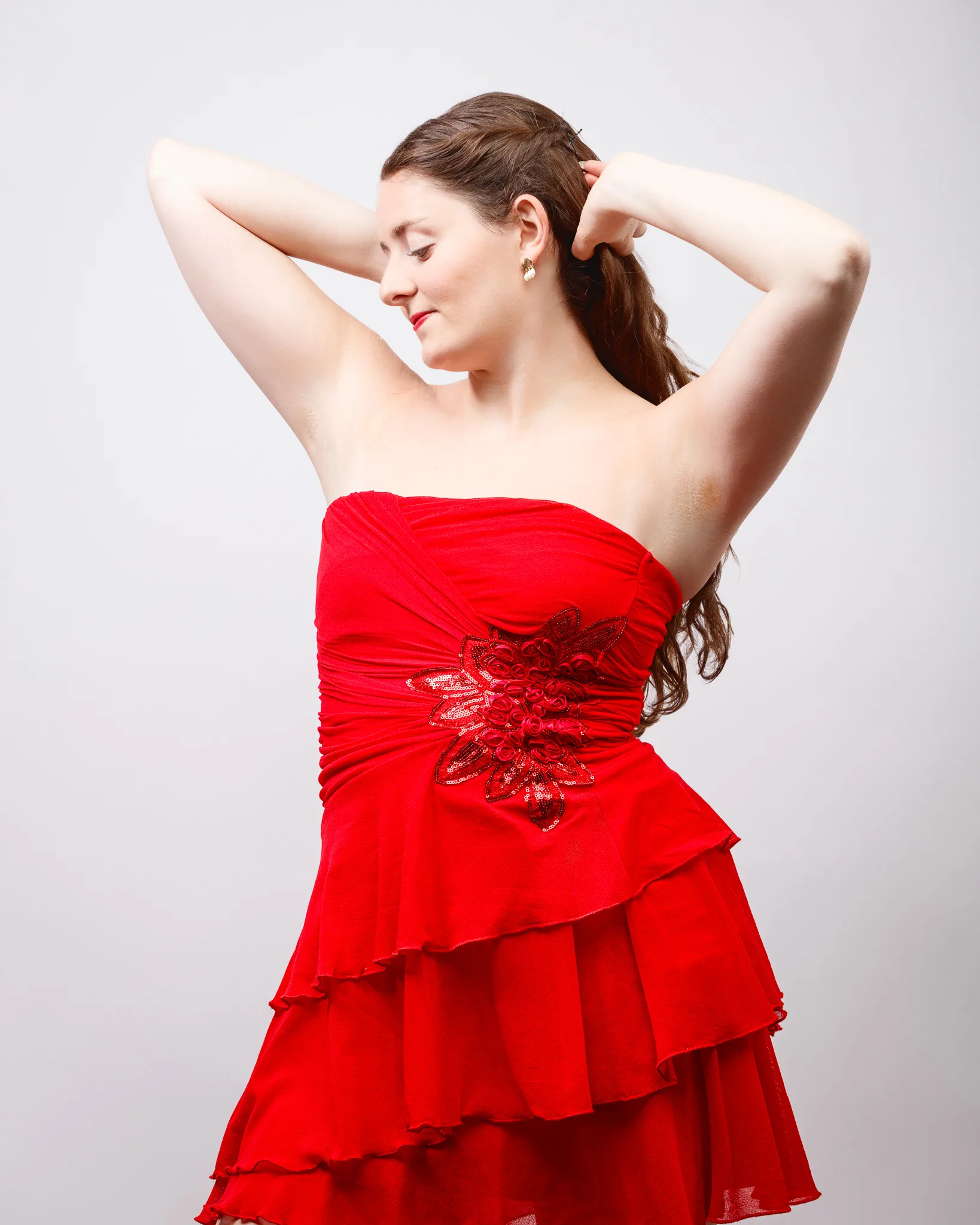
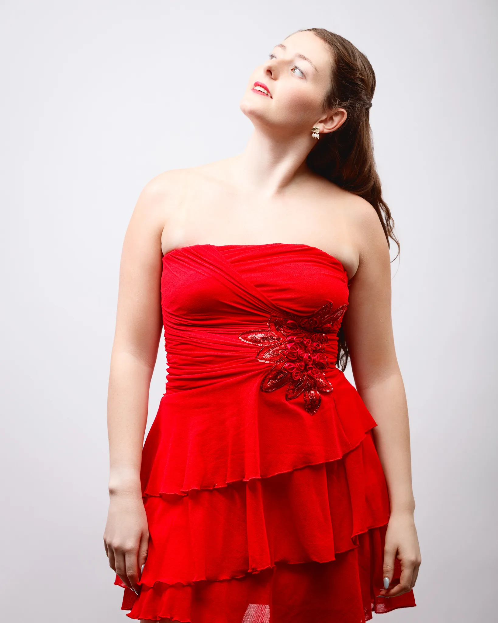
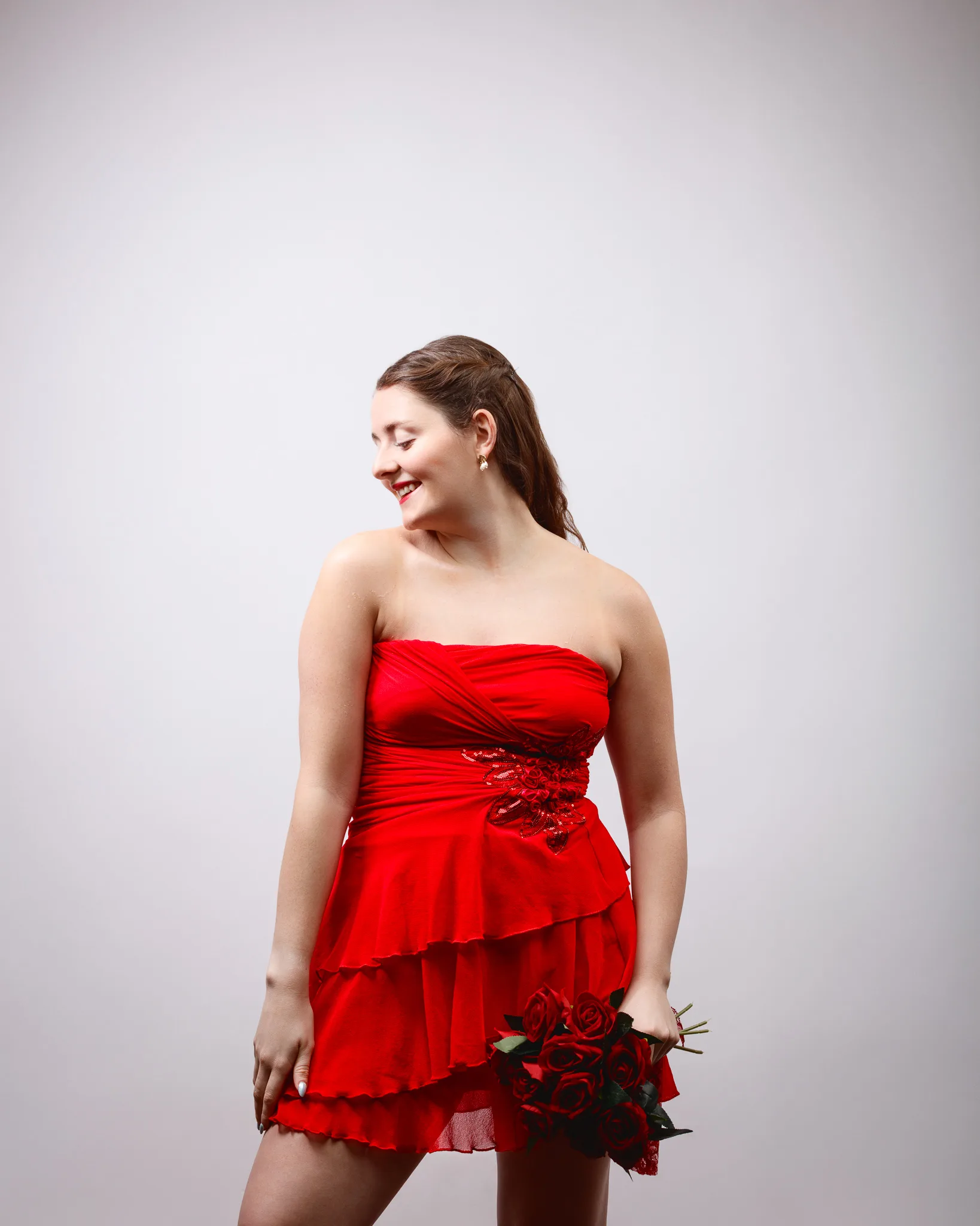
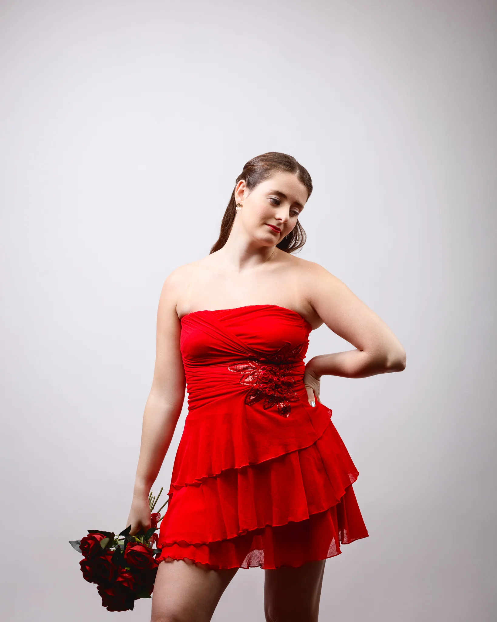
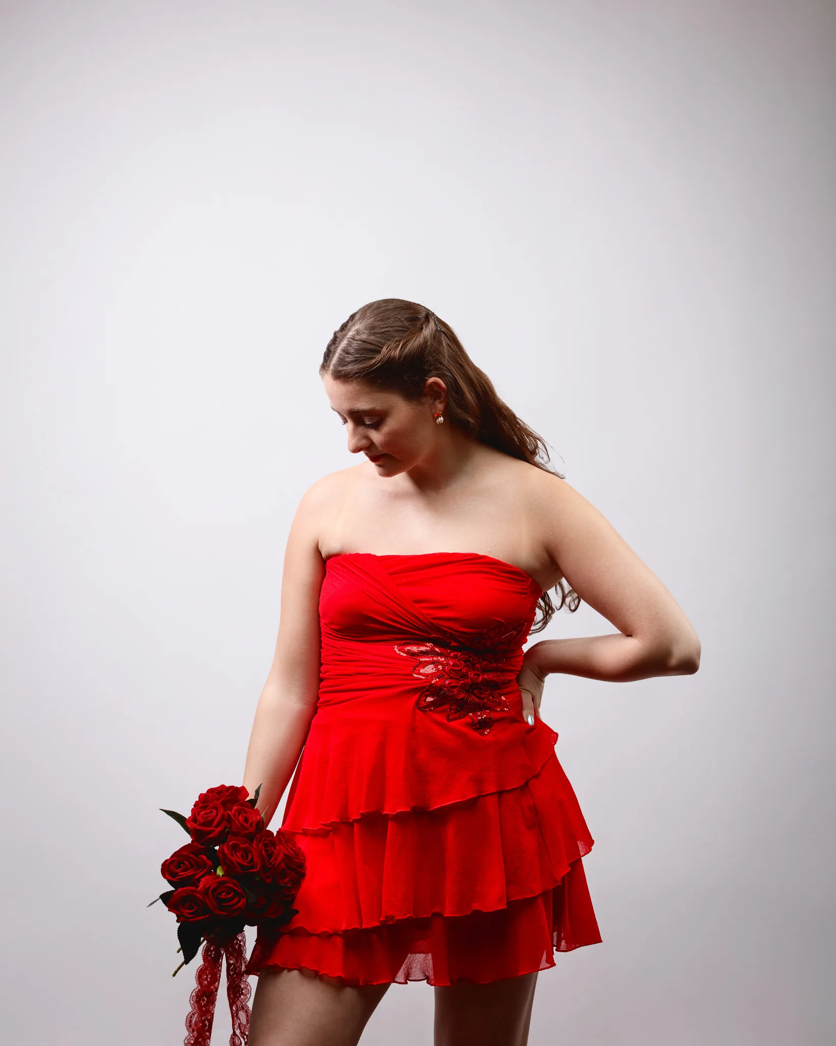
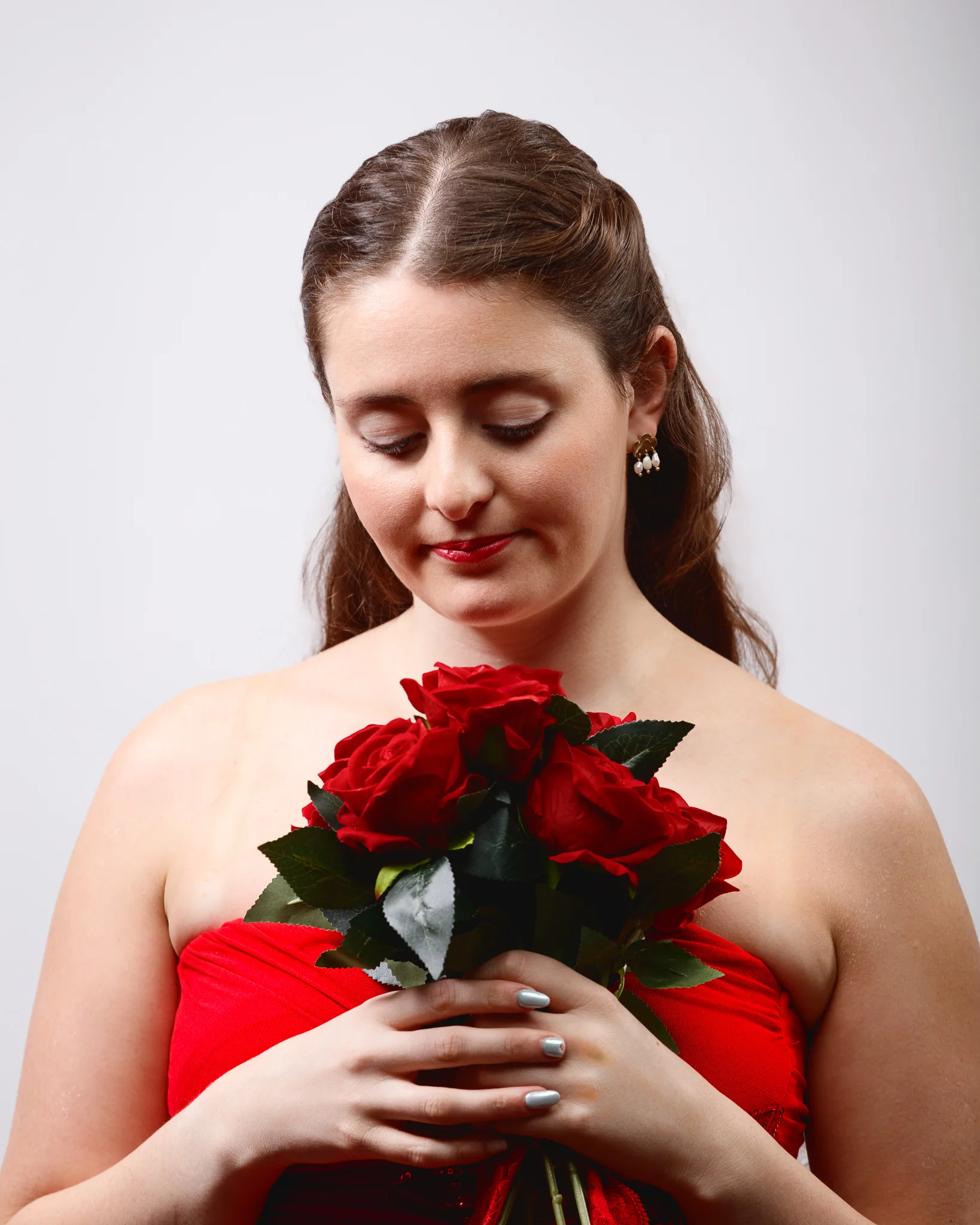
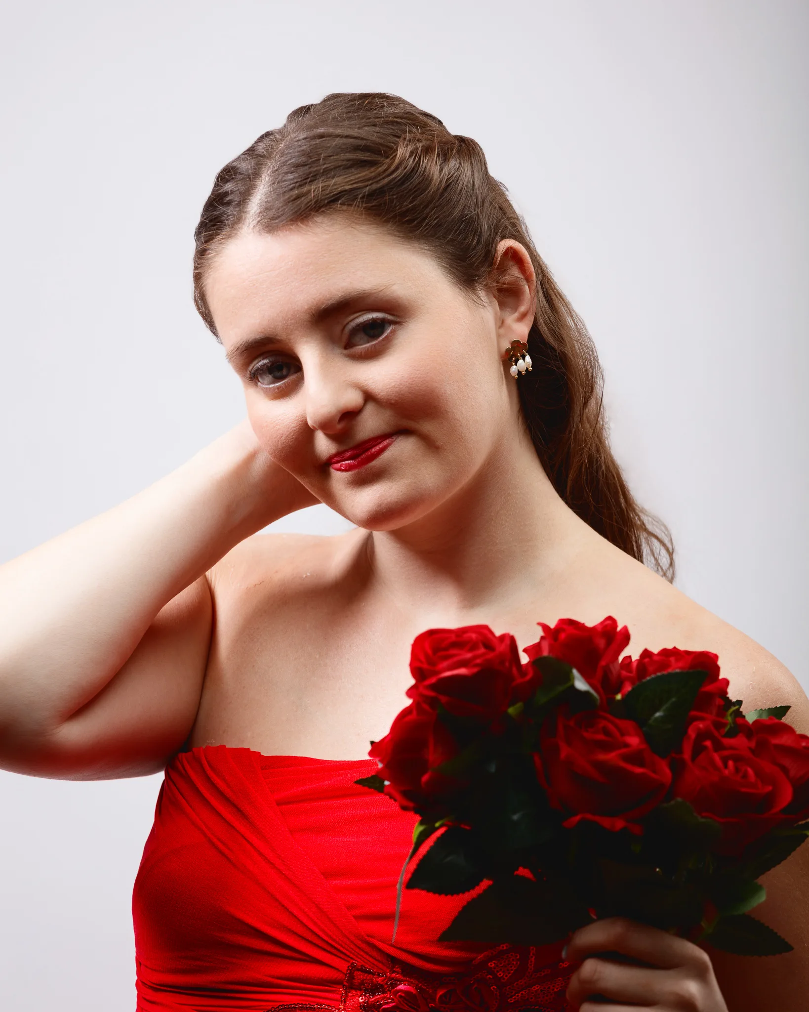
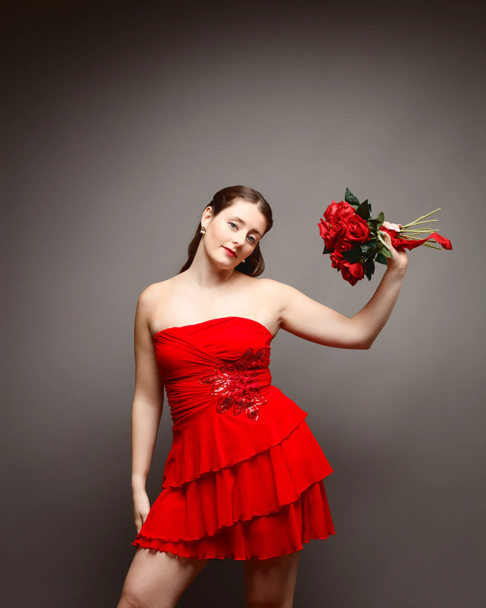
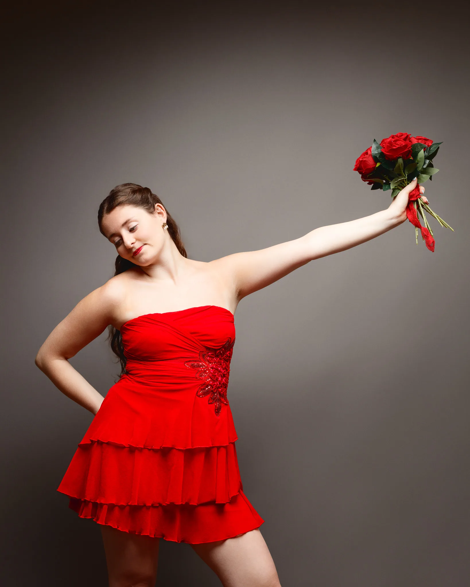
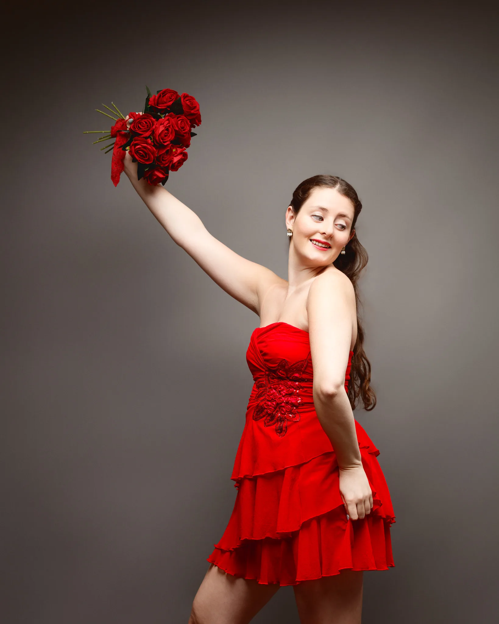
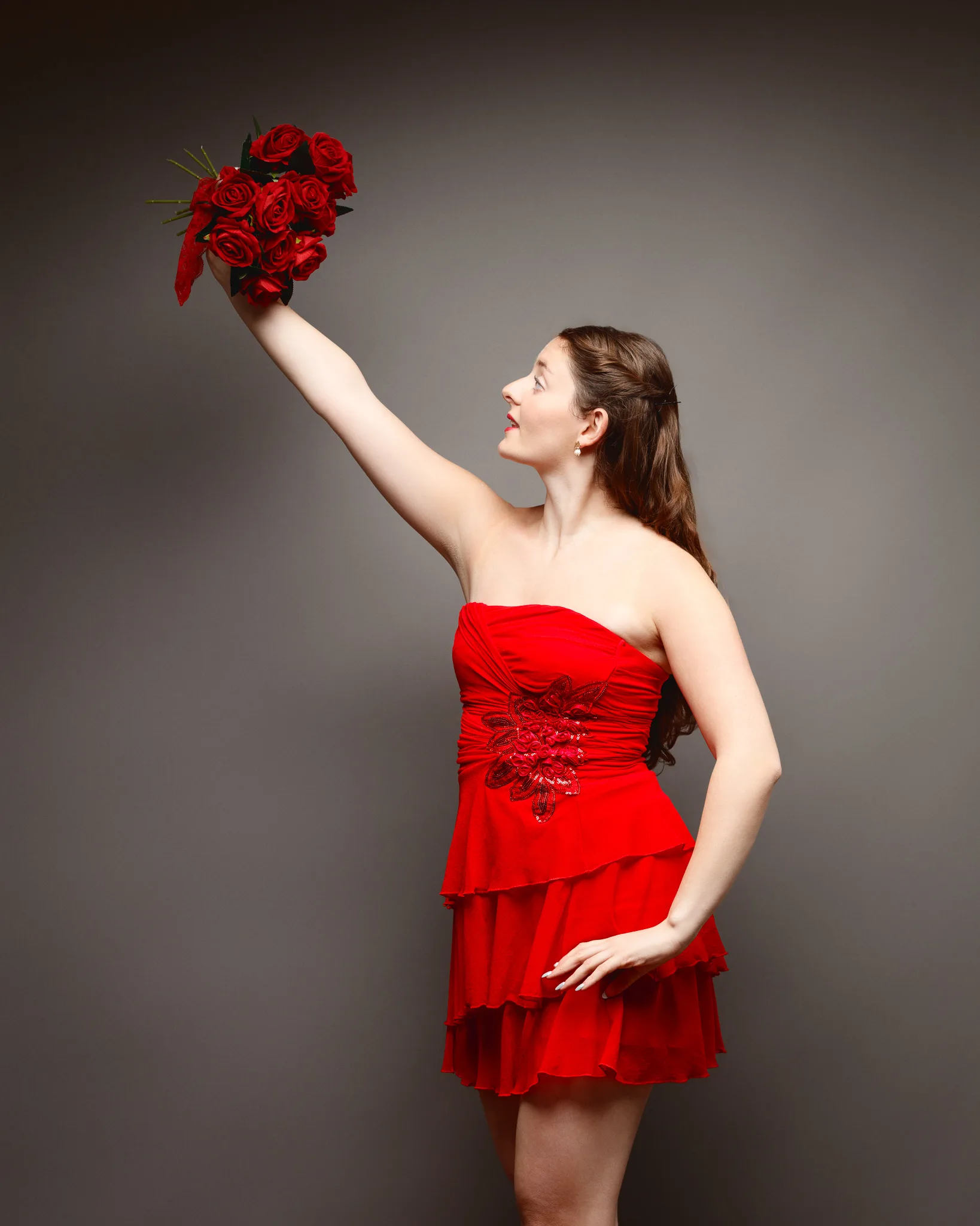
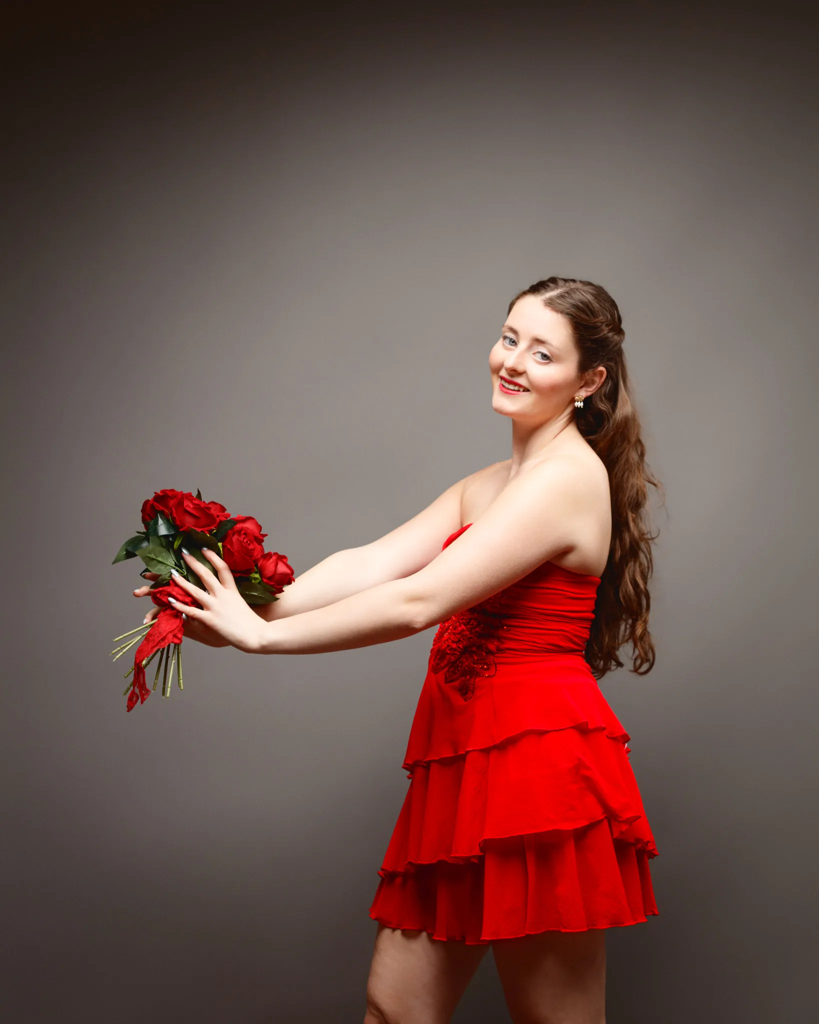
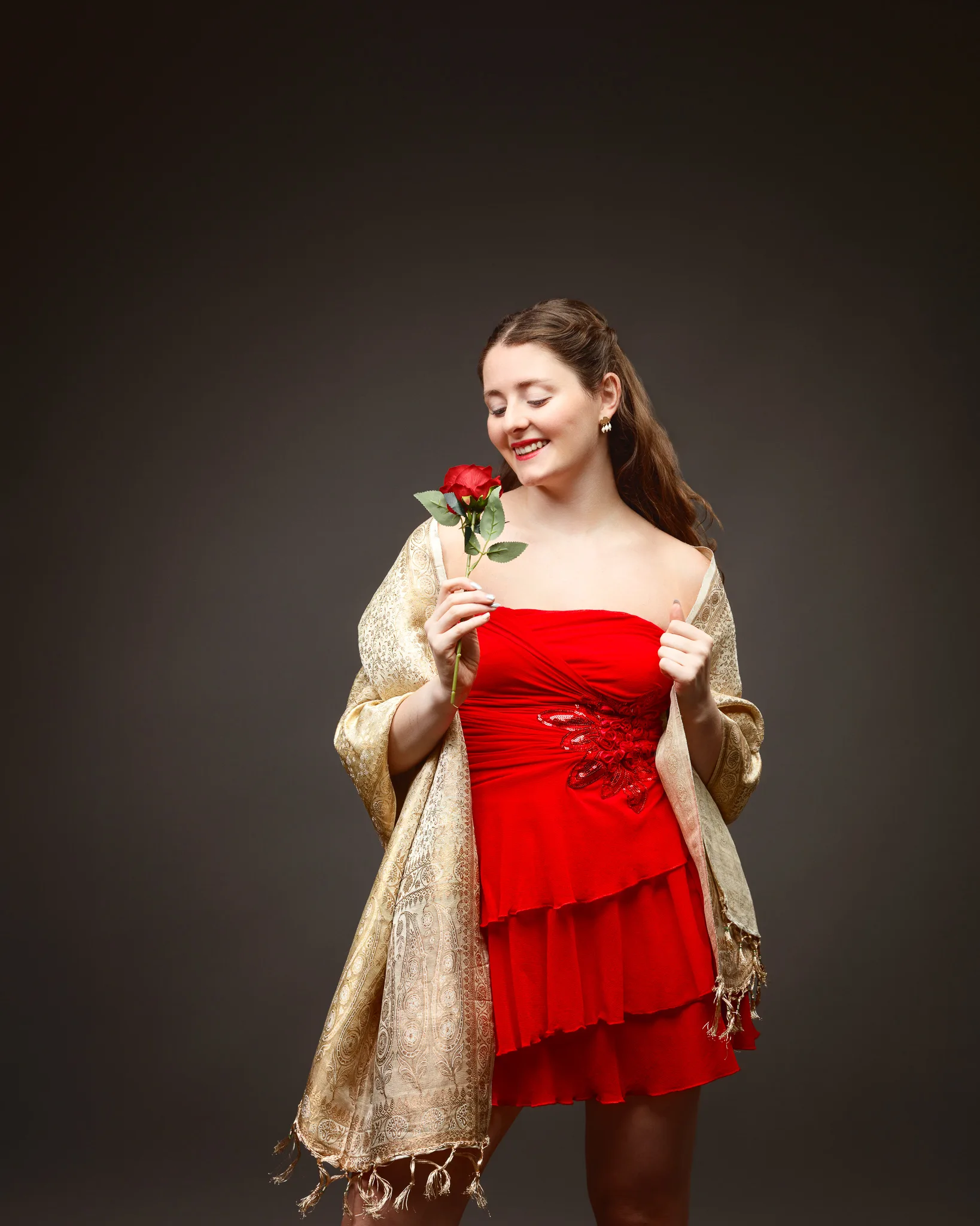
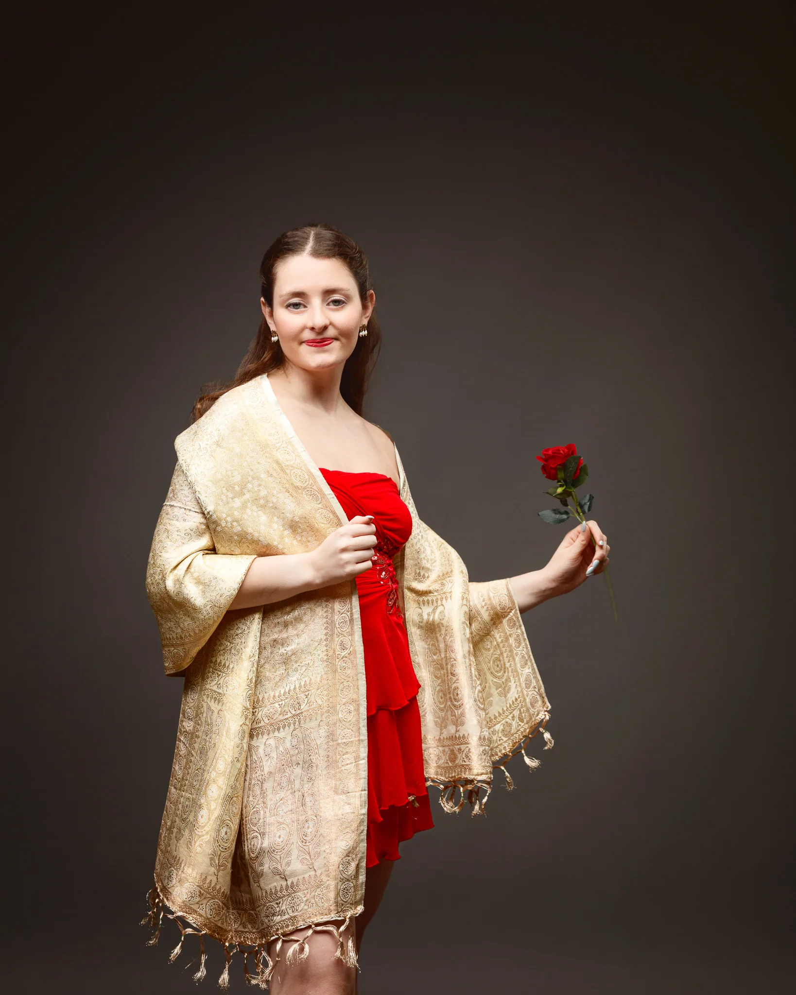
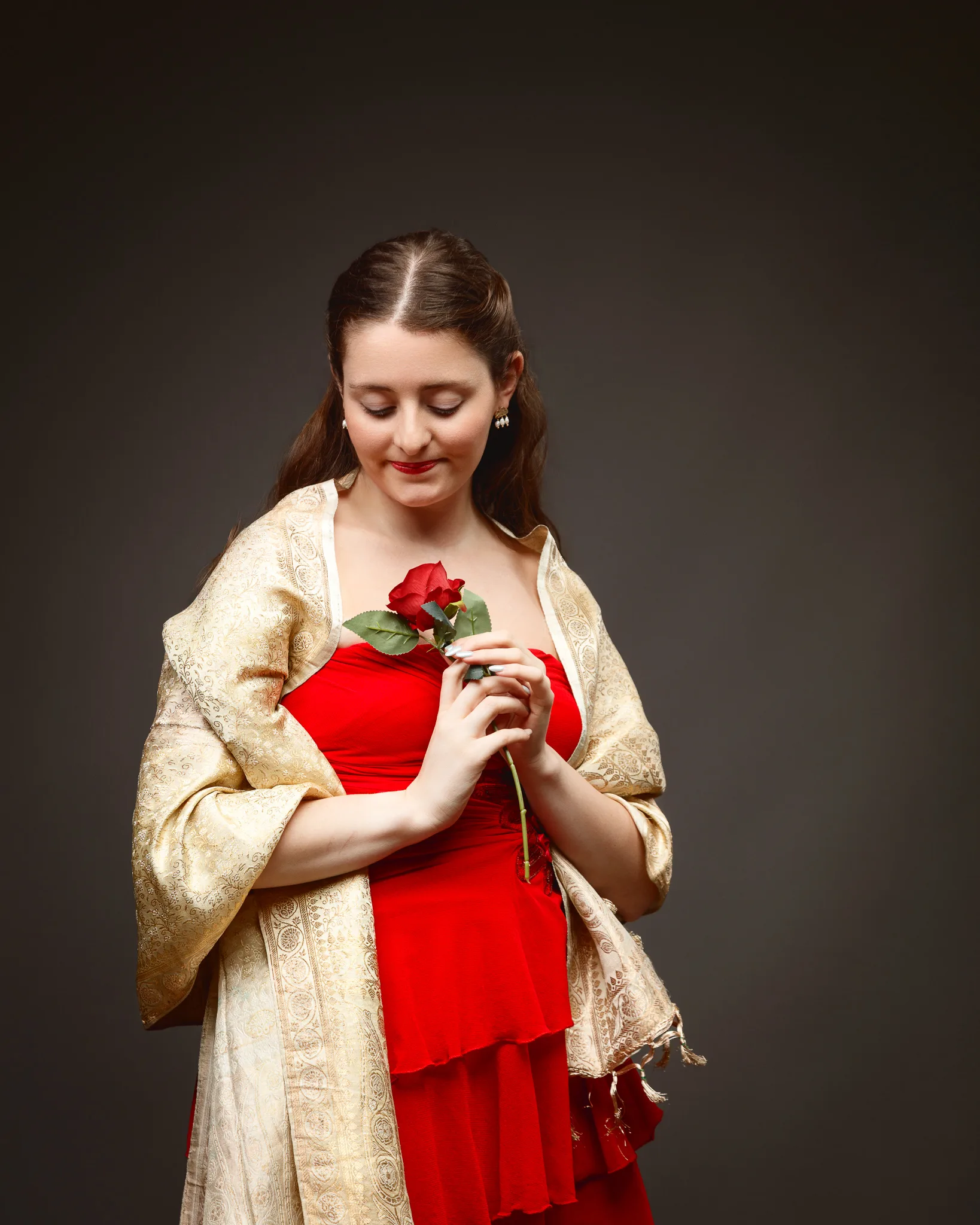
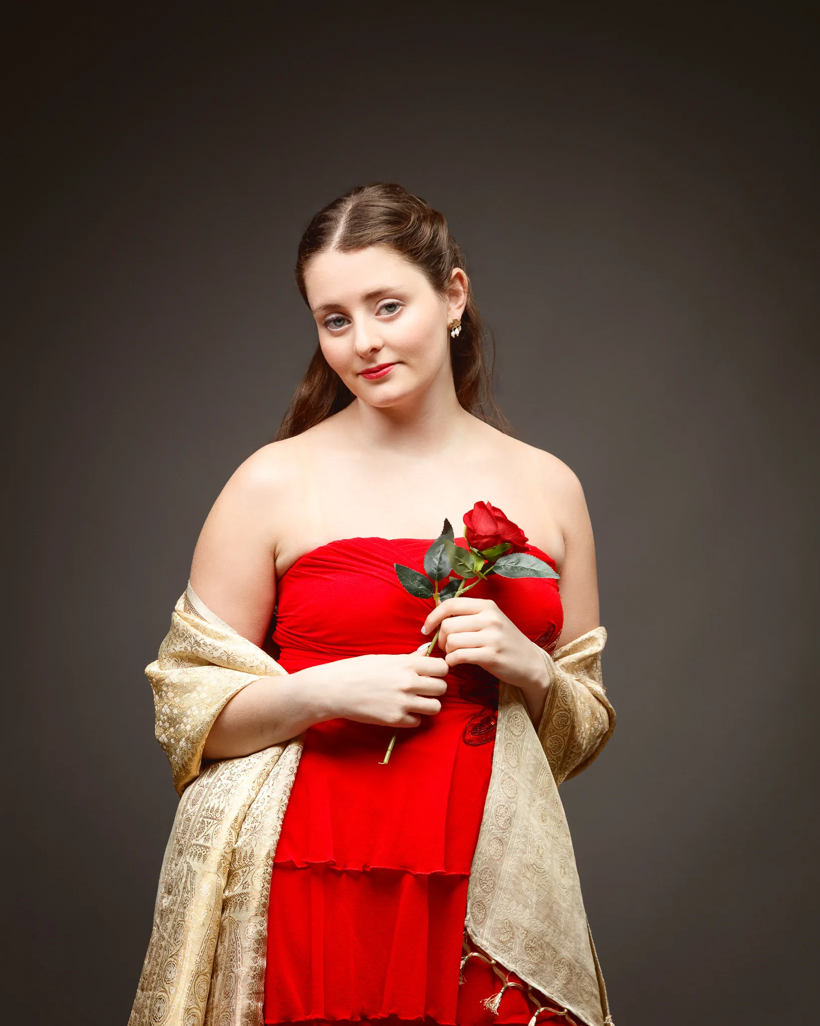
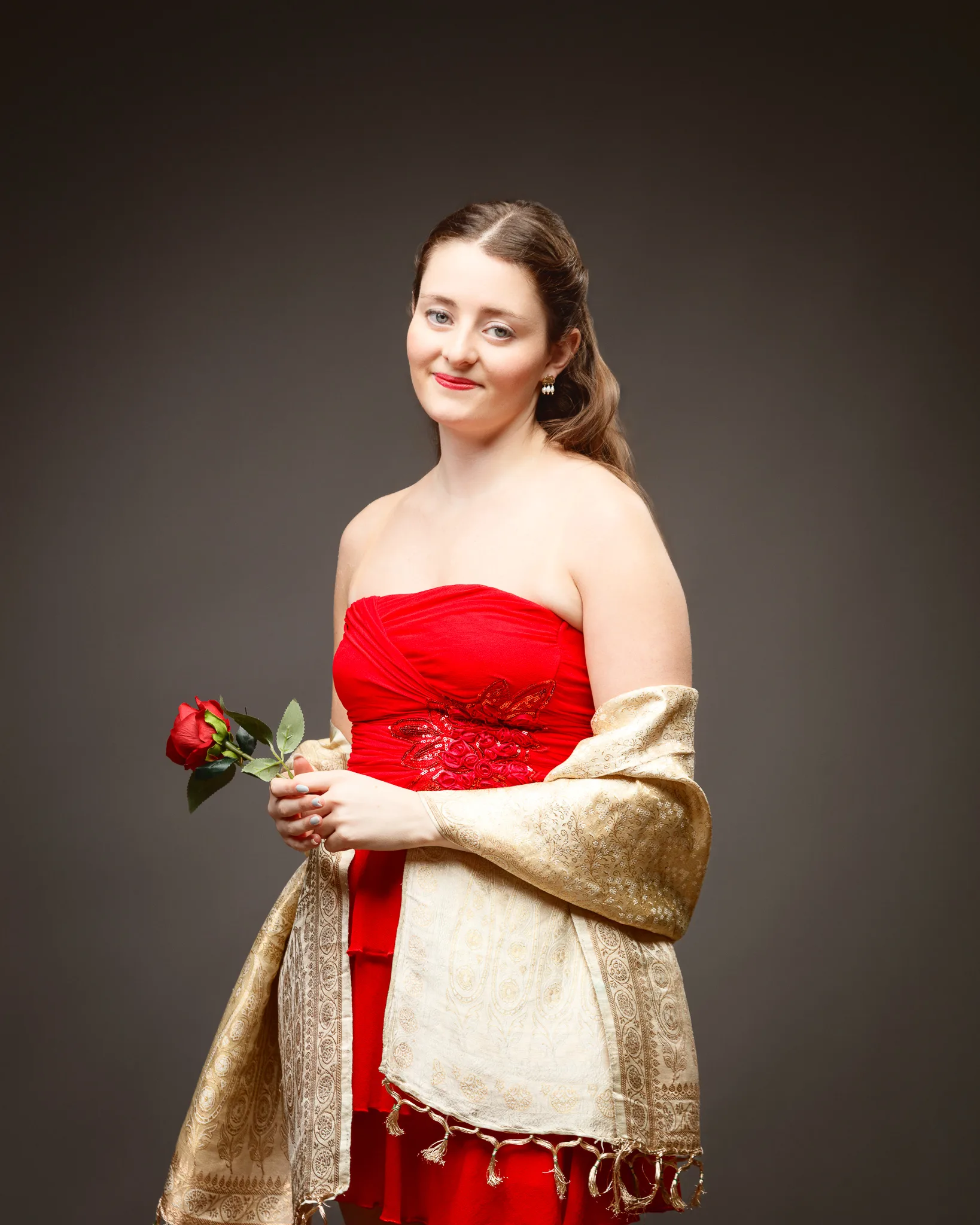
The third dress is the most “studio tricky” of the three, and that is exactly why it belongs in a test shoot. It is a red silk and chiffon short dress with a diamanté jewel panel. That combination of silk sheen, chiffon softness, and reflective stones forces me to be precise.
Styling details:
- Gold and pearl earrings
- Gold silk shawl
- Black and silver bow shoes
This look is all about controlling specular highlights. Silk can jump quickly from rich colour to bright reflection. Diamanté can produce hot spots that pull the eye away from the face. A gold shawl adds another reflective surface. If I do not manage the light carefully, the image becomes a collection of shiny distractions.
So I treated this set like a lighting discipline exercise, but in service of creativity. I want the sparkle, but I want it in the right places. I want the dress to glow, not glare.
This is also where Sophia’s posing choices really matter. A slight change in wrist angle can catch the light in a distracting way. A small shift of the chin can move a highlight from cheekbone to forehead. In a test shoot, I can slow down and refine those micro-decisions.
Props and pacing: roses, a box, and the value of simple objects
I included roses and a gift box across the shoot because props give a model a task. They reduce “pose noise”. They also anchor the Valentine theme without forcing hearts everywhere.
Roses are useful because:
- They introduce a natural line through the frame
- They encourage gentle hand shapes
- They create a clear colour accent against neutral backgrounds
The gift box adds a narrative beat. It suggests a moment: receiving, offering, opening, considering. That is enough story for a portrait. I do not need more than that.
What I learned from this session
Every test shoot should produce answers, not just images. These are the main takeaways I am carrying forward:
First, red is unforgiving, but it is also rewarding. If the exposure is even slightly off, red can clip and lose texture. When it is right, red feels rich and dimensional.
Second, simple backgrounds are not boring. They are honest. They show you whether the styling, posing, and expression are doing the work.
Third, accessories need to earn their place. A locket, earrings, or a shawl should support the portrait, not compete with it.
Fourth, fabric behaviour is a lighting problem and a posing problem at the same time. Cotton, net, silk, and chiffon all respond differently. The model’s movement matters as much as the modifier choice.
Finally, the creative benefit of a test shoot is confidence. When I have already explored an idea in my own time, I can bring that knowledge into client work with calm certainty.
Dress comparison overview
Here is a simple summary of the three looks, and what each one tested for me:
| Dress | Key materials | Styling accents | What it tested |
|---|---|---|---|
| Dress 1 (late 1700s) | Cotton, petticoats | Gold heart locket | Period feel, shape, gentle narrative |
| Dress 2 (modern red) | Cotton, net petticoats | Patent shoes, red earrings, hair band | Layering, movement, clean editorial mood |
| Dress 3 (silk and chiffon) | Silk, chiffon, diamanté | Gold shawl, gold/pearl earrings, bow shoes | Layering, movement, and a clean editorial mood |
If you are building your own test shoot ideas
If you are reading this as a model, stylist, or photographer planning a personal project, I would keep it simple and intentional. Pick one theme. Choose a wardrobe that supports it. Then build one clean lighting base and explore from there.
A few practical prompts that help:
- What is the subject of this shoot: wardrobe, mood, or character?
- What is the minimum set design that still supports the theme?
- What prop creates a natural action without stealing attention?
- What is the one technical risk you want to test safely?
That is how test shoots stay useful. They stop being random, and they start becoming a creative toolkit you can draw on again and again.