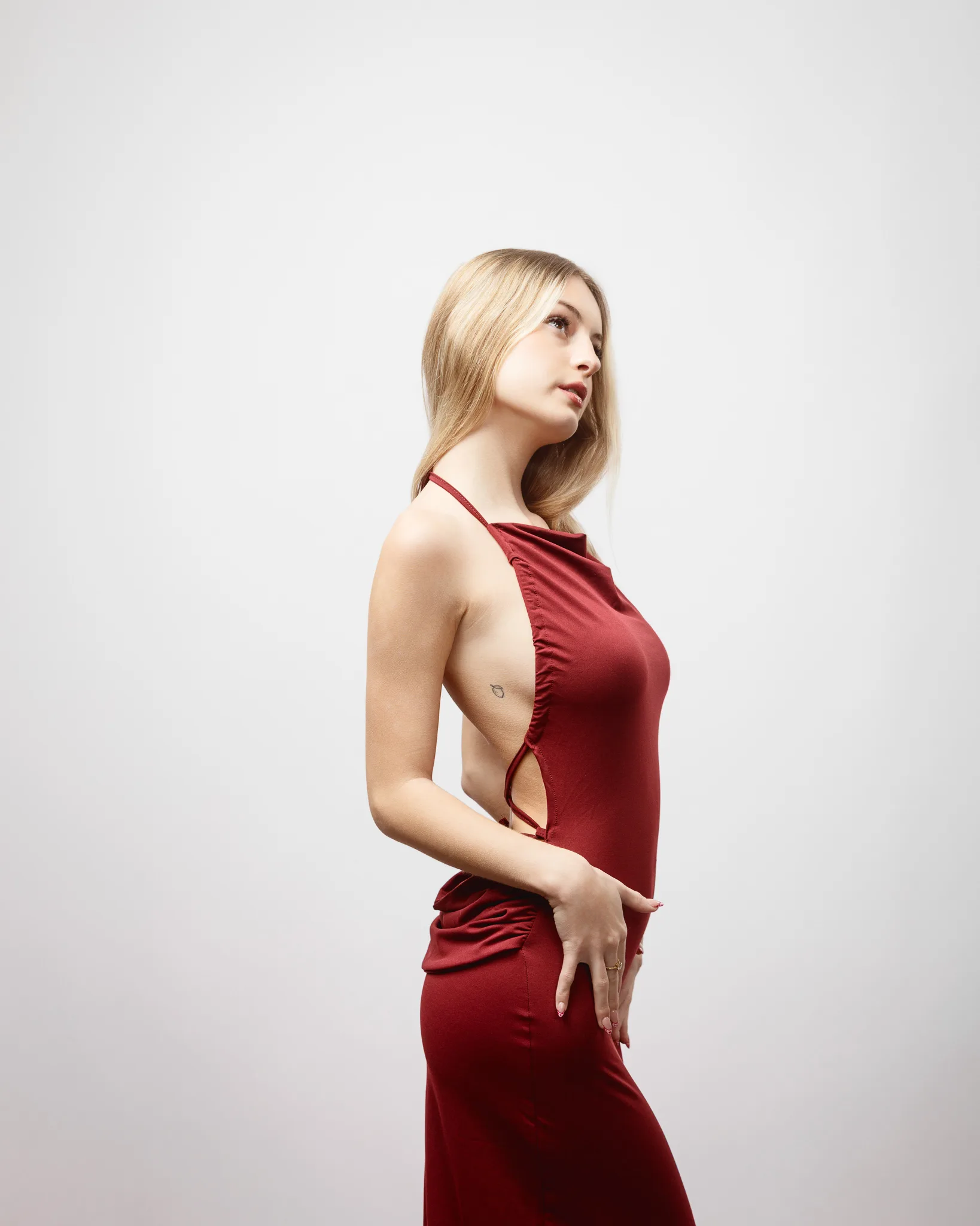
Studio fashion portraits with a chaperone-led, comfort-first approach
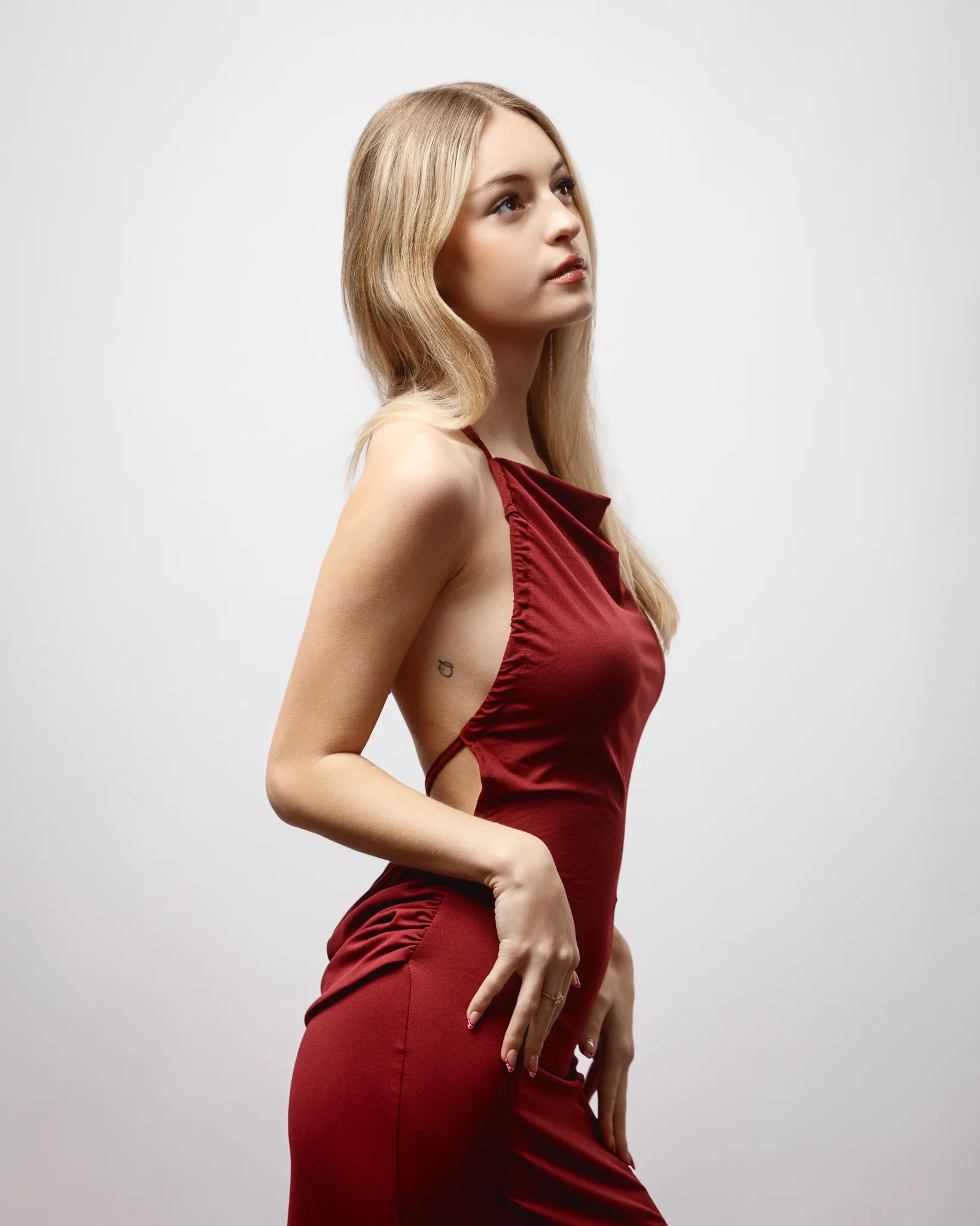
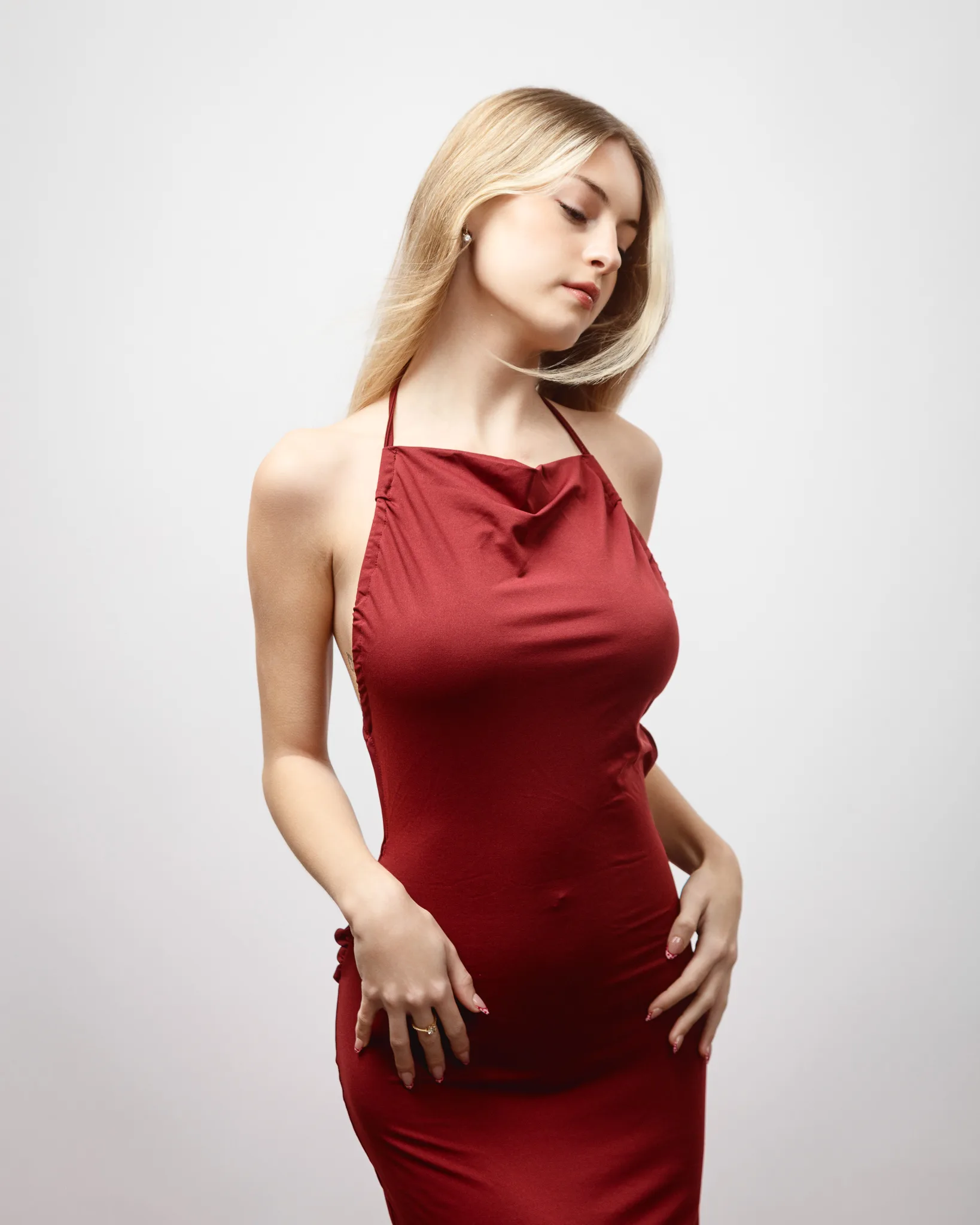
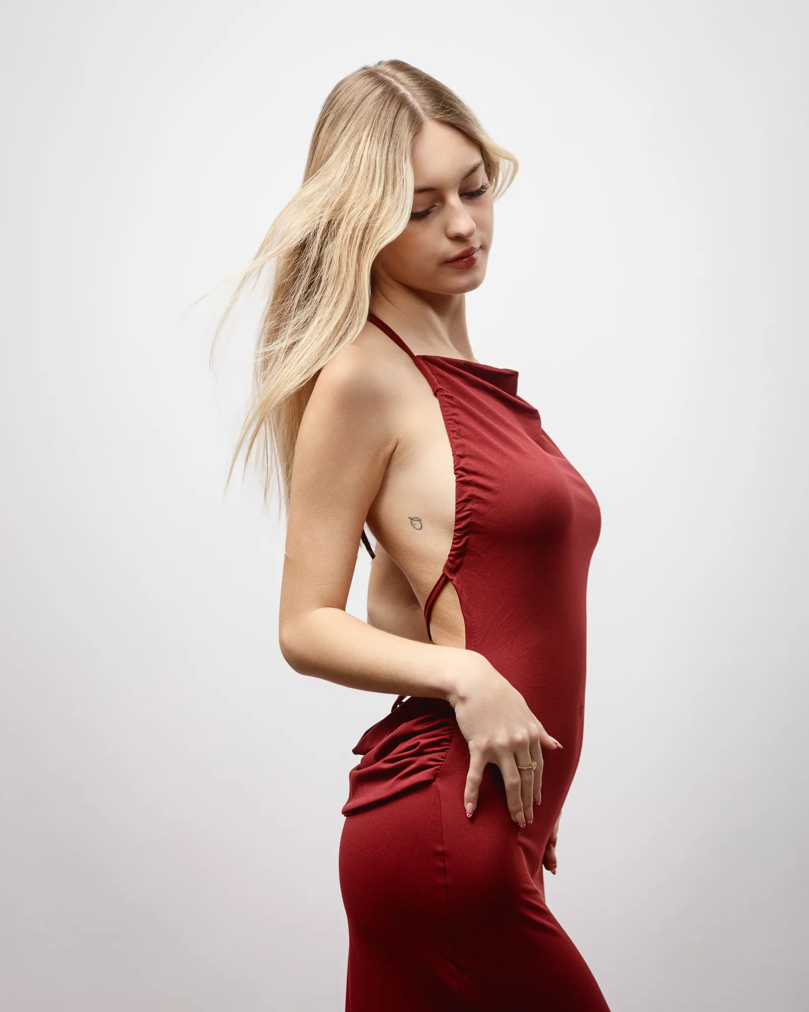
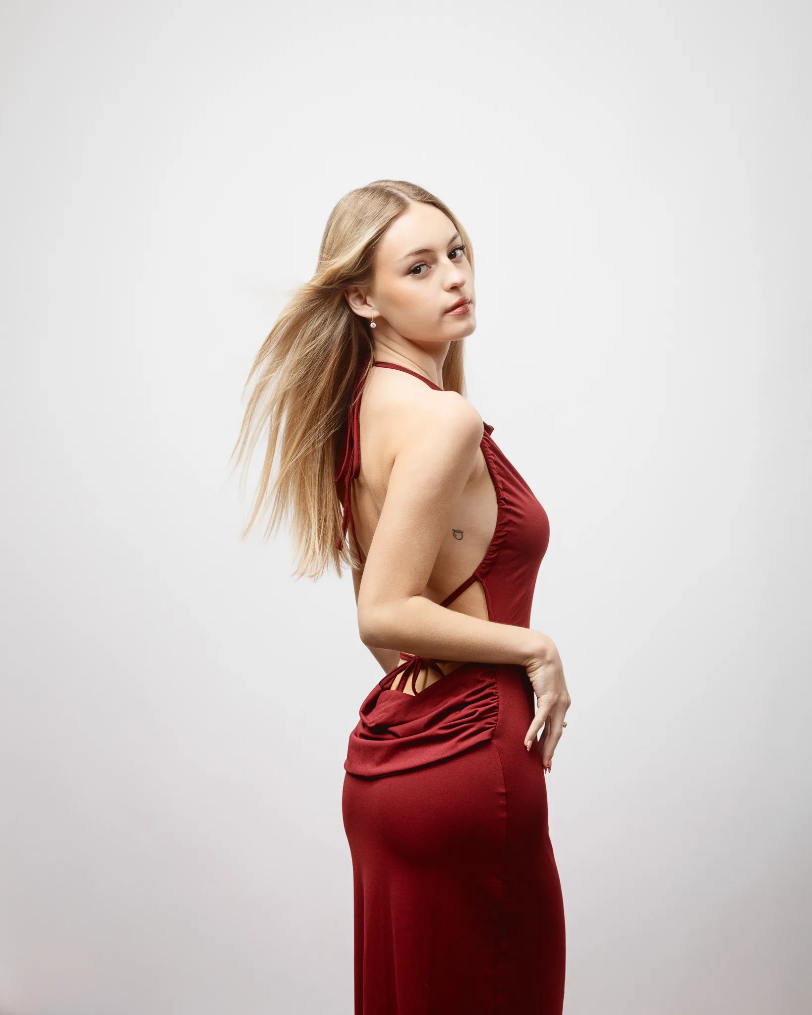
I photographed Rose in my studio for a Valentine’s themed fashion portfolio session. The brief was simple. Keep the backgrounds clean. Let the styling lead. Build a set of images that feels varied, but still cohesive.
Rose is a real pleasure to work with. She turns up prepared, listens well, and brings a calm focus that makes studio work flow. What I enjoy most is watching her confidence grow over time. A portfolio is not built in one day. It is built through repetition, reflection, and small jumps in skill. I have genuinely enjoyed being part of that.
Fay, Rose’s mum, came along as a chaperone. Fay is wonderfully supportive. She is steady, thoughtful, and helps the day feel relaxed. That matters. A calm set makes better portraits.
This post is aimed at models who are building a fashion-led portfolio. If that is you, I want you to leave with practical reasons for why sessions like this work, and how you can protect your comfort while you build a strong body of work.
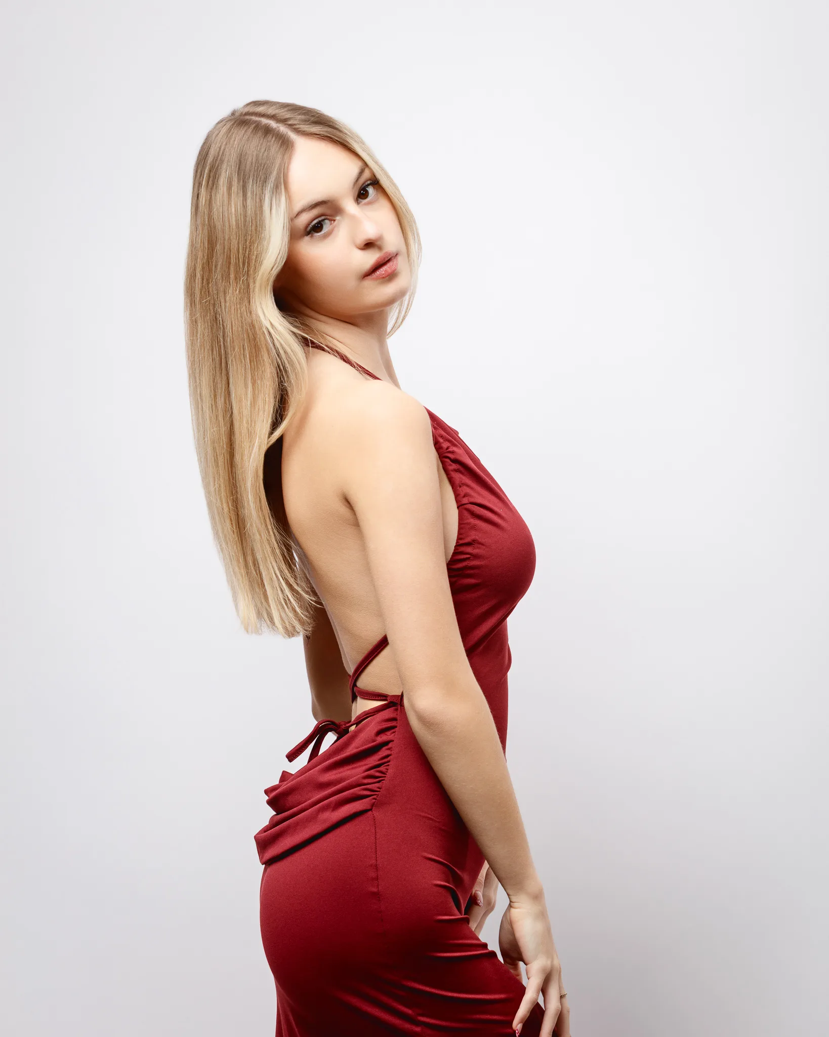
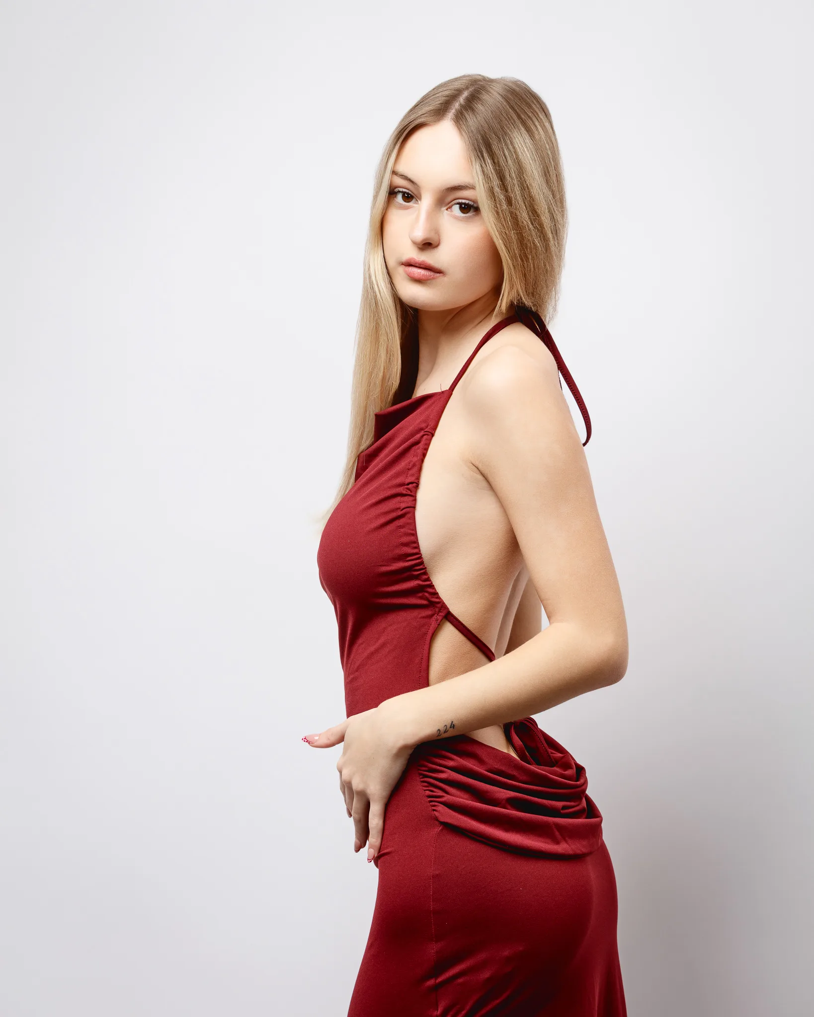
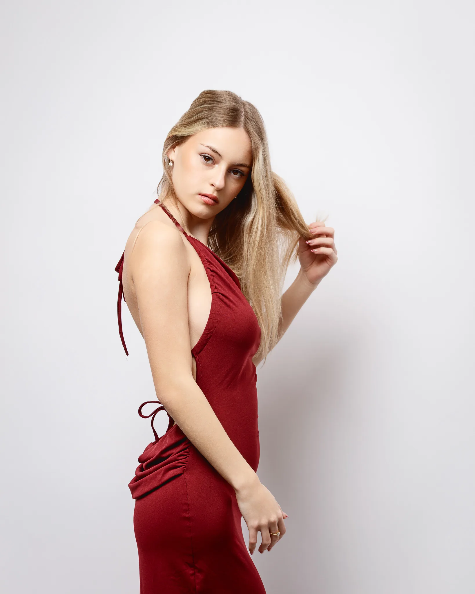
Why I always prefer models to bring a chaperone
I prefer that models bring a chaperone to studio shoots, even when the model is an adult. Rose’s age makes it essential, but the principle is bigger than that. Comfort is paramount, and a chaperone supports comfort in several ways.
First, a chaperone changes the feel of the room. It reduces pressure. It makes it easier for the model to say “no”, or “can we try that again”, without feeling awkward. That alone improves the quality of the work.
Second, a chaperone gives the model a familiar anchor. Studio work can feel intense. There is lighting, posing, mirrors, and silence between frames. A supportive person helps the model stay grounded.
Third, a chaperone improves clarity. If a model forgets a detail, a chaperone often remembers. That might be a styling note, a water break, or a quick check that a strap is sitting right.
Fourth, a chaperone helps protect boundaries. I run a professional studio, and I treat every shoot with care. I still want models to feel they have extra support. I want them to feel safe asking for space, breaks, or changes. A chaperone helps normalise that.
If you are a model reading this, I want you to take one point seriously. You should feel able to tell any photographer that you will be bringing a chaperone. If a photographer pushes back, that is useful information. It tells you something about whether they will respect your comfort on set.
A quick note on safety, boundaries, and how I work
I keep studio sessions calm and structured. I explain what I am doing and why, in plain terms. I keep changes simple and model-led. I also make sure the model is in control of styling choices.
The model’s outfits are always the model’s choice. That is not a small detail. Your portfolio should look like you. You need images that match your comfort level and your personal style. If you feel forced into a look, it shows. If you feel confident in what you wear, it also shows.
That is why I always recommend a mood board, even for a simple theme like Valentine’s. It gives a shared reference. It reduces guesswork. It keeps the shoot led by what the model wants to create.
Why test shoots help creatively, not just technically
People often talk about test shoots as a lighting exercise. They can be. But the bigger value is creative. A good test shoot gives you room to experiment without the pressure of a tight commercial brief.
Here is what I see happen in a strong test shoot.
- The model tries poses they would not risk on a paid job.
- The photographer tests angles and framing choices, then refines quickly.
- Styling ideas get proven or rejected fast, with no drama.
- Small details become obvious, like how fabric creases under light.
- Everyone learns what works for that model’s face and body language.
Creativity needs space. A test shoot gives that space. It also gives permission to fail. Failure is useful. It shows you where the idea needs work.
For Rose, this shoot gave us a clear set of portfolio outcomes. Clean fashion frames. A Valentine’s theme that stays tasteful. Several looks that each feel distinct. And a stronger sense of what styling lines suit her best.
Why portfolio diversity matters, even if you are fashion-focused
Rose is concentrating on fashion. That is a smart direction if you love clothing-led work and want agencies to see a clear niche. Still, fashion portfolios need variety.
Variety does not mean chaos. It means the range within your lane.
If you want to book fashion work, you need to show:
- different silhouettes
- different necklines
- different colour stories
- different moods
- different posing energy
- at least one clean “baseline” set on a simple background
A strong portfolio lets a booker imagine you in more than one campaign. It also shows that you can adapt, without losing your identity.
This Valentine’s theme helped with that. Hearts, red, and romance are obvious motifs. But the looks still need separation. We achieved that through fabric, cut, and backdrop.
The looks from the shoot
We photographed several outfits with a consistent studio approach. Clean lighting. Simple backgrounds. Space around the subject. That keeps the focus on styling and expression.
Below is a breakdown of each look, and why it adds value to a fashion portfolio.
Look 1: White halter dress with red hearts
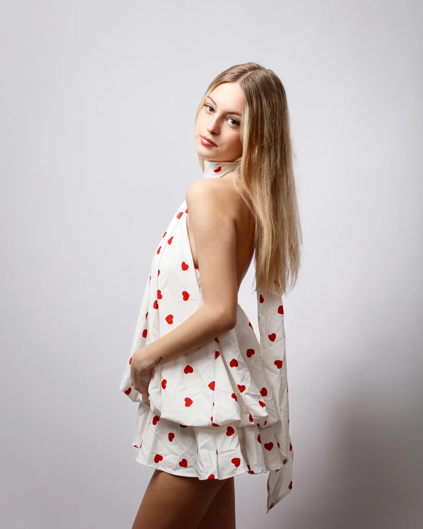
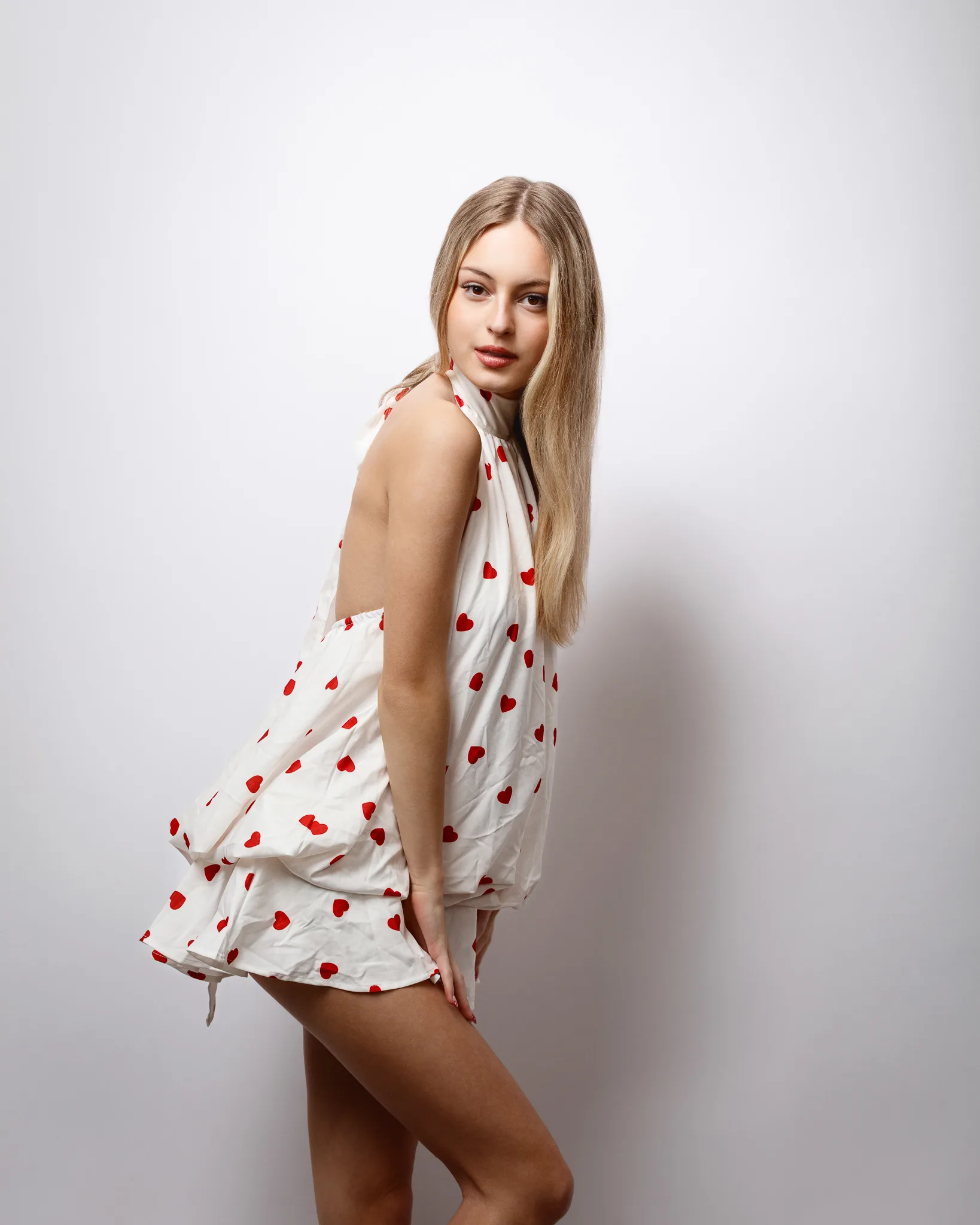
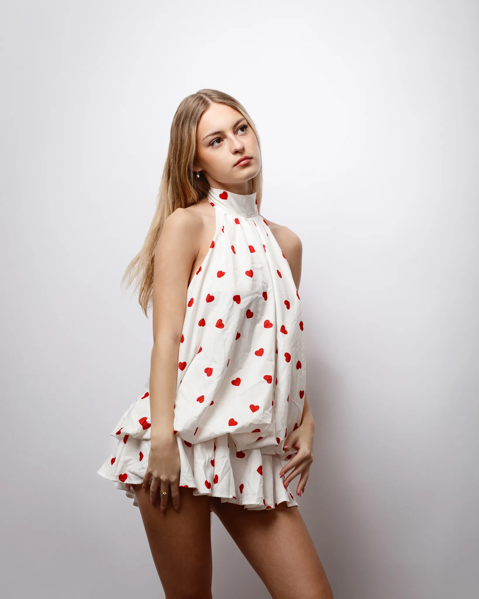
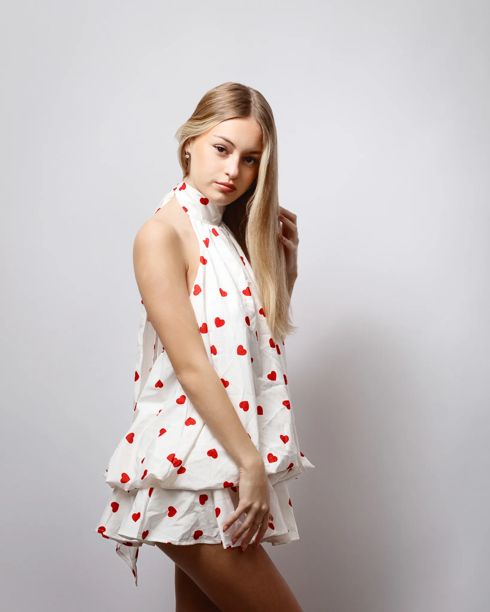
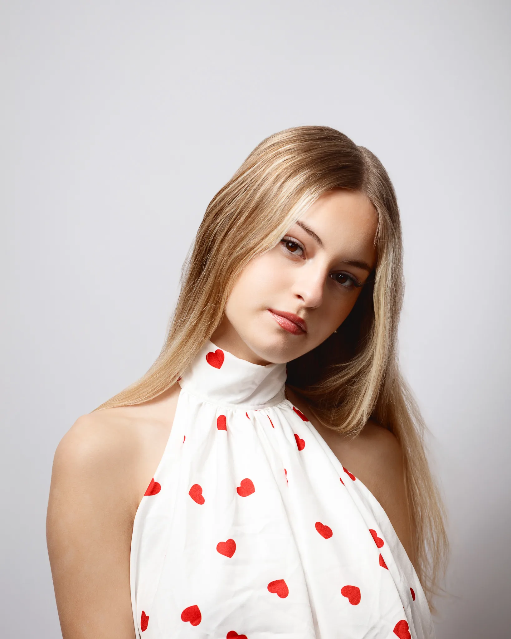
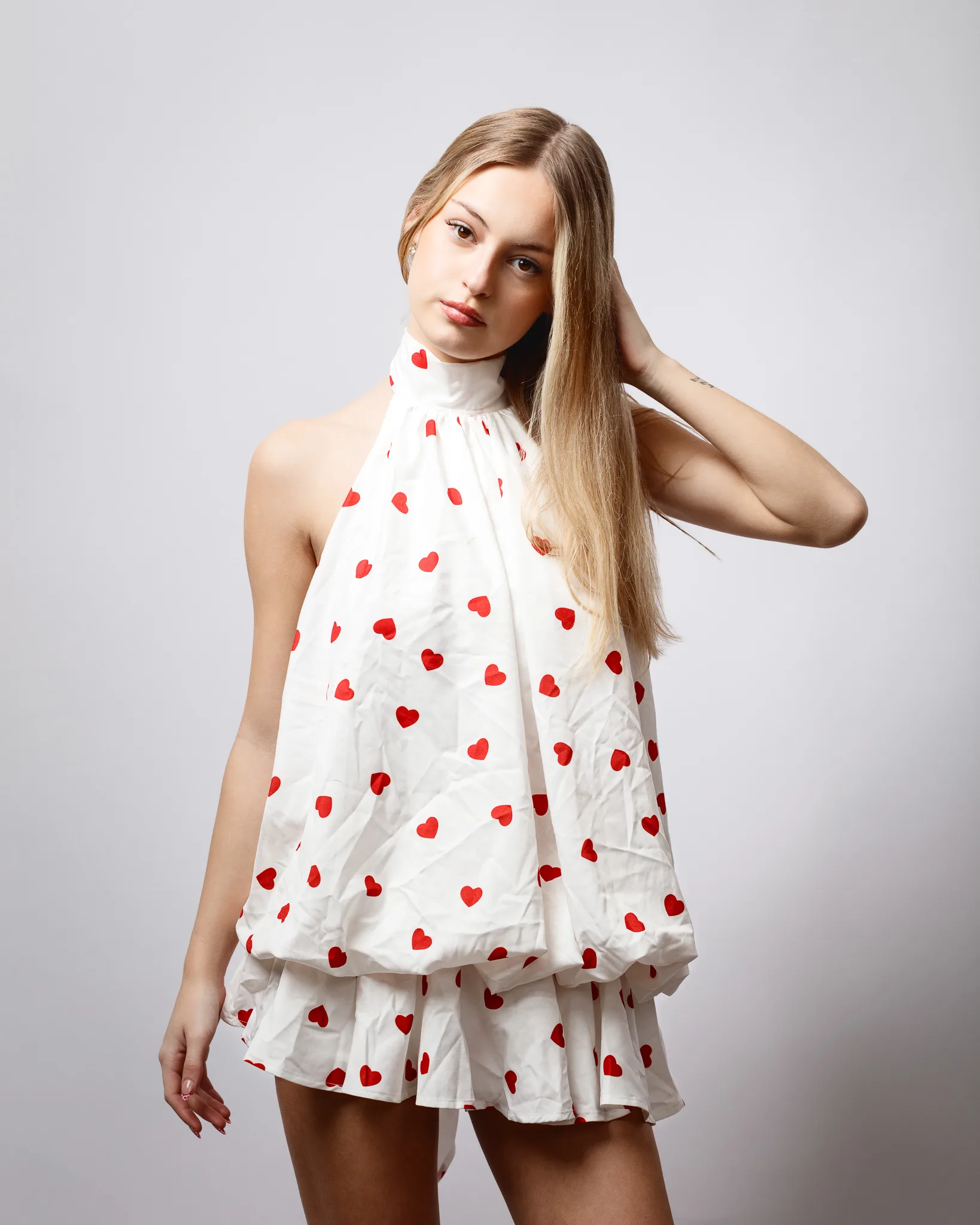
This dress has a playful, vintage feel. The halter neckline frames the shoulders and draws the eye up to the face. The red heart print reads clearly on camera, even at smaller crop sizes.
The fabric has natural creasing, which is part of the charm. It also gives you texture that catches light in a soft way. We kept the posing gentle and simple. Head angle changes did a lot of the work. The overall mood stayed romantic, but not overly posed.
Styling note: the heart motif could easily become too “cute”. We avoided that by keeping expression calm and mature, with clean lines in the body.
Portfolio value: print handling, halter neckline, and a light romantic mood.
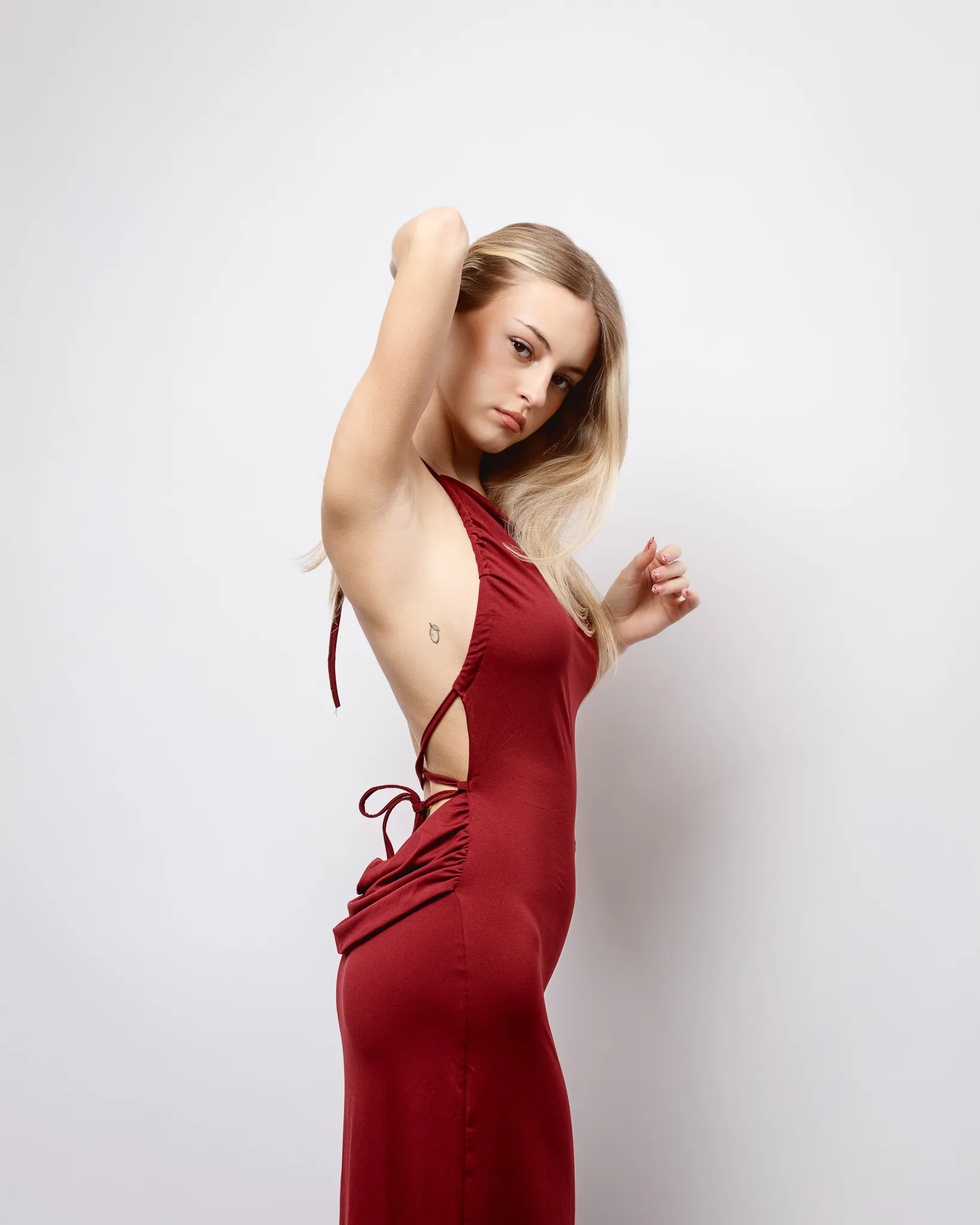
Look 2: Heart-print black dress with an open back
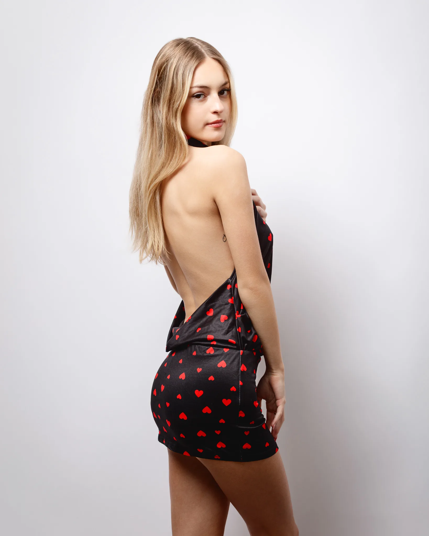
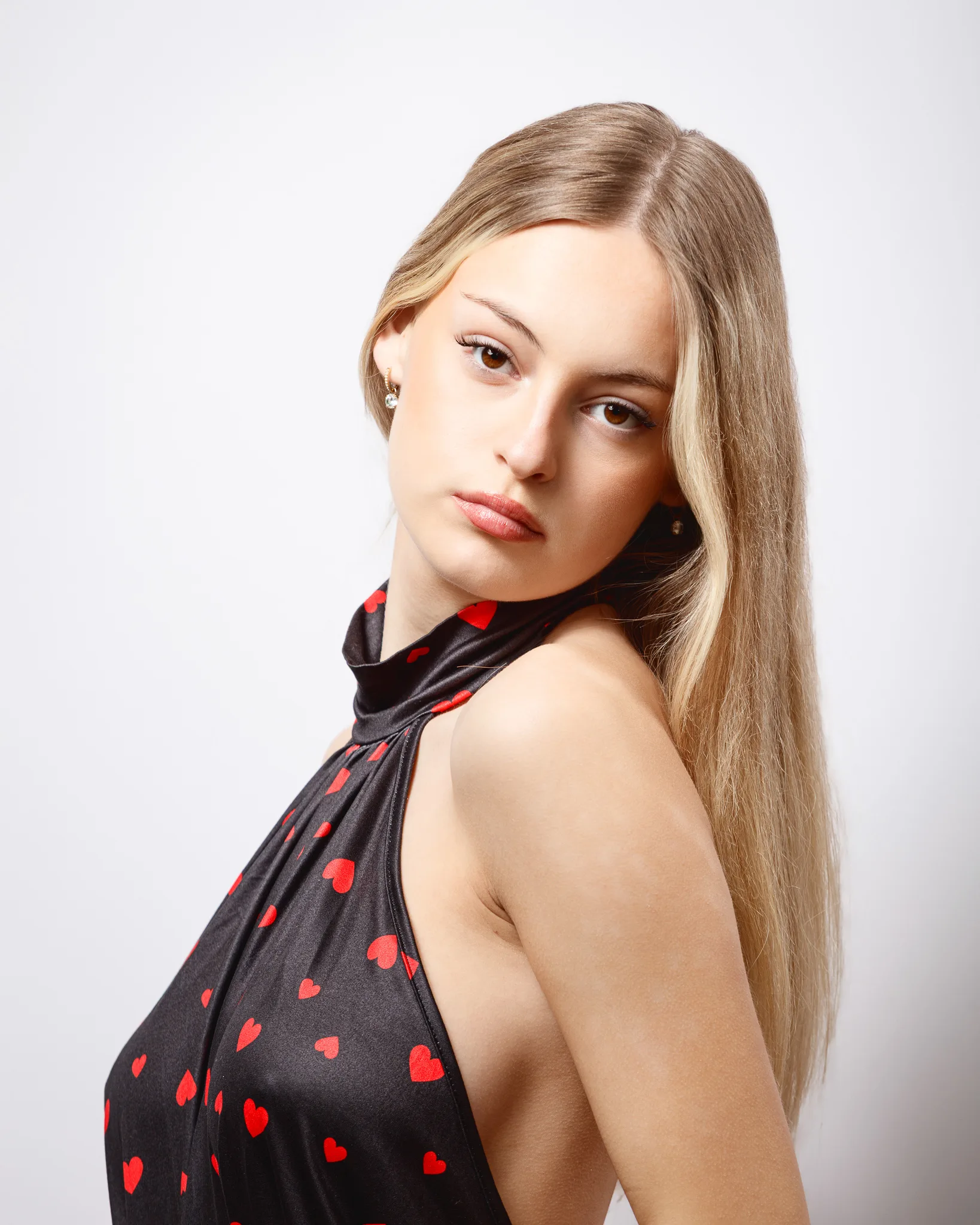
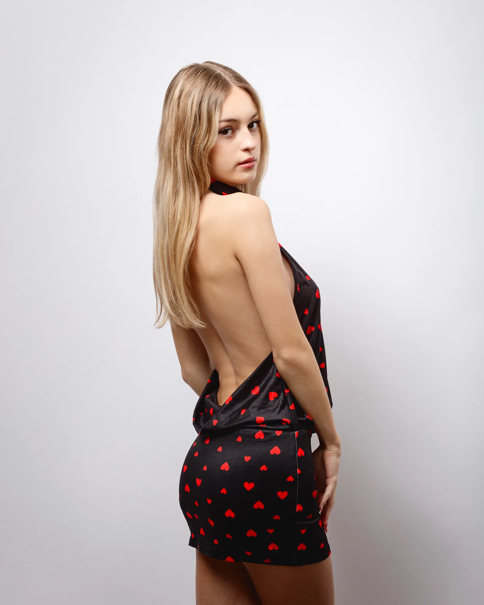
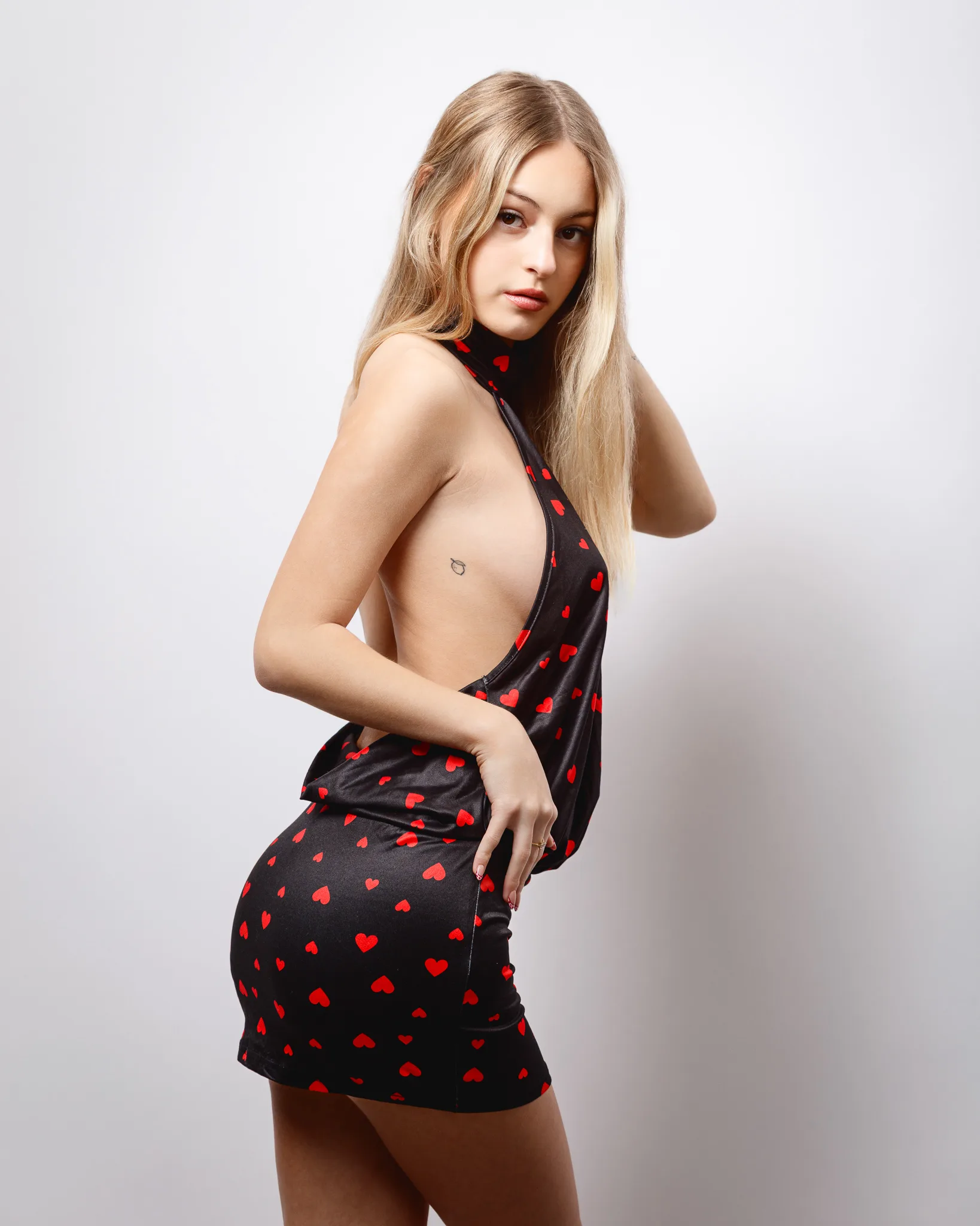
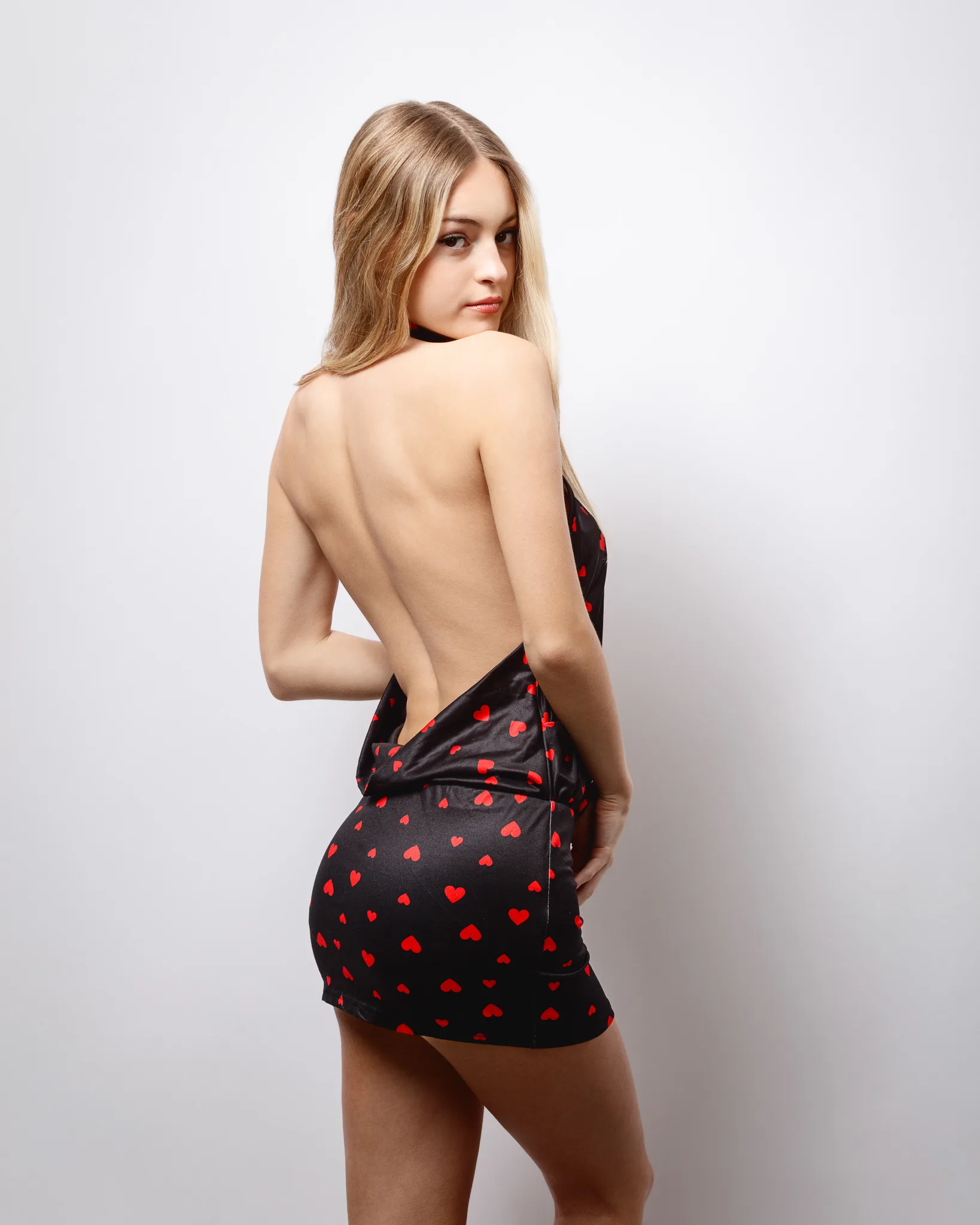
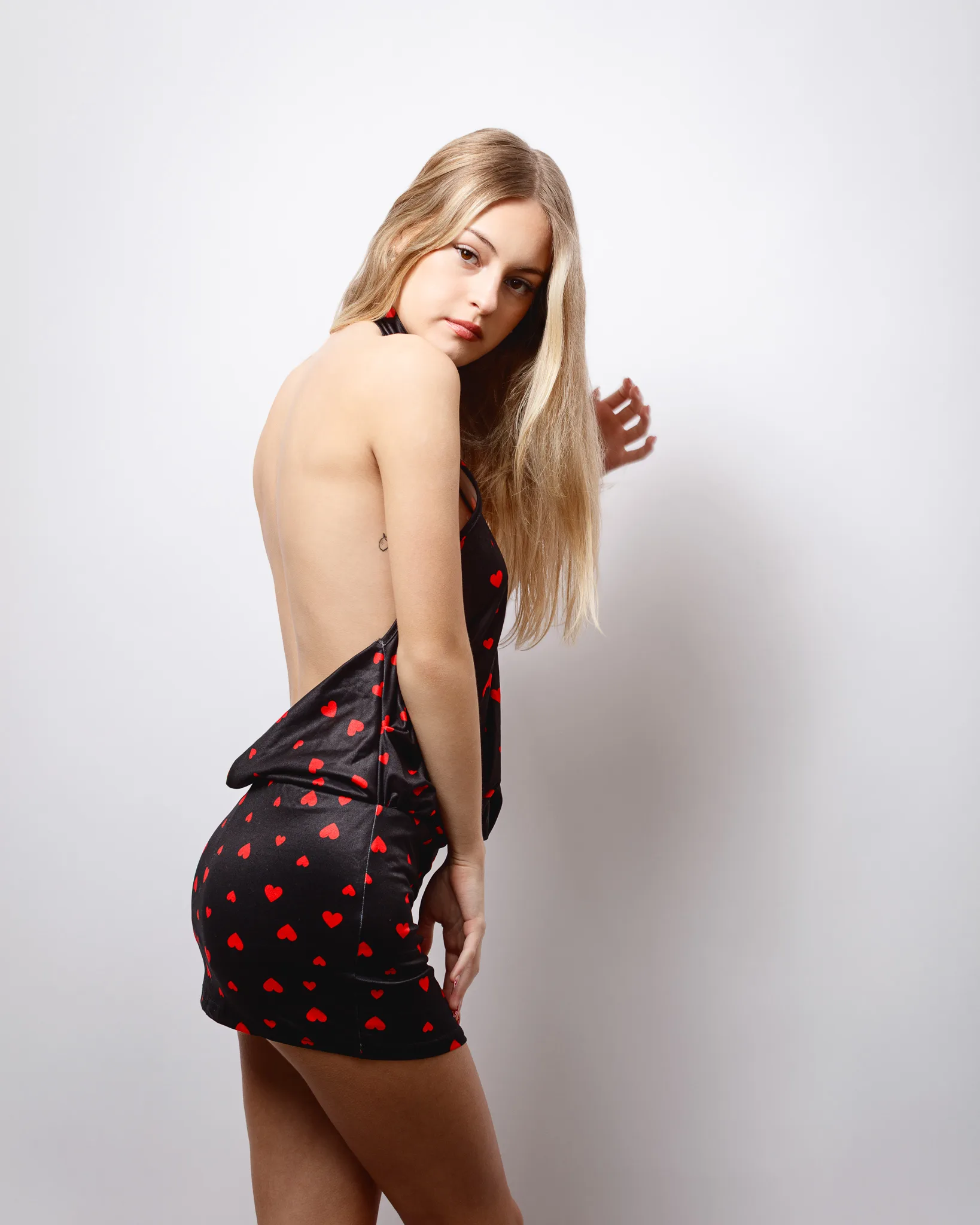
This look shifts the tone. The black base colour makes the red hearts feel bolder and more graphic. The open-back cut changes the body language. It naturally encourages a twist and an over-shoulder glance. That gives strong shape without needing complicated posing.
This look also shows how a simple styling change can create a new mood. On the same white background, it feels more editorial than playful. The dress fabric has a slight sheen, which responds well to controlled studio light.
Portfolio value: darker fashion energy, stronger silhouette, and a clean editorial feel.
Look 3: Black heart-print two-piece with scarf detail
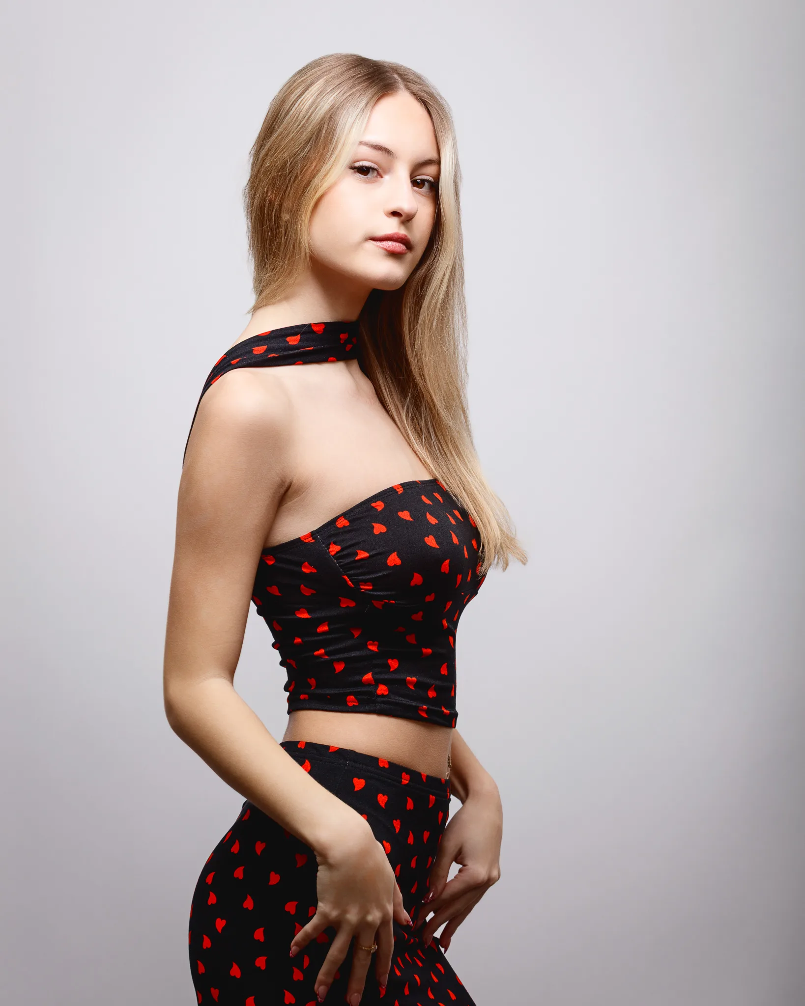
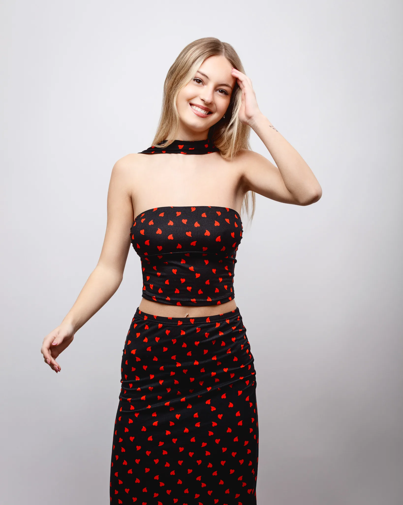
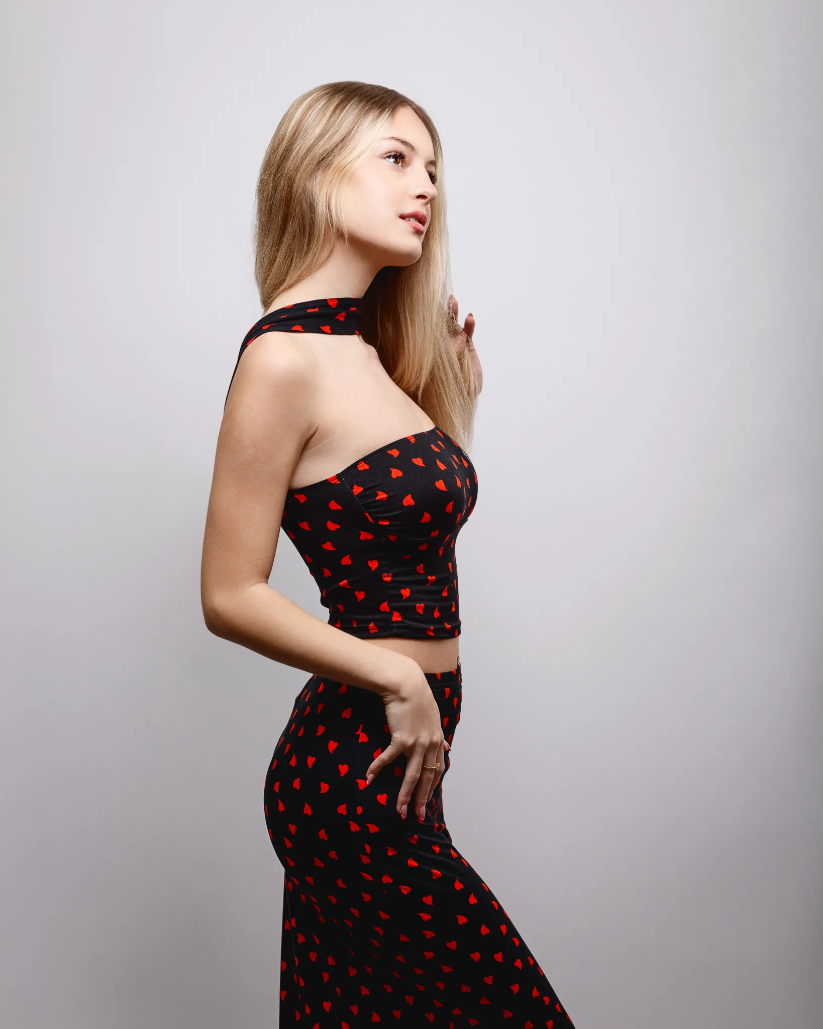
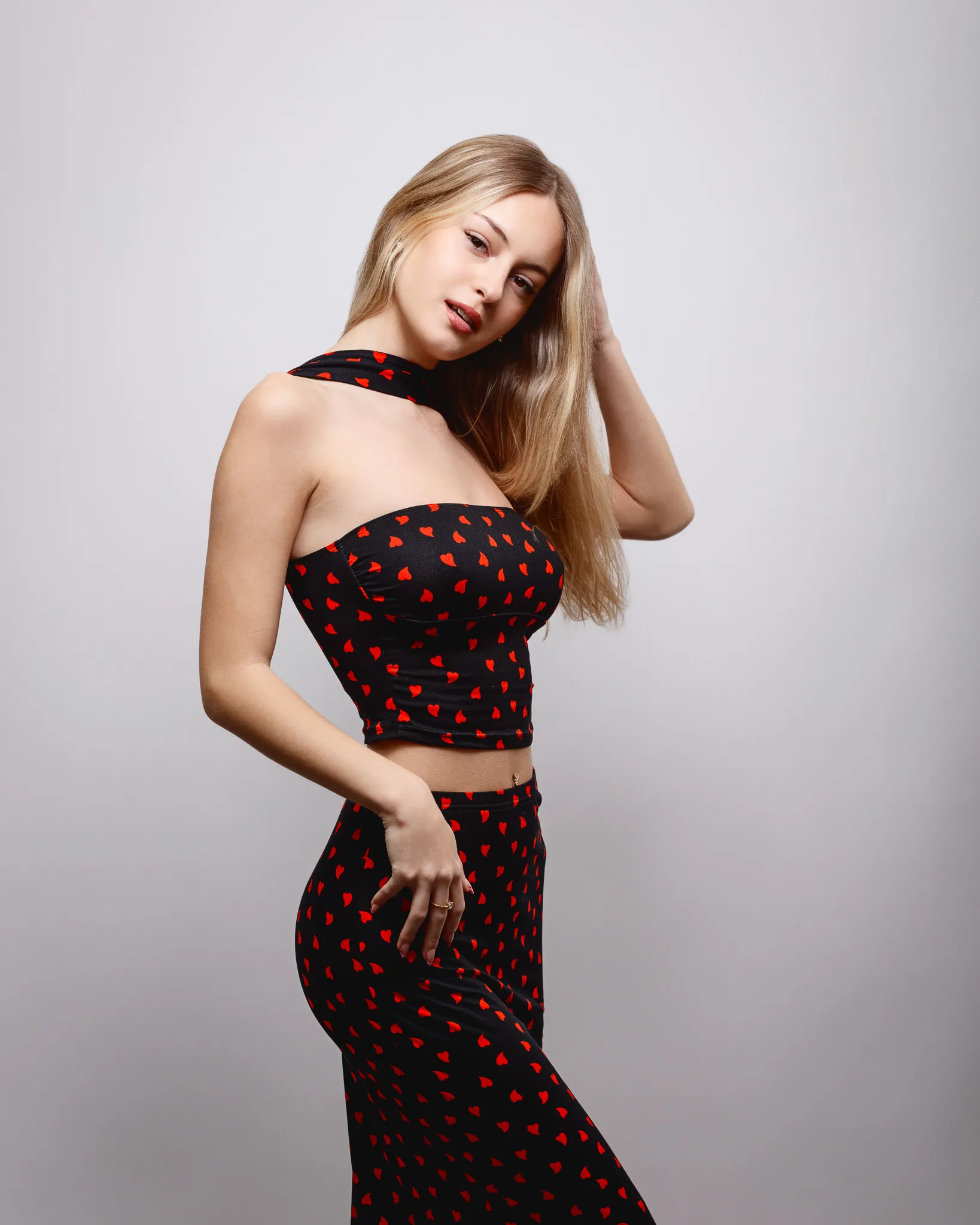
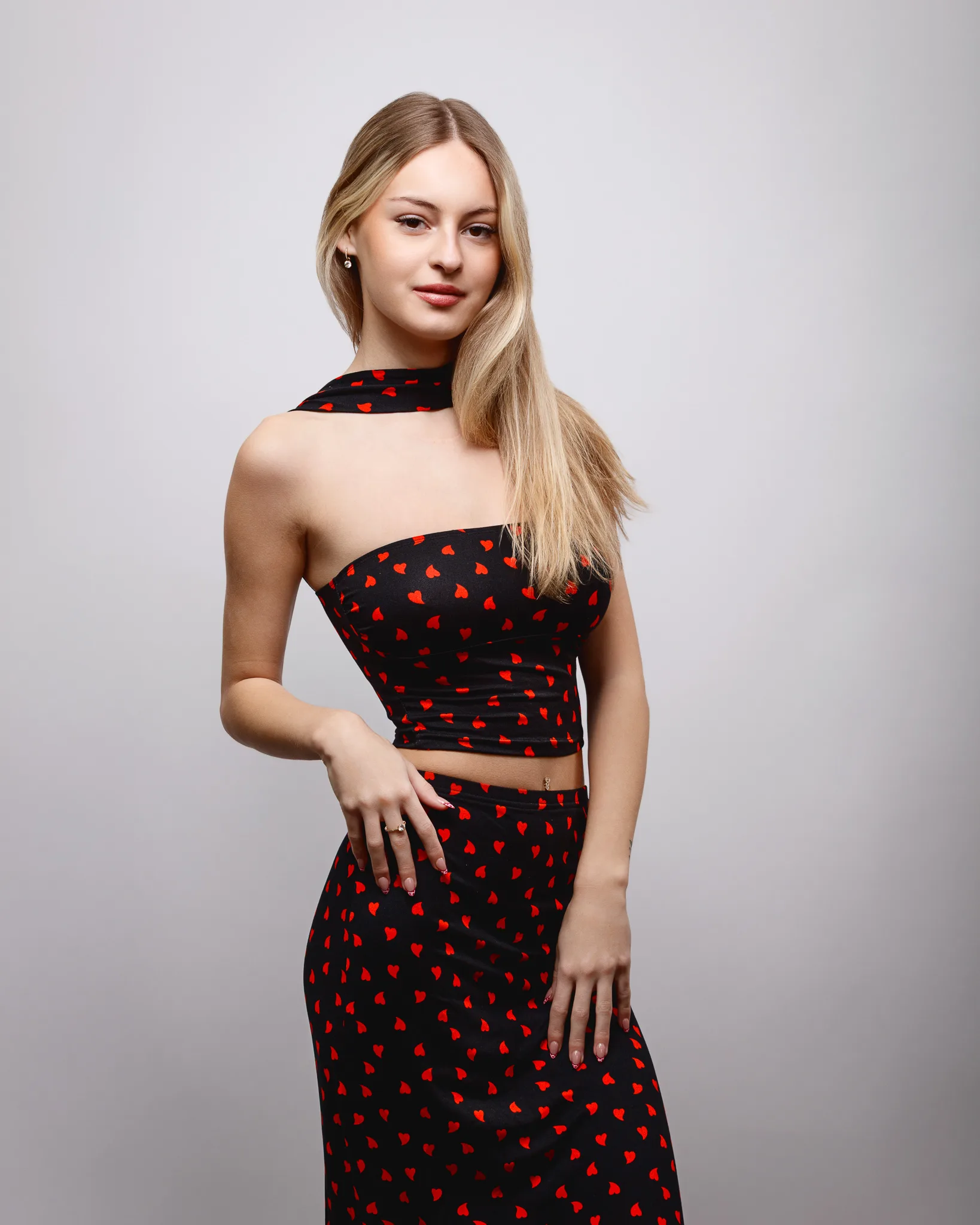
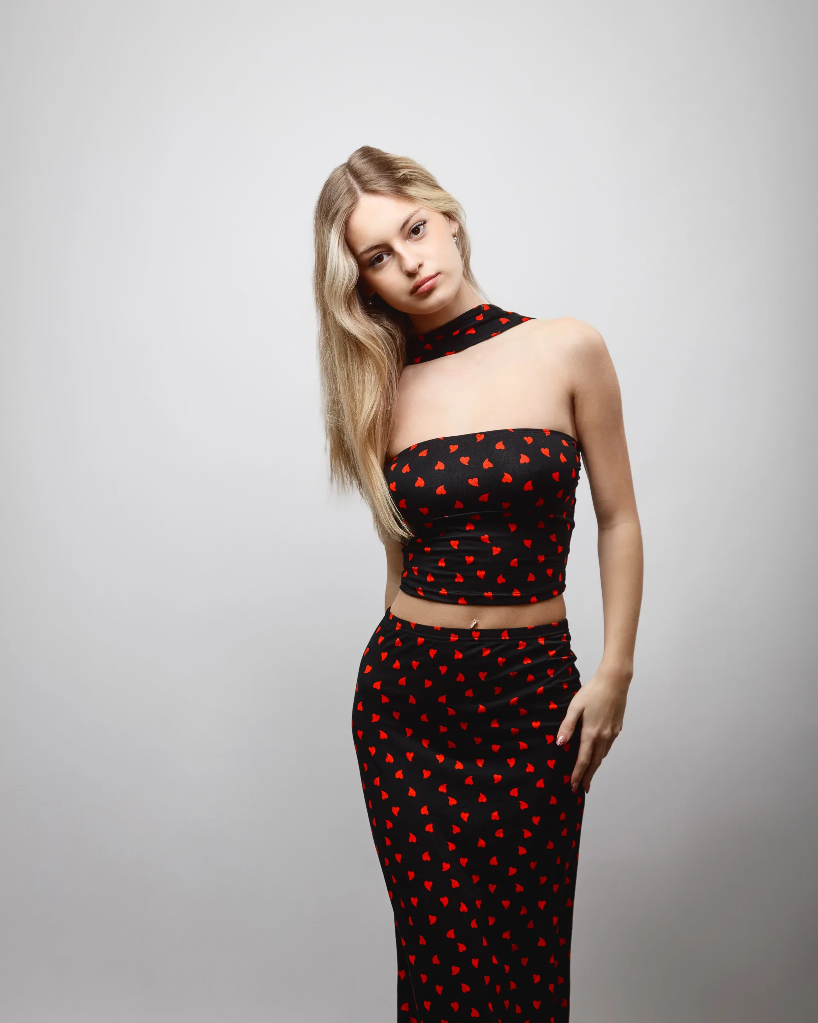
This set adds a more styled, “going out” fashion note. The strapless top and matching skirt create a clean line through the torso. The scarf detail at the neck gives shape near the face, and it adds motion when the model moves.
We leaned into brighter expression for this look. A natural smile works here, because the outfit reads fun. The key is keeping it believable, not forced.
Portfolio value: two-piece styling, strapless neckline, and an upbeat fashion mood.
Look 4: Red strapless satin dress with bow detail
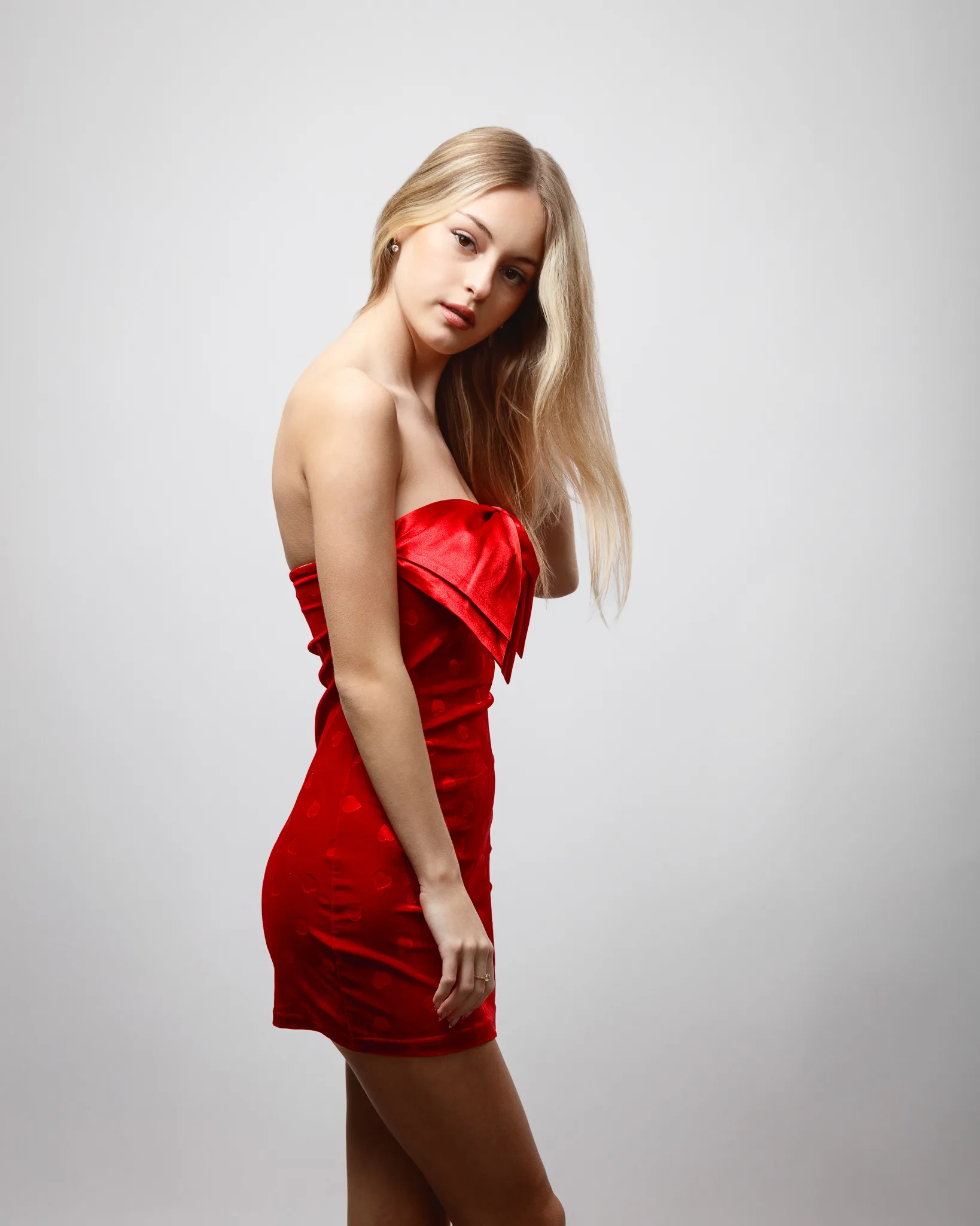
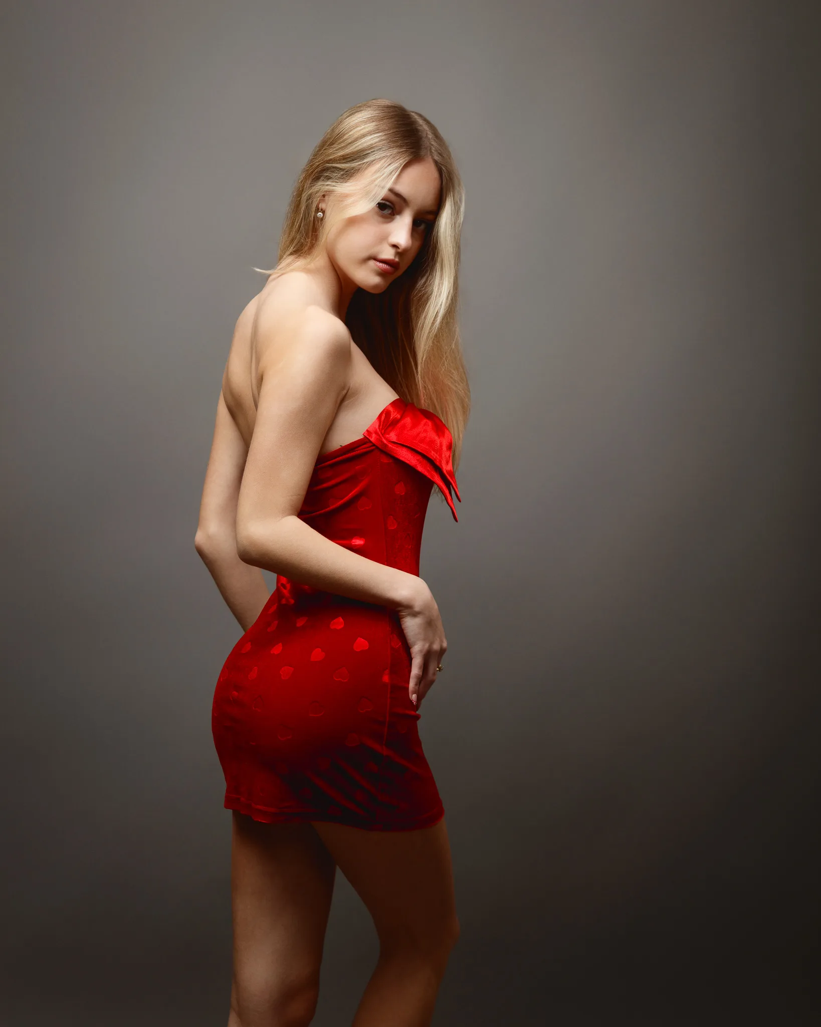
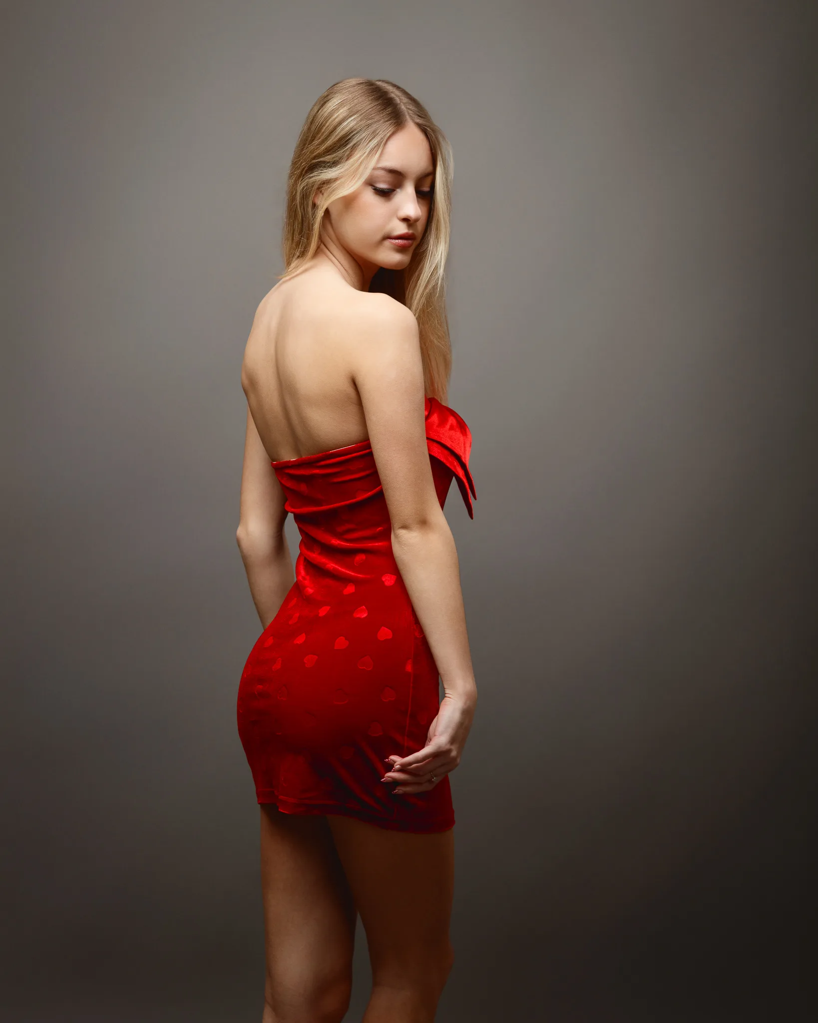
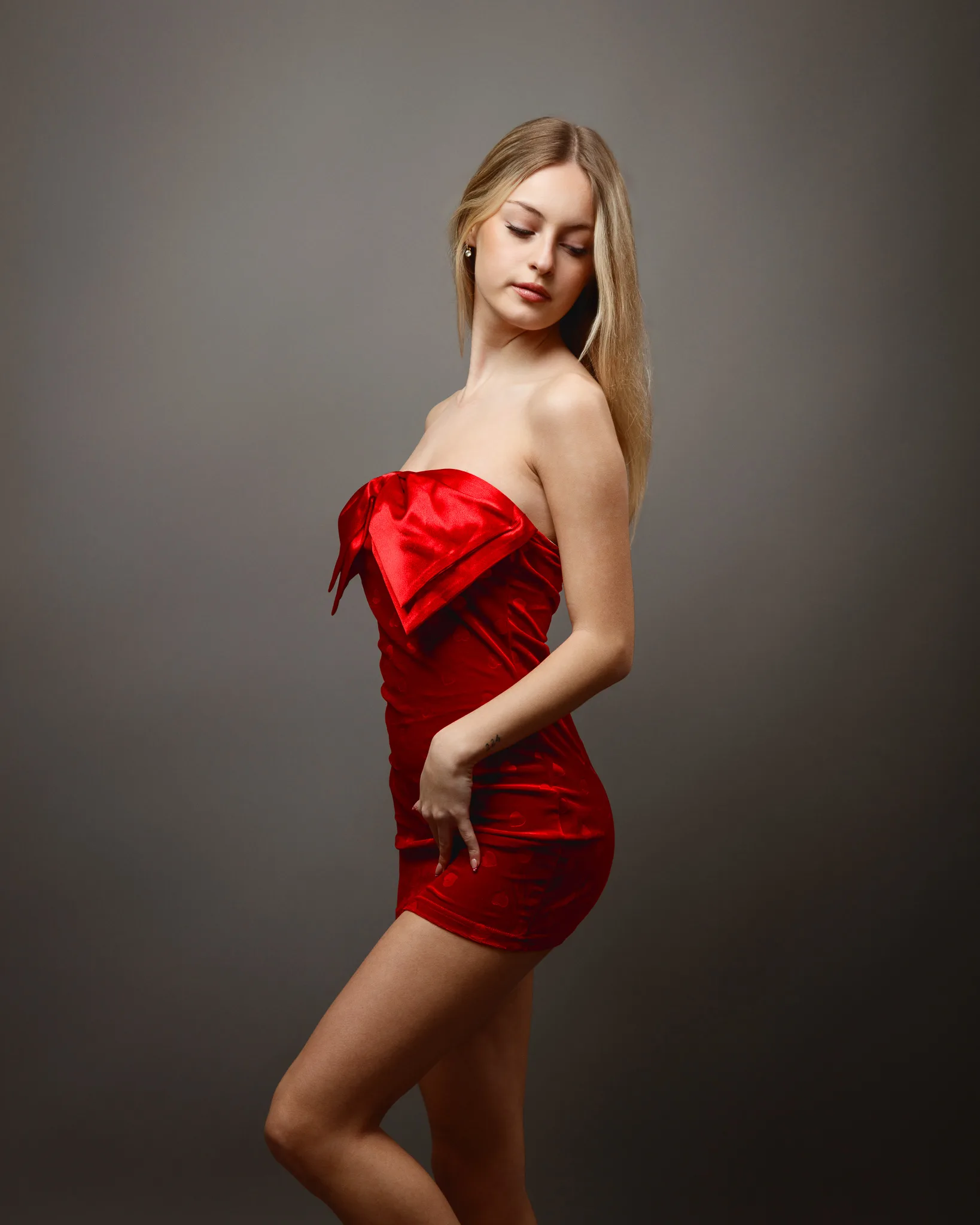
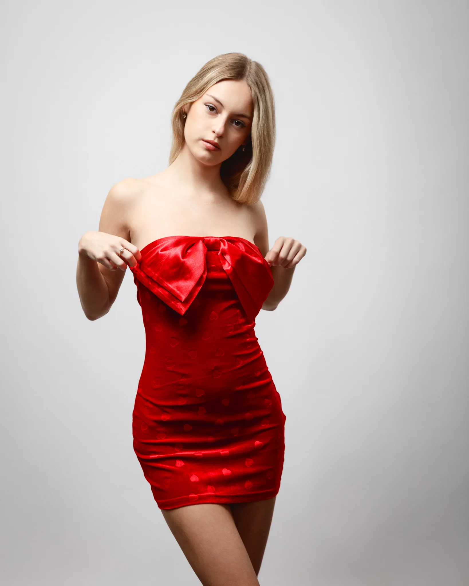
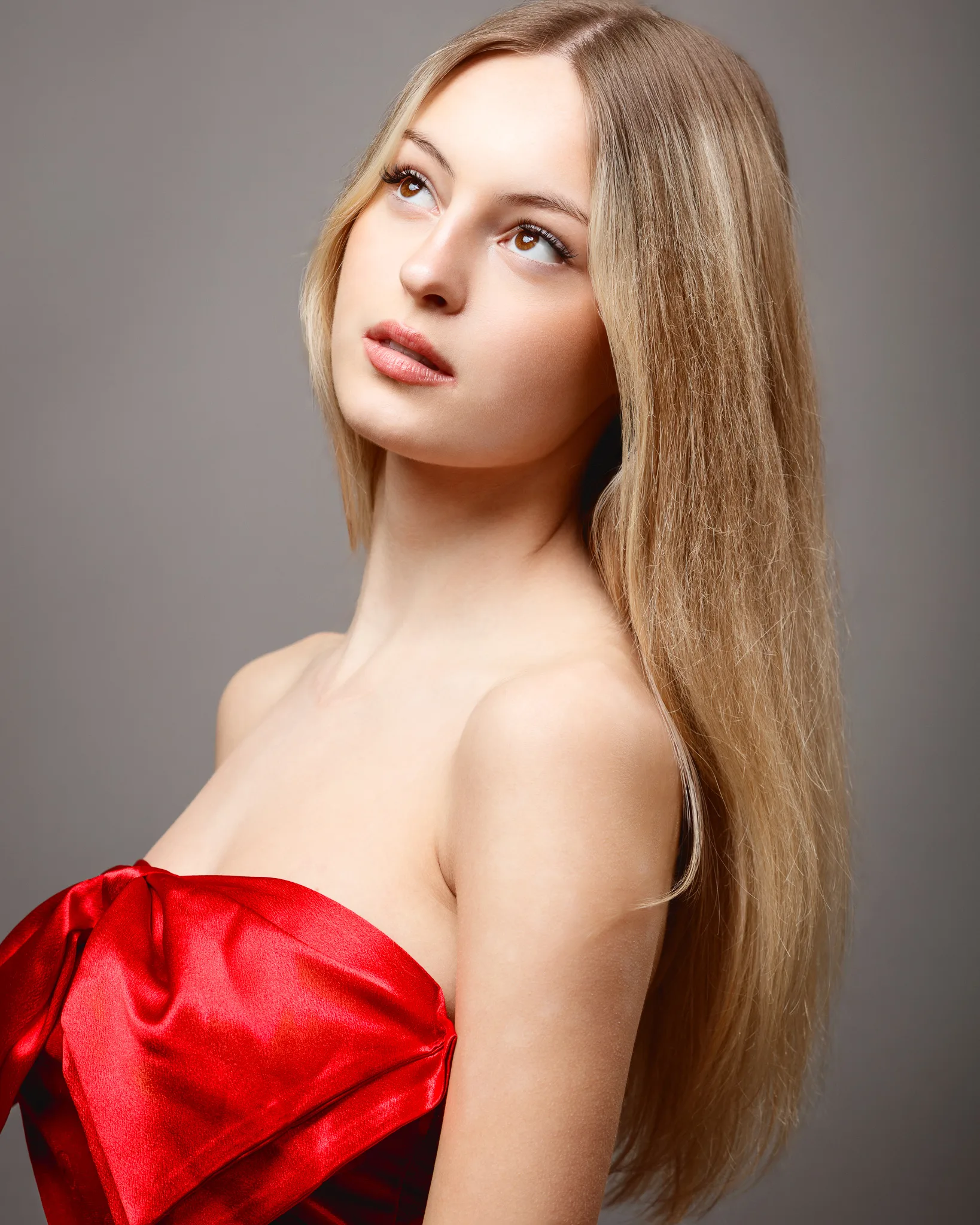
This dress is a statement. Strong red, structured bodice, and an oversized bow. Red satin can be tricky because it shows highlights fast. It rewards careful lighting and careful posing.
We kept the pose front-on with small changes. Hands, shoulder line, chin position. With a bold dress, tiny changes are enough. Anything too dramatic can compete with the garment.
Portfolio value: bold colour handling, satin highlights, and classic “hero dress” impact.
Look 5: Red long-sleeve dress on a red background
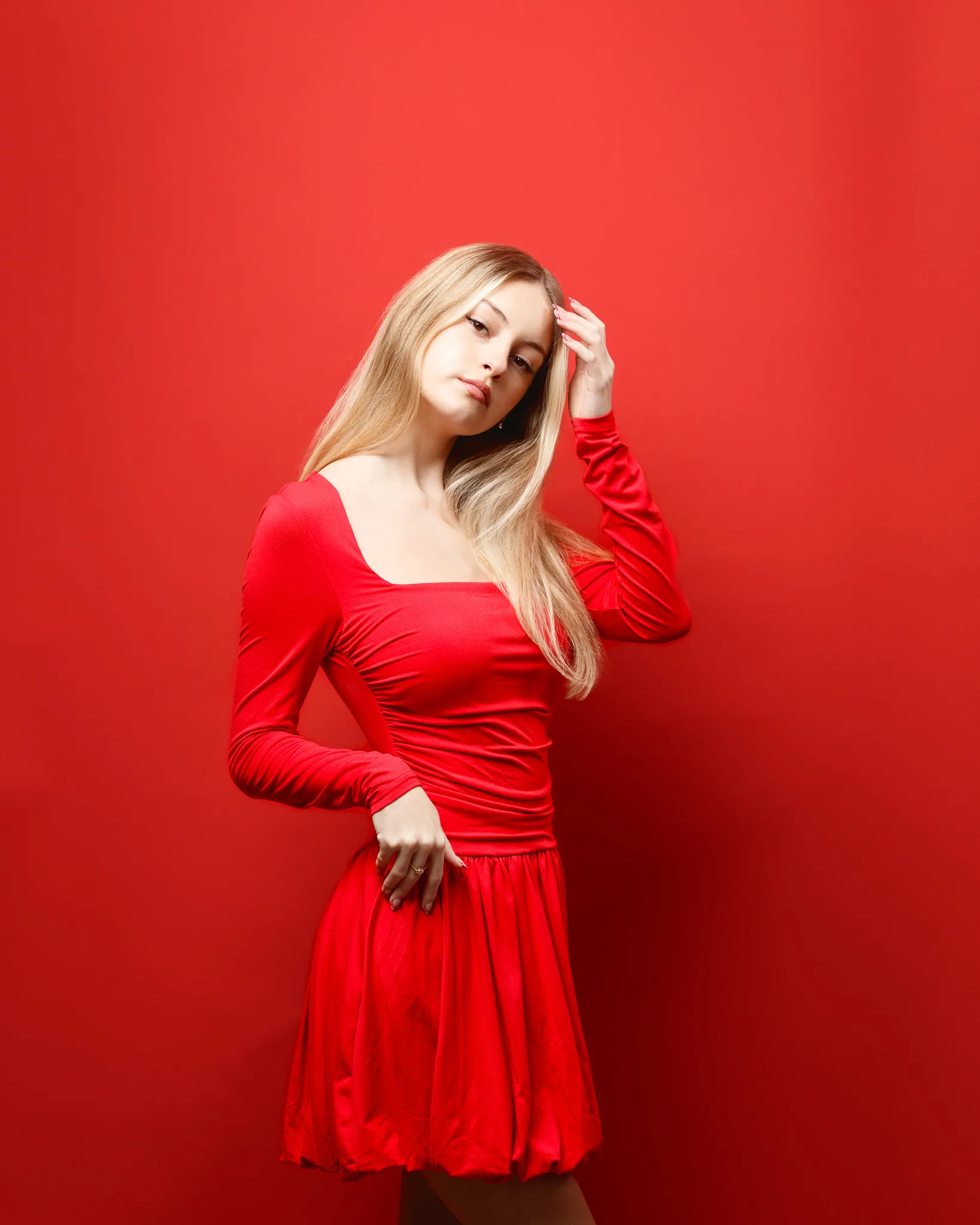
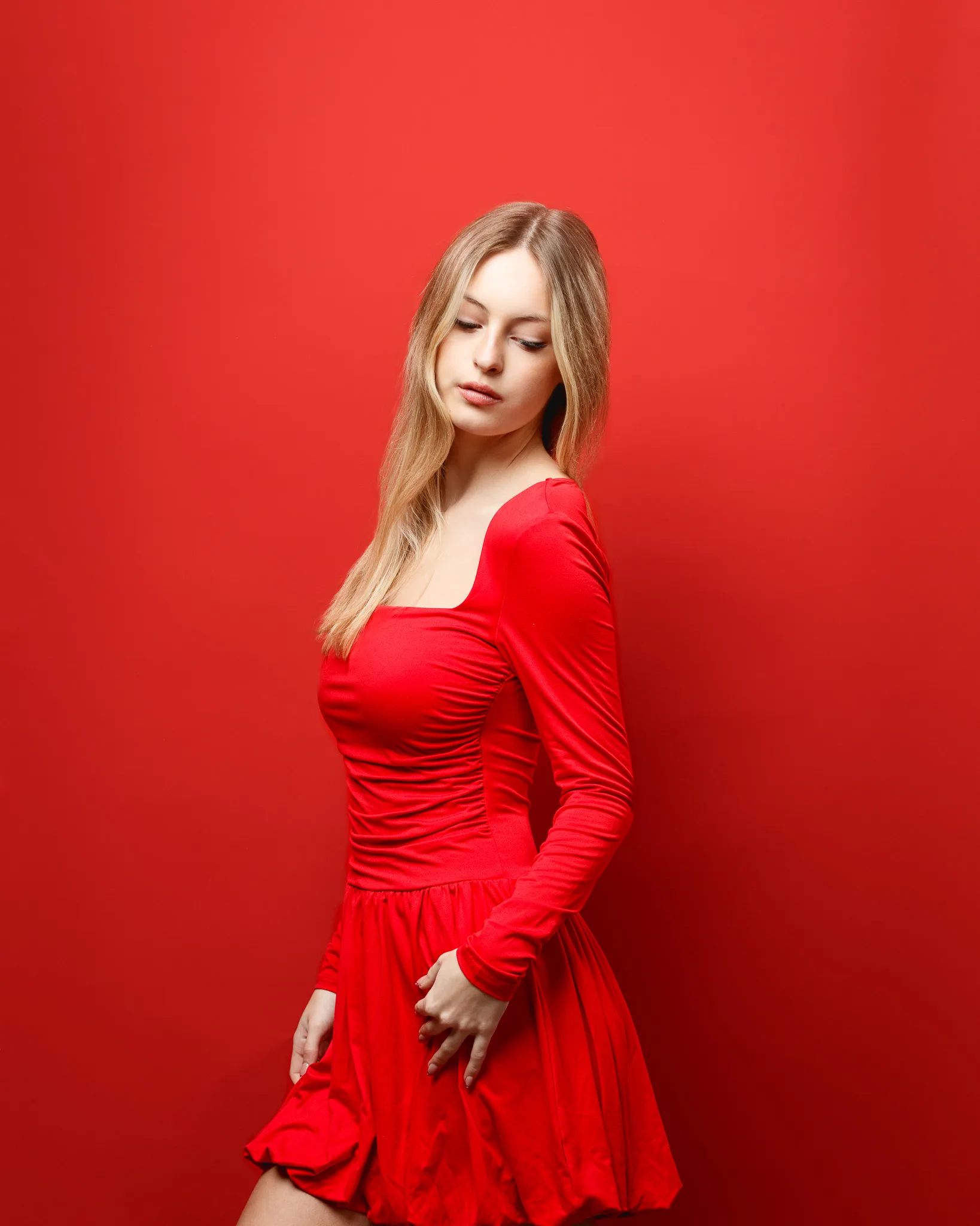
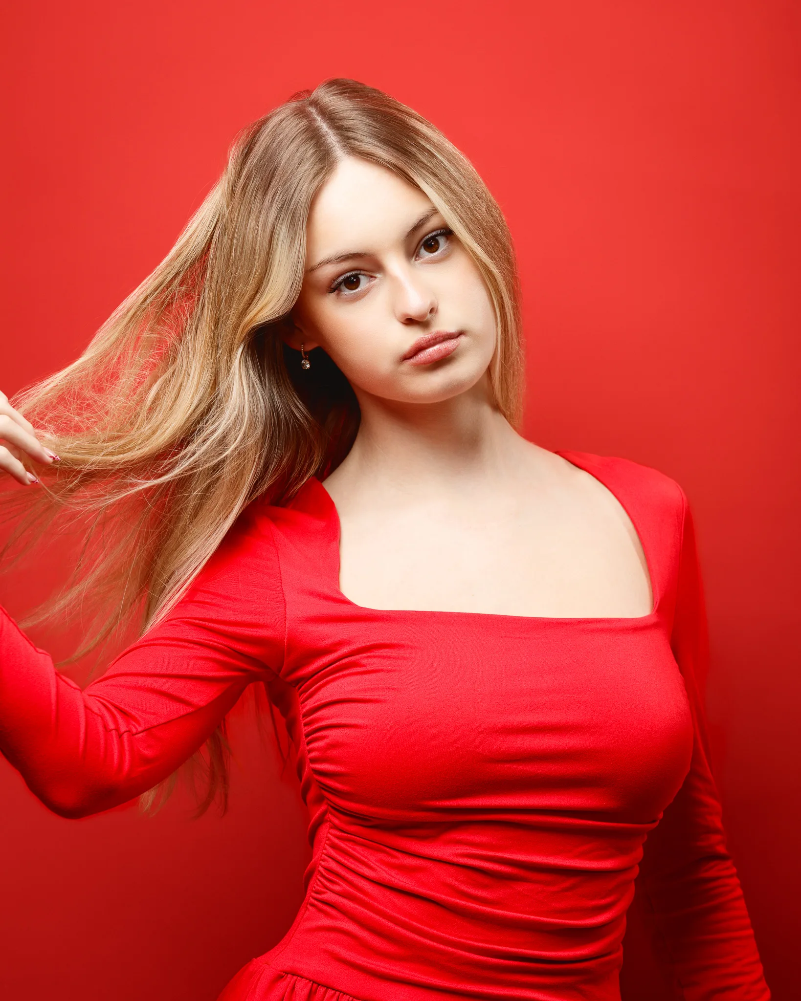
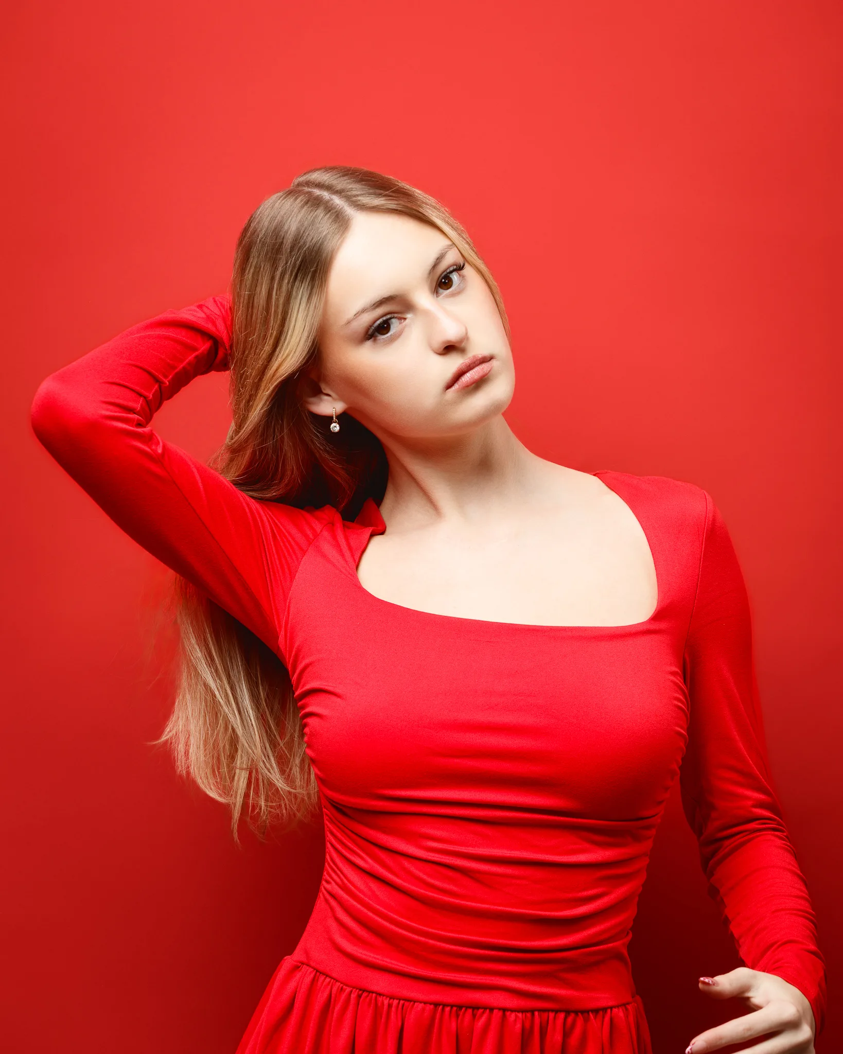
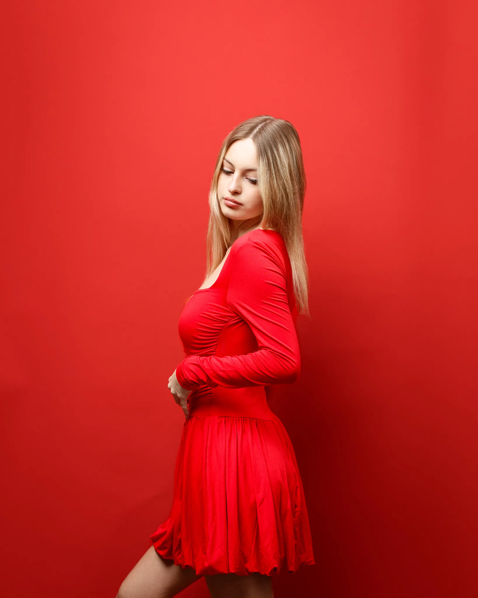
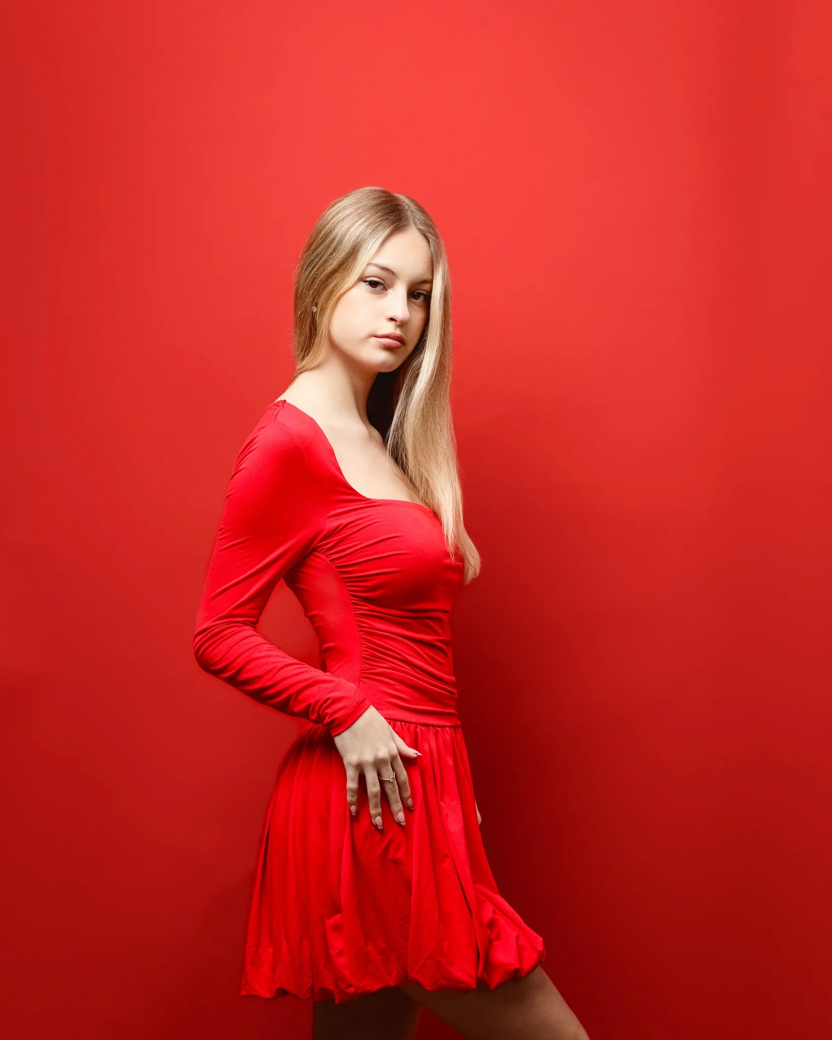
Changing the background changes everything. A red-on-red set feels more immersive and more graphic. It is also a test of control. If skin tones drift too warm, the whole frame can look heavy.
This look had a calmer, more cinematic mood. The long sleeves create elegant lines through the arms. The red background makes the model’s face the anchor point. It is a simple set, but it reads strong.
Portfolio value: monochrome styling, mood control, and a more serious fashion tone.
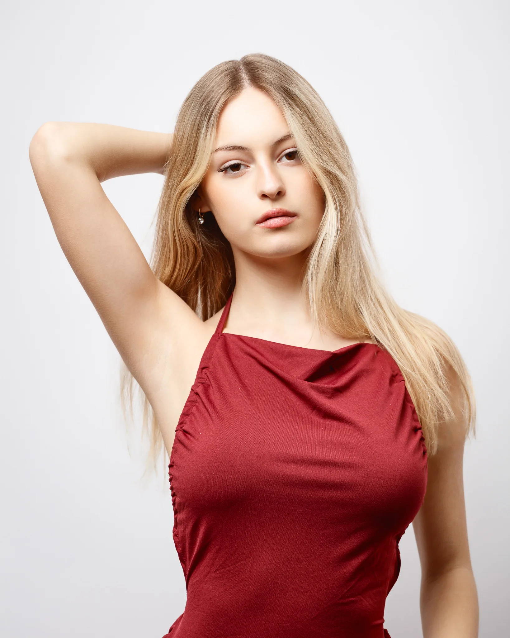
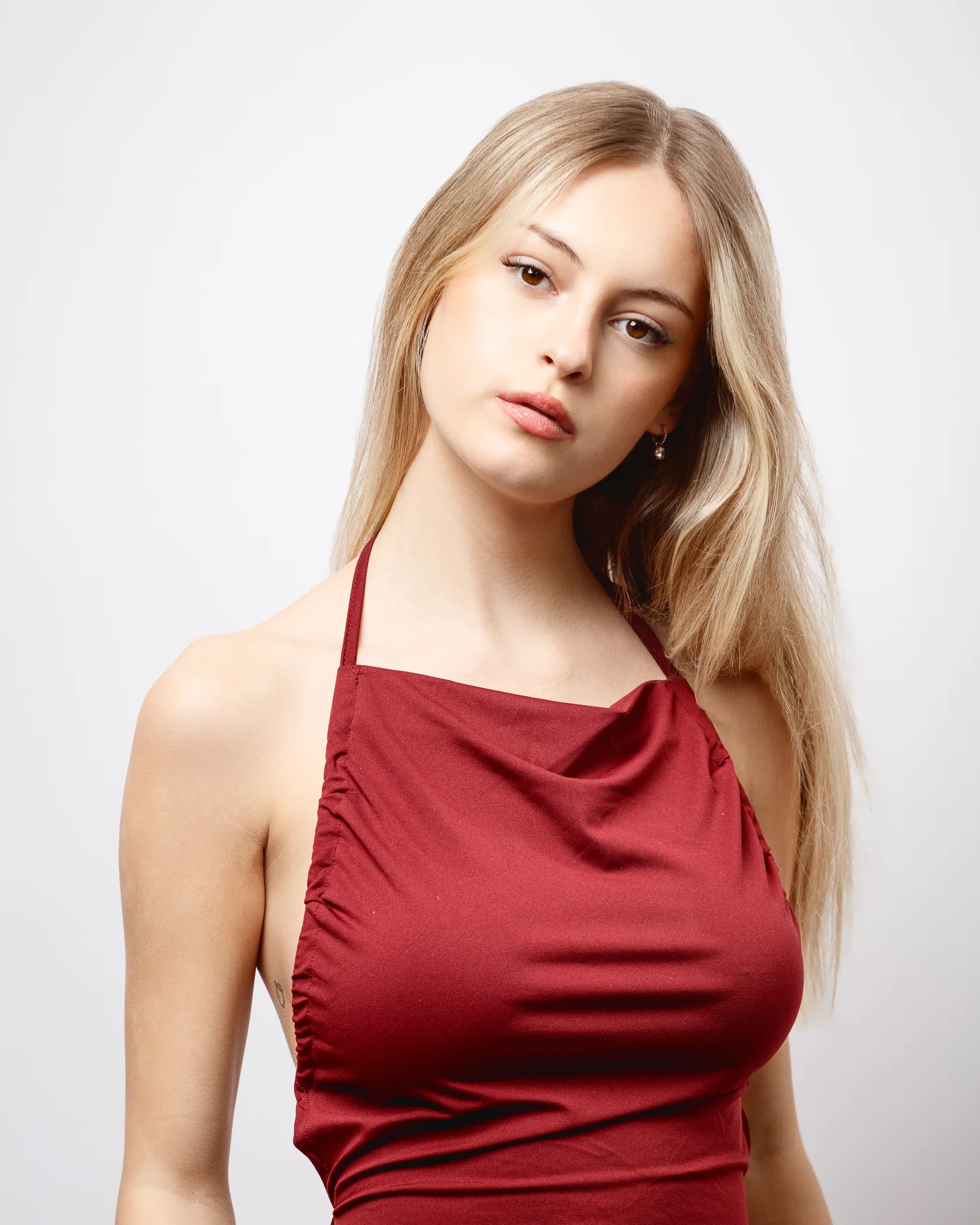
Look 6: Burgundy halter dress on a red background
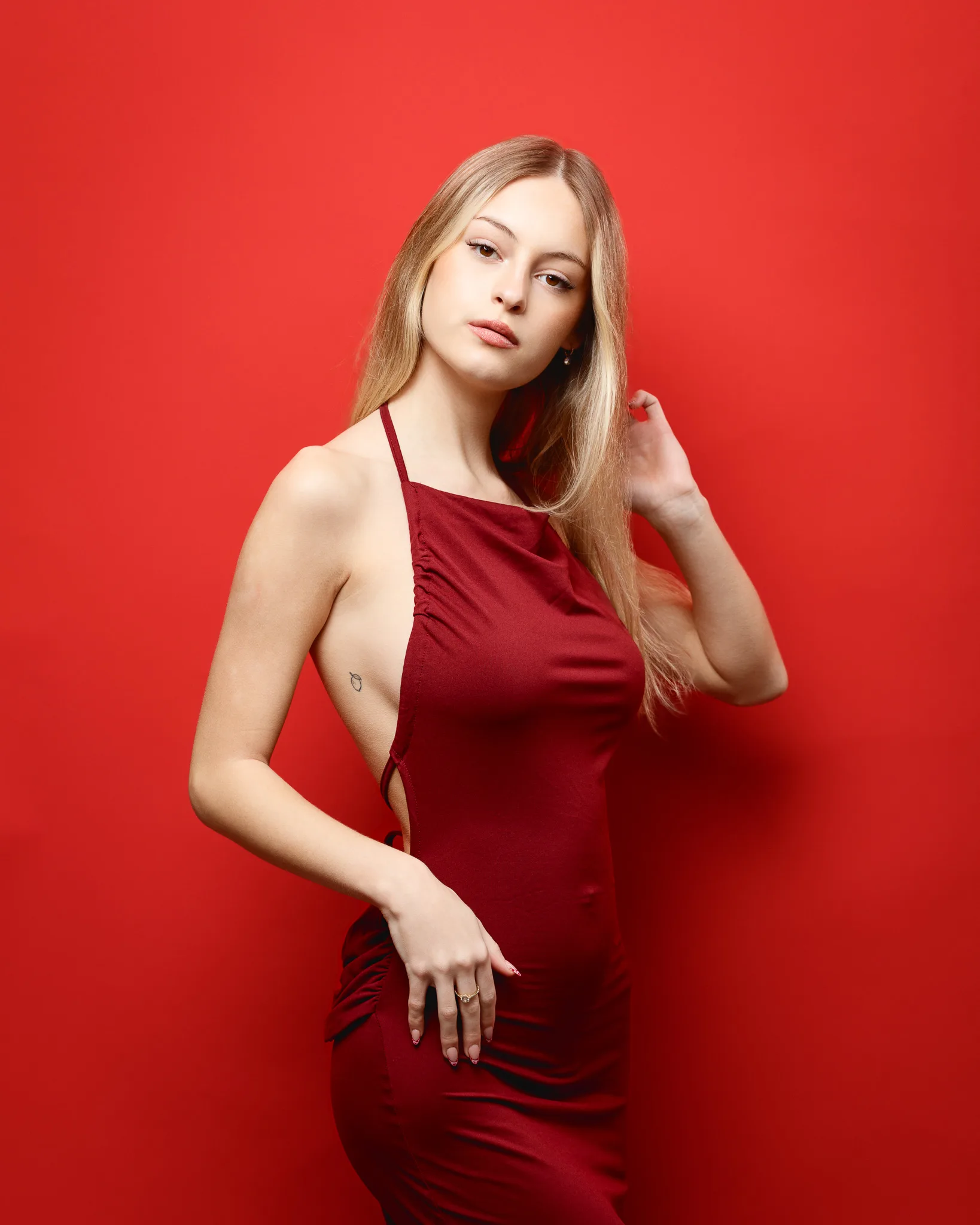
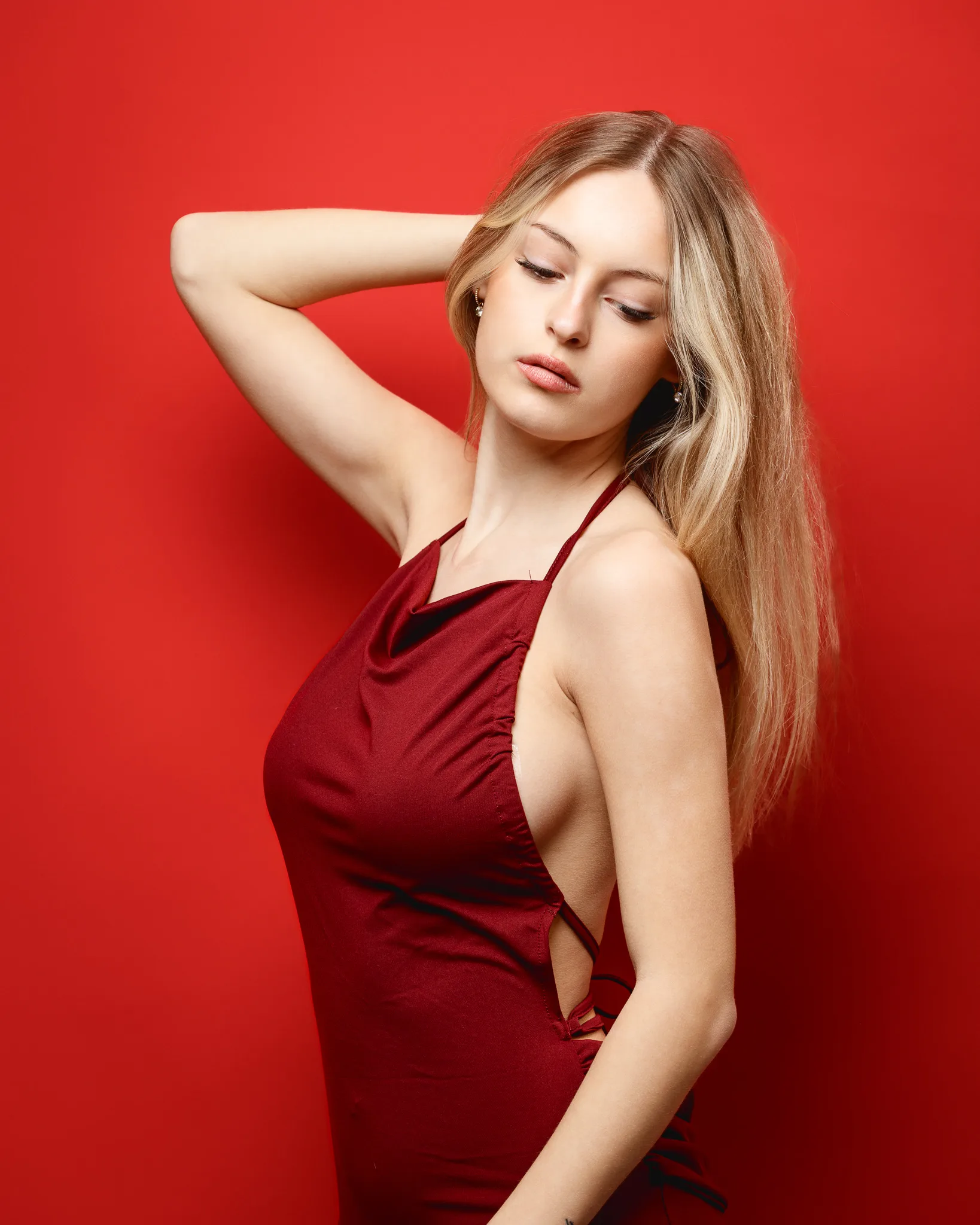
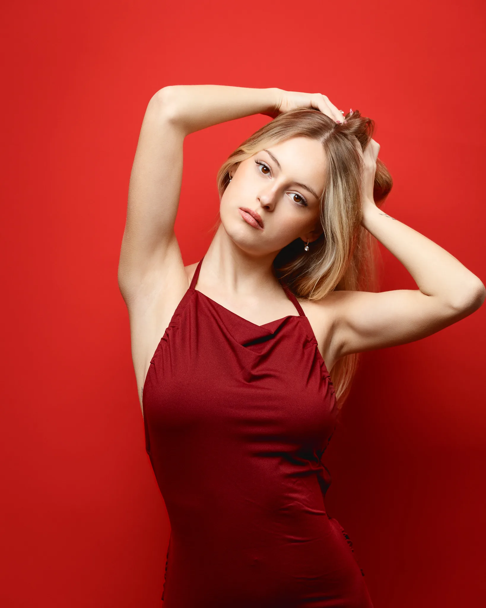
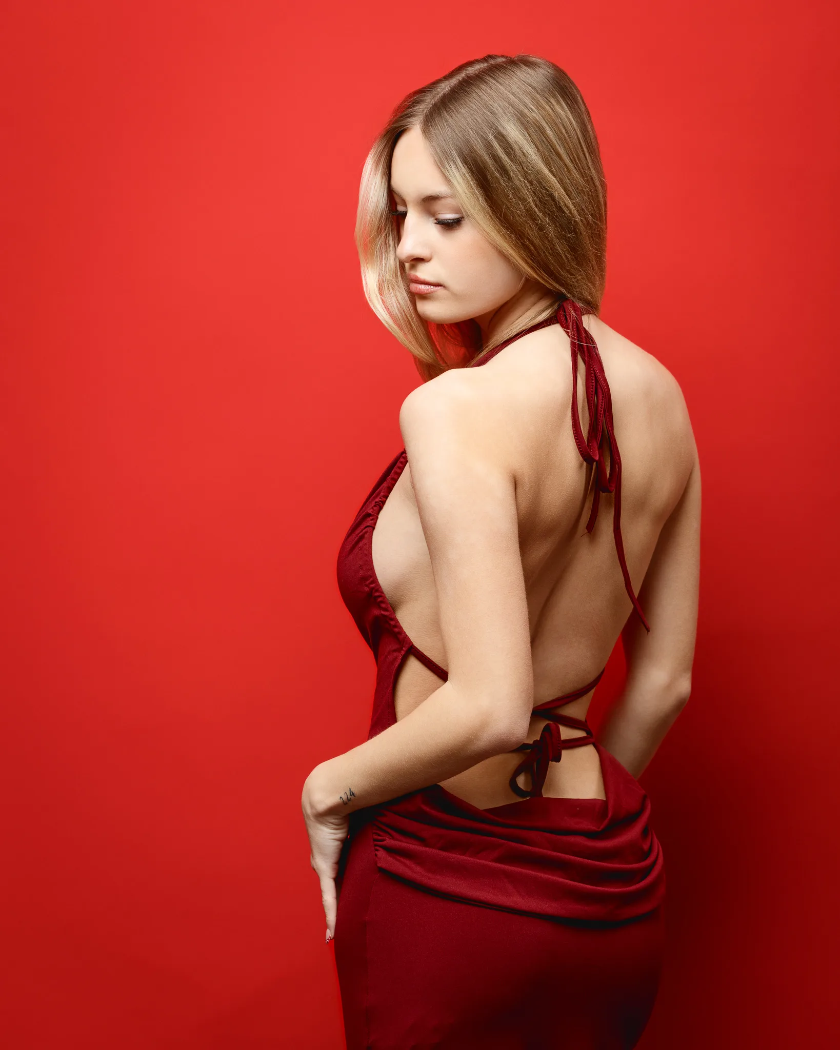
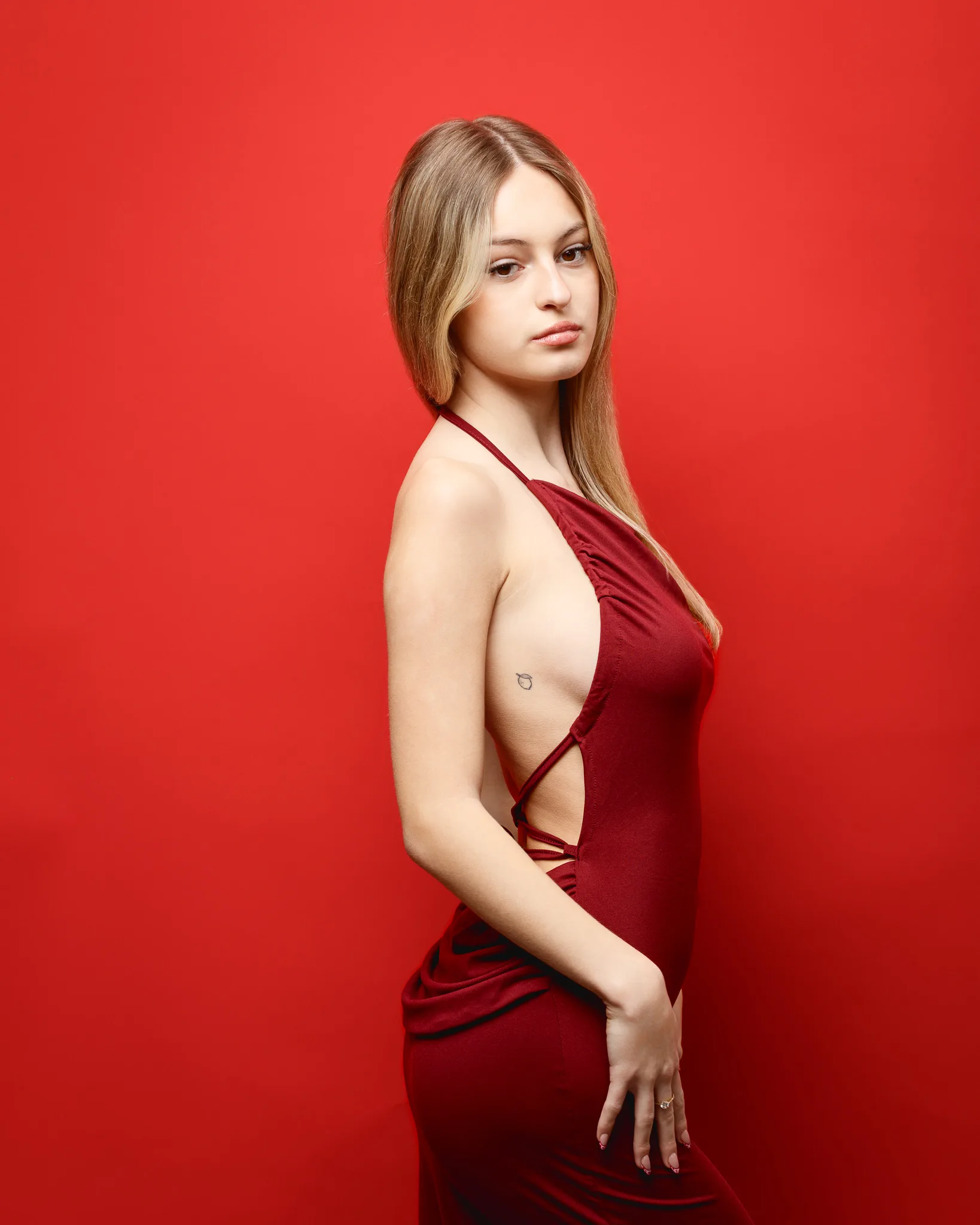
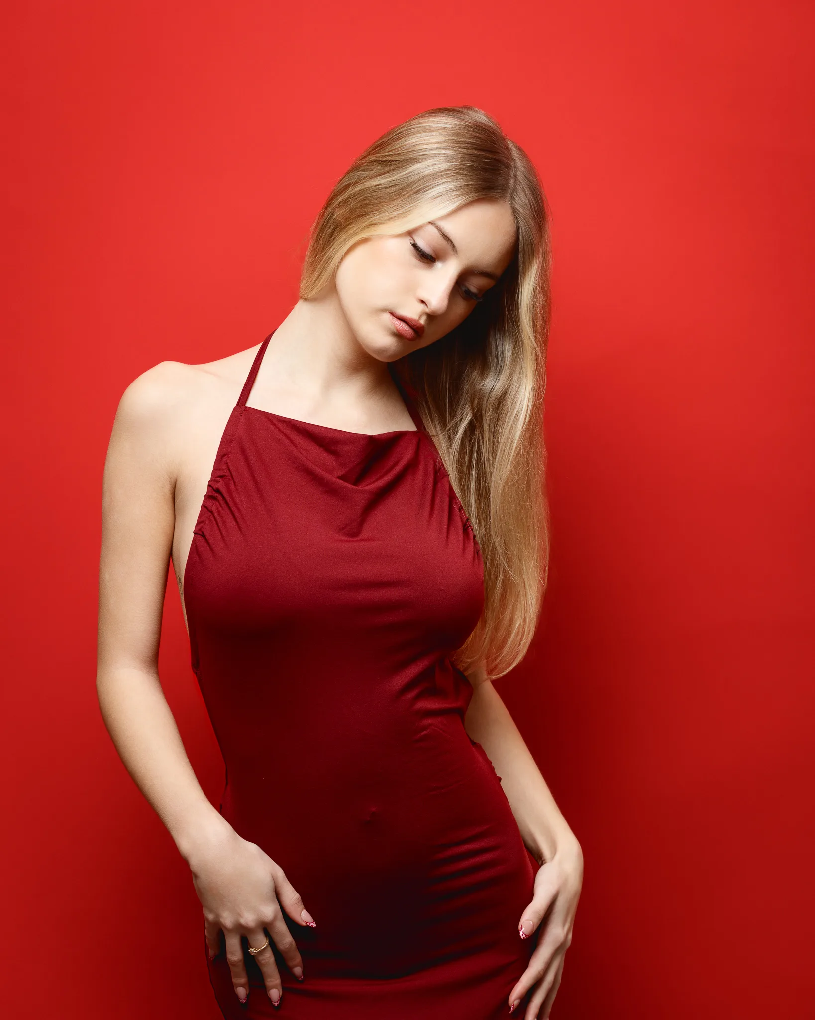
This is a subtle shift, but it is important. Burgundy against red gives separation without breaking the theme. It also creates a more grown-up palette.
The halter cut again frames the shoulders, but the deeper colour changes the emotional feel. This set encourages softer expression and slower posing. It is the kind of look that can sit well in a fashion portfolio as a quieter counterpoint to brighter sets.
Portfolio value: tonal colour work, elegant neckline, and refined mood.
Look 7: White heart dress with heart curtain backdrop
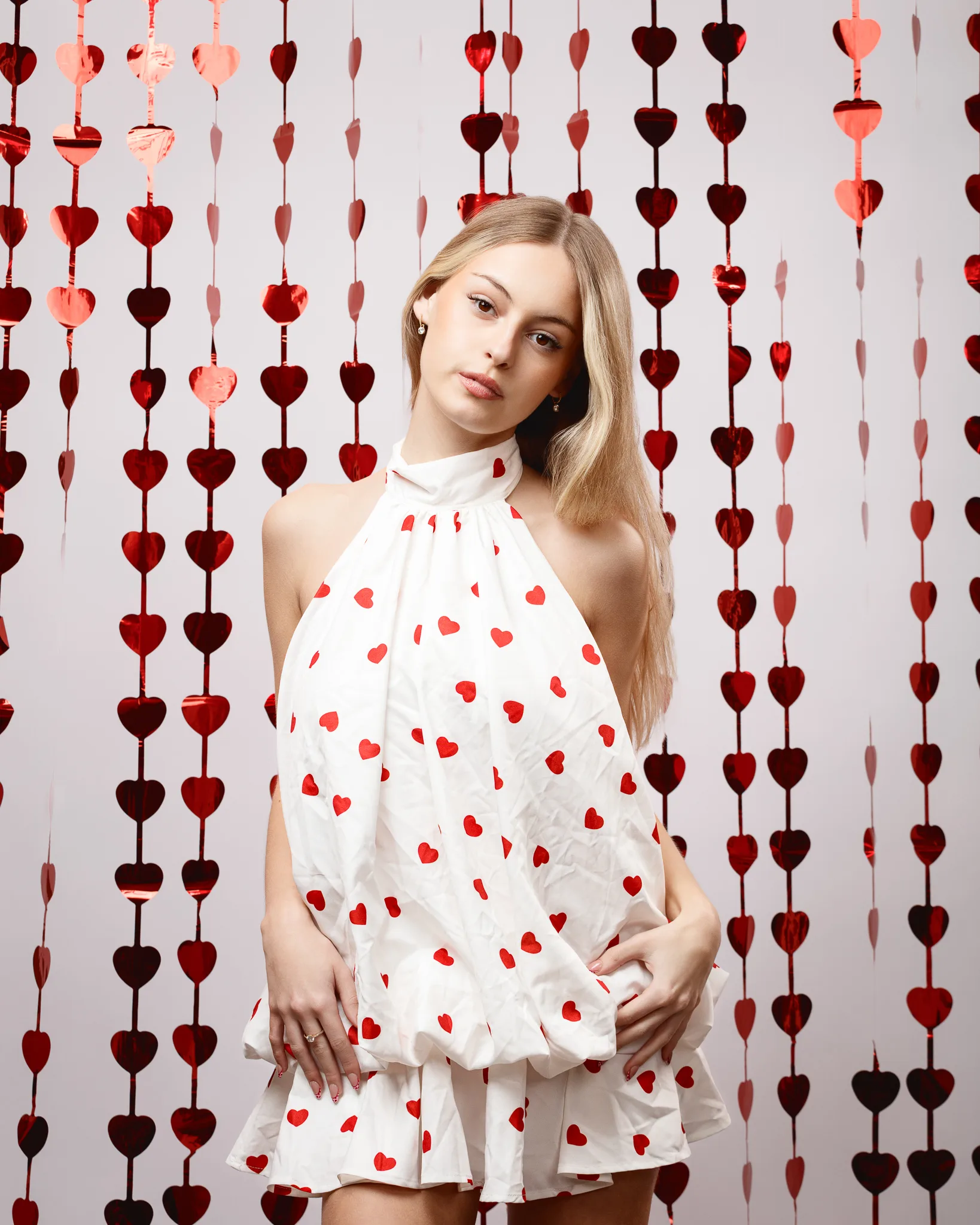
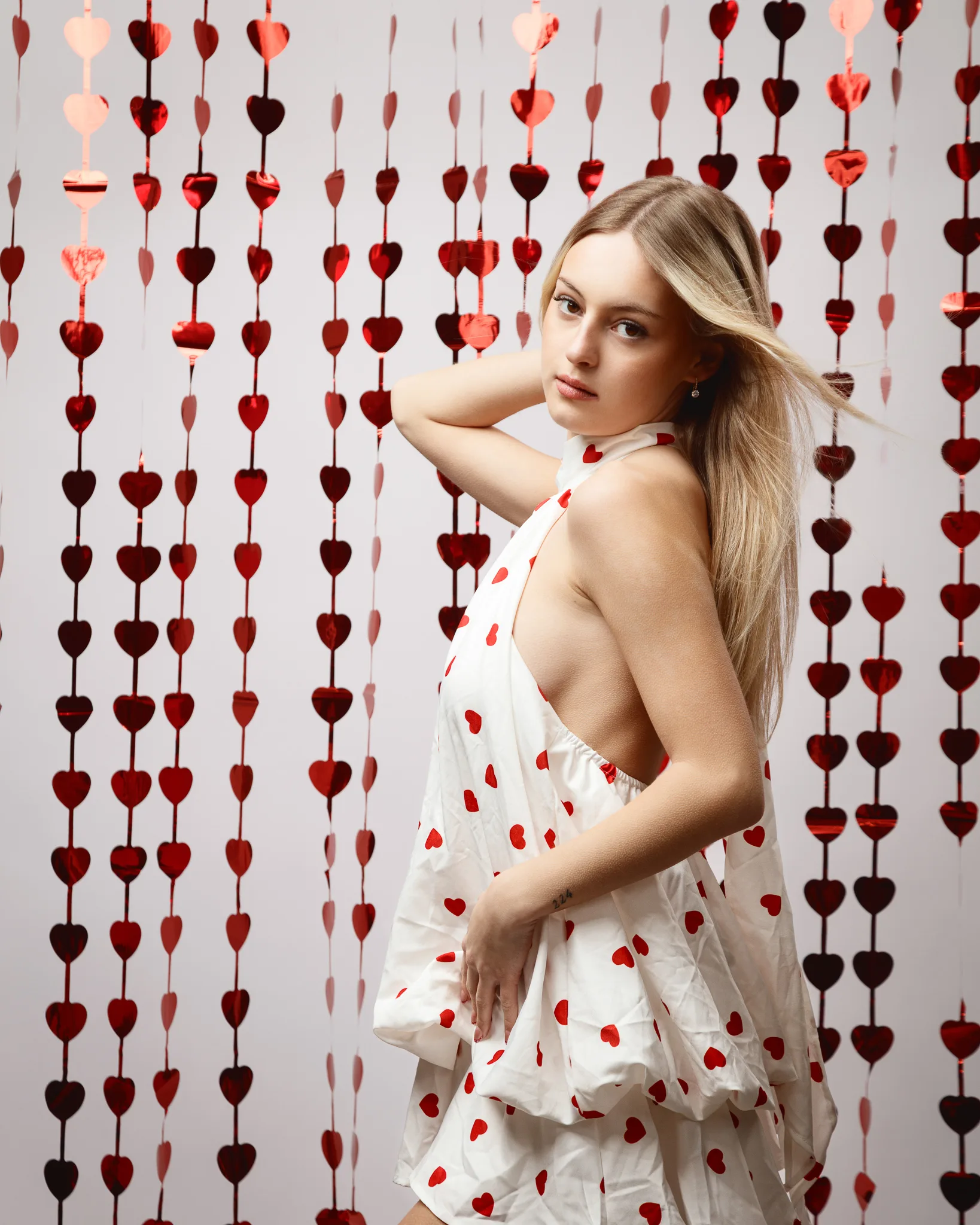
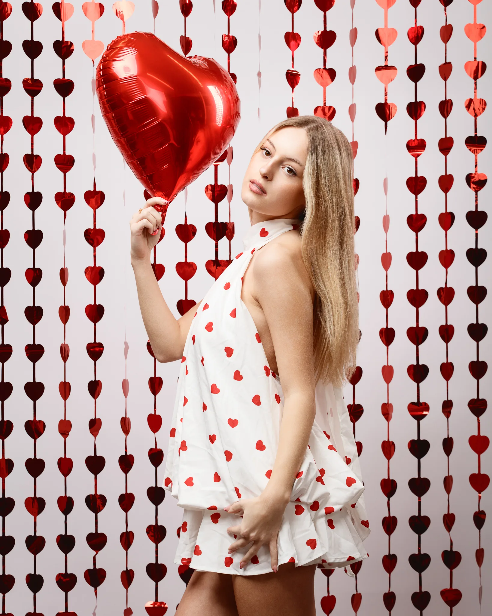
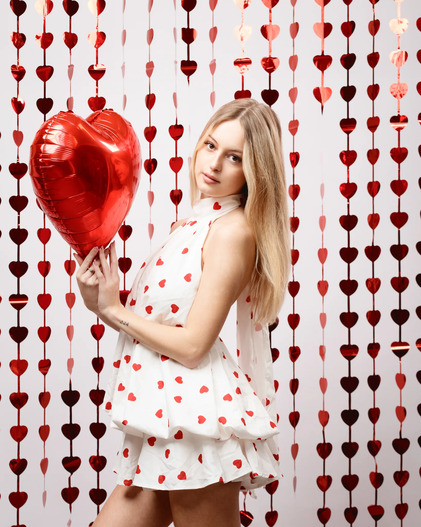
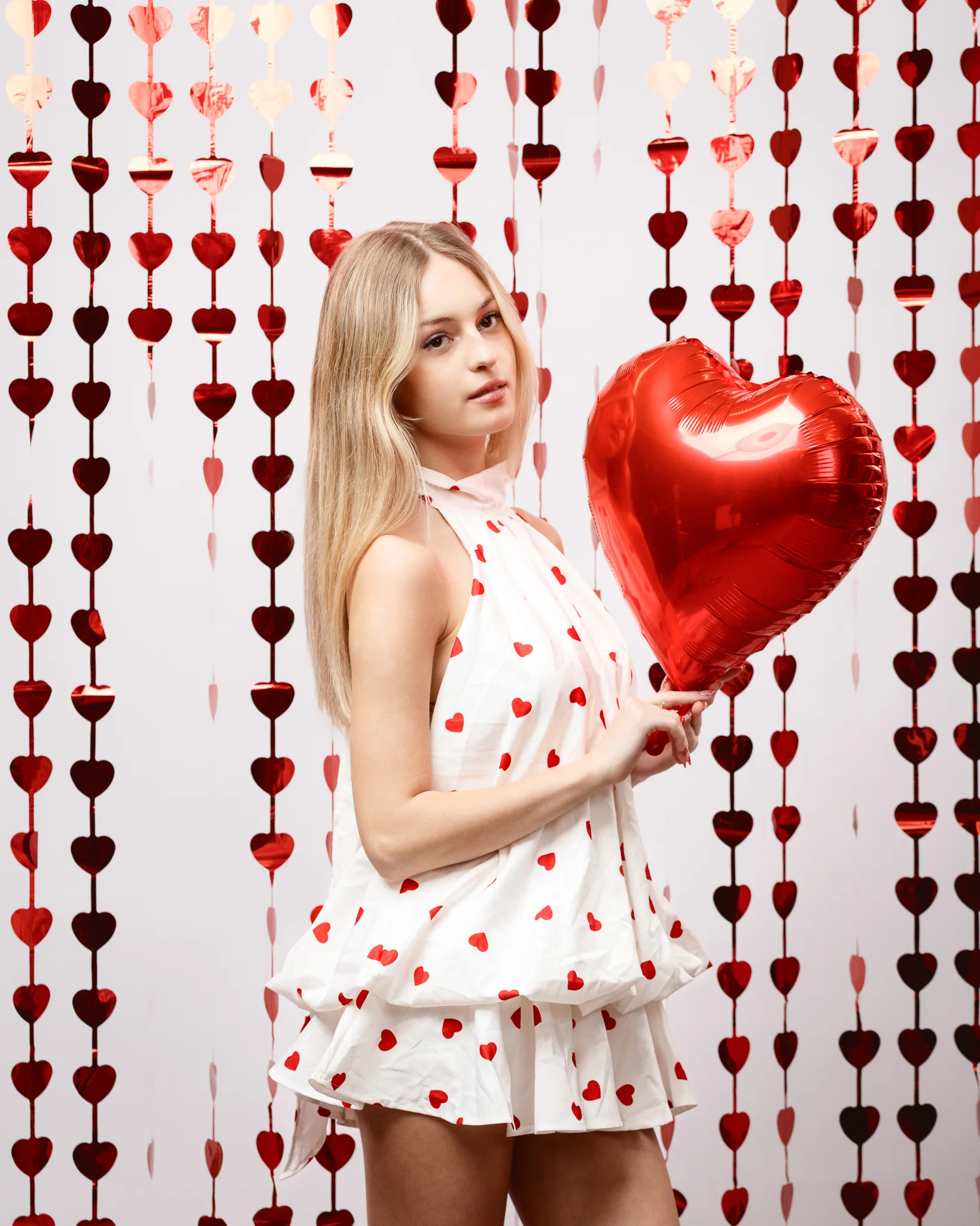
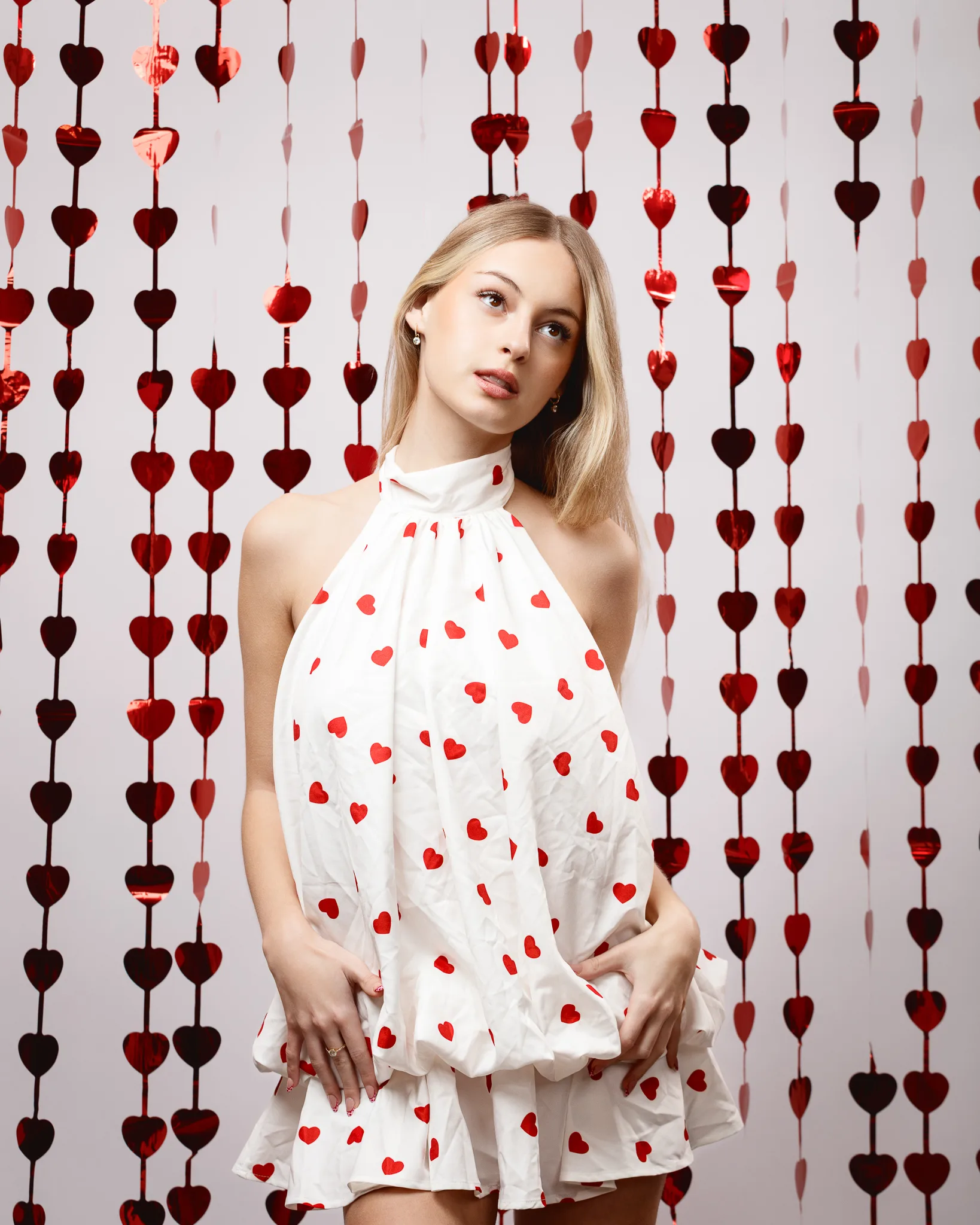
This backdrop turns the Valentine’s theme up, but it stays tasteful because the lighting is clean and the styling is simple. The hanging hearts add depth, repetition, and sparkle. They also create a gentle sense of “scene” without becoming a full set build.
We kept Rose centred and let the background do the decorative work. This is where restraint matters. If the pose becomes too busy, the frame feels cluttered.
Portfolio value: themed set, layered depth, and strong seasonal content.
What I want other models to take from Rose’s session
If you are building a fashion portfolio, I want you to take these practical points.
- Choose outfits that you feel good wearing. Confidence reads in posture.
- Bring a chaperone if it helps you feel comfortable. That is normal.
- Build variety through silhouette, colour, and mood, not random styling.
- Keep at least one clean background set that shows you clearly.
- Use themed shoots as a way to create seasonal content, but stay tasteful.
- Repeat sessions over time. Growth shows, and bookers notice.
Rose is growing into a confident model. She is learning what suits her, and she is learning how to hold a look without overacting it. That is a real skill. I am looking forward to working with her again, and I am already thinking of new themes that would suit her fashion direction.