I have been running a little series of studio product test shoots with everyday, recognisable brands. It keeps my eye sharp. It also keeps my lighting honest, because real packaging always fights back.
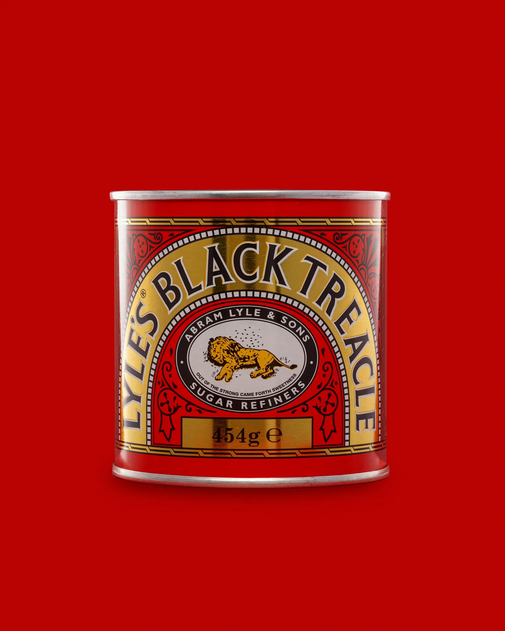
This time I photographed Lyle’s Black Treacle.
On paper, it sounds simple. A tin. A bold label. A red background. Then I added the part that makes it worth doing: I wanted a small triptych that shows the product in three ways.
- A clean hero packshot
- An open tin variation
- A controlled treacle drip, with a spoon, to show texture
That last frame is where tins and sticky liquids can get awkward fast. It is also where you learn the most.
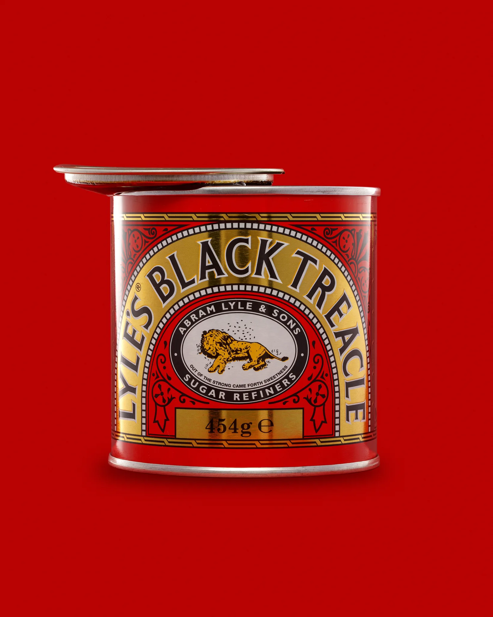
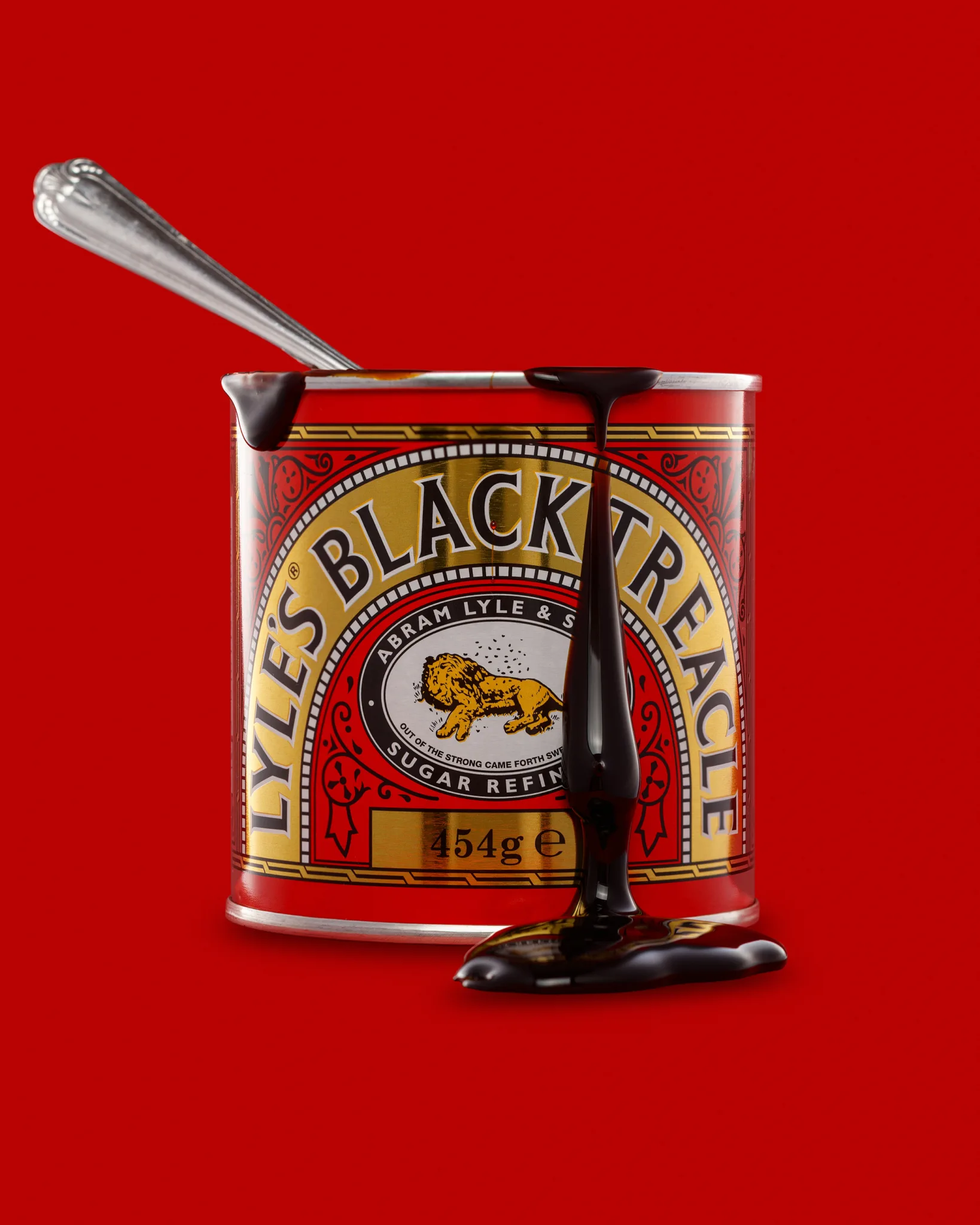
What I wanted this set to feel like
I wanted the images to feel like they belong together. Same angle. Same scale. Same background tone. Same lighting mood.
That “same, same, same” feeling matters in e-commerce. It stops a product pagefrom looking messy. It also helps when a brand wants to build a range later.
So I kept the brief tight:
- Keep the label readable at a small size
- Keep the red background rich, not noisy
- Keep the tin looking like a tin, not a mirror
- Show the treacle as glossy, thick, and dark
- Avoid visual clutter
If you sell online, you will recognise those goals. They are simple to say. They take time to do well.
Why tins are harder than people expect
A tin is a wraparound mirror. Every light source shows up somewhere. Every white wall in the studio shows up somewhere. Even I show up somewhere, if I get lazy.
The label on this tin also has strong contrast and fine detail. You have the gold border, the black type, and lots of decorative shapes. If you let reflections run across the label, the whole design loses punch.
The other issue is the metal rim at the top and bottom. That rim loves to grab a bright highlight. If the highlight blows out, the tin looks cheap. If the rim goes dull, the tin loses shape.
So I treat tins like cars. I do not “light the product”. I light the reflections.
Choosing the background: why I went red
The Black Treacle tin has a bold red label. So a red background can either look perfect, or it can swallow the product.
I chose red because I wanted a strong graphic look. I also wanted the label to feel like it sits inside its own world.
To make that work, I had to do two things:
- Keep a clear edge between the tin and the background
- Keep the background red stable across frames
A red background can shift fast. Tiny exposure changes can make it go orange or muddy. Even the tin’s reflections can tint it.
So I kept the background lighting steady. Then I adjusted the product lighting around it.
Composition and framing choices I stuck to
I kept the tin centred for the hero shot. I left a generous space above it. That space is useful for banners and crops later. It also makes the frame feel calm.
Then I repeated the same framing for the open tin shot. The lid adds a new shape, but the layout still feels consistent.
For the drip shot, I brought the tin closer. I wanted the treacle to become the story. I still kept the label readable, because it anchors the frame.
I also shot straight-on. A tiny tilt can make a tin look like it is falling backwards. When you shoot for product pages, that “not quite straight” look hurts trust.
My lighting approach for this set
I used a controlled, soft setup. I wanted clean reflections and good label detail. I also wanted the treacle to look glossy, not grey.
Here is the way I thought about the light:
1) Build the main shape first
I started with a broad, soft key light. I positioned it so the tin got a smooth highlight down each side. Not too wide. Not too thin.
Those side highlights define the cylinder. They tell your brain, “this is metal”.
2) Add diffusion, then adjust with flags
Diffusion gives you smooth highlights. Flags give you control.
I used flags to cut messy reflections and to stop bright hotspots. A tin will happily show you the edge of a softbox, a stand, or a doorway. Flags tidy that up.
3) Keep the label readable
I did not want glare across the main type. I adjusted angles until the label sat in a clean zone.
If you ever wonder why product photography can take time, this is a good example. A few degrees can change everything.
4) Separate the tin from the background
A red background can swallow edges. So I made sure I had clean edge definition.
Sometimes that is a rim light. Sometimes it is careful placement of the side highlights. In this set, the side highlights did most of the work.
5) Light the treacle like a surface, not a liquid
Treacle can look flat if you light it wrong. The trick is to give it a controlled specular highlight, so you see gloss and thickness.
I kept the treacle highlight tight and deliberate. That way it reads as rich and sticky, not just “dark stuff”.
The open tin shot: small changes, new problems
Opening a tin seems easy. It is not.
The lid becomes a reflector. The inside rim becomes a reflector. The surface of the treacle becomes a reflector.
So I had to re-check everything:
- Did the lid throw a bright reflection onto the label?
- Did the open rim catch a hotspot?
- Did the top edge stay clean and sharp?
- Did the tin still look centred and steady?
I also watched the lid angle. If the lid sits too high, it feels awkward. If it sits too low, it hides the top rim.
I wanted it to look natural, like it has just been opened. No drama. Just a clear story.
The drip shot: getting sticky without making a mess
This was the “fun” frame.
I wanted the drip to feel slow and heavy. That means it needs to stretch. It also needs to hold shape long enough for focus and timing.
Treacle does what it wants. It moves when it is ready.
So I worked in steps:
- I warmed the treacle slightly, so it flowed. Not hot. Just workable.
- I tested drips off-camera first.
- I set the spoon angle and committed to it.
- I shot a short burst when the drip looked right.
- I cleaned and reset when it went wrong.
The spoon also introduced new reflections. A shiny spoon can easily become the brightest thing in the frame. I kept an eye on that, and I flagged where needed.
I also watched the drip placement. I wanted it to fall in front of the label, but not block the main text. That balance matters. The label still sells the product.
Colour control: keeping red consistent
Red is unforgiving. It shows banding. It shows uneven light. It shows noise if you underexpose.
So I aimed for a clean, even background with a gentle gradient. I did not want it to look like a flat sheet. I also did not want it to look patchy.
A few practical things helped:
- I exposed so the red stayed strong, without clipping.
- I kept the background light stable across all shots.
- I avoided pushing red too hard in edits.
- I checked colour on a calibrated screen.
If you sell online, this matters because red can shift across devices. You cannot control every screen. You can control your master file.
Camera choices that matter for packshots
I kept the focal length in a “safe” zone. I did not want wide-angle distortion. I also did not want to flatten the tin too much.
I used a sturdy tripod and kept the camera level. That is boring, but it works.
Depth of field matters too. With product labels, you need enough sharpness to keep the type crisp. But you do not need every background fibre sharp. Here, I prioritised label clarity.
I also left myself space to crop. Many ecommerce platforms use square crops. If you compose too tight, you lose options later.
Retouching: what I fixed, and what I left alone
Studio light is honest. It shows everything you did not see with your eyes.
On tins, the usual culprits are:
- Dust specks
- Fine scratches
- Fingerprints
- Tiny dents
- Uneven sheen on the metal
I tidied dust and marks. I kept the tin looking real. I did not try to turn it into a perfect CGI object.
On the red background, I cleaned small flaws and smoothed transitions. I kept it natural. I do not like heavy, plastic backgrounds.
For the drip shot, I checked edges carefully. Treacle has a dark edge that can merge into shadows. If you lose that edge, you lose the texture.
Why I like making triptychs
A single hero packshot is useful. It is also only part of the story.
A small set gives you options:
- Your main product page image
- A second image that shows “open and ready”
- A third image that shows texture and taste
Even when you do not shoot lifestyle work, you can still suggest use. A spoon, a drip, an open lid. Those small cues help.
And from my side, it keeps me sharp. Every new product brings a new problem. That is the point.
If you are planning your own product shoot, ask yourself this
You do not need a huge shot list to start. You need a clear one.
Here are three questions I use:
- What is the hero image meant to do?
- What detail will a buyer worry about?
- What is the simplest way to show that detail?
For Black Treacle, the detail is texture and gloss. So I made the drip the third frame.
If your product is matte, the challenge changes. If it is clear glass, the challenge changes. If it is reflective chrome, everything changes.
See more about my product photography for Suffolk businesses.