This was another set in my product photography test series, built around everyday brands that people recognise in a second. I keep coming back to food packaging for these tests because it is brutally honest. If my lighting is even slightly off, the product looks cheap. If my reflections are messy, the image feels messy. If my colour control slips, the whole set falls apart.
Heinz Beanz was a perfect choice. A tin is simple on paper. In the studio, a tin is a mirror with sharp edges. Add glossy sauce, a fork, and a few beans on the floor of the set, and you have a mix of surfaces that all behave differently.
This post is about how I approached the shoot, what I was trying to achieve, and what the images taught me.
Why I chose Heinz Beanz for this test
I like products that force me to solve common client problems. Heinz Beanz does that immediately.
A tin gives me:
- Metallic reflections that show every light source
- A printed label that must stay readable
- Curved surfaces that distort highlights if I am careless
- A top rim that loves to catch bright hotspots
The beans add a different challenge:
- Wet highlights that can look appetising or oily
- Sauce that can look rich or flat
- Texture that needs directional light to feel real
The fork adds another layer:
- Chrome reflections that can pull attention away
- A strong line that can help the composition
- A prop that can also ruin the set if it looks random
I wanted a set that felt clean and controlled, but still had a bit of story.
The look I wanted from the set
I set myself a clear target. I wanted the tin to look tidy and premium. I wanted the label to read instantly. I wanted the beans to look glossy and fresh, not dull or sticky.
I also wanted consistency across the set. These triptychs only work if every frame feels like the same world. The background tone, the shadow depth, and the highlight style all need to match.
The teal background was not chosen to be clever. It was chosen to test discipline. Strong background colour shows mistakes quickly.
The shot list and why it works
I built this set around three core images, plus a clean extra that works as a simple packshot.
Image 1: Hero tin with fork and beans

This is the main frame. The tin is the anchor. The fork and beans add action. The spill suggests serving without becoming a kitchen scene.
Image 2: Tight packshot
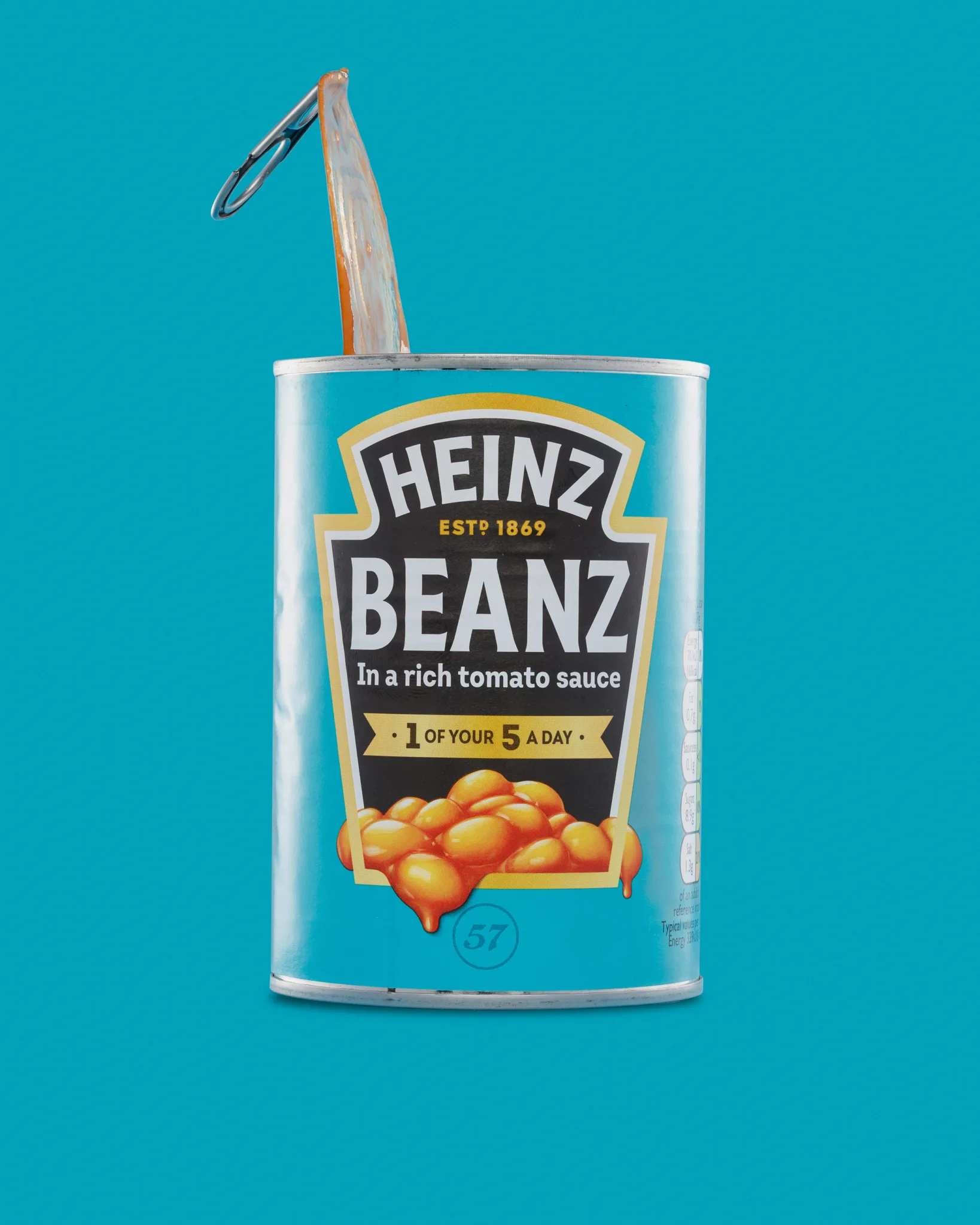
This is the clean frame. It is the one that suits a product page. It is also the one that reveals every reflection problem.
Image 3: Tin with lots of negative space

This gives the set breathing room. It also tests how well I can keep edges crisp against colour. Negative space is not empty. It is design flexibility.
Extra: A variation on the hero
A small change in fork position or spill shape can change the whole feel. I like having a backup option that still fits the set.
That structure is useful for real e-commerce work. A brand often needs one clean image, one with a use cue, and one that works for banners.
Background choice: why teal made sense
The teal background does a few jobs at once.
It separates the tin from the beans. It also avoids the obvious red background that everyone expects with this product. It keeps the focus on the label, without drowning the frame in one colour.
Teal also forces careful colour balance. If teal shifts too green, skin tones would look sickly in a lifestyle shot. Here, it just looks wrong. If it shifts too blue, the tin can look cold and lifeless.
I wanted the teal to feel confident, not loud. I also wanted it to stay consistent across all frames.
Lighting approach: what I prioritised
I did not set this up to be complicated. I set it up to be controlled.
With a tin, the key question is always the same. What do I want it to reflect?
If the tin reflects a messy room, the image looks messy. If it reflects a clean, diffused source, the image looks intentional.
So my priorities were:
- A clean highlight shape down each side of the tin
- A readable label with no glare through the logo
- A top rim that stays bright, but not blown out
- A background gradient that feels smooth and deliberate
I rely on three ideas when I am photographing reflective packaging.
First, use broad diffusion
Big soft light sources create smooth highlights. They make the metal look premium, not harsh.
Second, control spill with flags
Flags shape reflections. They stop light from bouncing into places where it looks ugly. They also bring back contrast where the tin looks flat.
Third, adjust angles before adjusting power
With reflective surfaces, a small angle shift can fix more than a stop of power change. It is often faster and cleaner.
Managing reflections on the tin
Tins are unforgiving. The reflections can look “fine” until you zoom in. Then you see a bright streak through the wordmark. Or you see a hotspot on the shoulder. Or you see a muddy reflection that makes the metal look dirty.
I watch for four reflection problems.
A bright stripe through the label
If a highlight runs through the main text, the viewer reads it as glare. I want the label lit, not shiny.
Hotspots on the top rim
The rim catches light fast. If it blows out, it pulls attention away. It also makes the tin look dented, even if it is not.
Uneven side highlights
If one side is bright and the other side is dull, the tin looks crooked. Symmetry matters more than you think.
Mess near the base
The base picks up reflections from the surface. If the surface is messy, the base looks messy. Even if it is clean.
The fix is usually a mix of diffusion and negative fill. I want clean highlights, then controlled contrast.
Keeping the label readable
Label readability is the whole point of packshot work. If you cannot read the brand quickly, the image fails.
I keep the camera position careful. I want the tin to look straight, not leaning back. A leaning tin looks like a quick snapshot. It also warps the label shape.
I also keep an eye on micro contrast. Over-sharpening can make the label edges look crunchy. Under-sharpening makes the print look soft. The sweet spot is crisp, but calm.
A good label in a product photo feels effortless. It is not effortless.
The beans and sauce: making the texture look good
Food texture is where a product shot can become appealing. It is also where it can become horrible quickly.
Beans in sauce give me:
- Wet highlights that need control
- Shape that needs directional light
- Colour that can shift if the background contaminates it
I wanted the beans to look glossy, but not oily. I wanted the sauce to look rich, but not dark brown. I also wanted the spill to feel intentional.
The trick with spills is restraint. A small amount reads as real. Too much looks like an accident. I aimed for a controlled mess. It still looks messy, but in a planned way.
I also wanted individual beans to have definition. If the light is too flat, the beans become a soft orange blob. Directional light gives them shape.
The fork: a simple prop that can steal the scene
Chrome is a nightmare if you let it be. It reflects everything. It can pull the eye away from the product. It can also add a strong line that makes the frame feel designed.
I used the fork for two reasons.
First, it adds a clear “serving” cue. People understand it instantly.
Second, it gives me a compositional line. The fork can point back to the label. That keeps the viewer’s eye moving in the right direction.
To stop the fork dominating, I kept it clean and controlled. I also watched for bright hotspots on the metal. A small hotspot can look like a mistake. It can also become the brightest thing in the frame, which is never what I want.
Composition decisions that made the set feel tidy
I kept the tin centred in the clean frames. That is a simple choice, but it helps. It makes the set feel stable. It also suits ecommerce grids.
In the hero frame, I still kept the tin as the anchor. The beans and fork add interest, but they do not replace the product.
I also left negative space. That space makes the image feel calm. It gives room for crops. It also gives room for text overlays, if a brand needs that later.
What I would do differently next time
Every test shoot gives me a short list of improvements.
For this set, my next steps would be:
- Try one frame with a slightly lower camera height, for a more heroic feel
- Test a softer background gradient, to see if it feels more premium
- Explore a tighter crop that focuses on the beans and lower label
- Build a second spill shape, with fewer beans and more sauce gloss
None of these are “fixes”. They are options. Product work is often about having options that still match the set.
Retouching and finishing choices
Product retouching is where the clean look is earned. Tins and wet food both need careful finishing.
Here is what I typically tidy in a set like this:
- Dust and fibres on the tin and rim
- Tiny dents or scuffs that catch light badly
- Smears on the label that look minor in real life
- Background banding or uneven gradients
- Small edge distractions along the tin silhouette
Here is what I keep honest:
- The natural texture of the beans and sauce
- Small variations that make the food look real
- The basic shape and character of the packaging
It is easy to overwork food. If you over-smooth it, it stops looking edible. I want polish, not plastic.
What this shoot taught me
This set reinforced something I already know, but it is worth repeating.
Reflective packaging is not about adding more light. It is about controlling what the product reflects. The clean look comes from diffusion, flags, and small angle changes. It comes from patience.
It also reminded me that “simple” props are only simple when they are controlled. A fork can be brilliant or distracting. A spill can look rich or messy. The difference is planning.
I like these tests because they mimic client work. A brand rarely has one product. They have a range. They need consistency. They need files that sit together and still look fresh.
That is what I practise in these sessions.
Why are tins harder to photograph than they look?
They reflect everything. You have to control reflections, not just exposure.
How do you stop glare across a label?
I use diffusion and flags. I also adjust angles to move hotspots.
Why include beans in front of the tin?
It shows texture and colour. It also gives a “real product” cue.
Does background colour affect the product?
Yes. Strong backgrounds can contaminate reflections and colour perception.
See more about my product photography for Suffolk businesses.