
I photographed another studio session with Margita, built as a six-look fashion and portrait series. I designed the shoot to move through distinct styling worlds. I also kept the photographic treatment consistent throughout.
That consistency matters more than people think. When the light and background stay steady, the styling gets room to speak. You also end up with a set that feels intentional, not like six separate mini shoots.
For this session, I worked on a grey studio backdrop with controlled, directional light. I kept the contrast tidy and the skin tones natural. I also stayed focused on posture, hand placement, and clean lines, because those details carry fashion portraiture.
Below, I have broken the shoot down look by look, with the thinking behind each one.
Quick overview of the six looks
Here is the shoot structure at a glance.
| Look | Styling world | Key wardrobe | Hero elements |
| 1 | Indian-inspired jewellery in a modern studio context | White shirt | Statement necklace, chandelier earrings, red bindi, red lip |
| 2 | Rich occasion mood | Red satin dress | Same jewellery language, stacked bangles, deeper red palette |
| 3 | Heritage-led layering and texture | Black roll neck | Layered strands, warm orange beads, paisley pendant, ornate bangles |
| 4 | Fashion-forward version of the layered set | Sleeveless black dress | Jewellery on skin, sculptural posing, stronger wrist detail |
| 5 | Contemporary accessory-led fashion portrait | Black top and animal-print skirt | @michaelkors structured handbag, statement drop earrings |
| 6 | Modern tailoring with movement | Black tailored layers | Strong pose sequence, burgundy loafers by @dune_london |
The unifying thread: one background, one lighting language
I chose a grey background because it behaves well across many palettes. Grey does not shout. It also lets reds, golds, and blacks sit cleanly in the frame.
I used controlled directional light, rather than soft flat fill. Directional light gives shape to faces. It also gives jewellery and fabric a better sense of form. Sparkle looks better when it has a clear highlight path. Satin looks better when the sheen rolls predictably.
I also stayed disciplined with angle choices. I shot plenty of variety, but I kept the editorial feel consistent. That meant clean crops, tidy negative space, and no fussy background distractions.
Look One: Indian-inspired statement jewellery with a crisp white shirt
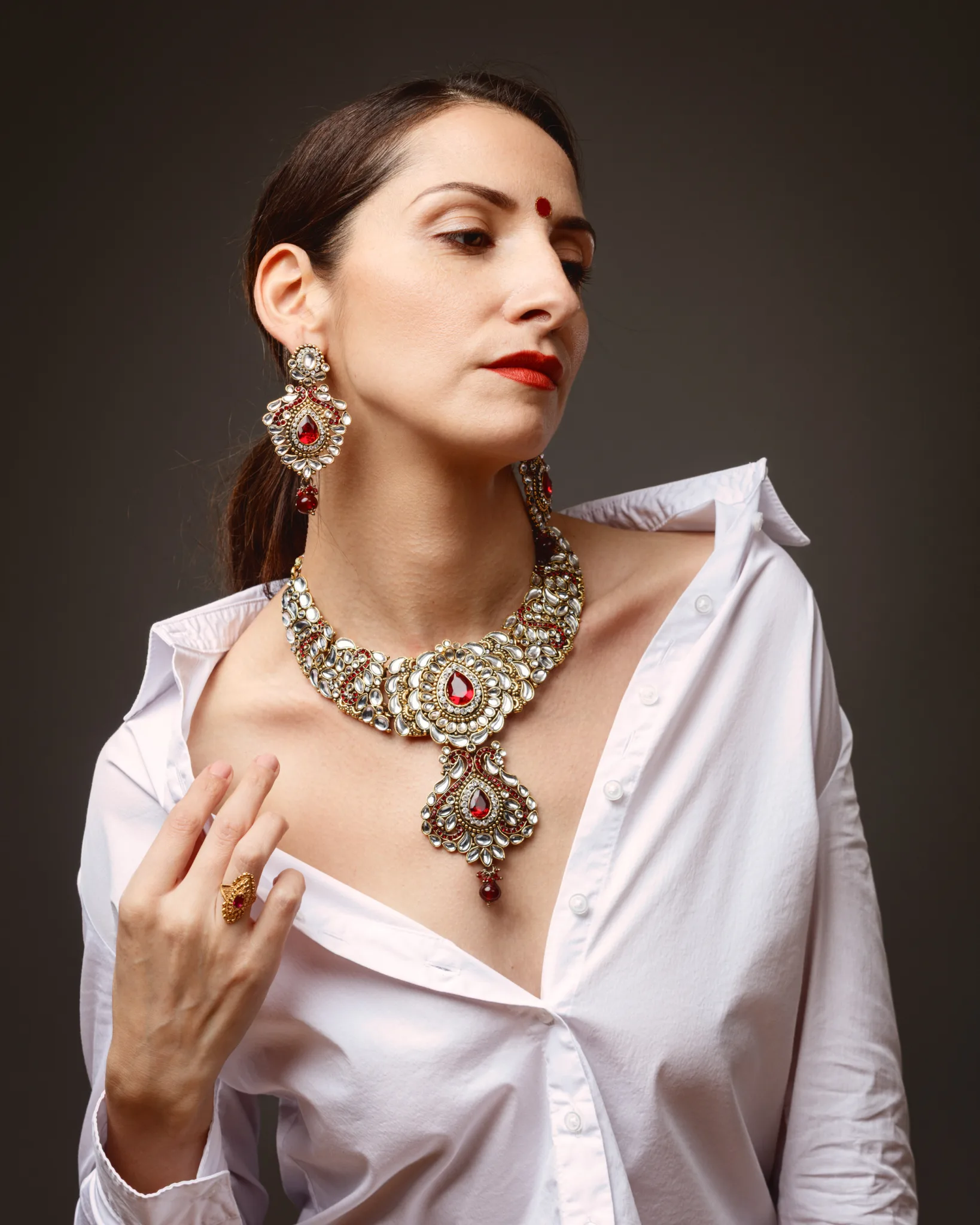
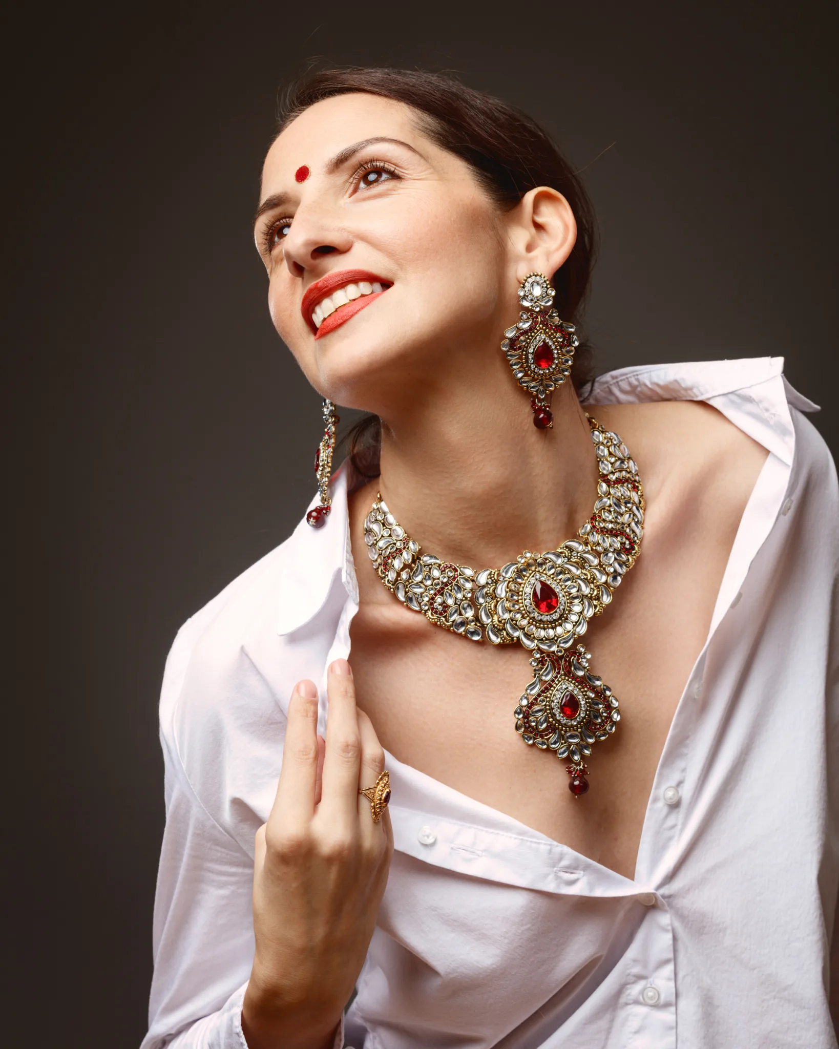
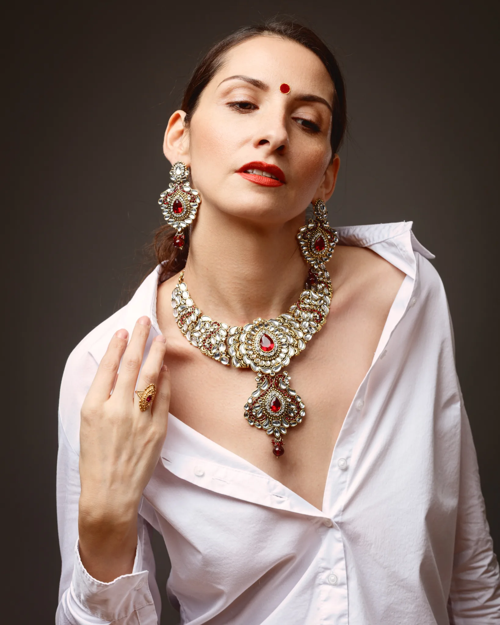
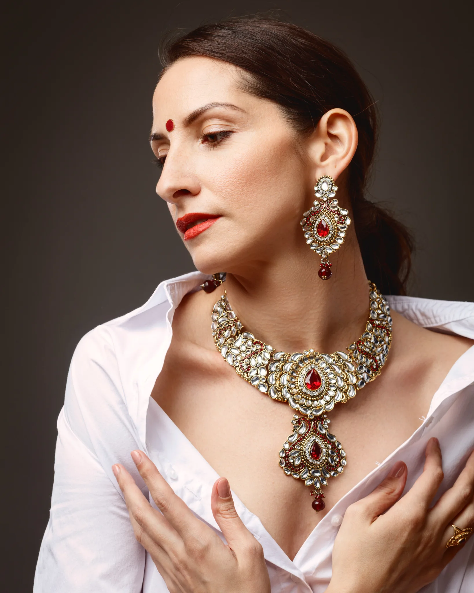
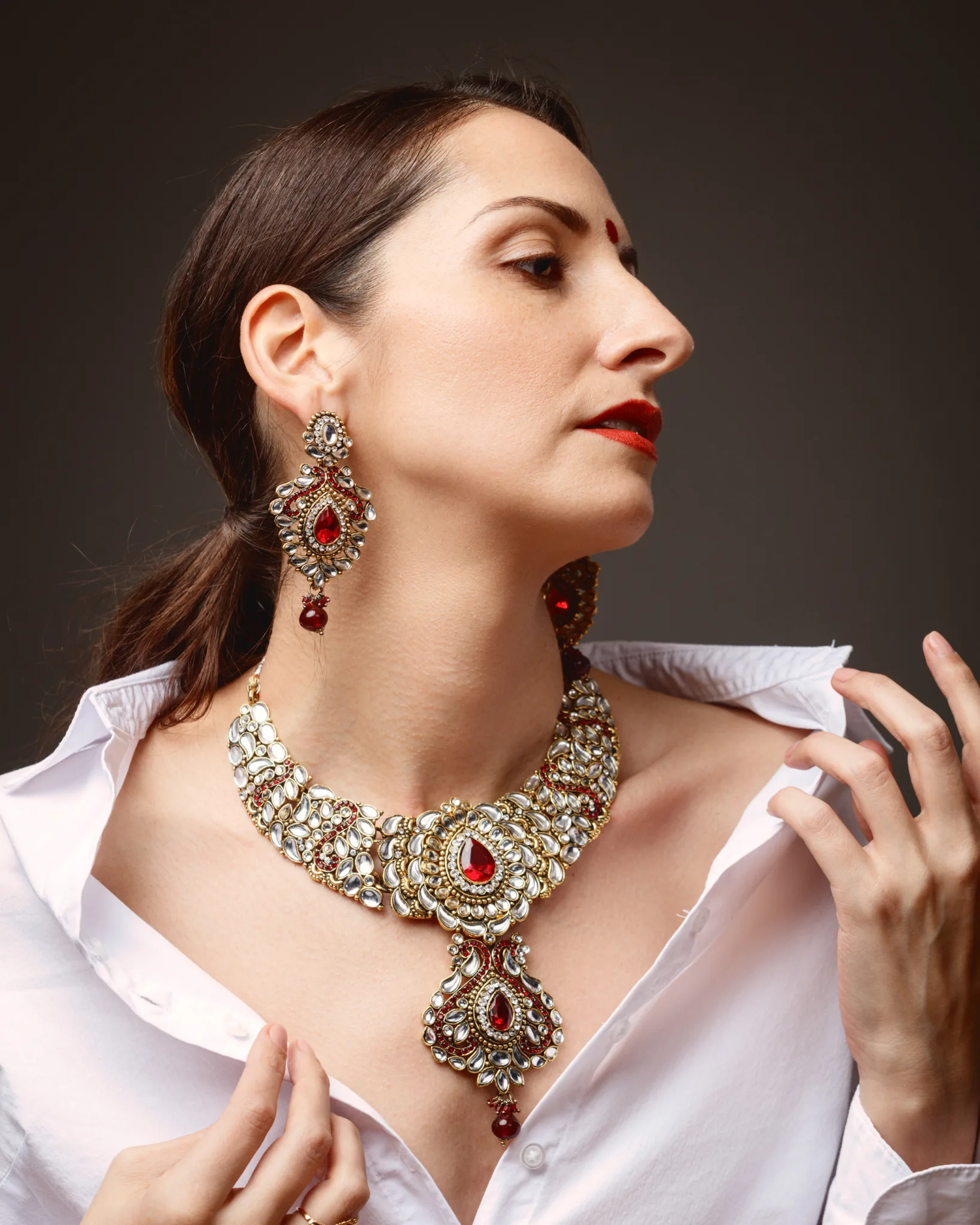
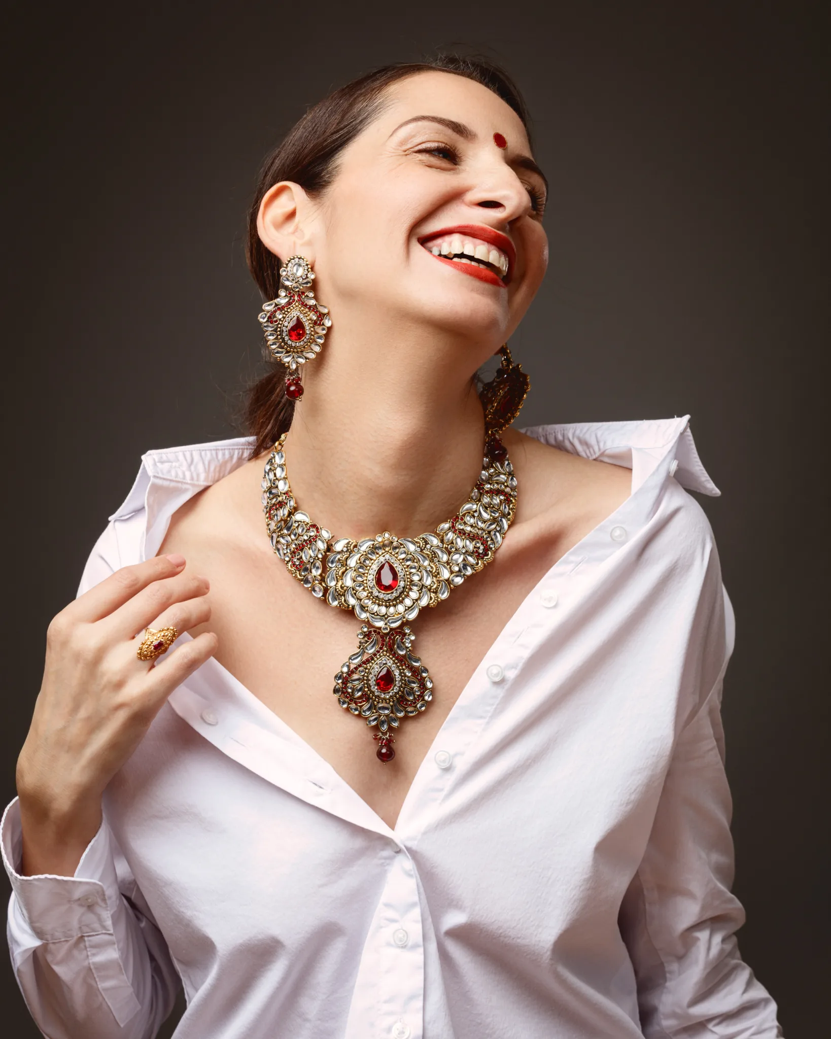
The first look set the tone for the whole shoot. I wanted the styling to feel culturally resonant, while still reading as modern studio portraiture.
Margita wore a crisp white shirt, open at the collar. That simple wardrobe choice did a lot. It framed the jewellery without competing. It also created a clear contrast between modern clothing and ornate adornment.
The jewellery reads as a coordinated statement set in a kundan and polki-inspired design language. From a photograph, I cannot confirm materials, stones, or the exact origin. I can describe what the design is doing and why it reads the way it does.
The necklace sits high across the collarbone, with dense clusters of reflective white stones in warm gold-toned settings. The red teardrop centre stones create instant hierarchy. Your eye lands on the central red stone first, then moves through repeating motifs. The pendant drop below adds weight and movement. The matching chandelier earrings mirror that structure, which helps the face stay balanced in three-quarter angles.
The red bindi and red lip pull the whole palette together. In visual terms, that is the cleanest way to make the reds feel intentional. The bindi also anchors the look in a South Asian visual language without needing heavy wardrobe cues.
If you want a careful and readable reference point for the bindi as a cultural practice and aesthetic marker, this is a good starting resource:
https://www.britannica.com/topic/bindi
Look Two: deep red satin, bangles, and a richer occasion mood
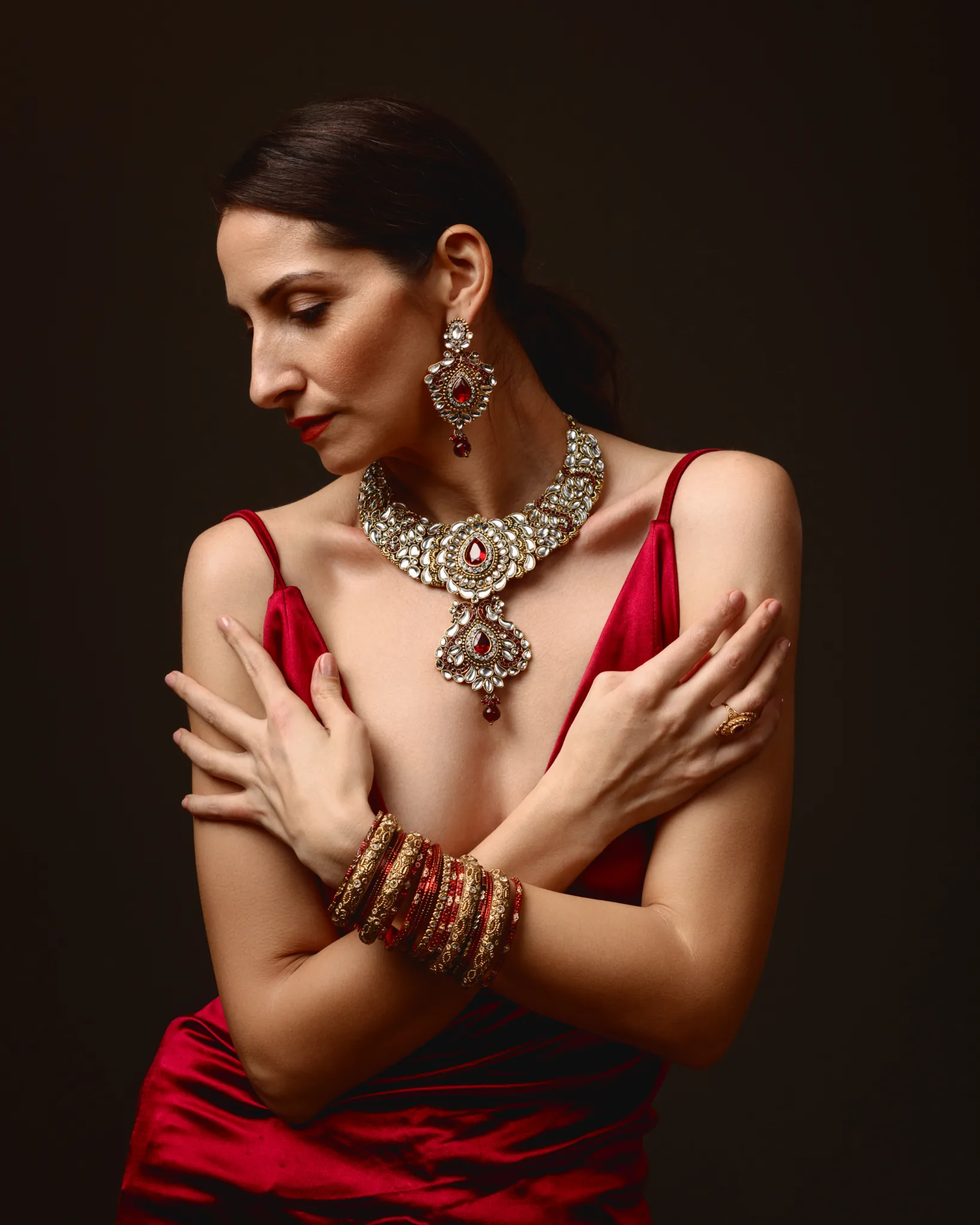
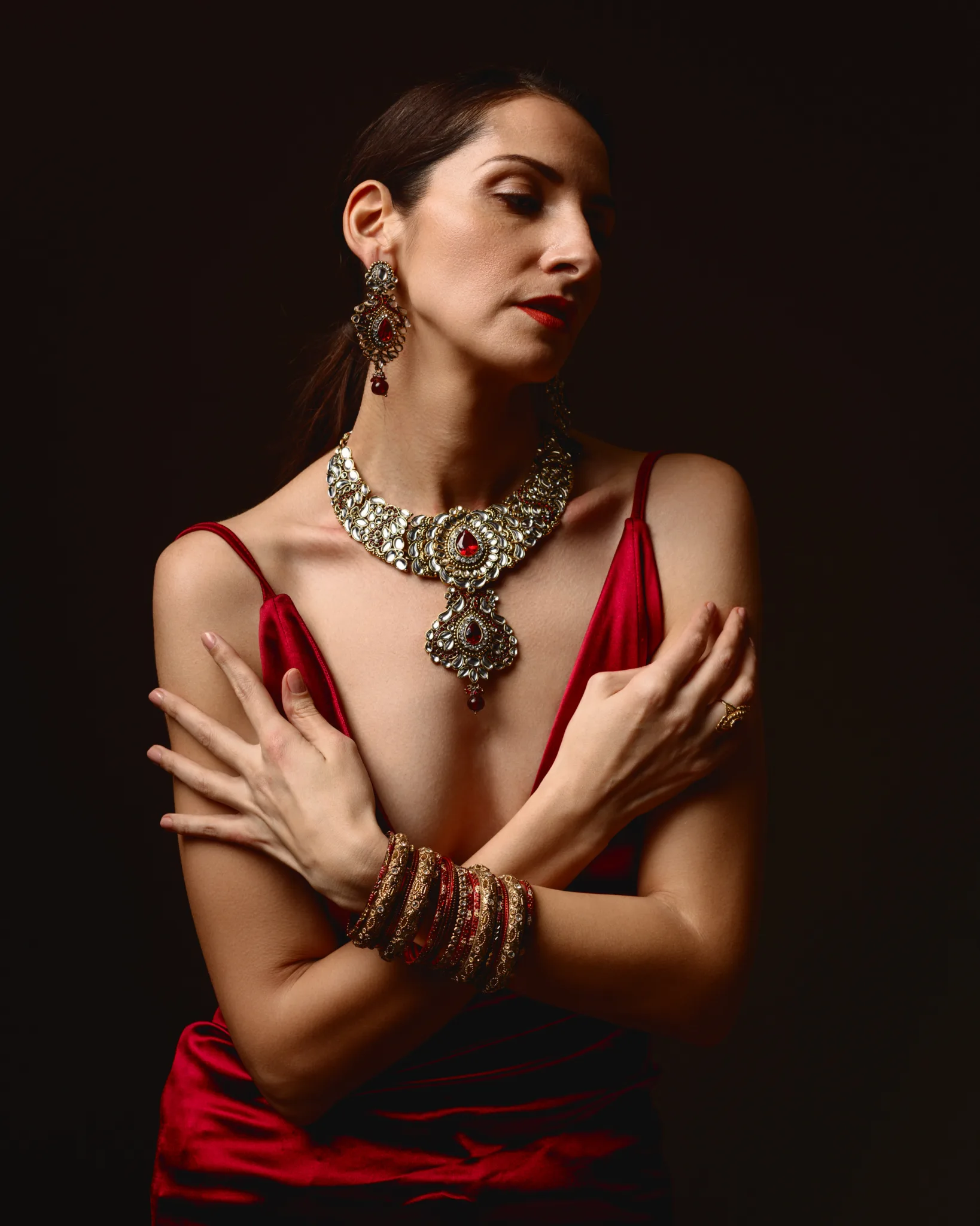
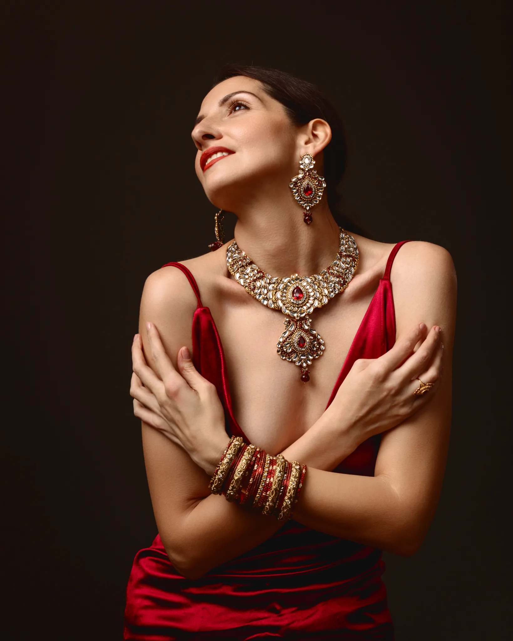
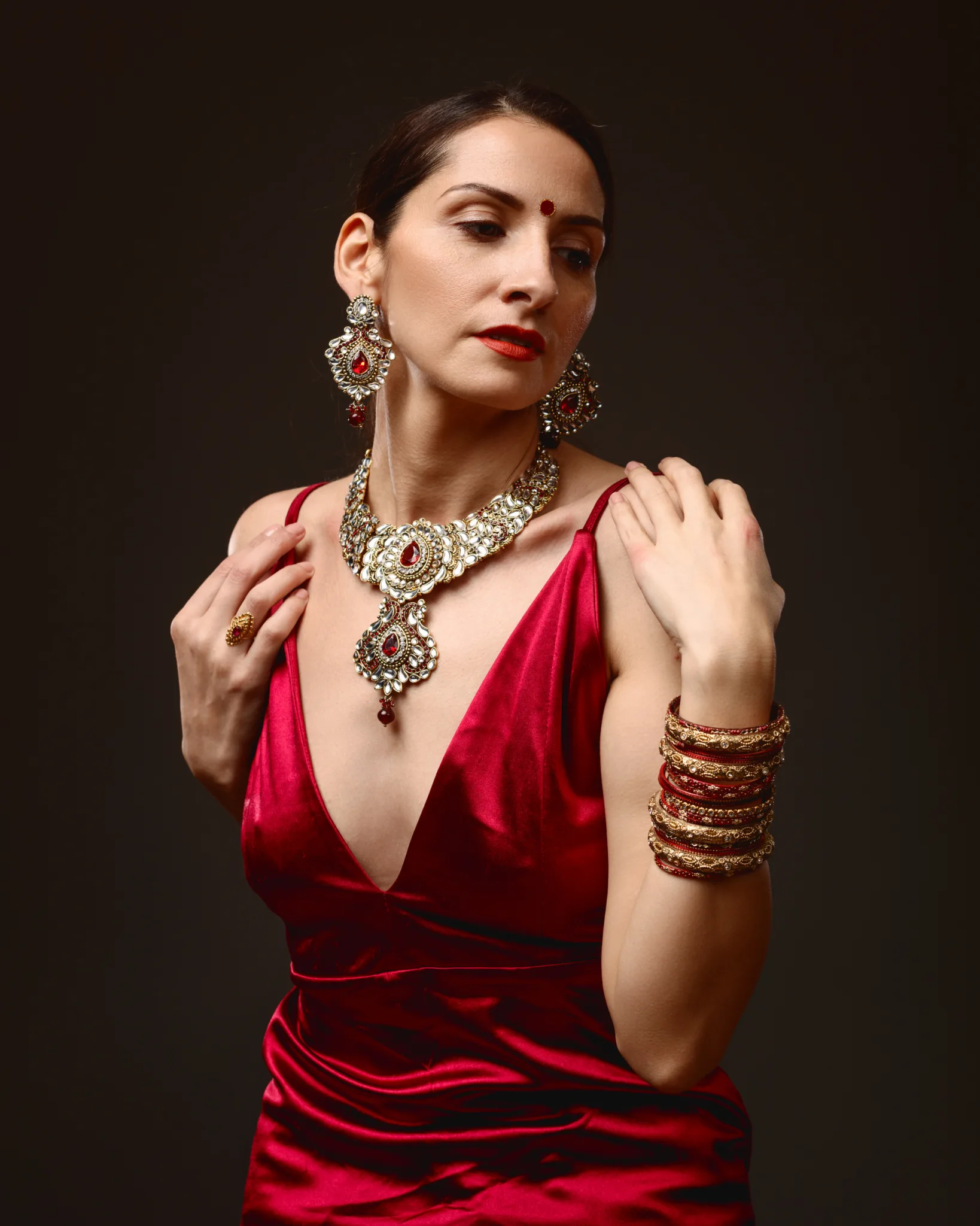
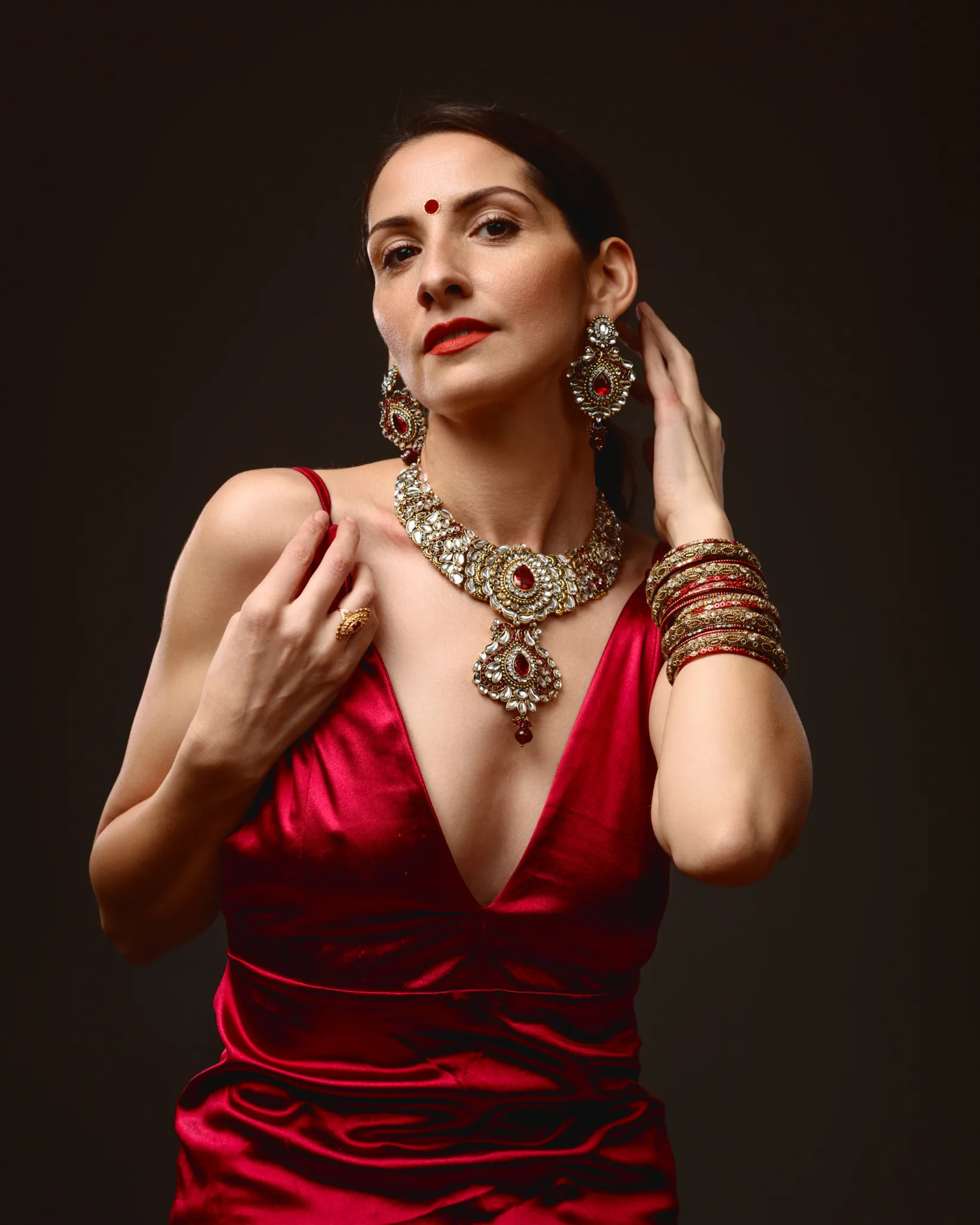
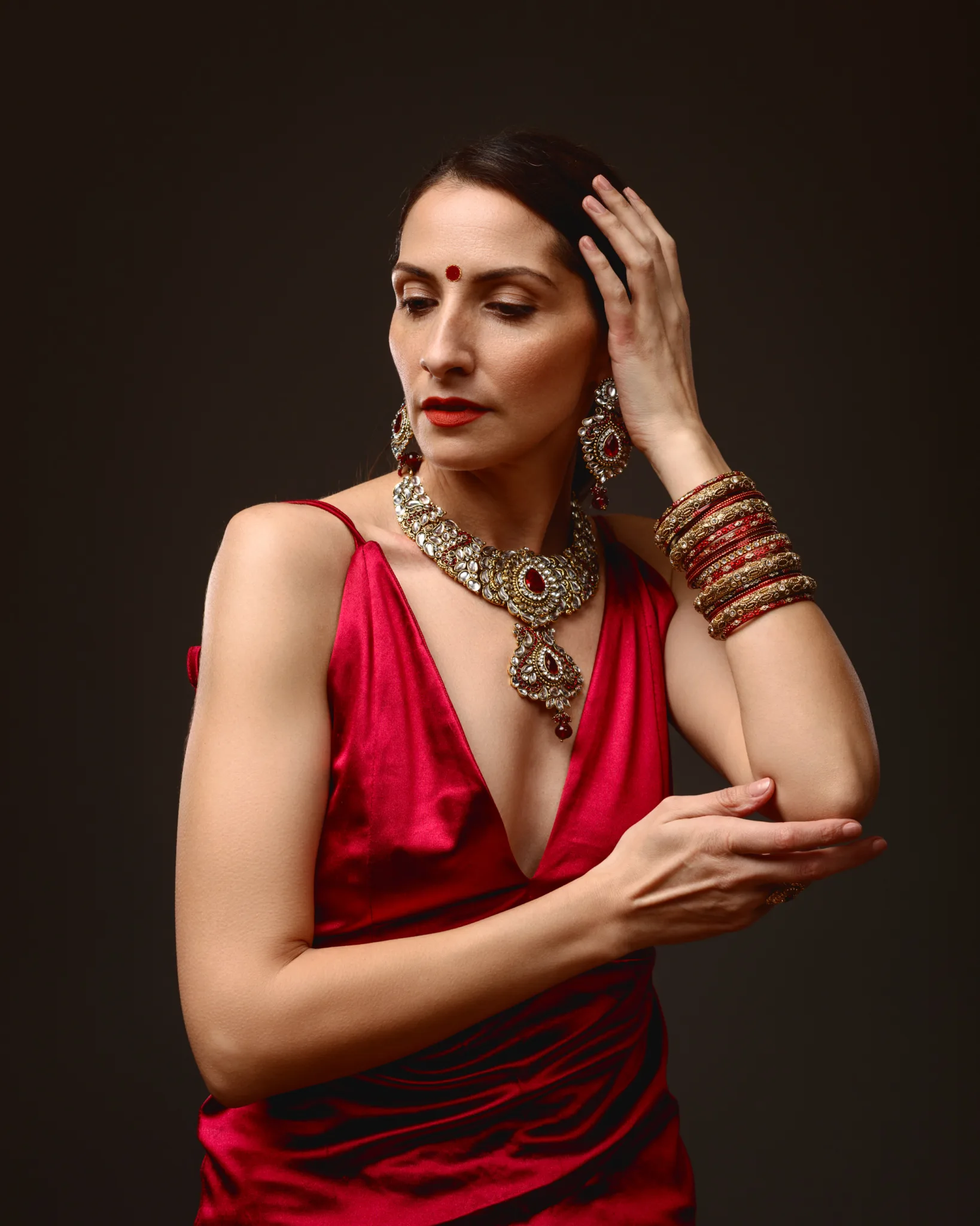
The second look kept the jewellery language, but changed the atmosphere. Margita switched into a deep red satin dress, with a clean slip silhouette and a sharp V neckline.
Satin is unforgiving if you light it lazily. It can turn patchy and chaotic. With controlled light, it becomes cinematic. The highlights roll in a way that suggests luxury without overdoing it.
This is where the stacked bangles mattered. They add rhythm and texture to the hands and wrists. They also change how you pose. Once bangles enter the frame, your hand placement has to become more deliberate. A wrist twist can bring bangles to life. A small lift can catch the highlight and pattern.
I kept the posing elegant and contained. I wanted the jewellery to lead, not the gesture. Margita’s calm expression helped with that. It kept the images poised, rather than theatrical.
Look Three: layered strands, warm orange beads, and a paisley pendant over a black roll neck
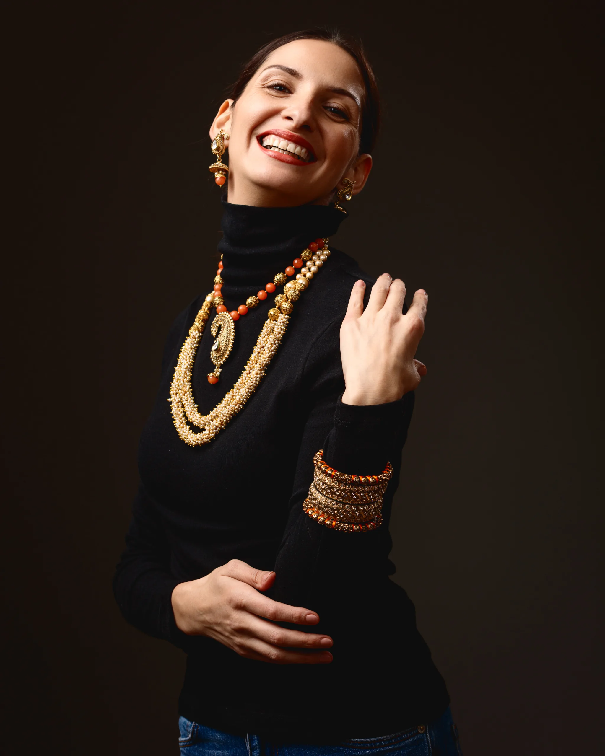
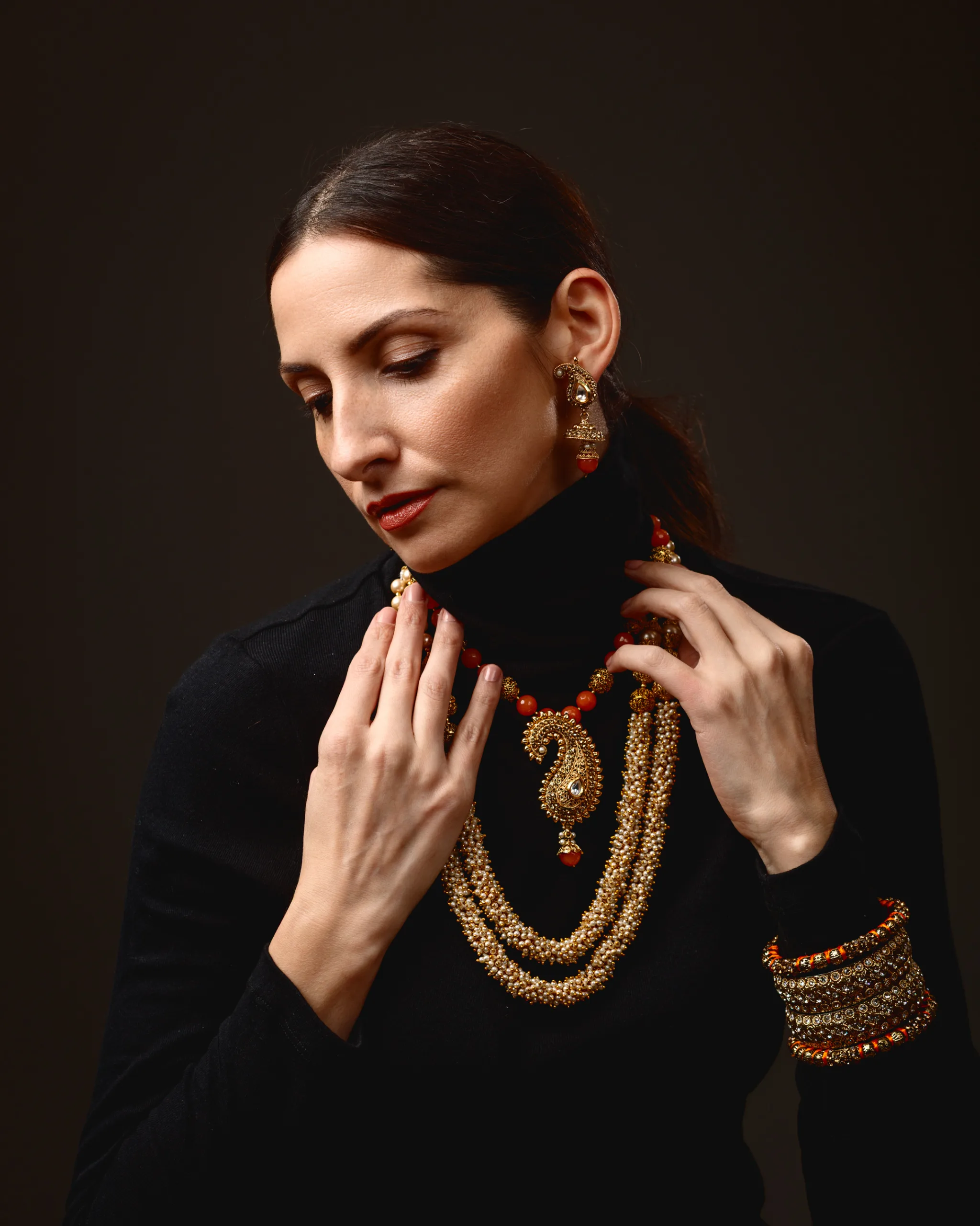
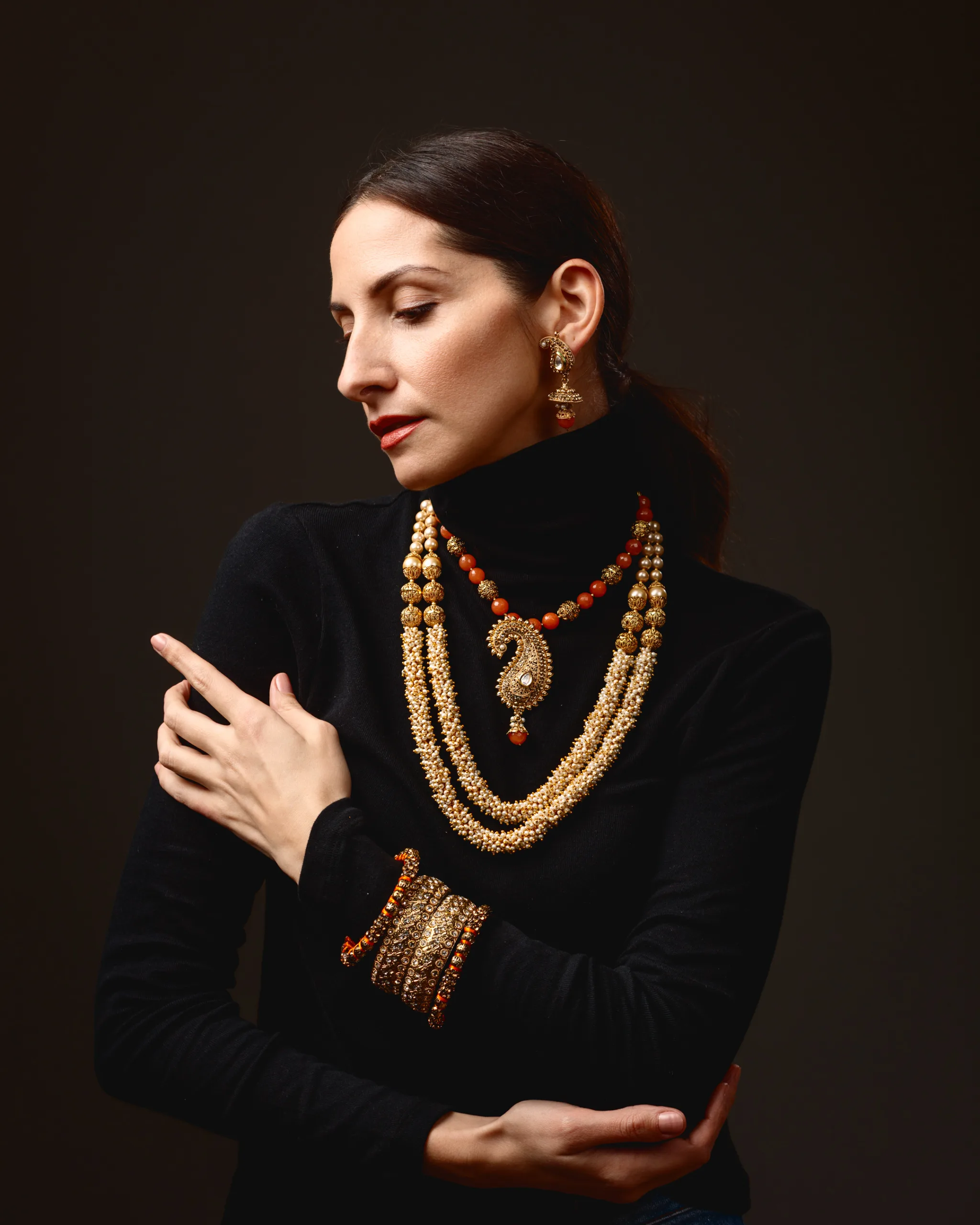
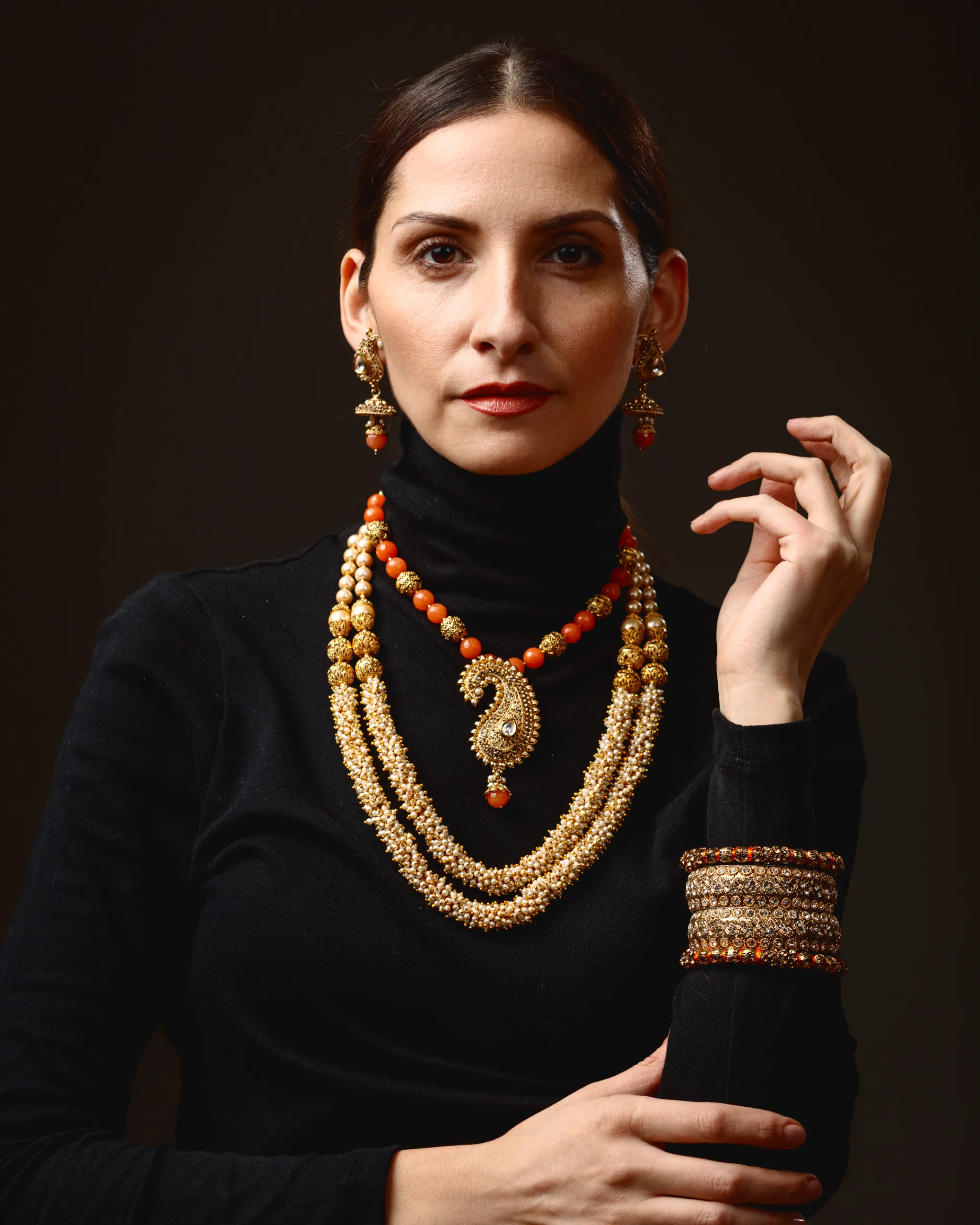
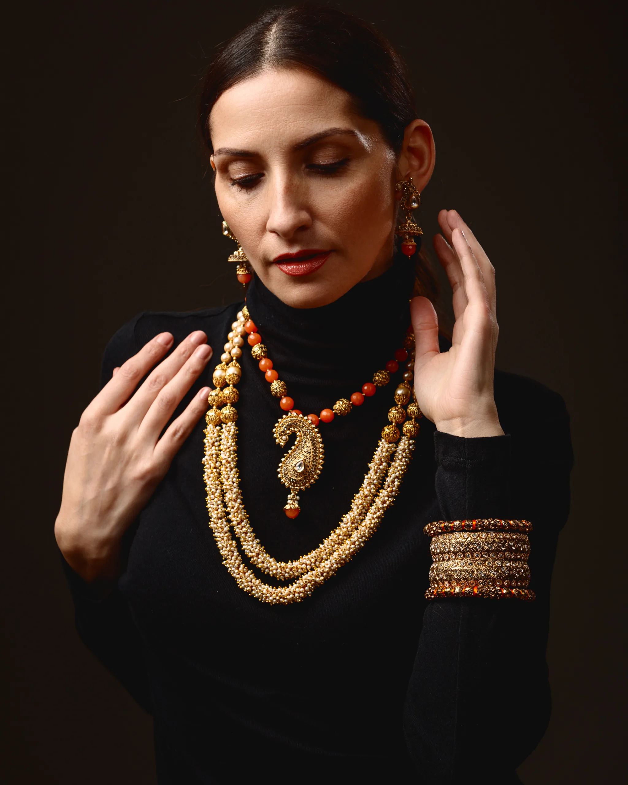
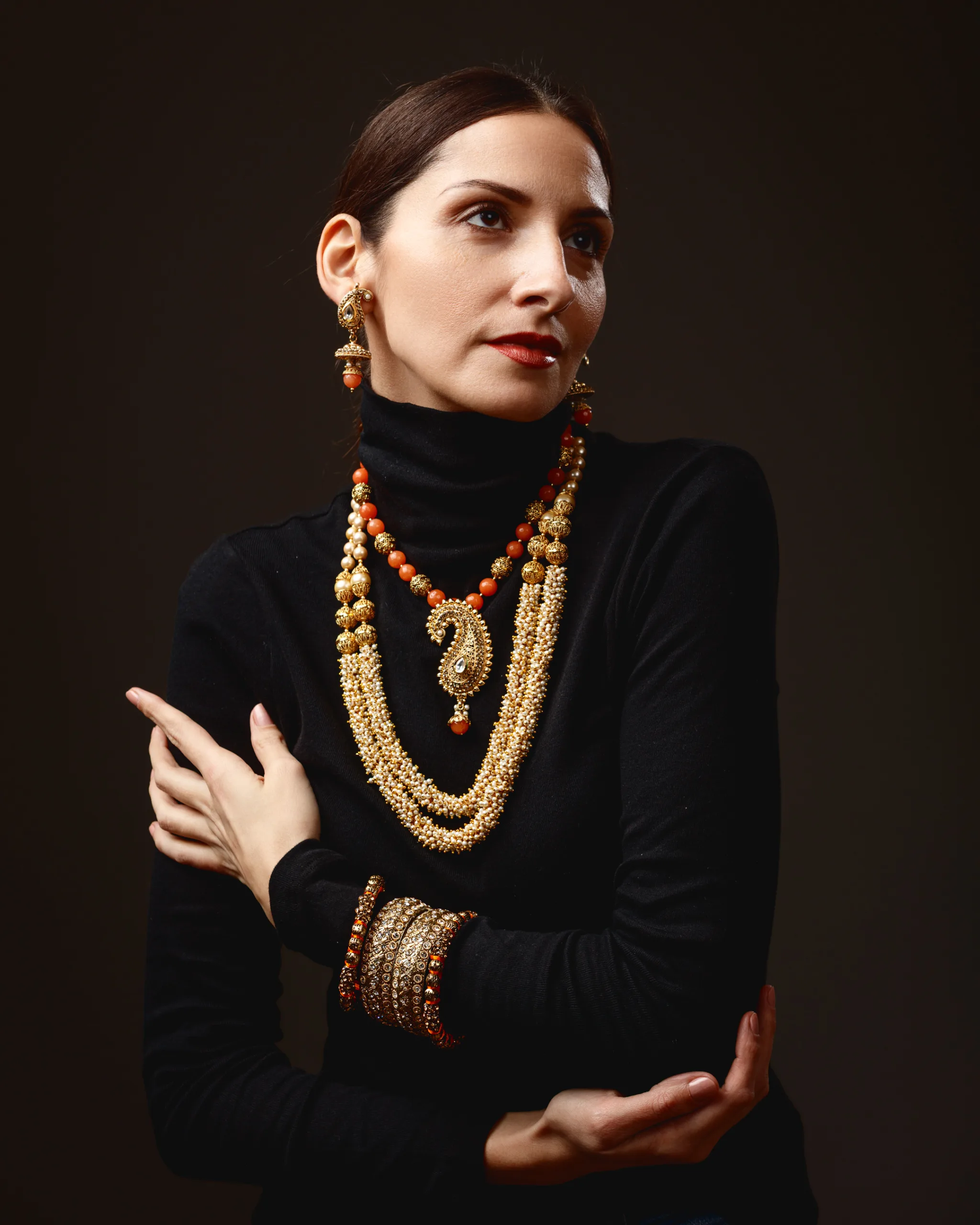
The third look pivoted away from sparkle and into texture. Margita wore a fitted black roll neck. That choice creates a clean stage for layered jewellery. It also shifts the mood at once. The look becomes quieter, more heritage-led, and more about drape.
The layered necklace arrangement reads like a mala-inspired styling approach, in the sense that it uses multiple strands and a central pendant to create depth and rhythm. I am using “mala” here in a general descriptive way, not as a claim about religious use or specific tradition.
The strands include pearl-like beads and warm orange beads, separated by gold-toned elements. The central pendant uses a paisley form. In South Asian design, the paisley, also referred to as the mango motif in some contexts, is widely used across textiles, jewellery, and decorative art. It carries long-standing associations with abundance and auspiciousness, but meanings can vary by region and context.
If you want a museum-grounded overview of the paisley motif and its broader design history, the V&A’s general pattern and textile resources are a sensible place to begin:
https://www.vam.ac.uk/articles/paisley-pattern
The earrings in this look read as small jhumka-style drops. Jhumkas are an enduring silhouette in South Asian jewellery, often defined by a bell-shaped form and a tiered structure. Again, I cannot confirm provenance from an image. I can describe the shape and why it reads as jhumka-adjacent.
A useful, visual reference point for Indian jewellery forms and historical context can be found through the V&A’s South Asia collections:
https://www.vam.ac.uk/collections/south-asia
Look Four: the layered set, but on skin, with a sleeveless black dress
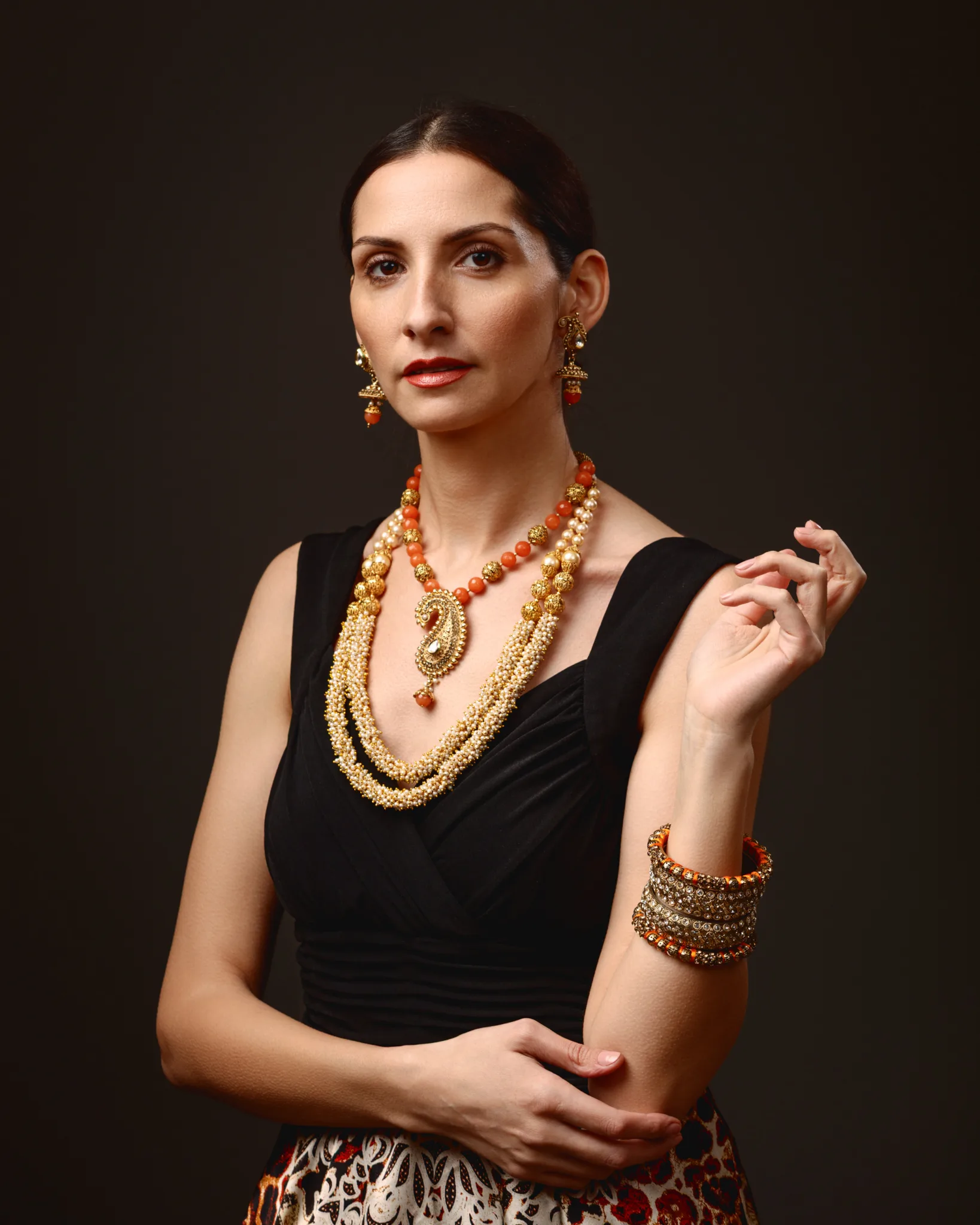
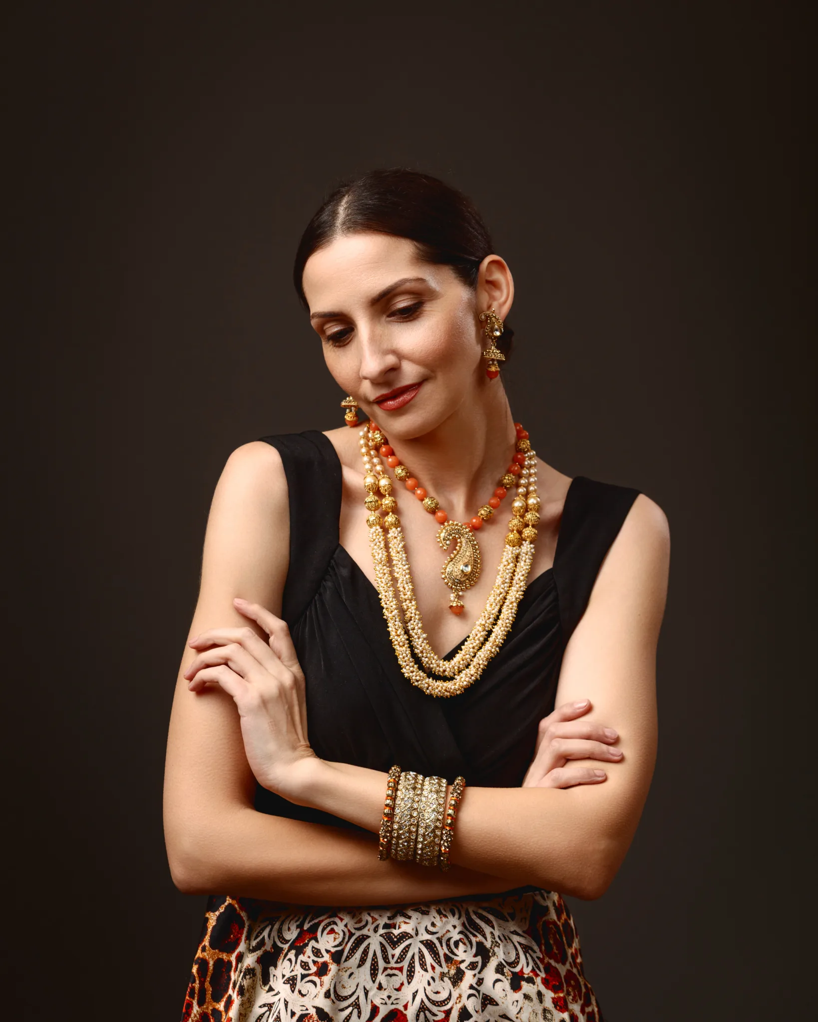
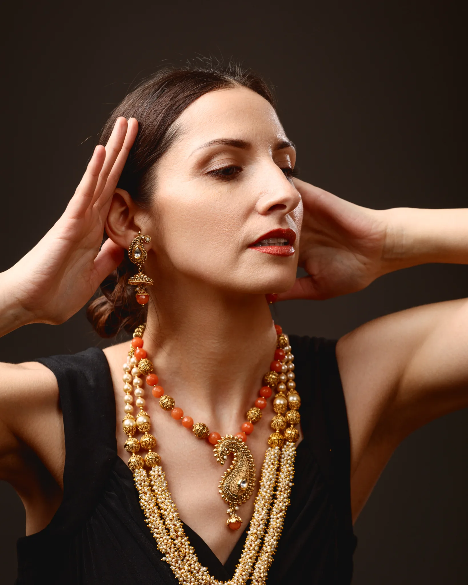
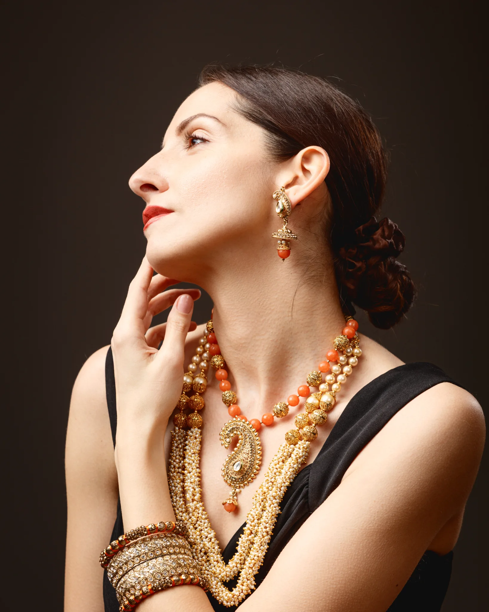
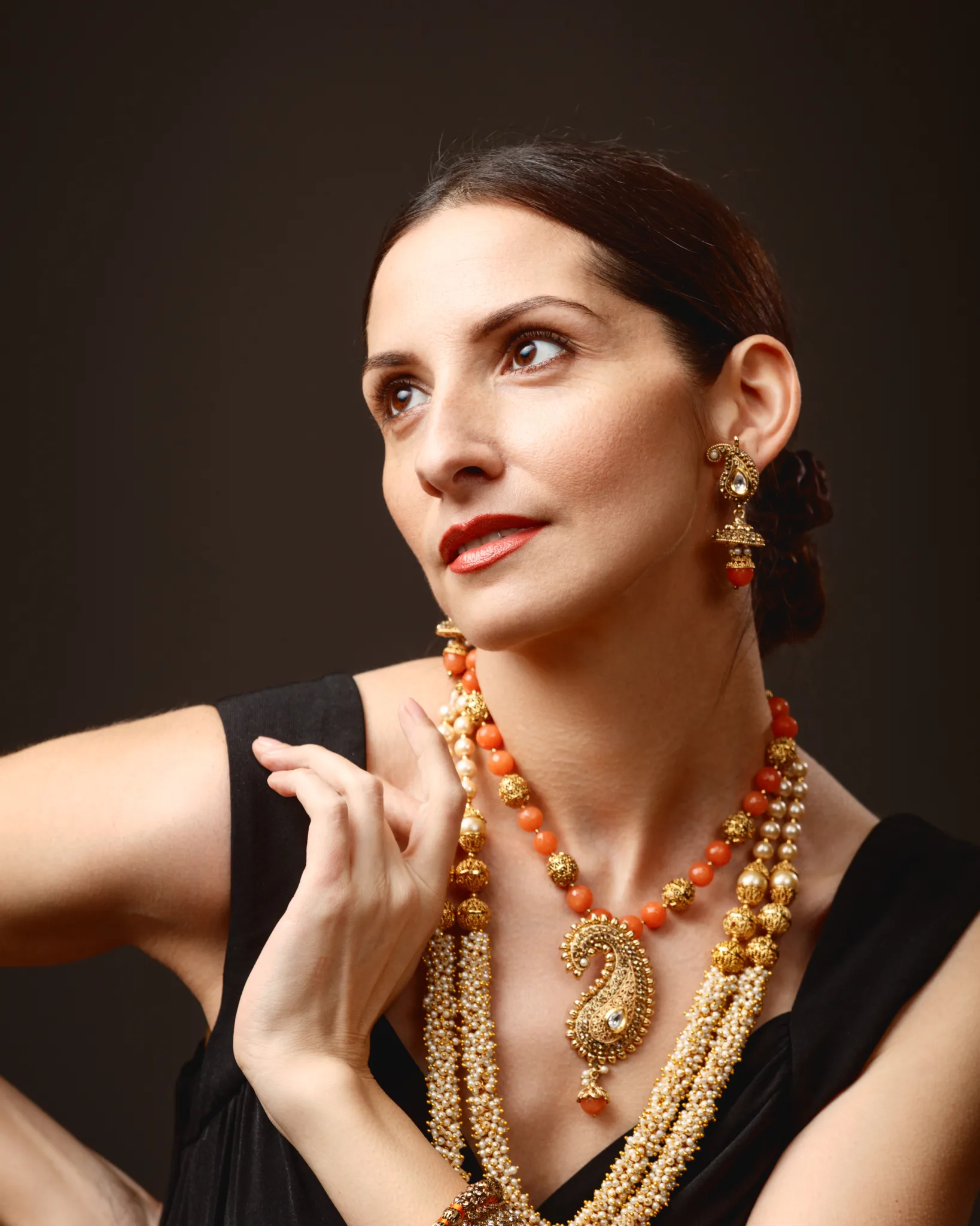
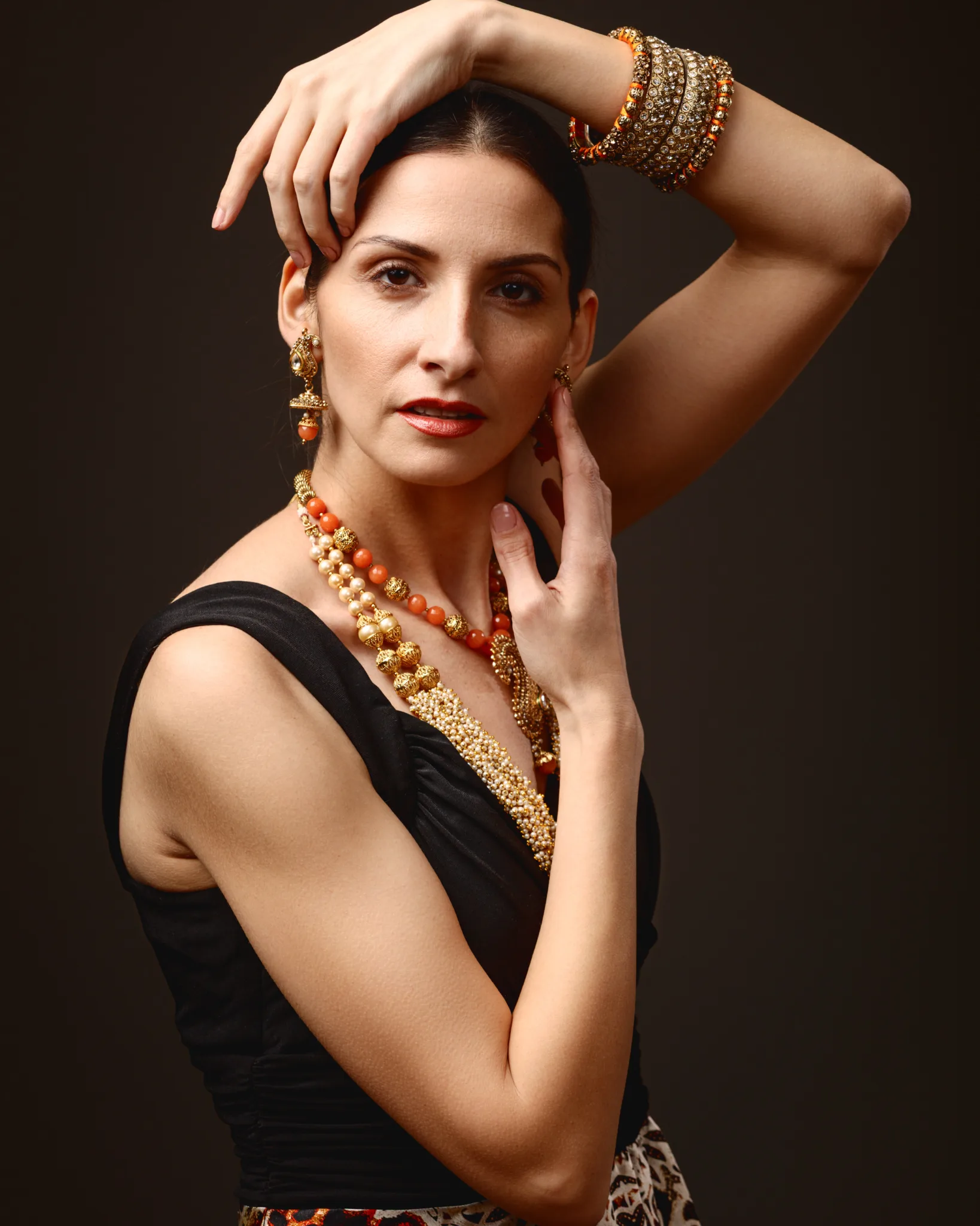
Look Four evolved the previous styling rather than replacing it. Margita swapped the roll neck for a sleeveless black dress. That simple change opened the neck and shoulders.
The jewellery now sat on skin, not fabric. That changes everything. The strands feel softer. The drape reads more naturally. The bangles also become more prominent because the arms are bare.
This set became more sculptural in pose language. I leaned into hand placement, wrist curves, and clean negative space. When jewellery has curved forms, you can echo those curves in the body. It creates visual harmony.
The portraits in this look sit in a sweet spot. They feel fashion-forward, but they stay respectful. Nothing reads like costume. Nothing reads like parody. It is simply traditional design language styled in a clean, modern portrait setting.
Look Five: modern fashion portraiture with a structured Michael Kors handbag
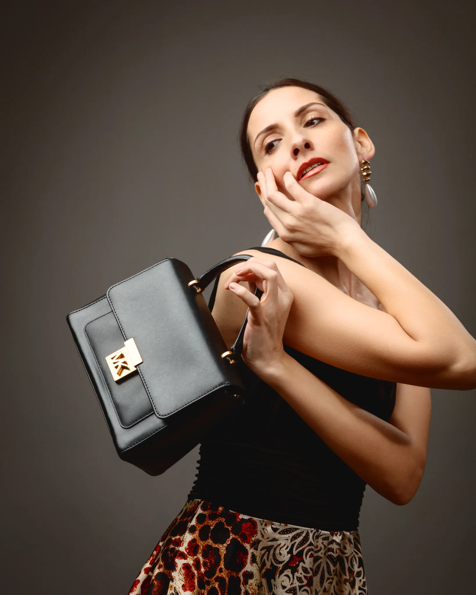
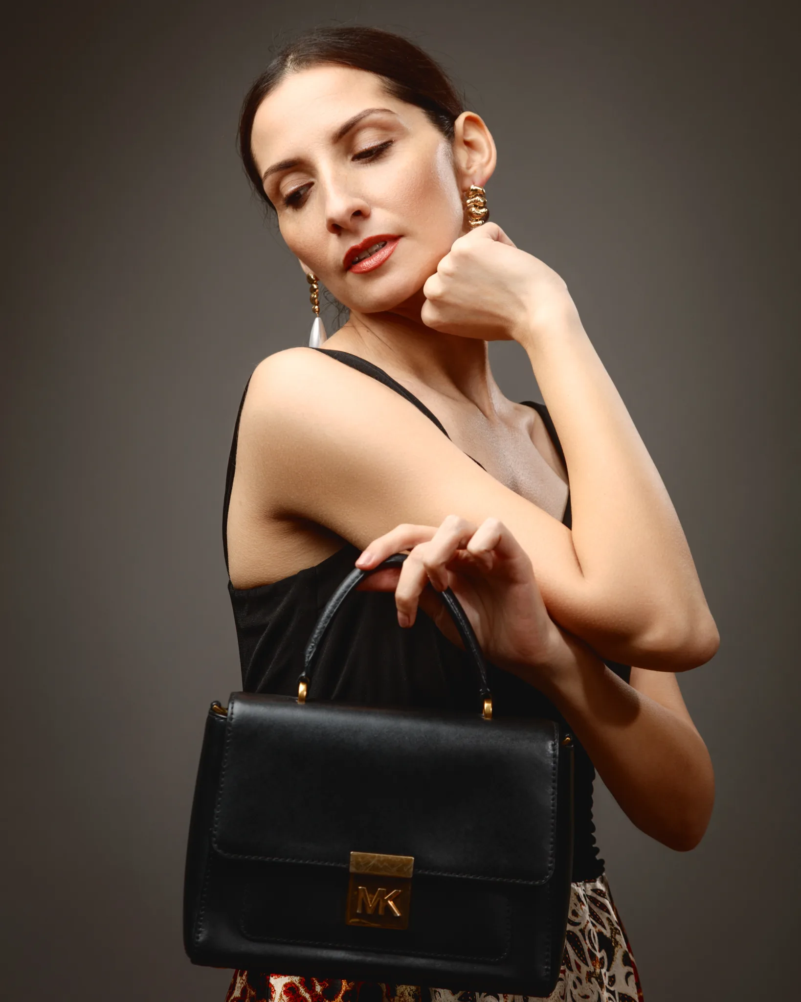
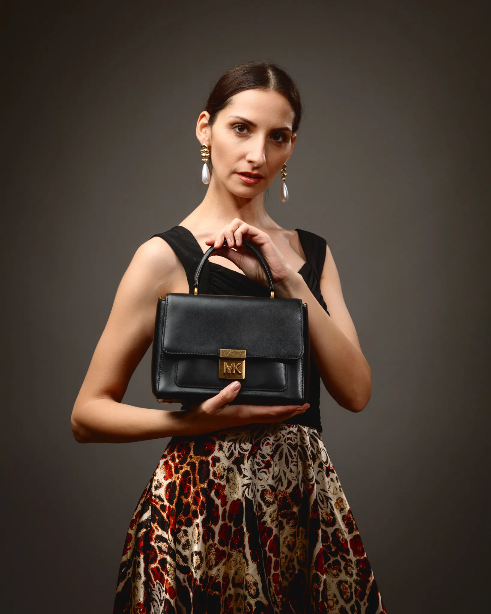
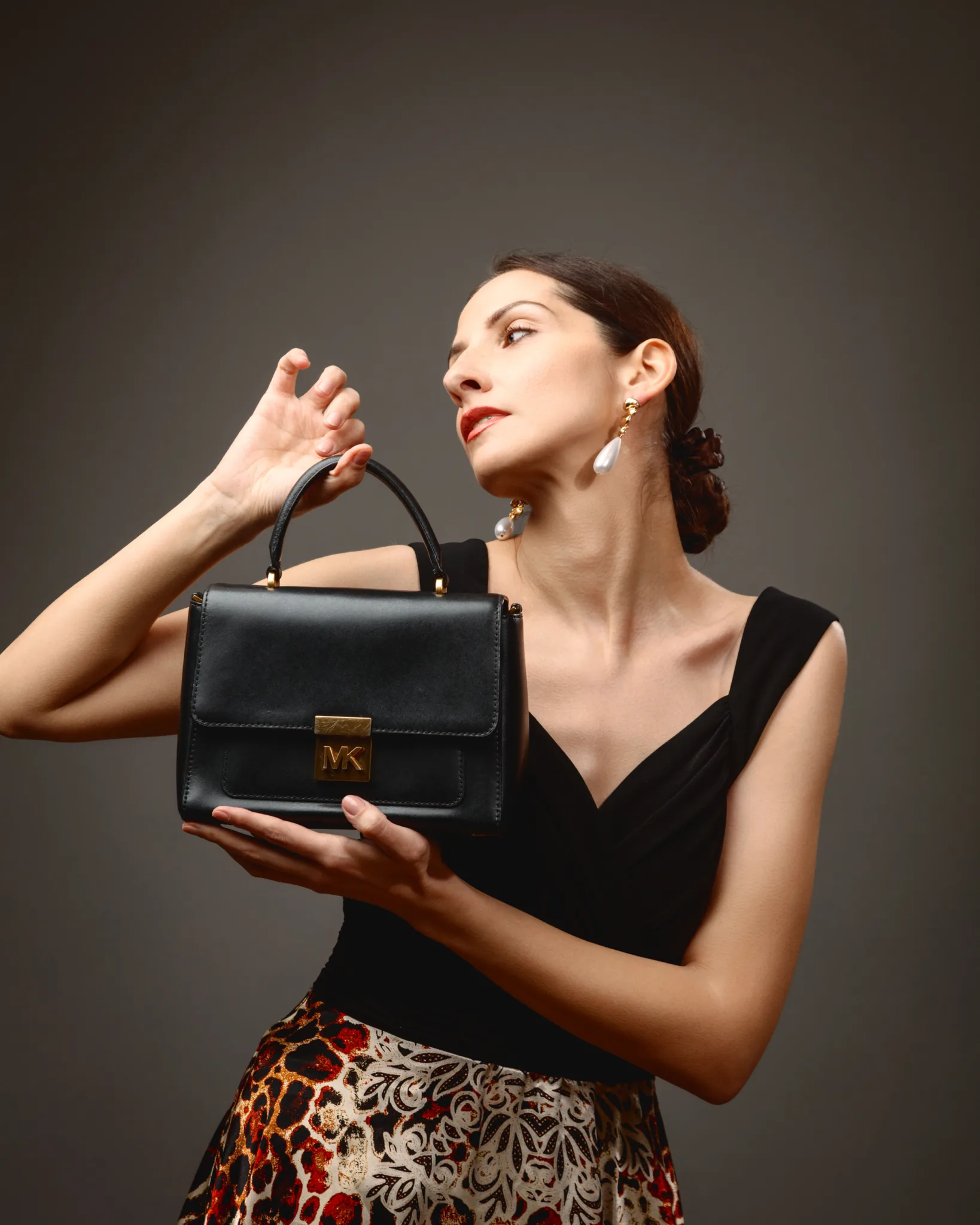
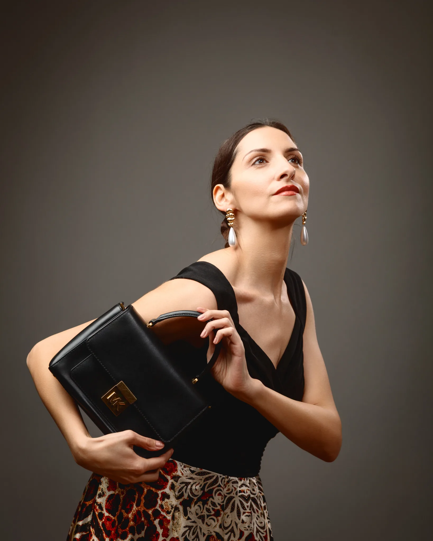
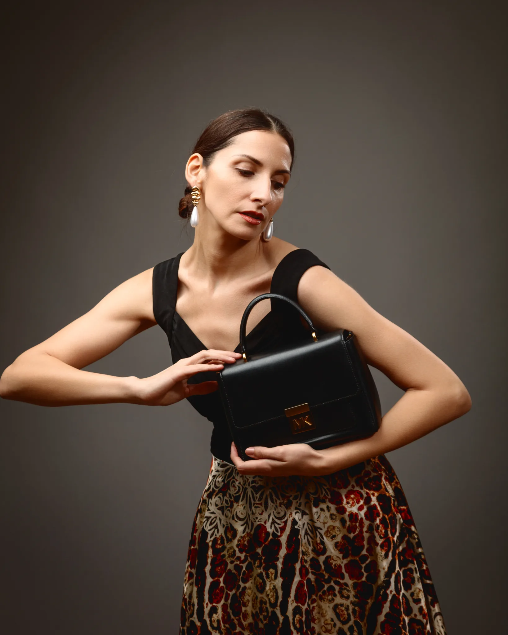
The fifth look moved fully into contemporary fashion, with the handbag as the hero prop. Margita wore a sleeveless black V-neck top, paired with a high-waisted animal-print skirt. The outfit gives a strong base, but keeps the upper frame uncluttered.
The structured black leather top-handle bag, with gold-toned hardware and the MK plaque, became the anchor. In this kind of prop-led portrait, the posing has to treat the bag like a product. It cannot be an afterthought.
So I designed the hand positions to present the bag clearly. I kept fingers relaxed but intentional. I also changed the bag angle across frames, so it read differently in each image. That turns a simple prop into a story device.
The statement drop earrings added polish near the jawline. They also helped the images feel styled, not casual.
This is a good example of how fashion portraiture and product thinking overlap. You are still photographing a person, but you are also managing object presentation, brand cues, and visual hierarchy.
Look Six: sharp black tailoring, movement, and burgundy loafers by Dune London
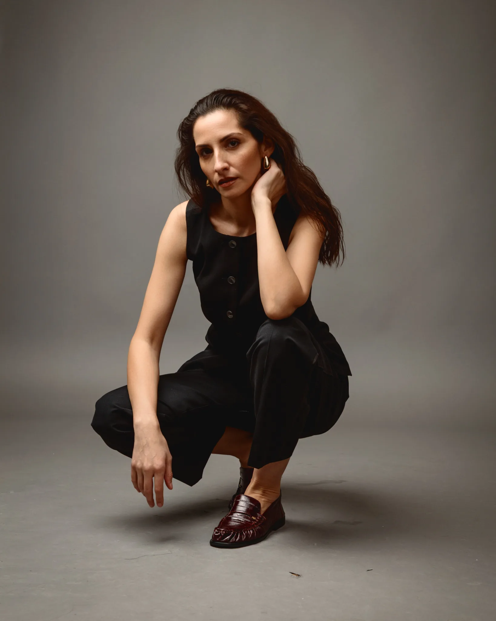
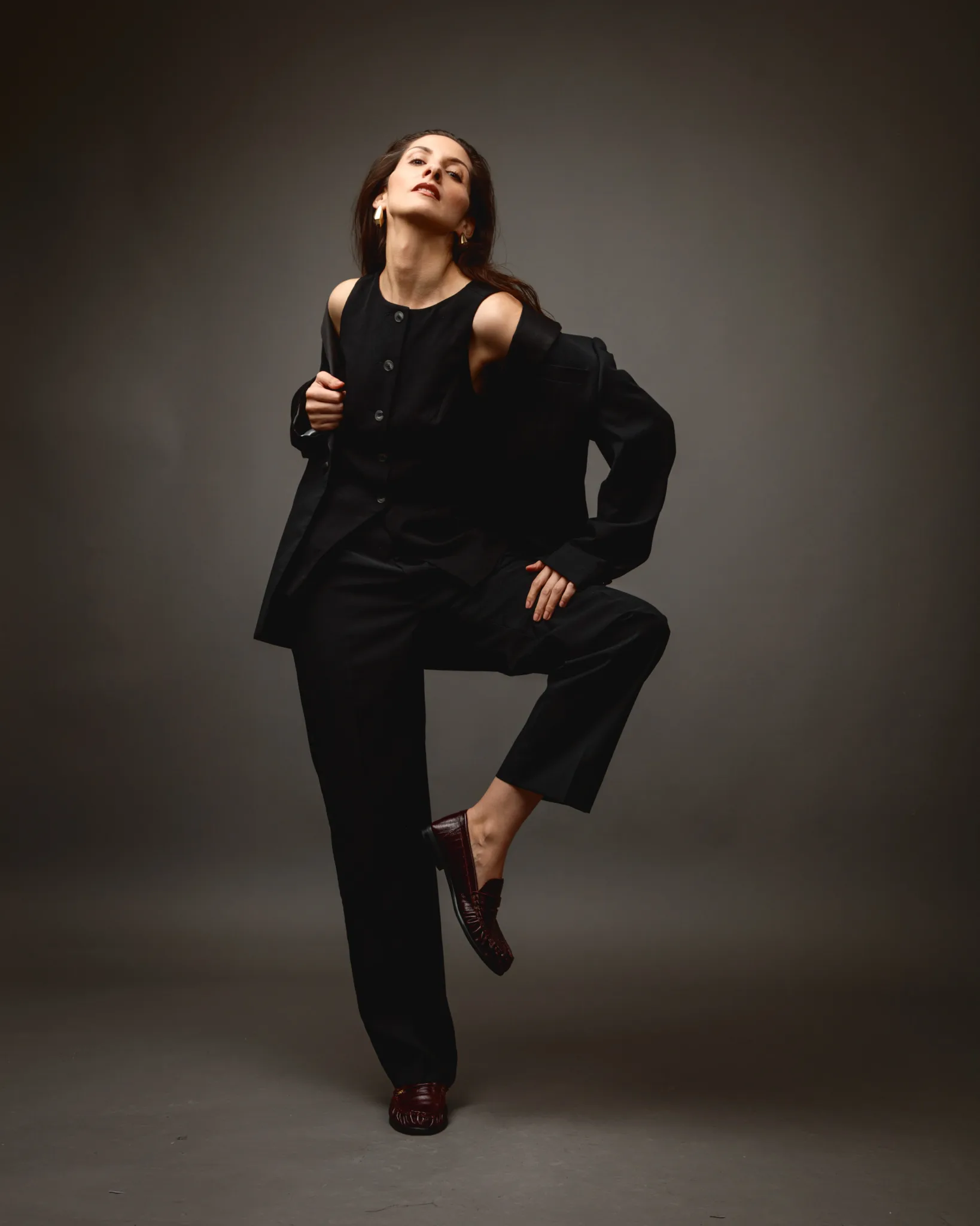
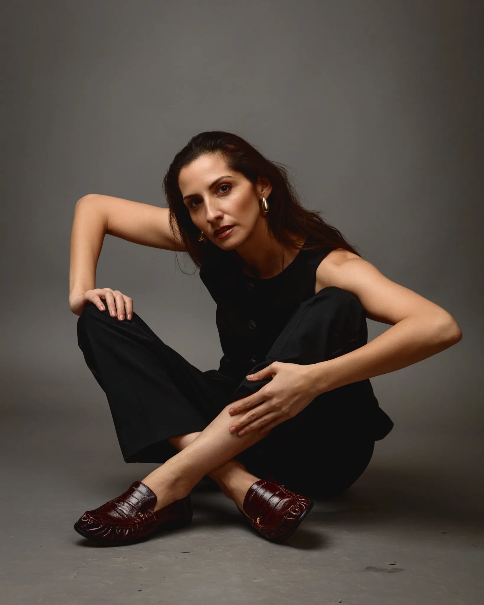
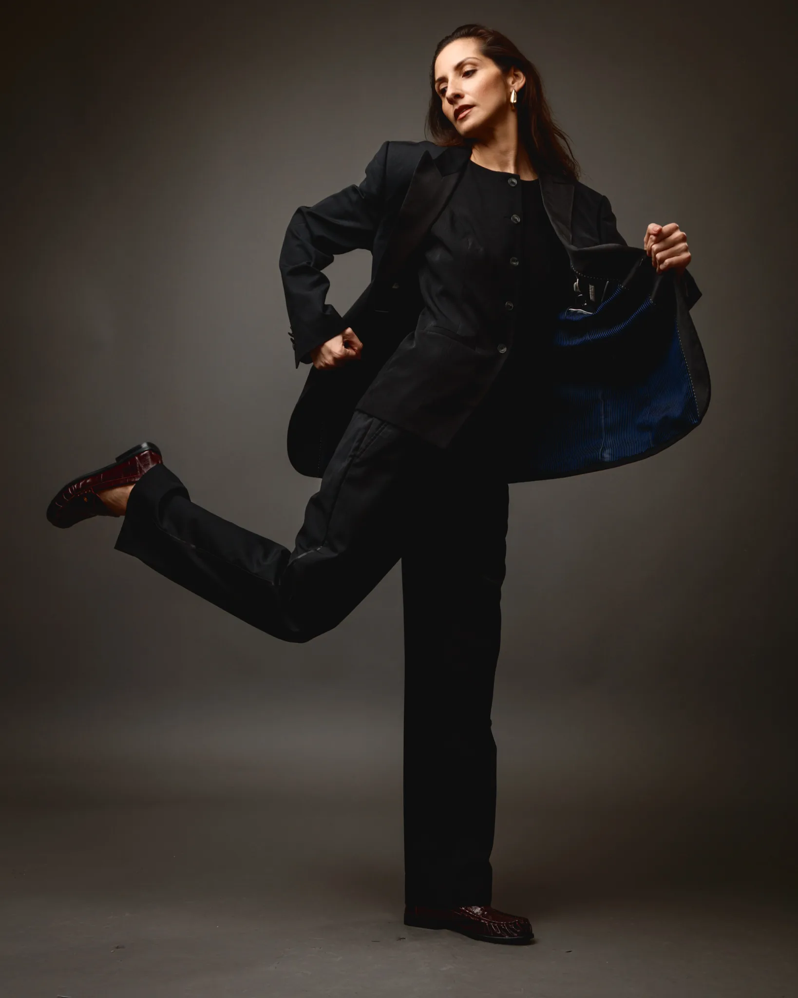
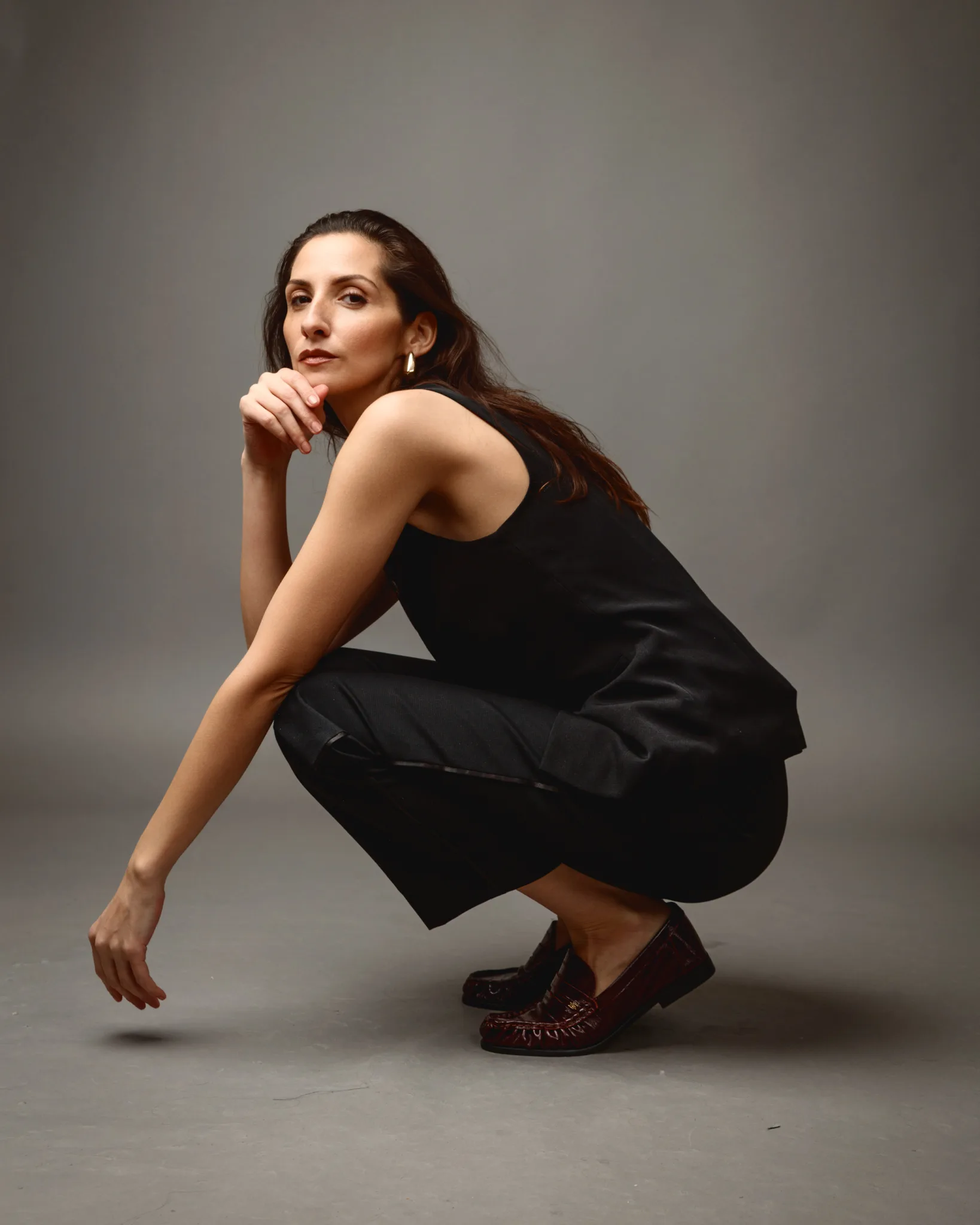
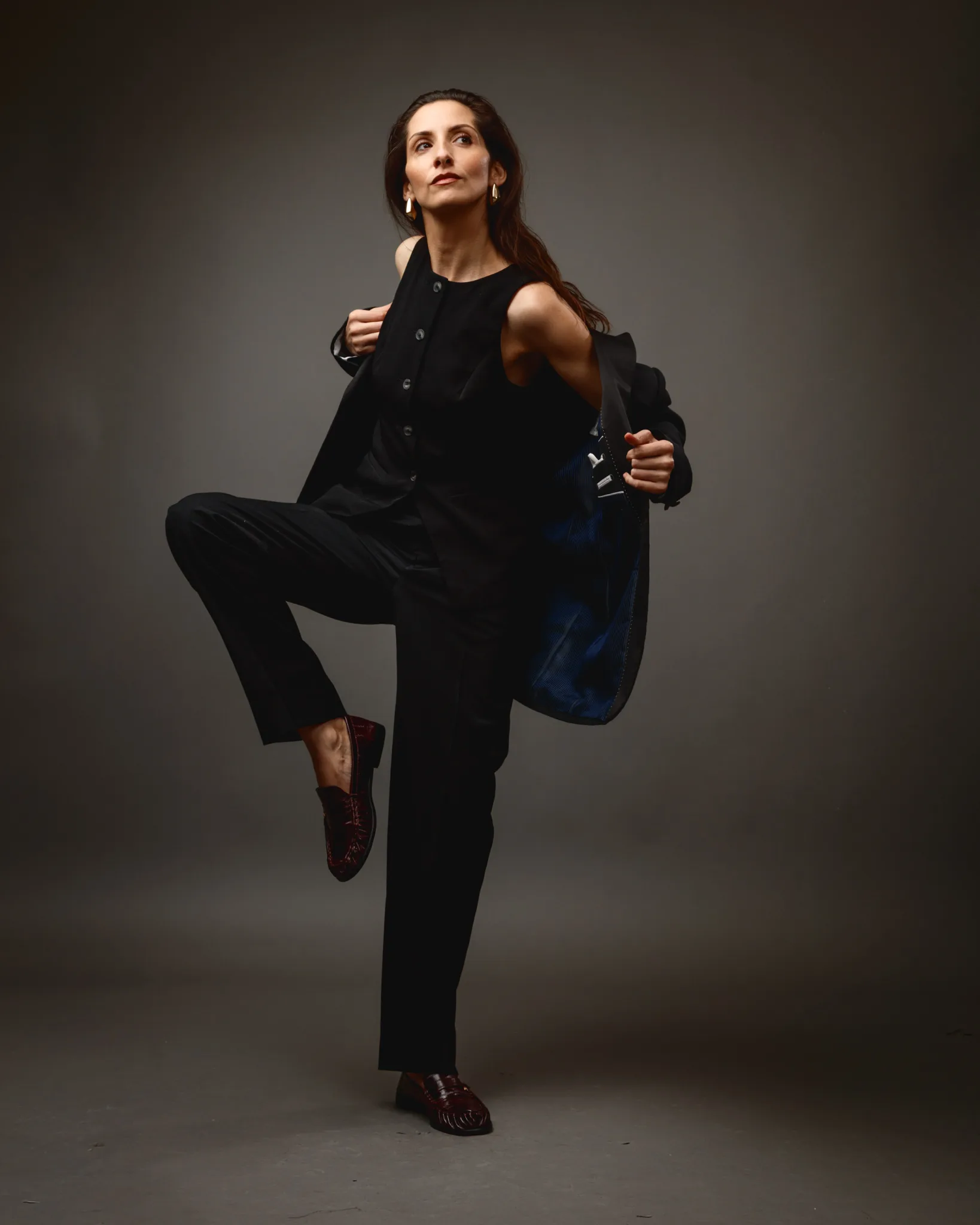
The final look completed the shoot with modern tailoring and stronger movement. Margita wore black tailored layers that shifted between blazer-on and a sleeveless waistcoat-style configuration. That lets us play with silhouette. It also lets us change the mood without changing the palette.
The burgundy loafers by @dune_london were a smart detail. Black tailoring can become visually flat if every element sits in the same tonal band. A deep burgundy shoe breaks that block subtly. It keeps the look grounded, but adds a considered styling note.
This set relied on posing as the main narrative device. I used dynamic standing shapes, controlled imbalance, and a grounded crouched sequence. These moves create fashion energy without chaos. You still see clean lines. You still see deliberate structure.
Margita also wore her hair down in this set, which softened the tailoring. That balance matters. Tailoring can feel severe if everything is hard-edged. Hair movement gives the frame a touch of life.
Why I like six-look shoots for fashion portrait work
A multi-look session forces you to think in chapters. It also forces you to keep a visual language consistent. That discipline improves the final set.
It also helps a model. You do not just deliver variety. You deliver range with cohesion. That matters for portfolios, because it shows adaptability without losing identity.
From a practical perspective, it also makes posing easier. Once you lock in the lighting and camera position, you can focus on expression and gesture. You stop chasing the setup. You start refining the performance.
Notes on posing: what made this shoot feel polished
Margita’s posing carried the session. She gave me a strong posture and clean lines. She also understood that small changes matter more than big ones.
Here are the key things I looked for, and guided where needed:
- Long neck lines, with the chin placed deliberately, not lifted randomly.
- Hands with purpose, either framing jewellery or presenting a prop.
- Wrists kept soft, not rigid, especially in bangle looks.
- Shoulder placement that supported the neckline of each outfit.
- Expression shifts that matched styling changes, without becoming dramatic.
Fashion portraiture often fails on its hands. Hands can look tense, or lost, or overly posed. In this session, the hands stayed intentional. That is why the images read editorial.
A brief note on cultural references and respectful styling
When I describe jewellery with cultural roots, I try to stay careful. Photographs can show form, motif, and styling language. They cannot confirm materials, makers, or origin.
So I describe what I can see, and why it reads the way it does. I avoid claiming exact regions, gemstone types, or religious meanings. Those details require confirmation from the owner or maker.
If you are interested in a broader background on Indian jewellery traditions, museum collections provide a useful context without social media noise. The V&A South Asia collections are a sensible starting point:
https://www.vam.ac.uk/collections/south-asia
Closing thoughts
This shoot with Margita reads as a coherent progression, from jewellery-led portraits with cultural resonance through to contemporary fashion storytelling and modern tailoring. Each look feels distinct. The set still hangs together because the background, light, and portrait approach stayed consistent.
For me, that is the balance I always want. Variety that still feels like one body of work.