This was the third set in my product photography test series, built around everyday, recognisable brands. I’m enjoying making these triptychs because they keep me focused on what matters in commercial work: clean control, repeatable lighting, and images that sit together as a proper set.
Colman’s Mustard is a deceptively good subject. It’s a simple glass jar, but it brings a mix of challenges that show up all the time in real client jobs: reflective glass, a glossy label, a lid with its own shine, and a bold colour palette that needs careful handling.
Why I chose Colman’s for this set
I like products that look straightforward but demand precision. A jar like this gives me four key things to practise:
- Glass reflections that can either look premium or messy
- Label legibility without glare across the branding
- Colour control so the yellow feels rich, not radioactive
- Consistency across a mini-series, not just one image
This shoot wasn’t about clever styling. It was about proving a repeatable technique.
The triptych idea and the shot list
I’ve settled into a pattern that works well for a lot of products, especially food packaging.
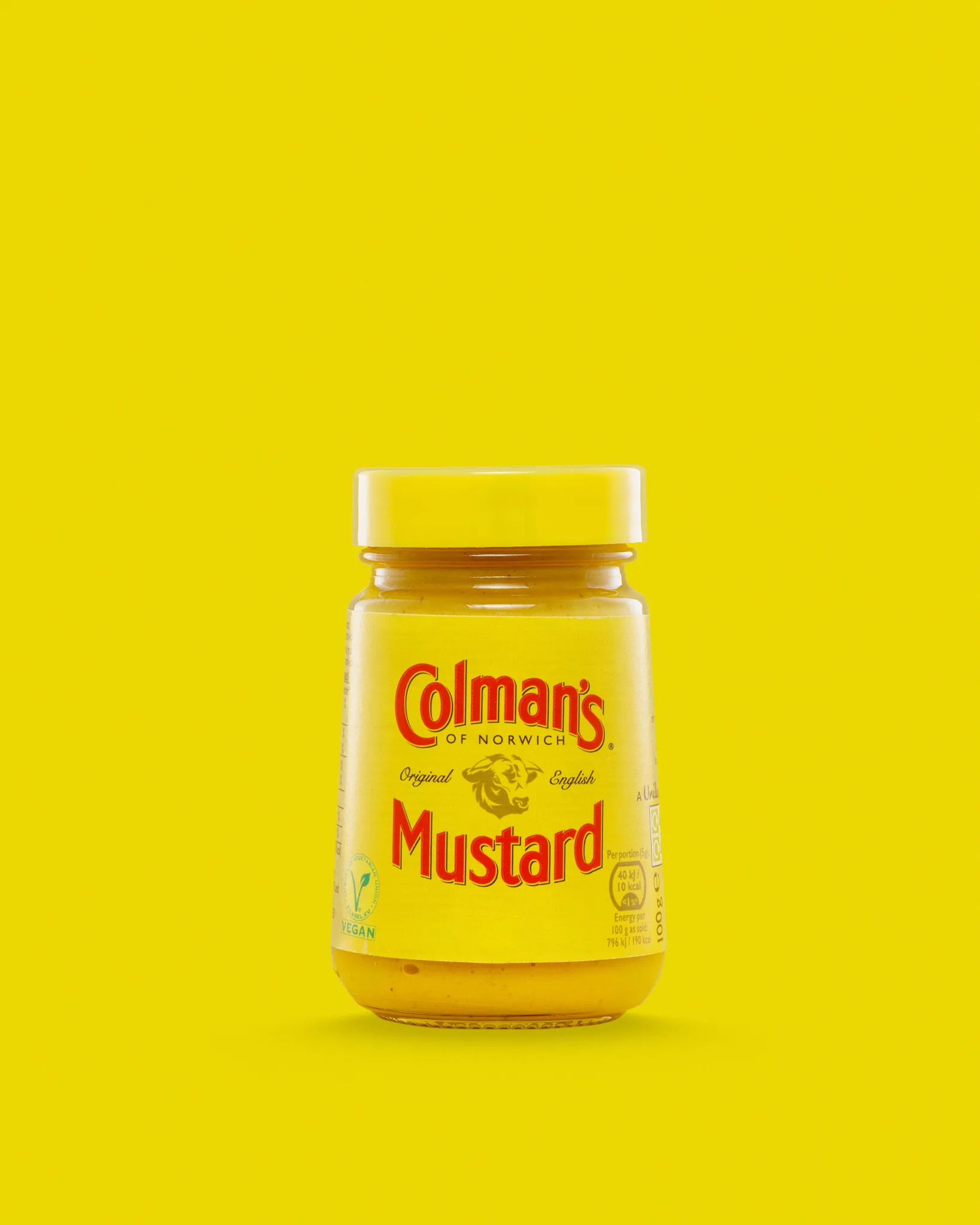
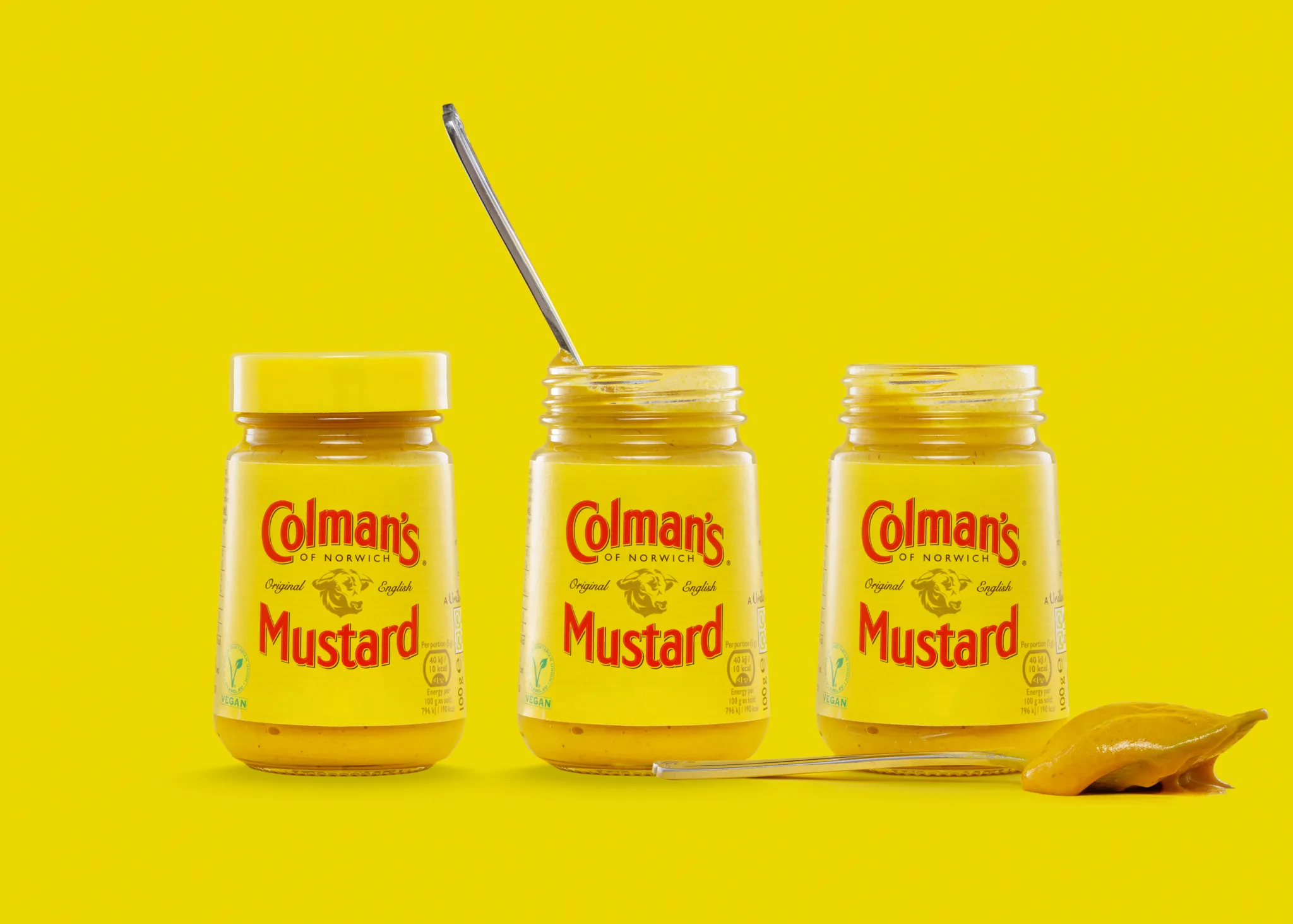
Frame 1: The hero packshot
Sealed jar, centred, clean label, generous negative space. This is the “trust” image. It’s the one that needs to be read instantly.
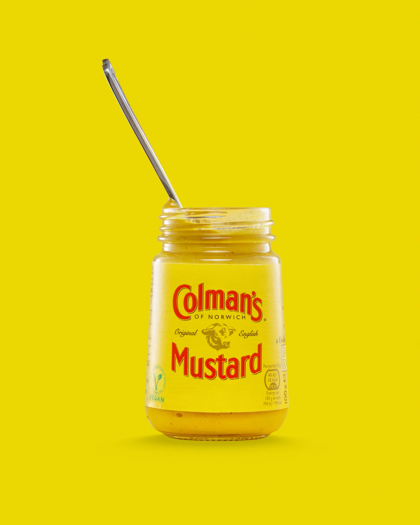
Frame 2: The open jar with a spoon
Open jar and a spoon gives a clear use cue. It suggests serving and texture without turning the image into lifestyle photography.
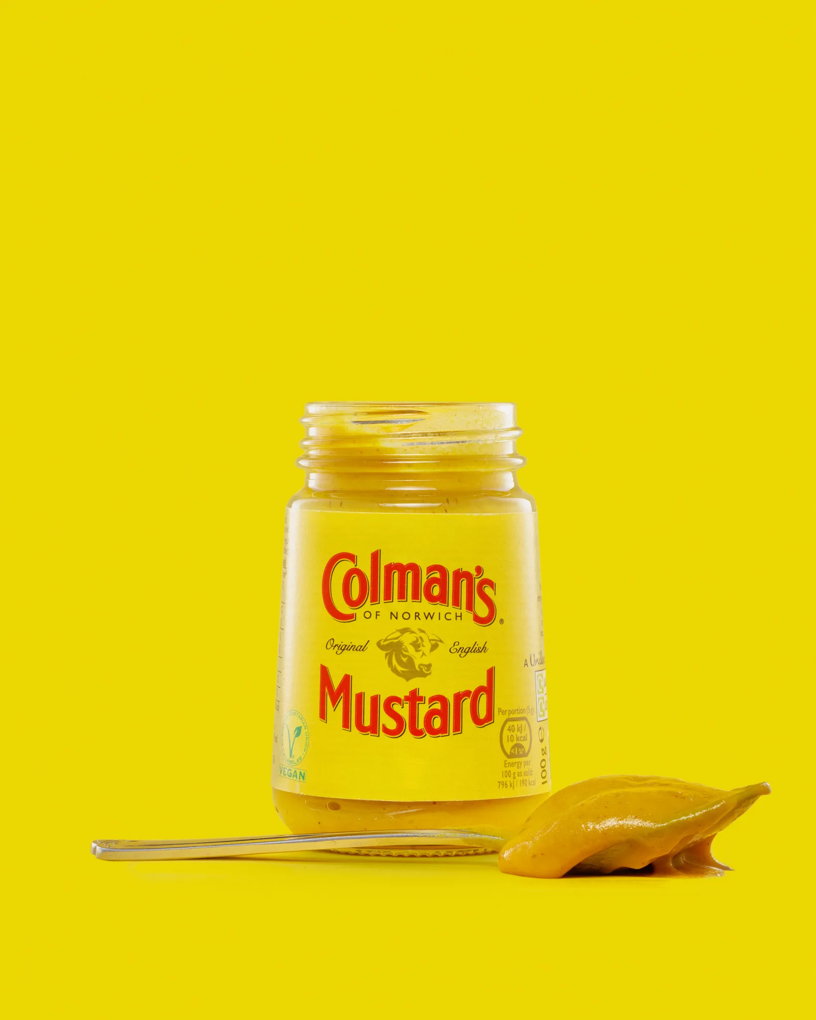
Frame 3: Texture and material
The mustard dollop is the point of this frame. It shows thickness, sheen, and colour in a way the label never can.
Bonus frame: The three-jar set
The group shot is useful as a “range” visual. It also lets me practise keeping multiple labels and reflections consistent in one frame.
Background and styling decisions
I chose a bold yellow background for a reason. It’s not a neutral, forgiving setup. It forces me to control exposure and gradients properly.
A few things I kept in mind:
- I wanted the background to feel clean and solid, not patchy or streaky
- I needed enough separation so the jar didn’t melt into the yellow
- I kept props minimal because every extra item adds reflections and shadows
The spoon and dollop were enough. Anything more starts to pull attention away from the packaging.
Lighting: how I kept the glass clean
With glass, the product is basically a mirror. You’re not lighting the jar so much as lighting what the jar reflects.
My priorities were:
- Smooth, deliberate highlights that describe the shape of the glass
- No harsh hotspots on the shoulder or lid
- A readable label with controlled specular shine
- Edge definition so the jar feels cut out cleanly against the background
Diffusion did most of the heavy lifting
I leaned on broad, soft sources so the reflections stayed smooth. Small, hard sources tend to create pin-prick highlights that look accidental.
Flags and negative fill mattered as much as lights
If you let light spill everywhere, the jar looks chaotic. Flags let me “edit” the reflections, keeping the bright parts where they help and removing them where they distract.
Negative fill helped bring back shape. On a bright background, that’s often what stops the product from looking flat.
Label readability came first
I always prioritise the label. If the label is compromised, nothing else matters. I balanced exposure and angles so the branding stayed clear, then shaped the glass around it.
Composition and camera decisions
Keeping the jar honest
A jar needs to look straight and premium. That means:
- Careful camera height
- Level verticals
- Clean symmetry where it suits the product
If a cylindrical product leans or the ellipse looks wrong, it subconsciously reads as “cheap” or “snapshotted”.
Depth of field: sharp where it counts
For e-commerce-style packshots, I want the label sharp enough to read, but I don’t want the image to feel brittle. Too much sharpness can make every microscuff shout.
So I aim for:
- Crisp label type
- Controlled fall-off where it flatters
- No harsh, over-sharpened edges
Managing the yellow background
Yellow is brilliant when it’s right. When it’s wrong, it turns green, goes orange, or looks like it’s glowing.
To keep it controlled, I focused on:
- Even background exposure
- Avoiding hotspots behind the jar
- Keeping gradients smooth and intentional
A bold background shows every mistake. That’s why I like practising with it.
The open jar frame: keeping it neat
Open jars are tricky. The rim catches light. The inside can look messy. The spoon adds another reflective surface.
I kept it under control by:
- Using the spoon as a clean line that leads the eye
- Keeping the rim highlight soft, not blown
- Watching for tiny smears that look minor in real life but massive on camera
This is the frame that always takes longer than people expect.
The texture frame: making the mustard look appetising
Texture shots can look incredible or horrible. The difference is usually light shape and angle.
What I wanted here:
- A sheen that suggests freshness
- Thickness that reads as mustard, not paint
- Colour that matches the jar, not a weird shift
The dollop also gives scale. You can tell how dense the product is in a way you can’t from the closed jar.
Retouching: what I fixed and what I left alone
Product photography shows everything. Dust, fingerprints, tiny label marks, micro scratches. Studio lights turn them into neon signs.
Here’s what I typically tidy in a set like this:
- Dust and fibres on the glass and lid
- Small scuffs on the label where they catch light
- Background cleanup to keep the colour smooth
- Tiny edge distractions that interrupt the silhouette
What I leave alone:
- The honest texture of the mustard
- Packaging details that are genuinely part of the product
- Natural glass character, as long as it looks clean
My goal is a polished finish that still feels truthful.
What I liked most about this set
This shoot did exactly what I wanted. It tested control.
- Glass reflections stayed deliberate
- The label stayed readable across all frames
- The yellow background held together as a consistent world
- The triptych feels like a coherent mini-campaign
It’s a simple product, shot simply. But the control is the point.
See more about my product photography for Suffolk businesses.