
Heinz Ketchup Studio Product Shoot: Clean Hero to Controlled Drip (Personal Project)
I like to start a New Year with a simple studio brief.
One subject. One colour. One clear goal.
This time, I chose a Heinz tomato ketchup bottle.
It is an everyday product, but it is also iconic.
The bottle shape is familiar. The label is instantly readable.
That makes it a brilliant test of precision.
If I light it well, it looks effortless.
If I miss the details, the image falls apart quickly.
Glass is honest like that.
For this personal project, I wanted two moods in one set.
First, a clean hero frame with tidy reflections.
Then a controlled drip variation with a little attitude.
I kept everything intentionally minimal.
No props. No messy styling. No extra story elements.
Just bottle, backdrop, and a lighting problem to solve.
Why I photographed Heinz for a New Year personal project
At the start of a year, I want momentum.
A personal project gets me moving without client pressure.
It also gives me a clean space to practise.
I chose Heinz for three practical reasons.
- The bottle has a recognisable silhouette.
- The label has strong typography and crisp edges.
- The glass demands careful reflection control.
I also liked the idea of photographing something ordinary, with intent.
I wanted the final images to feel graphic and purposeful.
That is harder than it sounds.
A simple set gives me nowhere to hide.
Every highlight and shadow becomes part of the design.
That is exactly what I wanted.
The creative brief: clean hero frame, then controlled mess
I approached this as a two-part brief.
Part one: a classic hero shot.
Straight-on. Label centred. Vertical lines are clean.
The image should feel calm and dependable.
Part two: a drip variation.
Still controlled. Still readable.
But with movement and texture.
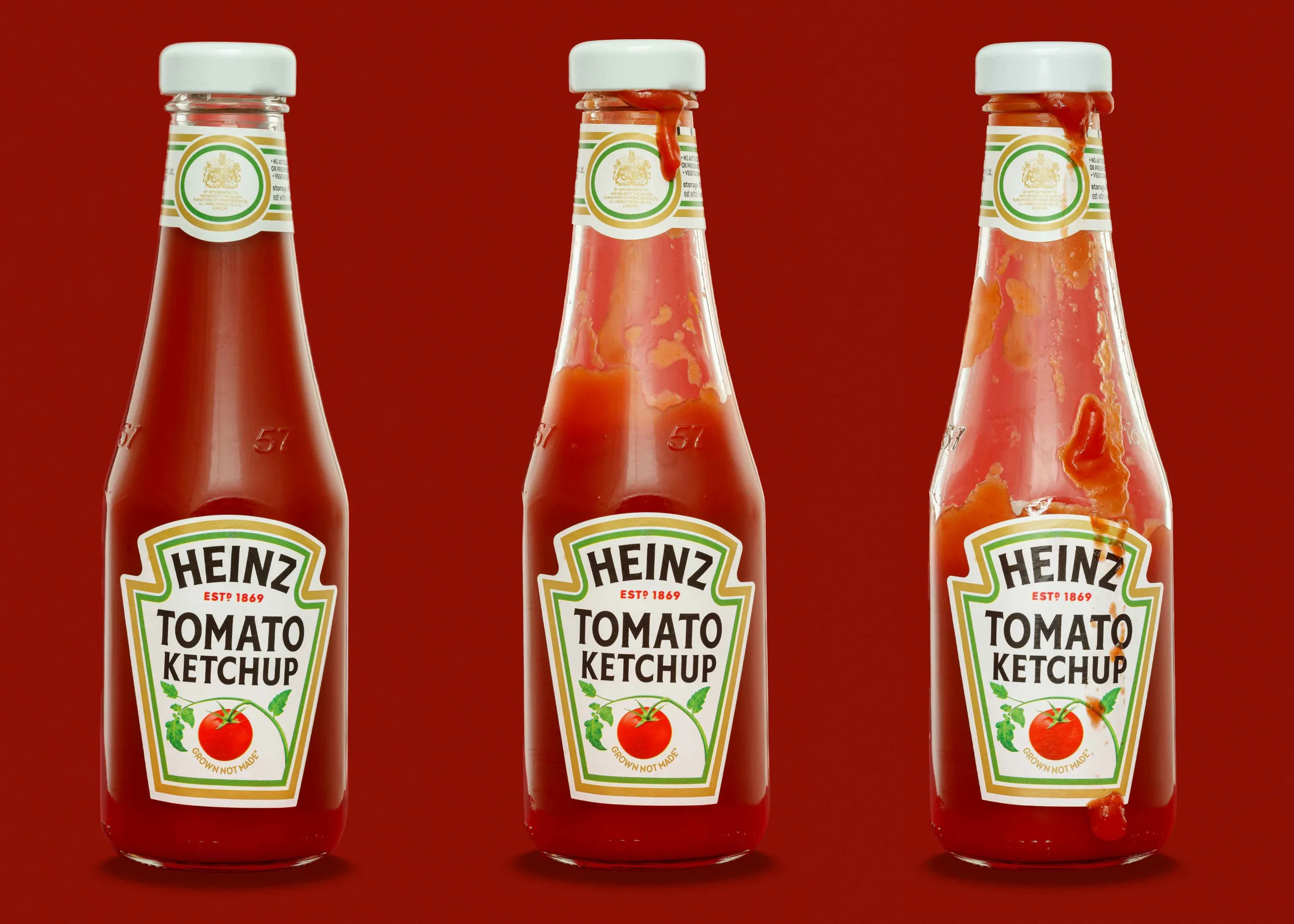
I shot three finals in total.
- A clean hero frame.
- A restrained drip near the cap.
- A bolder drip and smear for energy.
Each image has a different job, even in the same set.
That is useful for brand work.
It is also a useful practice for me.
Why the red backdrop mattered
Red felt like the obvious choice, but not for lazy reasons.
It is a strong colour with real technical consequences.
Red can contaminate the glass with bounce.
It can also push the histogram hard and clip quickly.
So I needed to control spills and exposure carefully.
I also wanted tonal harmony.
Ketchup is red. The brand world is red.
A red backdrop keeps the whole frame tight and graphic.
It removes distractions and raises the stakes.
If the lighting is sloppy, the whole image looks sloppy.
That tension is part of the exercise.
What makes this bottle tricky to photograph
A glass bottle looks simple until you put lights near it.
Then it behaves like a curved mirror.
Reflections and label glare
The glass reflects the studio, not the product.
Every bright object becomes a highlight.
Every dark object becomes a muddy patch.
The label can also catch glare.
If the label whites flare, the text loses contrast.
Then the product stops reading at a glance.
Keeping the bottle straight and the label centred
This matters more than most people realise.
A bottle that leans looks like a mistake.
A label that is off-centre looks careless.
I treat it like architecture.
I level the tripod and keep the verticals honest.
Then I micro-adjust and re-check.
Micro marks are always there
Dust on glass is constant.
Fingerprints show as haze in highlights.
Tiny cap scuffs catch the light and jump out.
I clean, shoot, re-clean, and repeat.
Then I still retouch, because glass always wins.
Consistency across a set
Three images should feel like one set.
That means matching:
- background tone and texture
- highlight character and position
- contrast and black level
- label colour and whites
If one frame drifts, you notice immediately.
Consistency is part of the craft.
Studio setup and lighting approach
I kept the setup simple in concept, but precise in practice.
The key idea was diffusion and control.
I did not want direct light hitting the bottle.
Direct light creates sharp, messy reflections.
It also makes the label glare harder to manage.
So I built a diffusion “envelope” around the set.
The bottle reflects clean white shapes instead of the studio.
That is the goal with glass.
Background distance and spill control
I placed the bottle away from the red background card.
That helped reduce red spill into the glass.
It also gave me space to control shadow and base shape.
I treat the background as its own exposure problem.
That separation makes the workflow calmer.
The lighting goals I worked to
I had four goals for every frame.
- The label must be readable and calm.
- The bottle edges must be defined and elegant.
- The highlights must look intentional.
- The red must stay rich without losing detail.
That is the whole brief in four lines.
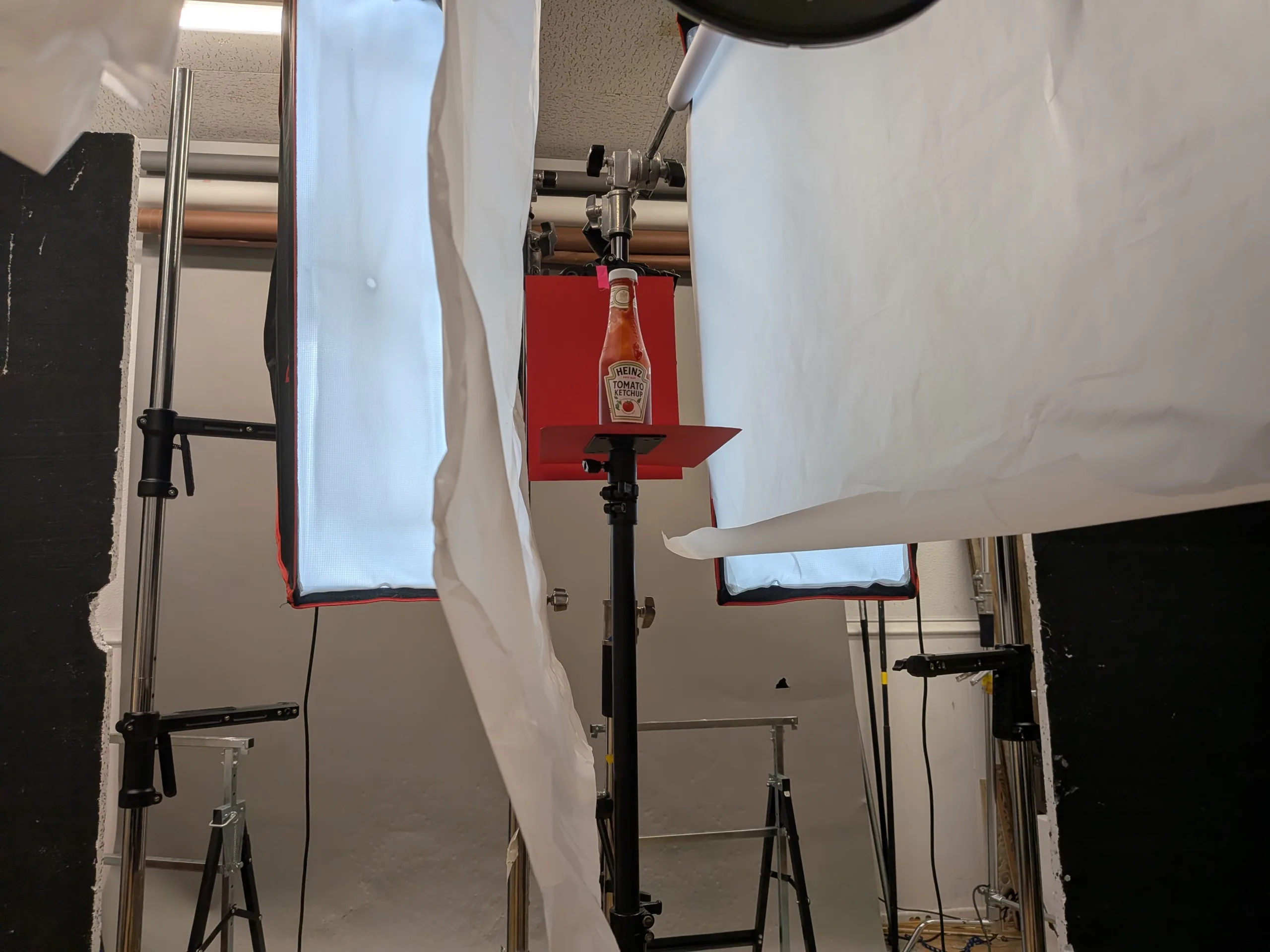
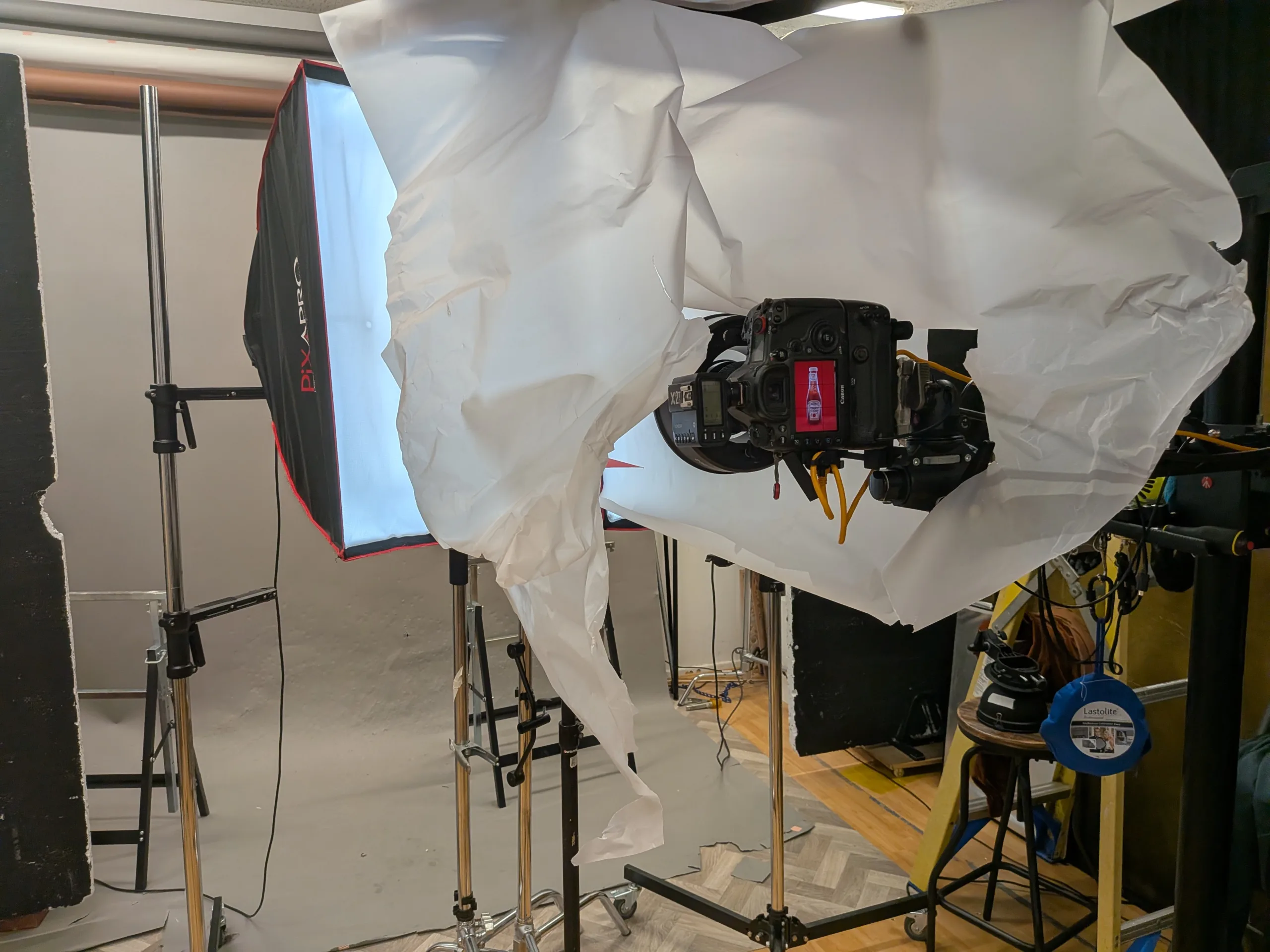
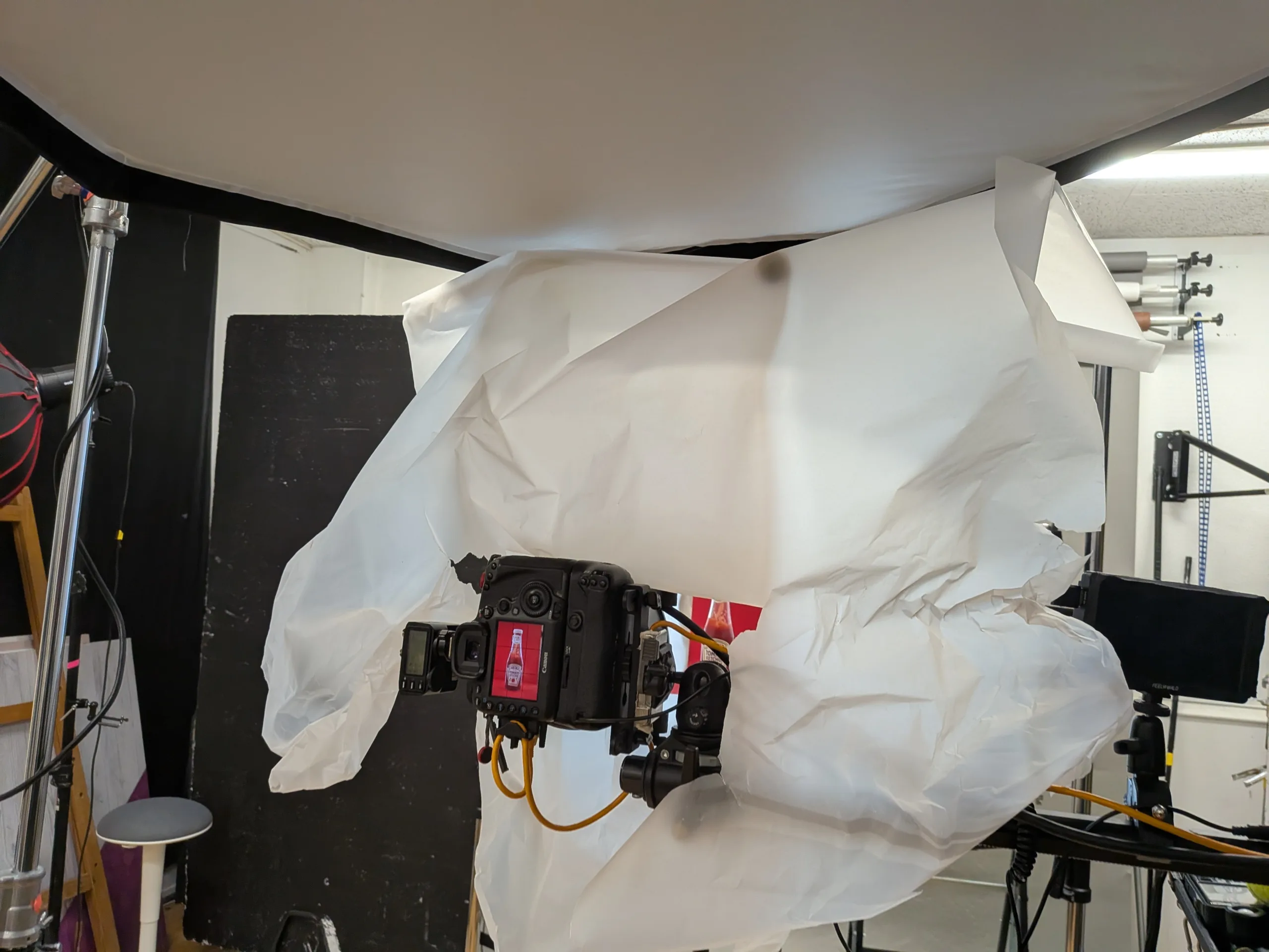
Behind the scenes photos showing the lighting setup
These behind the scenes frames show the structure clearly.
They also explain why the final highlights look clean.
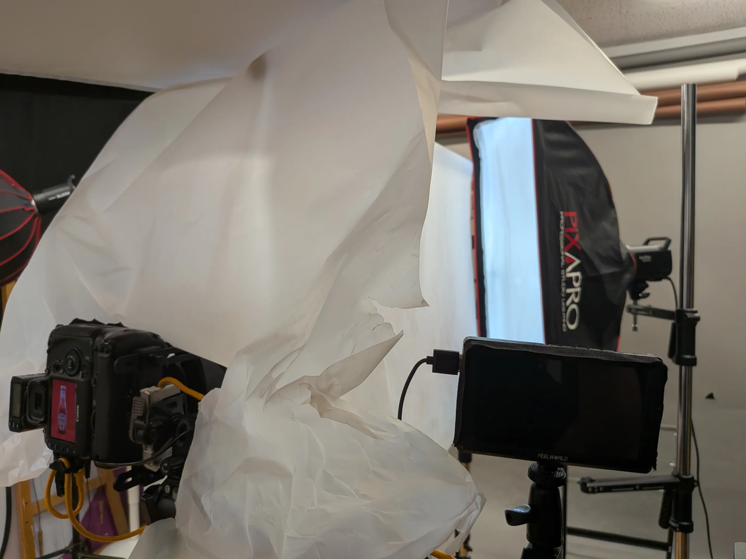
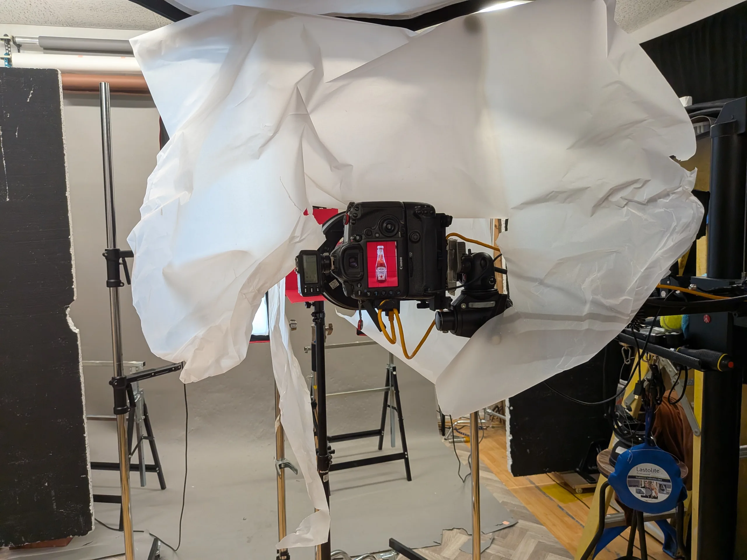
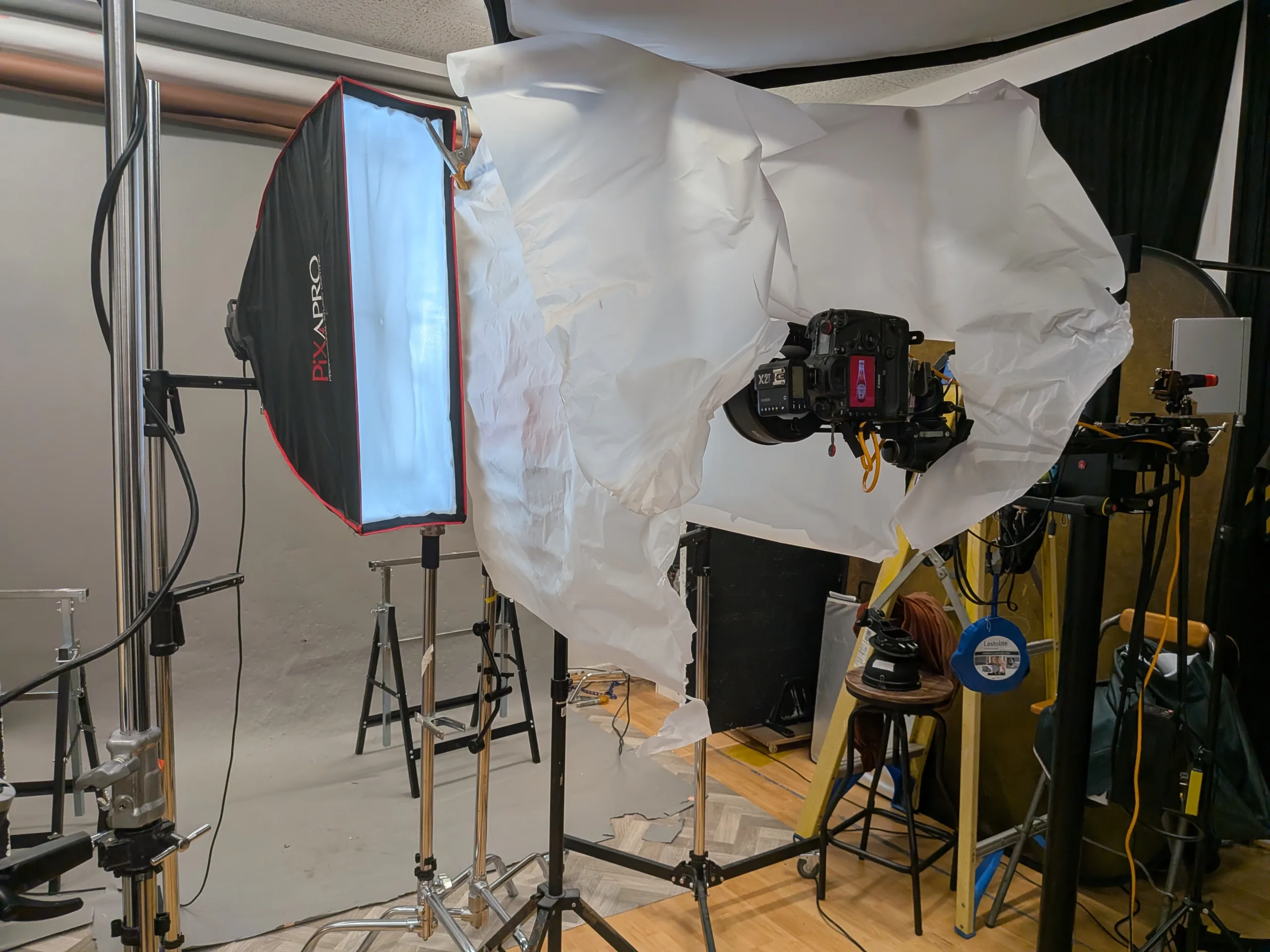
The lighting breakdown in plain words
Glass bottles reflect light sources, not subjects.
So I focus on what the bottle “sees”.
What I built
- A large diffusion wrap around the bottle.
- Tall soft sources to create clean edge lines.
- Overhead diffusion to soften the top reflections.
- Blackboards as a negative fill for contrast.
- A red background card on its own supports.
The diffusion creates broad, even highlights.
The tall soft sources create elegant edge definition.
The blackboards stop the glass lfrom ooking washed out.
This is a “shape the reflection” approach, not a “light the bottle” approach.
It is the difference between chaos and control.
Styling and control: getting the drip right
The drip images look relaxed, but they are not random.
A good drip must look natural and believable.
It must also support the label, not ruin it.
I treated the drip as a design element.
It needed a clear start, a believable path, and a tidy end.
What I looked for in the drip
- A drip that begins at the cap edge.
- A flow that follows the glass curve.
- A path that avoids key label text.
- A landing point that adds energy, not mess.
Surface tension changes everything.
Sometimes the ketchup clings and crawls.
Sometimes it drops quickly and splits.
So I worked in small steps.
I tested, adjusted, cleaned, and repeated.
Keeping the label readable
The label is the job.
If I cover “Heinz”, I lose brand recognition.
If I cover “Tomato Ketchup”, I lose clarity.
For the restrained drip, I kept it near the top.
For the bolder version, I let it travel further.
But I still protected the typography.
That is what makes it feel controlled.
It is “mess with a plan”.
Post-production and finishing choices
I keep post-production purposeful and honest.
I am not trying to invent a different bottle.
I am trying to present the bottle at its best.
Base clean-up
This is the standard work on glass.
- dust spots and micro specks
- smears and haze in highlights
- label edge tidying where needed
- small cap marks if distracting
This takes time, but it matters.
Clean retouching is invisible.
That is the point.
Reflection control
I do not remove every reflection.
If I do, the glass looks fake.
I reduce the messy reflections and keep the clean ones.
The best reflections describe the material.
They also describe the lighting quality.
That is what makes the image feel premium.
Colour control on red
Red can crush easily.
It can also clip and lose subtle texture.
So I kept detail in the darker reds.
I also checked label whites carefully.
White can drift warm or cool fast.
That changes the whole feel of the product.
Matching the trio
I compared the three finals side by side.
I matched the red tone, contrast, and highlight character.
Then I checked the label greens and golds for consistency.
Small shifts show up quickly in a set.
Consistency is part of a professional finish.
Final selects and what each image does
Here is how I think about the three finals.
| Final image | What it communicates | Where it could work |
|---|---|---|
| Image 1 | Clean, classic, dependable | Website hero, catalogue, product listing |
| Image 2 | Controlled movement, restrained texture | Social, web banners, menu graphics |
| Image 3 | Bold energy, more attitude | Posters, campaign concept, punchy social |
Final Image 1: clean hero
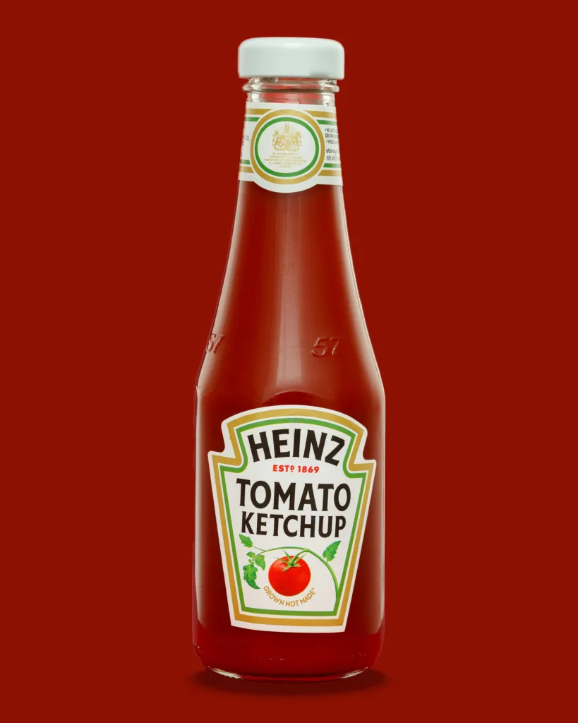
This is the benchmark image.
If this does not work, nothing else matters.
It proves the lighting and alignment are solid.
Final Image 2: restrained drip
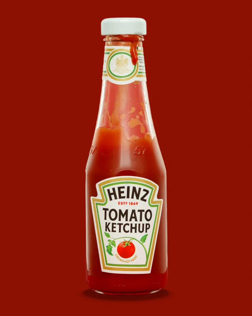
This version adds a hint of story.
It suggests use, without losing control.
It still feels tidy and deliberate.
Final Image 3: bolder drip and smear
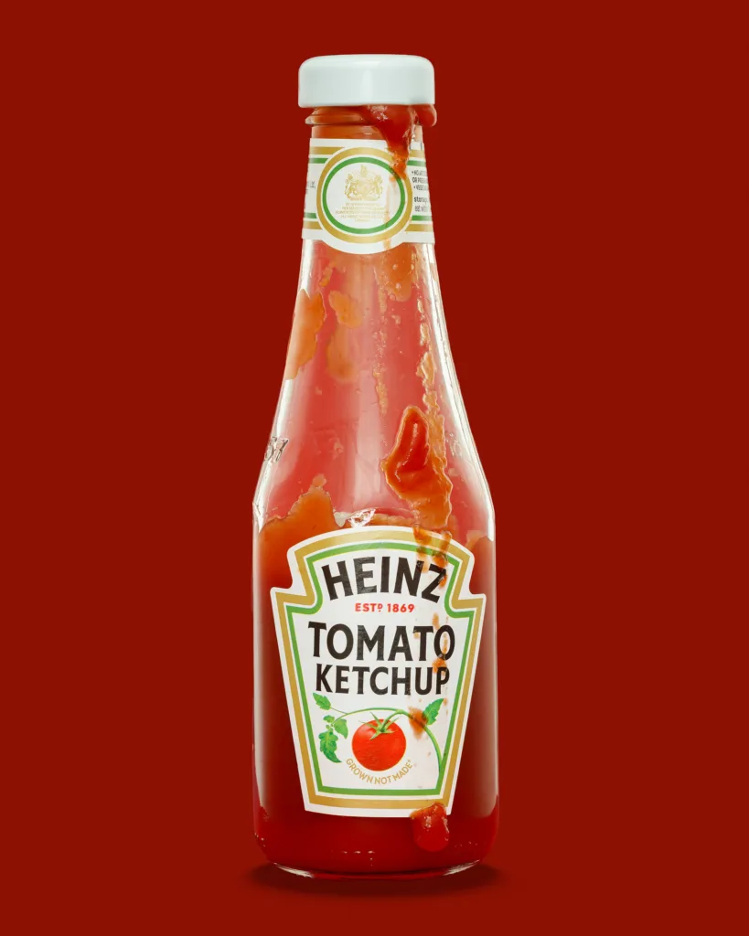
This is the loud option.
It has more attitude and movement.
It also tests how far I can push the concept.
The label still reads, which is the whole point.
What this personal project reminded me about product photography
Simplicity is hard
A bottle on a plain backdrop gives no hiding place.
Every highlight becomes a design decision.
Every speck becomes obvious.
That is why simple sets are valuable practice.
They expose weak points quickly.
Control beats complexity
I do not need lots of lights for this.
I need control, repeatability, and intent.
Diffusion and flagging do most of the heavy lifting.
When I can repeat the look, I can scale it.
That is what matters in real commercial work.
Small refinements make the image feel finished
Tiny changes carry the frame.
- a highlight moving a few millimetres
- the label rotated by a single degree
- the base shadow softened slightly
- one speck removed from the shoulder
Those changes are small, but they are visible.
They are also what separates “fine” from “finished”.
Quick checklist for photographing bottles
If you want a practical checklist, this is mine.
- Level the tripod and keep the verticals straight.
- Keep the sensor plane square to the label.
- Align the label before you touch the lighting.
- Clean the bottle constantly, not occasionally.
- Use diffusion to create predictable reflections.
- Add negative fill to keep edge contrast.
- Control the background as a separate exposure.
- Shoot a clean plate frame for easier retouching.
- Match highlight shape across the full set.
If you shoot glossy products, this list will save time.
It will also reduce the amount of rescue retouching later.
If you want a follow-up, tell me what you’d like to see
If this sort of breakdown is useful, I can write a second post.
I can go deeper on reflection shaping and negative fill.
I can also share a tighter “step-by-step” setup guide.
For now, I would love to know two things.
- Do you prefer the clean hero shot or the drip versions?
- What everyday product should I photograph next?
See more about my product photography for Suffolk businesses.