
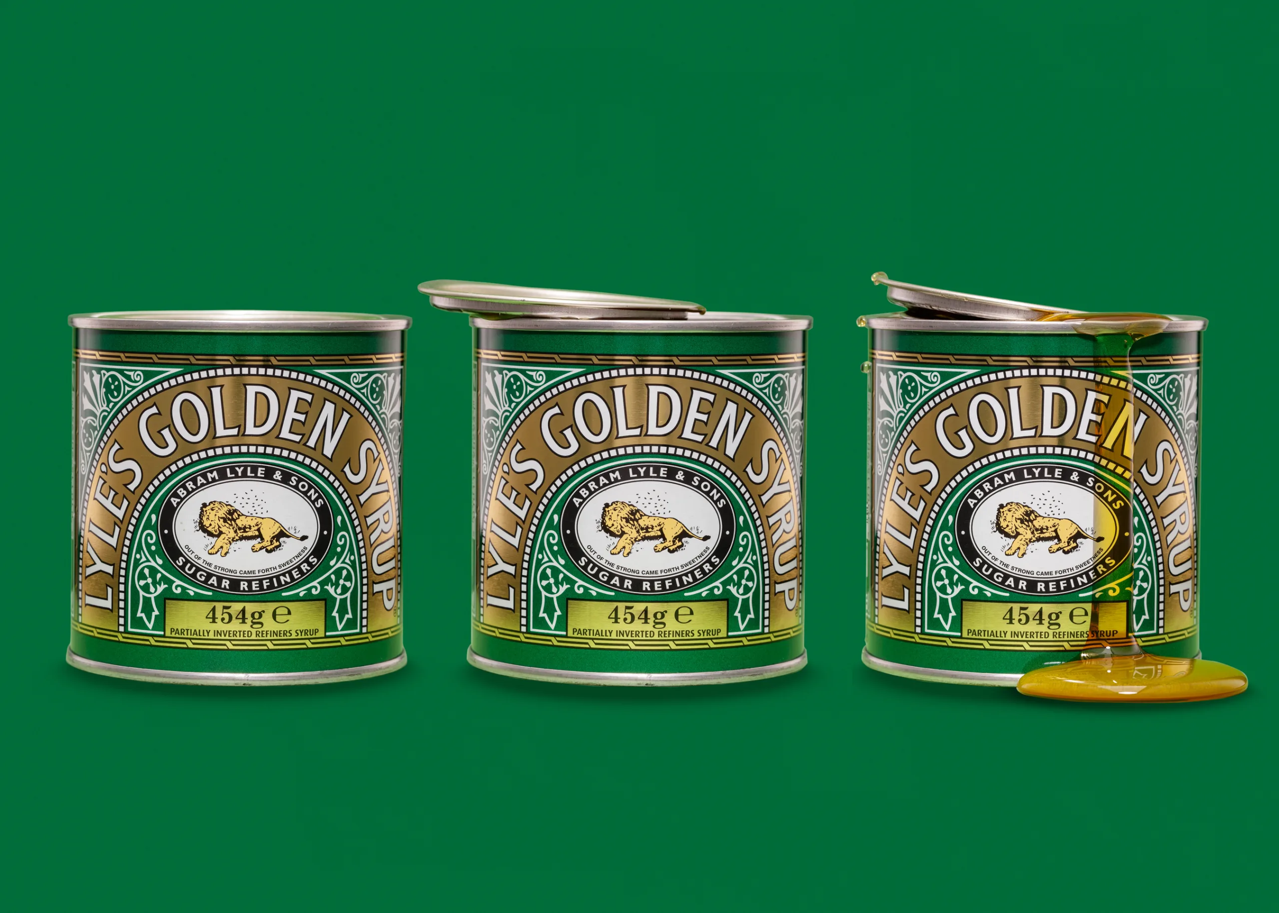
I have a plan over the next few months to do more of these studio test shoots. I love doing them. They are always great fun, and they keep my eye sharp. This time, I photographed a classic Lyle’s Golden Syrup tin on a green background. My goal was simple. I wanted a clean, controlled triptych that shows the product three ways. First, a tidy hero packshot. Second, an open-lid variation with a hint of story. Third, a final image with real syrup and a controlled spill. This kind of product photography in a studio is where I can be precise. I can shape light. I can control reflections. I can keep labels crisp. That is the work I enjoy most.
I also had search intent in mind while I shot and edited. Product owners and marketers tend to search by product type and outcome. They do not just search for “photographer”. They search for things like “food product photography”, “clean packshot”, or “hero shot product photography lighting”. So I built the shoot around outcomes that matter in real use. I wanted a set of images that could sit comfortably on a product page, in an advert, or in a social post, without feeling like a compromise.
Why I chose Lyle’s Golden Syrup for a studio test shoot
Some products are perfect for practice because they are honest. They show you your mistakes fast. A Golden Syrup tin has metallic edges that catch highlights. It has a glossy printed label that shows glare. It has strong branding that needs colour accuracy. It also has curves that can warp type if your angle is off. If I can make this tin look clean, sharp, and well lit, then I know my setup is working.
There is also a second reason. It is a recognised object. Viewers know what it should look like. That makes it a great test for packaging product photography and e-commerce product photography standards. If the gold looks wrong, people notice. If the green shifts, people notice. If the label reads soft, people notice. That is useful pressure.
The brief: clean packshot, hero frame, then controlled spill
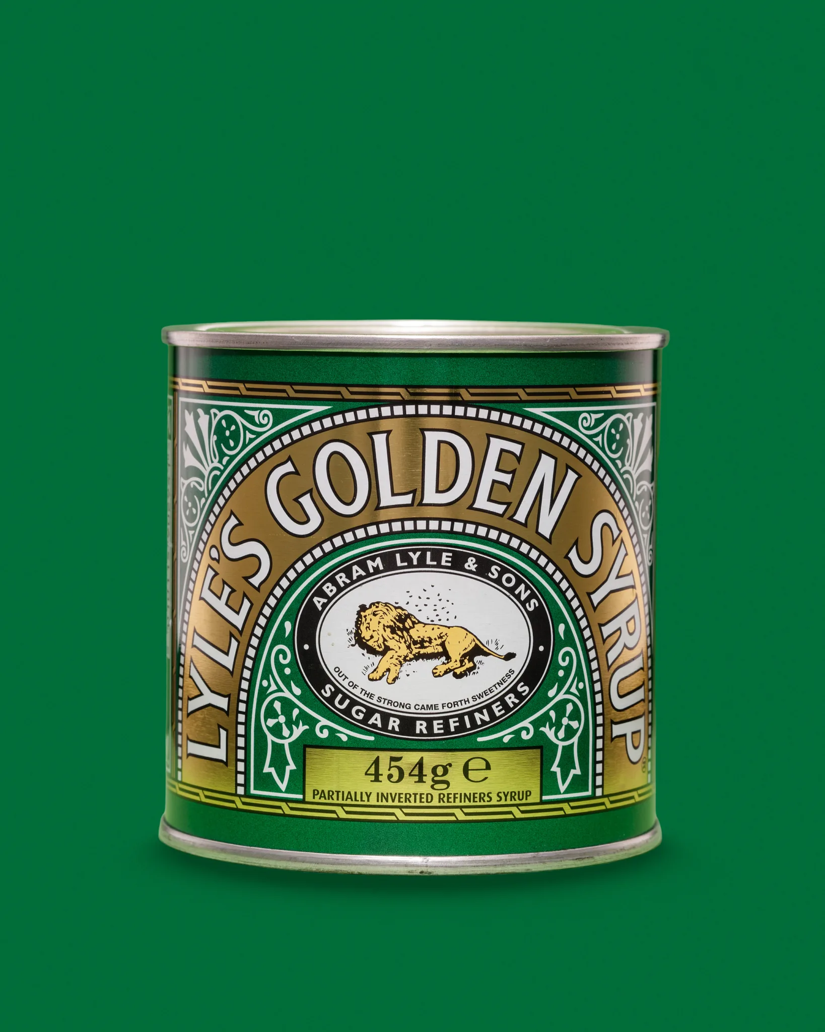
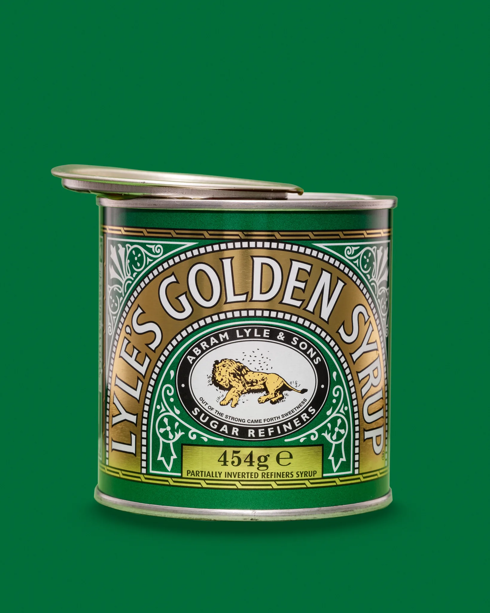
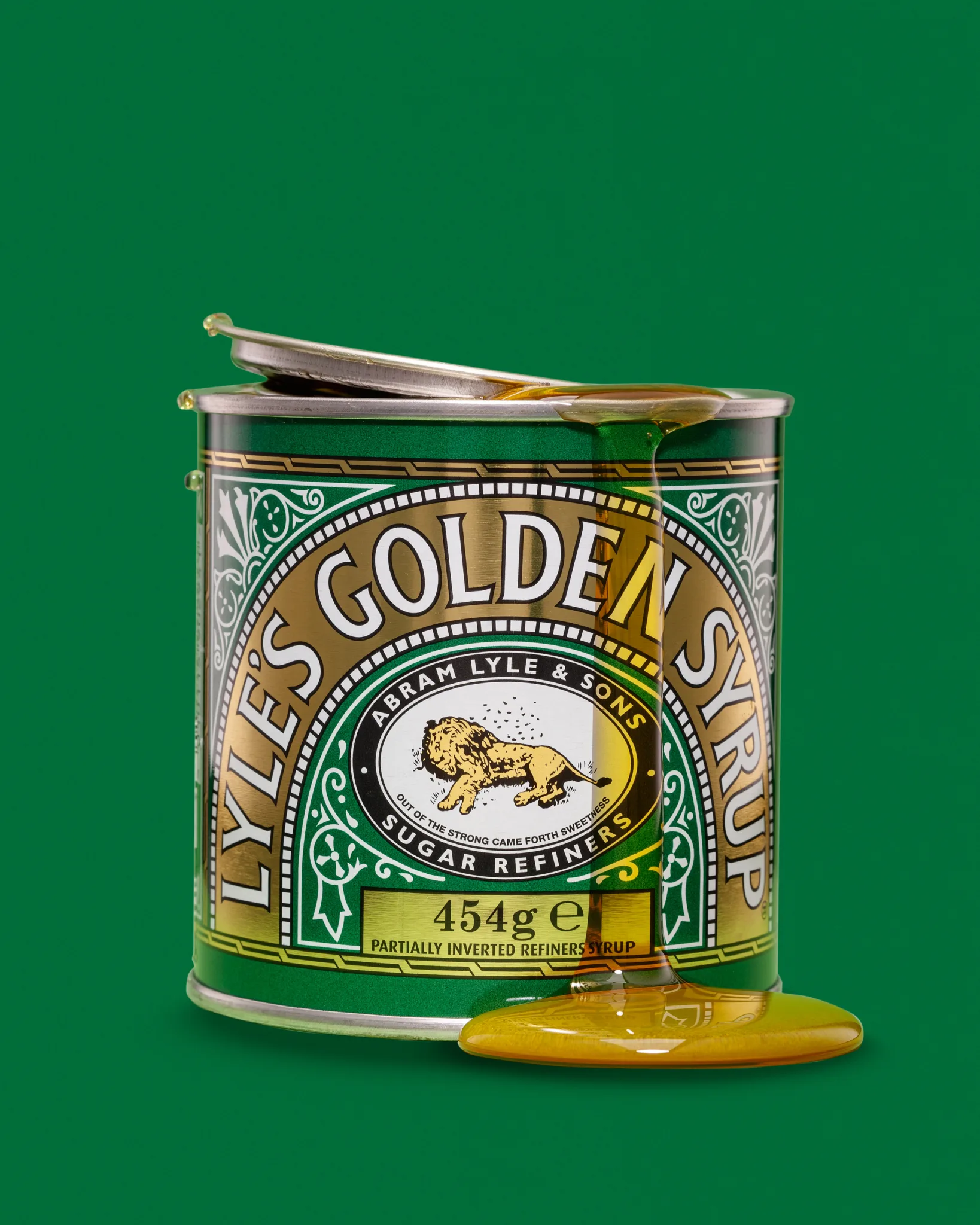
I kept the brief tight because it helps me make strong choices. The first frame was the clean packshot. This is the baseline. It should look tidy, accurate, and dependable. The label must read well. The edges must be clean. The tin must sit confidently on the background. The second frame was the open-lid variation. This adds interaction. It hints at use without getting messy. It also adds shape to the silhouette. The lid creates a new highlight problem, which is useful practice. The third frame was the syrup drip hero shot. This is the fun one. It shows texture, gloss, and movement. It also tests my control. Sticky liquids punish rushed decisions. They also punish sloppy retouching.
The triptych format matters to me. It turns a single product into a short story. It also makes the post more useful for anyone searching for process, lighting, and clean packaging work. It is a simple structure, but it works.
Lighting approach for reflective tins and metallic packaging
For this shoot I used four lights. Each one had a job. The tin is reflective, so I kept control as the priority. Here is the setup in plain terms. I used a top light with a large softbox for fill. I used two side lights with scrims to light the sides of the tin. I used a front light with a grid to lift the label and control spill.
I am careful with reflective product photography. I am not lighting the tin. I am lighting what the tin reflects. That is the whole game. If the reflection is ugly, the tin looks ugly. If the reflection is clean, the tin looks premium.
The top light sets the overall tone and keeps shadows civilised. I do not want deep, harsh shadow under the tin unless the brief calls for drama. Here, I wanted clean and readable. The side lights create smooth edge definition. I like a controlled “rail” down each side, because it separates the object from the background and gives the tin shape. Scrims help because they soften the highlight and avoid hard bands that look like cheap strip reflections. The front light with a grid is there for label clarity. It lets me add a little punch to the label without blowing highlights across the glossy print. The grid also stops the light from flooding the background and changing the green.
I also keep an eye on specular highlights. Metallic rims love to blow out. I would rather underplay the rim and keep detail. A clean rim with texture looks more premium than a bright rim with no information.
A simple way to think about this setup is roles. The top light handles exposure and mood. The side lights handle shape and edge definition. The gridded front light handles readability. When those roles stay separate, control becomes easier.
Background choice and colour control for food product photography
I chose green for a reason. It supports the product branding. It also gives me separation between tin and background. With tabletop product photography, background choice is never just taste. It is technical. I ask myself three questions. Does the background fight the label colours. Does it help the product read at thumbnail size. Can I keep colour consistent across the triptych.
Green can shift badly if white balance drifts. It can also reveal uneven lighting. That is useful. It forces good discipline. If I can keep the green stable from clean packshot to syrup spill, I know my exposure and lighting ratios are consistent.
When I talk about colour accuracy, I mean practical things. Greens should look stable across edits. Gold should not turn orange. Whites in the label should stay neutral. Blacks should stay deep but not crushed. In practice, I keep my workflow colour-managed from capture through export. That matters for packaging product photography, because brand colours need to match real packaging as closely as possible.
How I kept the label crisp and distortion under control
Label clarity is the entire point of a packshot. To keep the label crisp, I focused on camera angle, focal length, light placement, and finishing discipline.
Curved tins warp type if you shoot too high or too low. I kept the camera square to the label plane. I wanted the centre badge to read cleanly, with the outer typography still feeling natural. Focal length also matters. Wide lenses make tins look odd fast. I prefer a more natural perspective, then I crop with intent. That keeps the product proportions believable.
Light placement decides whether the label reads, or whether it turns into a glare patch. Glare is the enemy of readability. I moved the front gridded light until the label had contrast without hot spots. Tiny moves matter here. Millimetres count. I also watch for the point where the glossy print starts to look “wet”. That can happen even without liquid. It is just the wrong specular angle.
Finally, I stay disciplined in post. I avoid crunchy sharpening. It makes packaging look brittle. I aim for clarity through lighting first, then careful finishing. If you get the light right, you do not need to rescue it later.
Creating a controlled syrup drip without chaos
Sticky liquids look wonderful, and they are a pain. That is why I wanted it in the third frame. It adds texture and makes the set feel alive. My priorities were a drip that looks natural, a spill that reads clearly at a glance, a surface reflection that is not distracting, and no random mess on the label.
What helped me keep control was planning. I planned the pour path before I opened the tin. I protected areas I did not want syrup to touch. I worked slowly and watched for thin strands. I shot variations, because syrup never behaves once. The best syrup drips look effortless. In reality, they are planned. You build a controlled accident.
Syrup also creates strong specular highlights. Those highlights are what sell the texture. If you kill them, the syrup looks dull. If you overdo them, it looks plastic. The balance is delicate. I wanted the syrup to feel rich and glossy, but still real.
I also like the way syrup changes the story. The first frame says “this is the product”. The third frame says “this is the product in use”. That distinction matters when people search for hero shots. They want the item to feel tactile.
Retouching notes: dust, micro-scratches, and edge clean-up
Retouching for product photography is often invisible work. It is also where a clean result is won or lost. With tins, I expect dust specks that appear under hard light. I expect fine scratches on metallic rims. I expect tiny dents that catch highlights. I expect label scuffs that show at full size.
My retouching checklist for this set is simple and repeatable. I remove dust and fibres first, before I chase colour. I tidy edge transitions between tin and background. I clean micro-scratches on the rim without making it fake. I even out label glare, but I keep natural texture. I check the green background for gradients and marks. I zoom out and confirm it still feels real.
Edge definition matters a lot on a coloured background. If the cut-out looks too sharp, it feels pasted. If it looks too soft, it feels cheap. I aim for clean, natural edges with believable fall-off.
What I would refine next time
Every test shoot gives me notes for the next one. That is the point of doing them. Here is what I would refine. I would like more controlled rim highlights on the top edge. I would like slightly stronger separation between tin and background at the base. I would like more syrup shape options, with a second drip path for variety. I would like a tighter match across the triptych so the set reads as one story.
I may also try a different green next time. A small change in background tone can shift how gold reads. It is a useful variable for future tabletop product photography tests.
Packshot vs hero shot: how I think about the difference
People often use these terms interchangeably, but I treat them as different jobs. A packshot is clear, accurate, and easy to use on product pages. A hero shot adds mood, texture, or action while staying believable. It still needs accuracy, but it leans on impact.
In this triptych, the first frame leans packshot. The third frame leans hero shot. The middle frame sits in between. That range is useful for brands. It gives them options for web listings, adverts and banners, social posts, email headers, and print use when needed.
FAQ
How do you light reflective packaging for product photography? I use large, controlled light sources and shape reflections with diffusion. I treat the product like a mirror. I also use edge lights through scrims for clean rails, and a gridded front light for label clarity.
What’s the difference between a packshot and a hero shot? A packshot is factual and clear. A hero shot adds story and texture. It still needs accurate colour and readable branding.
How do you photograph sticky liquids like syrup without mess? I plan the pour, protect key areas, and shoot variations. I work slowly and watch highlights so the syrup looks glossy, not plastic.
How do you keep labels sharp and readable in product photos? I keep the camera square to the label, control glare with careful light placement, and avoid heavy distortion. Good lighting does most of the work.
What background colours work best for food product photography? It depends on the brand and the packaging. I choose backgrounds that support label colours and keep separation clear. I also test for colour stability in editing.
See more about my product photography for Suffolk businesses.