
This was another test shoot in my ongoing series of everyday, instantly recognisable brands. I keep doing these for one reason. They force me to solve the same problems my clients face, but in a controlled studio session where I can push and refine my process.
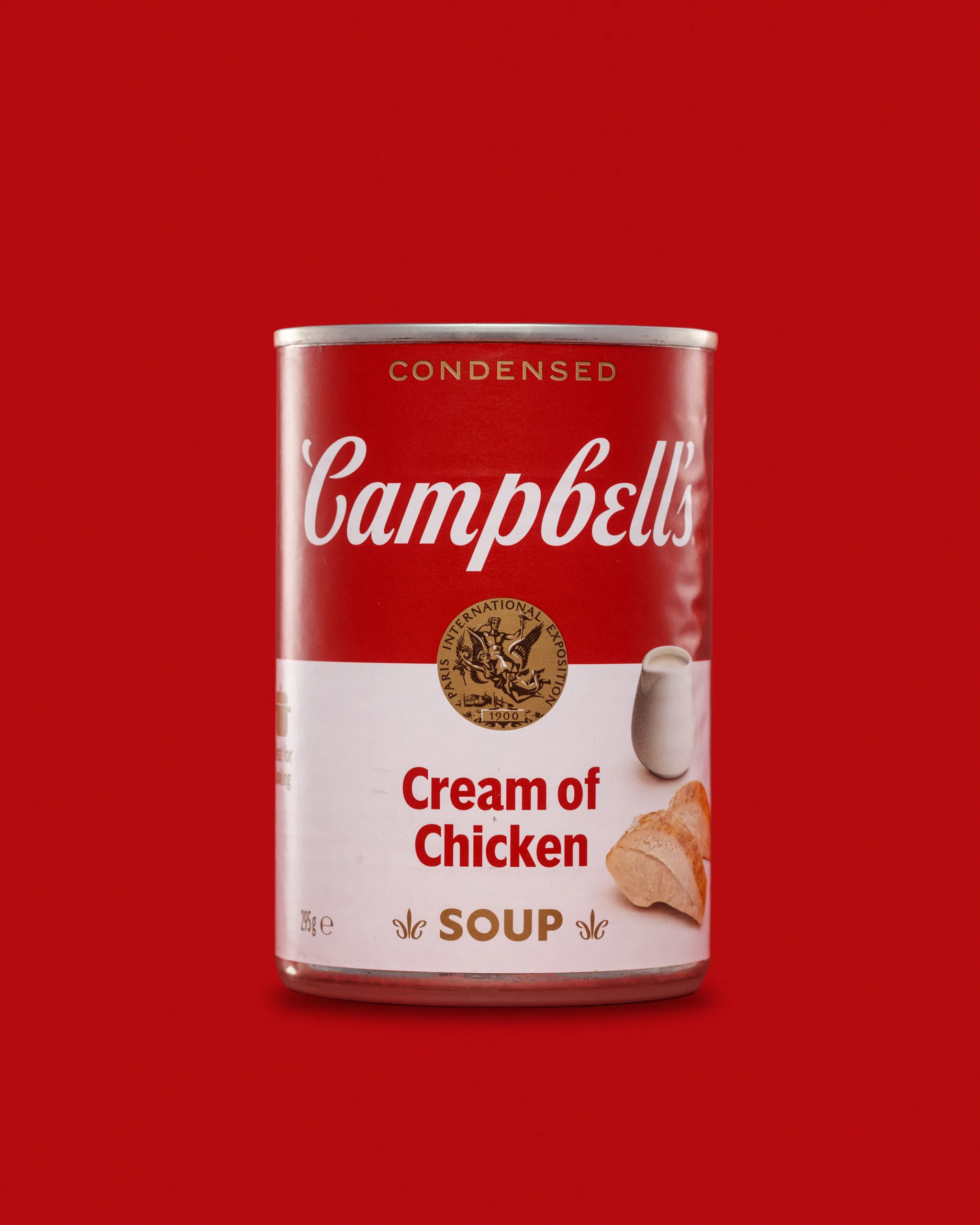
This time it was Campbell’s Cream of Chicken Soup, photographed as a tight, three-image set on a bold red background. A soup tin looks straightforward until you start lighting it. Metal is brutally reflective. Printed labels show glare. Curved surfaces distort highlights. Then I added an open lid and a spoon of soup, which introduced new surfaces and a very different texture problem.
I enjoyed this one. It was fiddly. It made me slow down. That is usually a good sign.
Why a Campbell’s tin is a great subject
Tins are one of the clearest “real-world” tests for product photography.
They give me:
- highly reflective metal that mirrors the studio
- a curved label that can pick up glare
- a top rim that loves to blow out
- a base edge that can disappear into the background
- fine print and brand marks that need to stay readable
Campbell’s adds one more factor. The design is iconic. People know it. That means small mistakes look bigger. A messy reflection or a dull red feels wrong straight away.
The plan for this triptych
I built this set the same way I have been building the others. A clean hero, a “use” variation, and a texture frame.
Image 1: Clean hero packshot
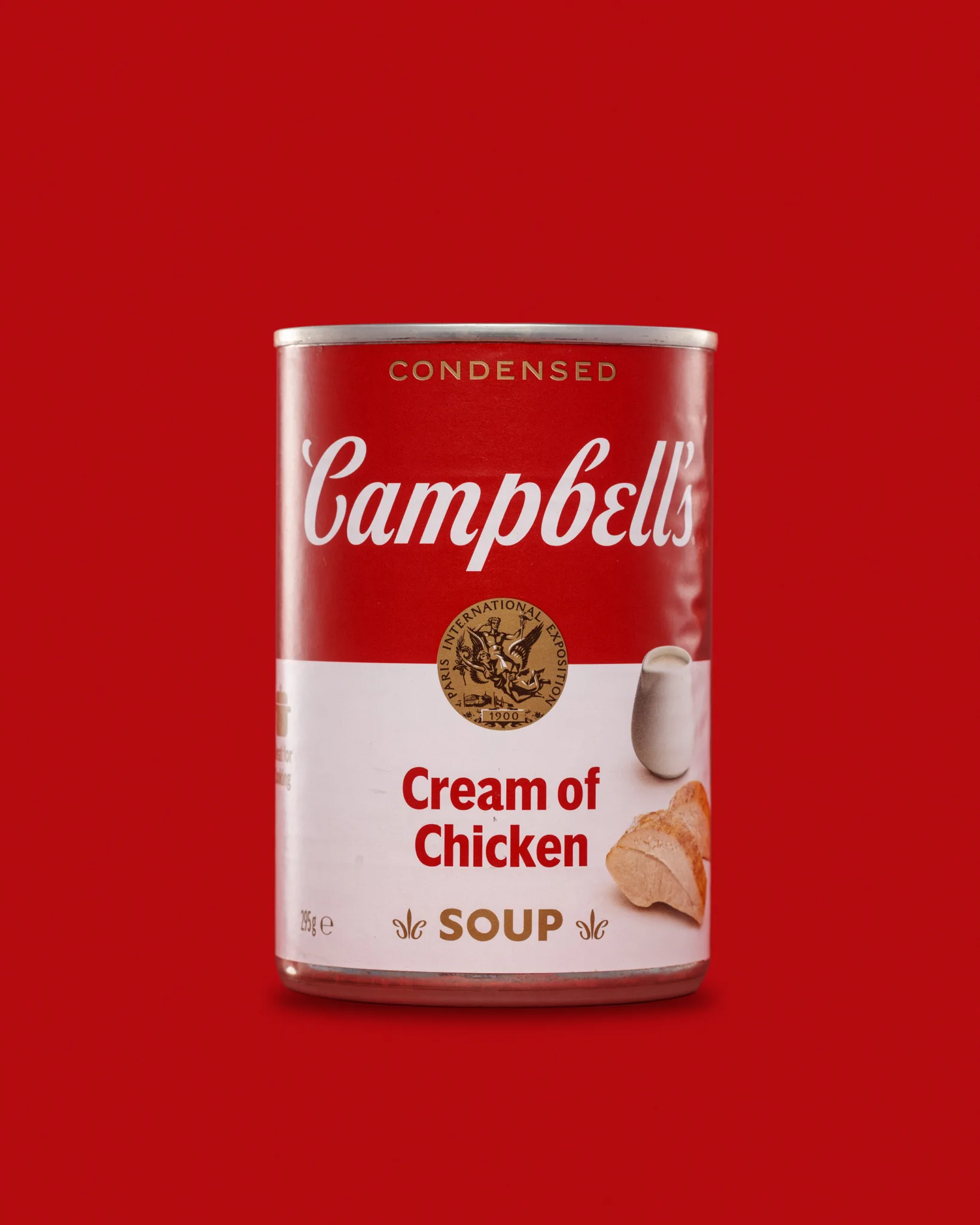
This is the simple one. Tin-centred, label straight, plenty of negative space, controlled shadows. It needs to look calm and premium.
This is also the frame that shows every mistake. If the metal reflects something ugly, you see it. If the background gradient is patchy, you see it. If the label has glare, you see it.
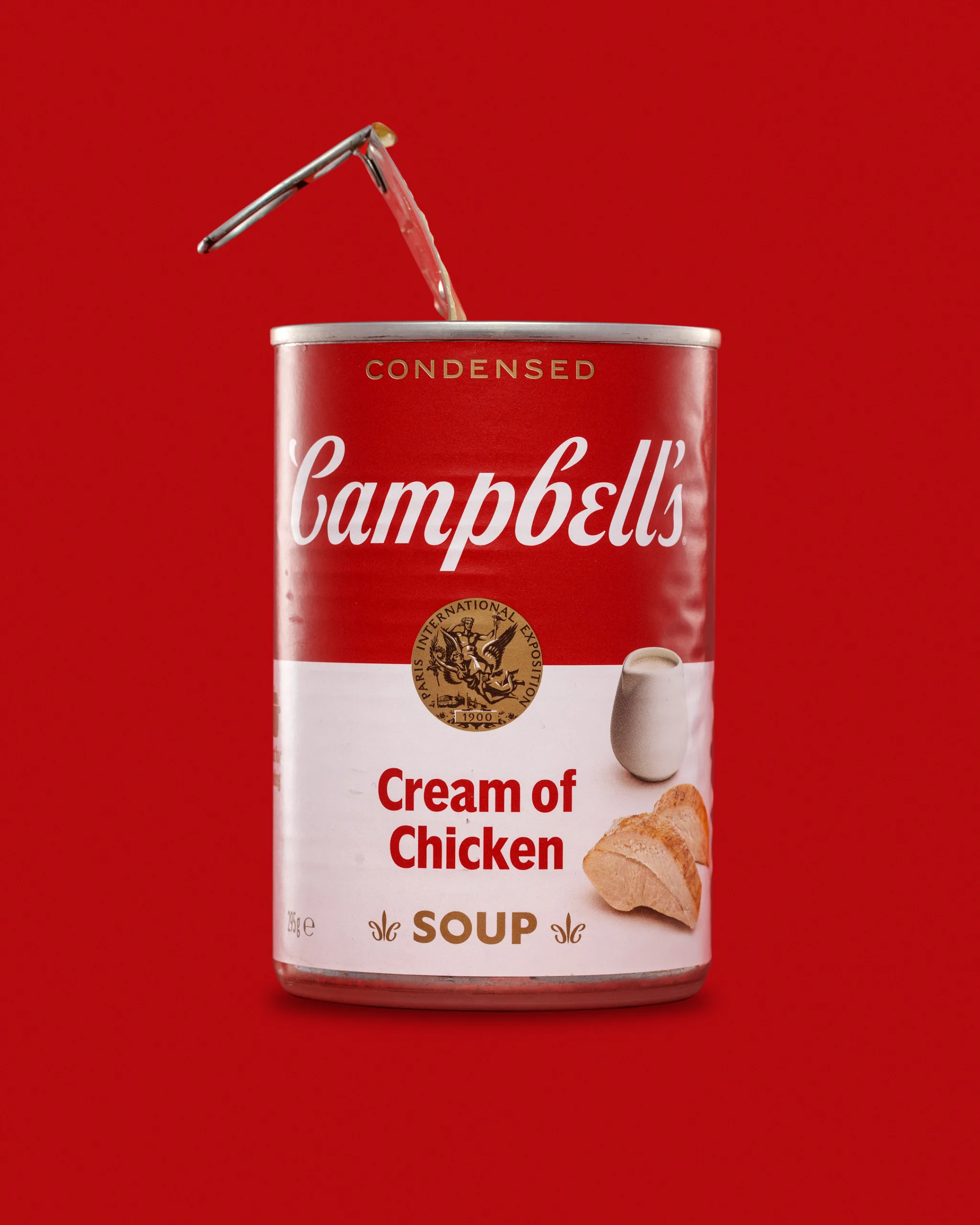
Image 2: Open can with lid lifted
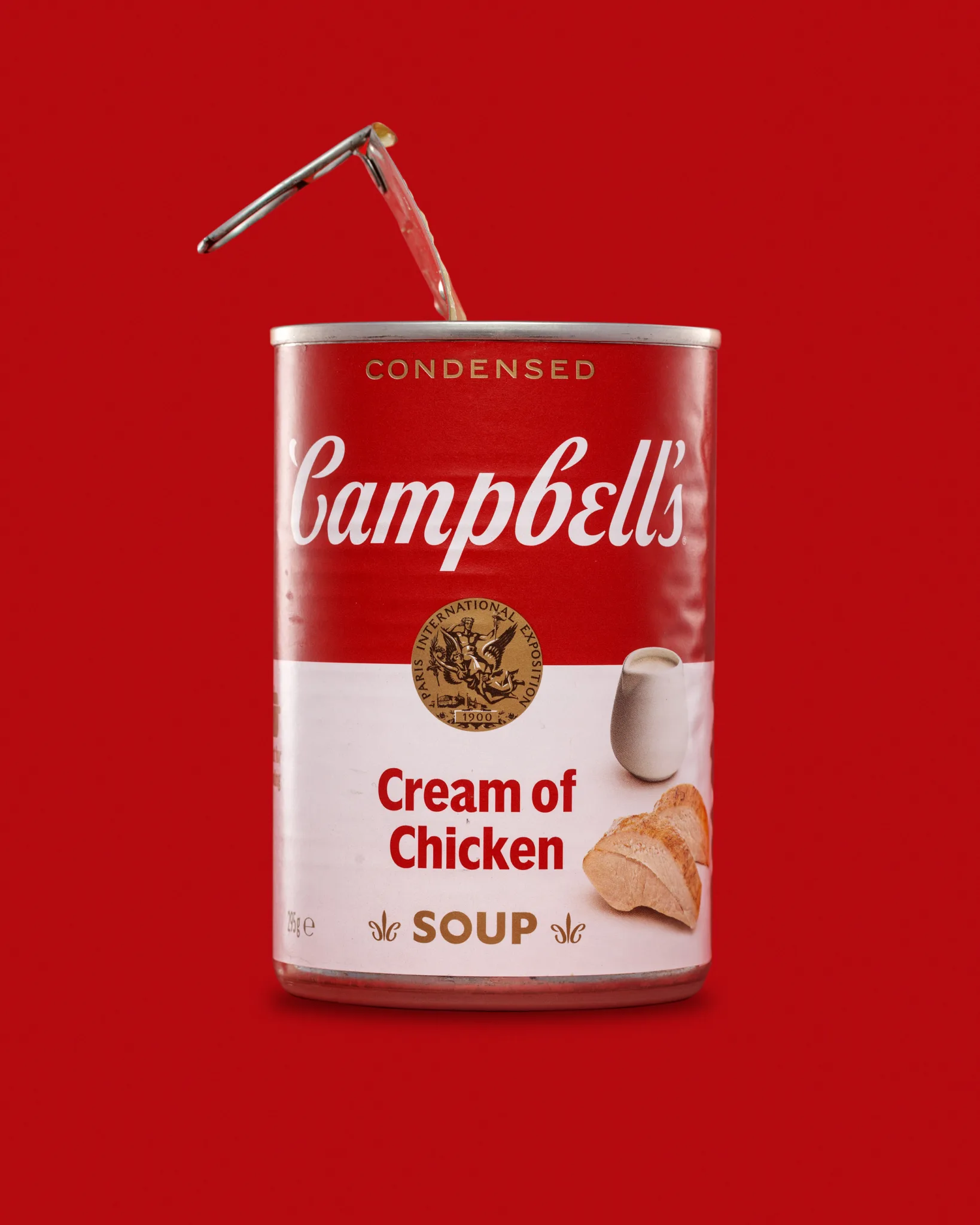
This adds story without becoming lifestyle. The lid instantly tells the viewer the product is ready.
But the lid is also a reflective surface. It can create strange highlights on the rim. It can also cast a shadow that makes the top edge look uneven. I had to treat it as part of the lighting problem, not just a prop.
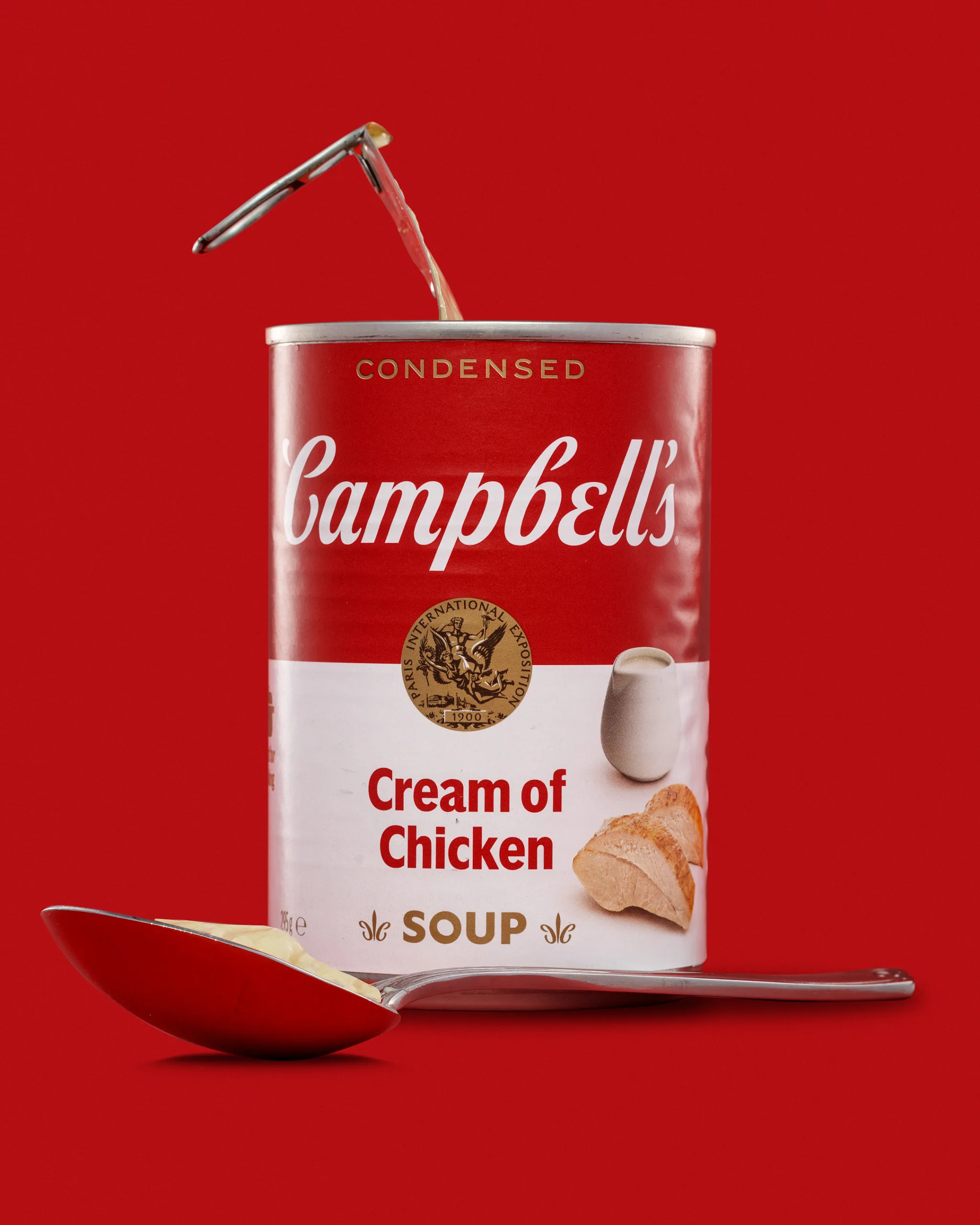
Image 3: Spoon with soup, plus the open can
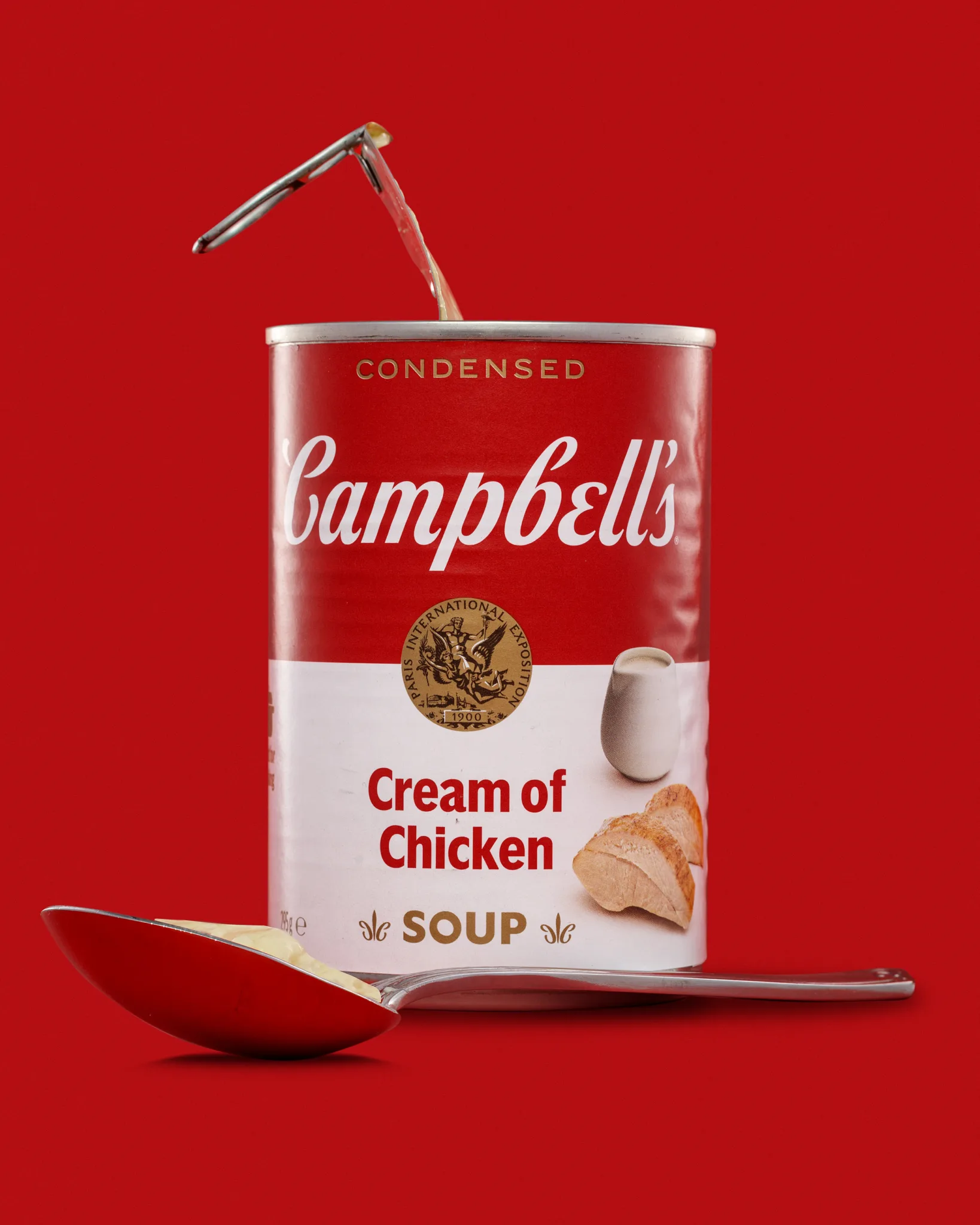
This is the texture frame. The spoon gives context and scale. The soup gives colour and sheen. It also adds a new challenge because creamy soup behaves like a soft, glossy surface. It can look rich, or it can look flat and dull.
I wanted that spoonful to look appetising, but controlled. No drips. No chaos. Just enough to show what the product is.
Why I committed to the red background
A red background with a red product is not subtle. I did it for the same reason I used orange on the marmalade jar. It demands proper control.
Red-on-red can collapse into a single block if you do not separate the edges. It also shows colour shifts very quickly. If the background red moves too warm, the tin looks orange. If it moves too cool, the whole thing looks harsh and synthetic.
I wanted the red to feel:
- strong but smooth
- consistent across frames
- deep enough to support the label whites
- clean enough that the tin edges stay clear
I also wanted a gentle gradient, not a flat wall of colour.
Lighting approach: shaping reflections, not blasting the subject
With a reflective tin, lighting is mostly about what the product reflects. The can does not care about my intentions. It will show whatever is in front of it.
So the job becomes:
- Build large, clean reflections where I want them
- Block messy reflections where I do not
- Keep the label bright and readable
- Keep the metal rim under control
Broad diffusion first
I start with diffusion because it gives me smooth highlight shapes. Hard light on a tin looks harsh and cheap, unless it is an intentional style choice. Here I wanted a clean commercial polish.
Flags and negative fill for definition
Once I have soft light, I often lose shape. That is where flags and negative fill come in. They create edge definition by removing light, not adding it.
This is the part I enjoy. Small changes matter. Move a flag a few centimetres and it can suddenly look straighter and more “premium”.
Rim control matters
The top rim catches light fast. If it blows out, it becomes the brightest thing in the frame. That pulls the viewer away from the label.
I wanted the rim bright enough to show metal, but not so bright it shouts.
Keeping the label crisp and readable
A label has to read at thumbnail size. That is the e-commerce test. It also has to look clean and true.
With tins, glare across the label is the common failure. It is not always obvious until you zoom in. Then you see a milky sheen across a word, or a hotspot that kills contrast.
I worked to keep:
- The Campbell’s script is clean
- The “Cream of Chicken” text is fully readable
- The whites are neutral, not tinted red
- The gold seal is visible without glare
That last point matters. Metallic gold elements can either look dead or become a bright blob, depending on angle.
The open-lid frame: where the tin changes character
As soon as the lid is lifted, the product feels more real. It also gets harder.
- The lid becomes a bright reflective shape.
- The top edge gains extra highlights.
- The inside of the can can go dark.
- The lid can cast a shadow that looks like a dent.
I needed the lid to sit at an angle that looked natural, but still photographed cleanly. I also had to watch for reflections of the lid in the can body. They can look like weird streaks if you are not careful.
The spoon frame: creamy texture that can look flat
Creamy soup is tricky. It is pale, glossy, and low contrast. It can look rich and smooth. It can also look like beige paint.
The spoon helped because it gives a clean shape and a familiar cue. But the spoon is also reflective, which means it can pick up red from the background and reflect it into the soup. That is not always flattering.
So the priorities were:
- show a gentle highlight on the soup surface
- keep the soup colour believable
- avoid messy reflections in the spoon bowl
- keep the spoon from stealing attention from the can
The spoon should support the can, not compete with it.
Composition: simple, centred, and calm
For these test sets, I tend to keep the product centred. It reads well. It suits e-commerce layouts. It also makes it easier to keep consistency if you later expand the set into a “range” shot.
In the spoon frame, I placed the spoon low and forward, so it adds depth. It also creates a foreground anchor, which helps the image feel more dimensional.
I also kept negative space. That space makes the set feel tidy. It gives flexibility for crops.
Retouching and finishing: what I always tidy on tins
These show everything under studio lighting. They also show things you do not notice with your eyes.
Here is what I typically tidy:
- micro dents and scuffs that catch highlights
- tiny specks of dust and fibres on the label
- background banding or uneven gradients
- small reflection distractions along the can edge
- marks on the rim that look worse once the lid is open
What I keep natural:
- the core packaging texture
- the realistic look of the soup in the spoon
- the overall character of the product
I want a clean commercial finish. I do not want it to look synthetic.
What I learned from this set
This shoot reinforced a simple truth. Tins are all about reflection and discipline.
It also reminded me that when I add a prop, I add a new lighting problem. The lid is not just a story. It is a reflector. The spoon is not just context. It is a mirror.
If I keep the scene simple, I can control it. If I add too much, I spend all my time chasing reflections.
This set felt like a good balance.
See more about my product photography for Suffolk businesses.