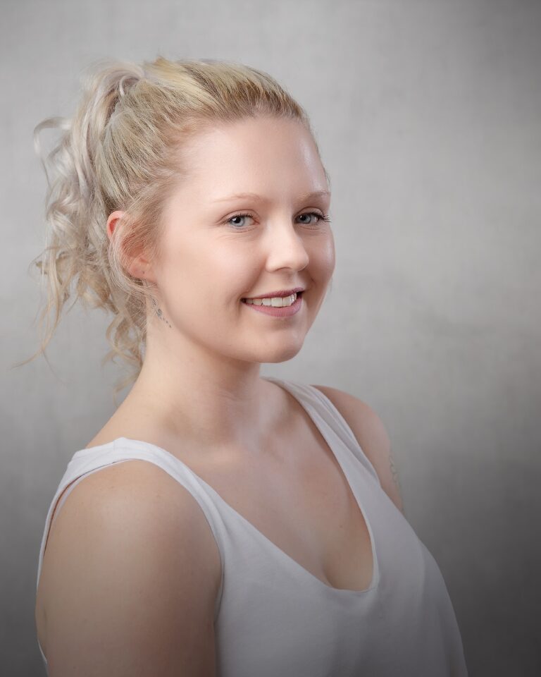
I recently photographed Margita in my studio at Bentwaters, near Woodbridge in Suffolk. The brief was simple on paper, but rich in detail. Create editorial-style studio portraits that feel like fashion, while still giving clear product attention to two watches and a standout local piece, “The Suffolk Fedora” by Hicks & Brown.
This sort of shoot sits in a sweet spot. It is portraiture first, but it respects product storytelling. The images need to feel calm, intentional, and wearable. They also need to show the watches and hat in a way that looks natural, not forced.
In this post, I’m going to break down the four looks, the lighting choices, and the posing language that made the set feel cohesive.
What made this shoot work as an editorial set
Editorial portraits rely on a few repeatable ideas. You can change wardrobe and colour, but the visual rules stay steady.
For this session, I kept three things consistent:
- Clean backgrounds with very little visual noise
- Controlled, soft studio light that keeps texture and shape
- Sculptural posing that uses hands, wrists, jawlines, and profile
That consistency matters when you want a gallery to read as one story, even with different styling.
This also suits product-led portrait work. A watch needs clear angles. A hat needs a crisp outline. A studio is ideal, because I can shape the light and keep it repeatable from frame to frame.
The four looks at a glance
Here is the session summary in a simple table. It helps you see the structure.
| Look | Hero item | Colour story | Background | Style notes | Posing focus |
|---|---|---|---|---|---|
| Look 1 | GUCCI watch | Red and black with gold accents | Saturated red | Sheer mesh top, red lip, gold hoops | Profile, ear and jaw framing, clean wrist lines |
| Look 2 | Rado watch | Teal and charcoal | Deep grey | Teal top, rectangular watch shape | Arms as leading lines, chin and hand frames |
| Look 3 | Suffolk Fedora | Warm brown and cream | Rich brown | Cream knit, belt, rustic table | Downcast mood, hat silhouette, negative space |
| Look 4 | Suffolk Fedora | Brown, burgundy, white | Rich brown | Suede-effect jacket, lace cuffs, bow and brooch | Strong profile, collar gestures, hat brim control |
The thread running through all four looks is shape. Shape in the face, shape in the hands, and shape in the product details.
Look 1: Red backdrop, black mesh, and the GUCCI watch
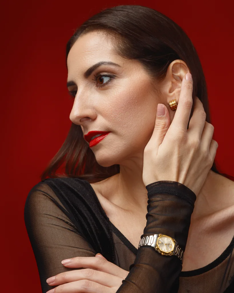
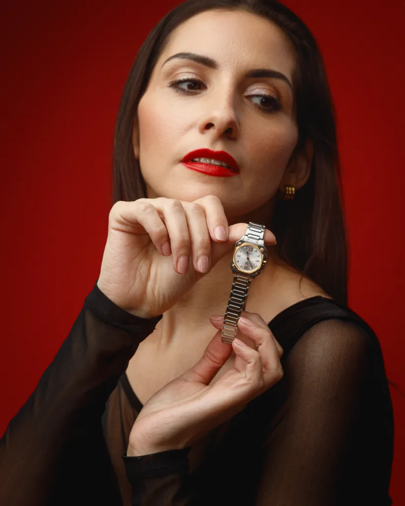
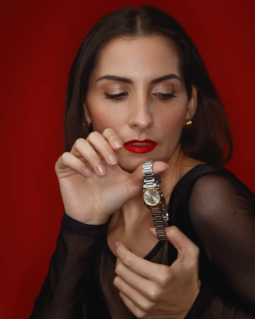
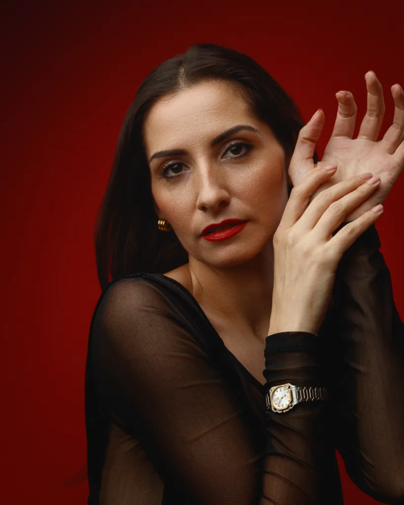
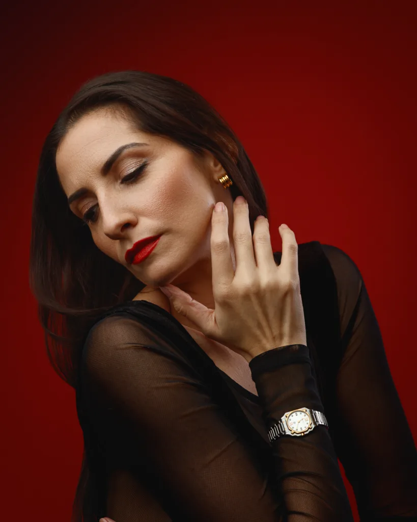
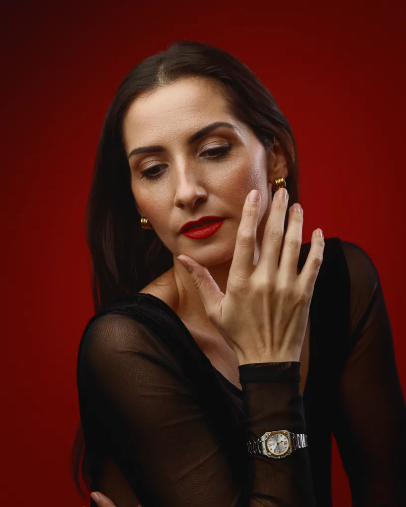


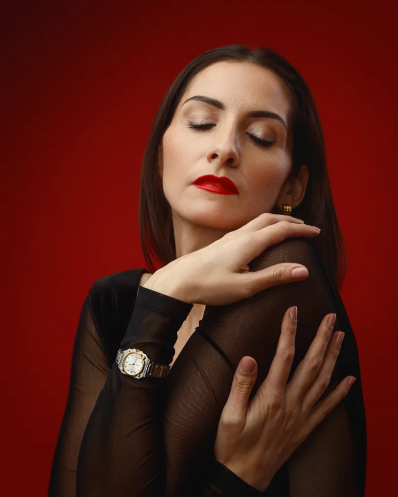

This first look is built around a bold red-and-black colour story, with small gold notes that lift the frame.
Margita wore a black sheer mesh long-sleeve top. That fabric matters. Mesh reads on camera if the light is soft and the exposure is controlled. Too harsh, and it goes shiny. Too flat and it loses texture.
Hair was sleek, side-parted, and tucked back. That creates a clean silhouette and keeps the neckline open. It also keeps attention on the face, earrings, and the watch.
Make-up was polished and classic. The red lipstick locked into the backdrop, but it stayed defined because the skin tones were kept natural and the light fall-off was gentle.
How I kept the watch visible without forcing it
With watches, the biggest risk is posing that looks like “showing a watch”. That can feel stiff fast.
Instead, I used a posing sequence that naturally brings the wrist forward:
- Hand at the ear, fingers soft, wrist turned slightly outward
- Hand along the jawline, elbow down, wrist clean and visible
- Arms crossed lightly, watch facing camera, shoulders relaxed
- Chin lifted with a side profile, watch in the lower frame
That gives a set of images that feel like fashion portraits, while still showing the product.
Why red works for this look
Red backdrops can overwhelm a face if the light is wrong. Here, it worked because:
- The wardrobe stayed simple and black
- Skin tones were held neutral
- The gold accents gave warmth at small points, not everywhere
A strong background needs restraint in styling. This look had that balance.
Look 2: Teal top, dark backdrop, and the Rado watch
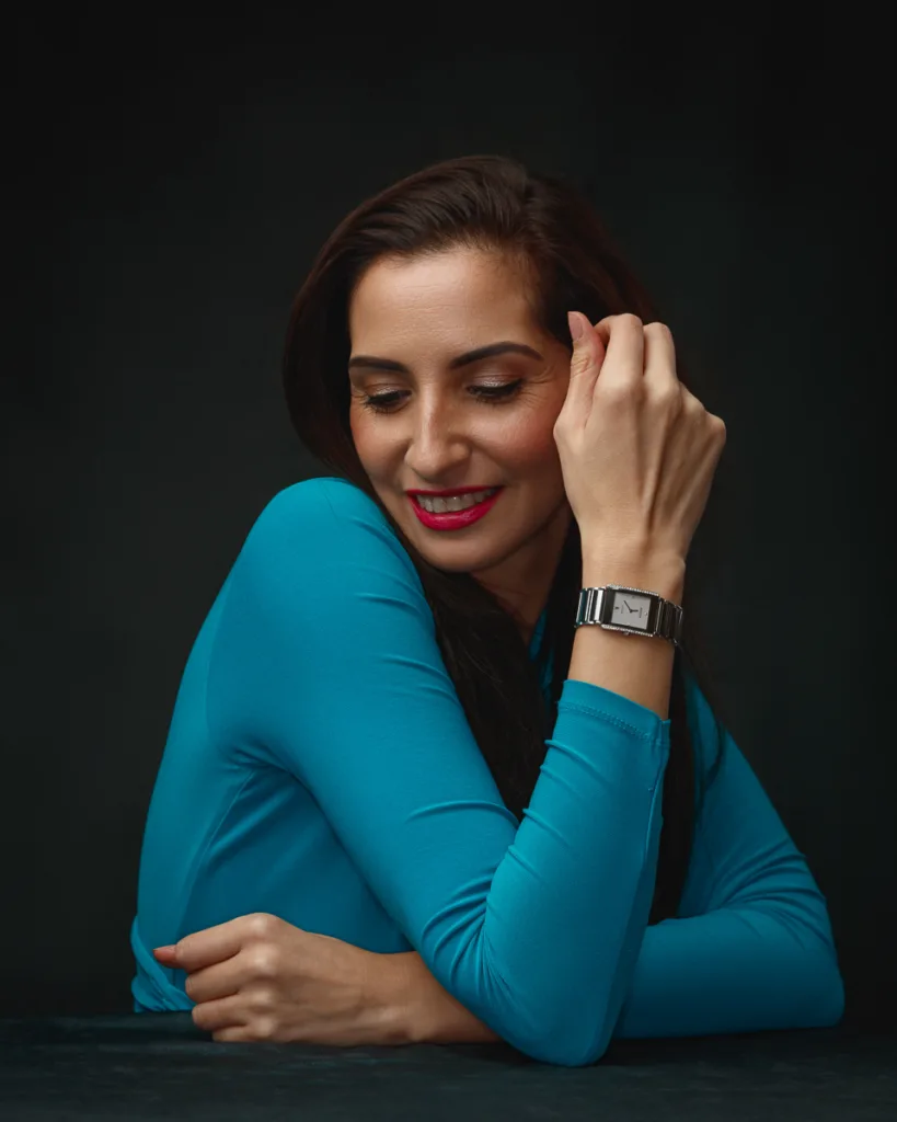
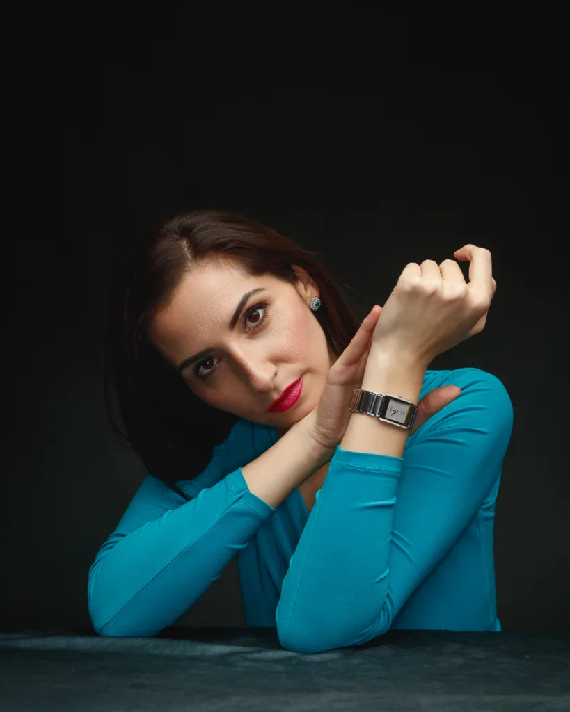
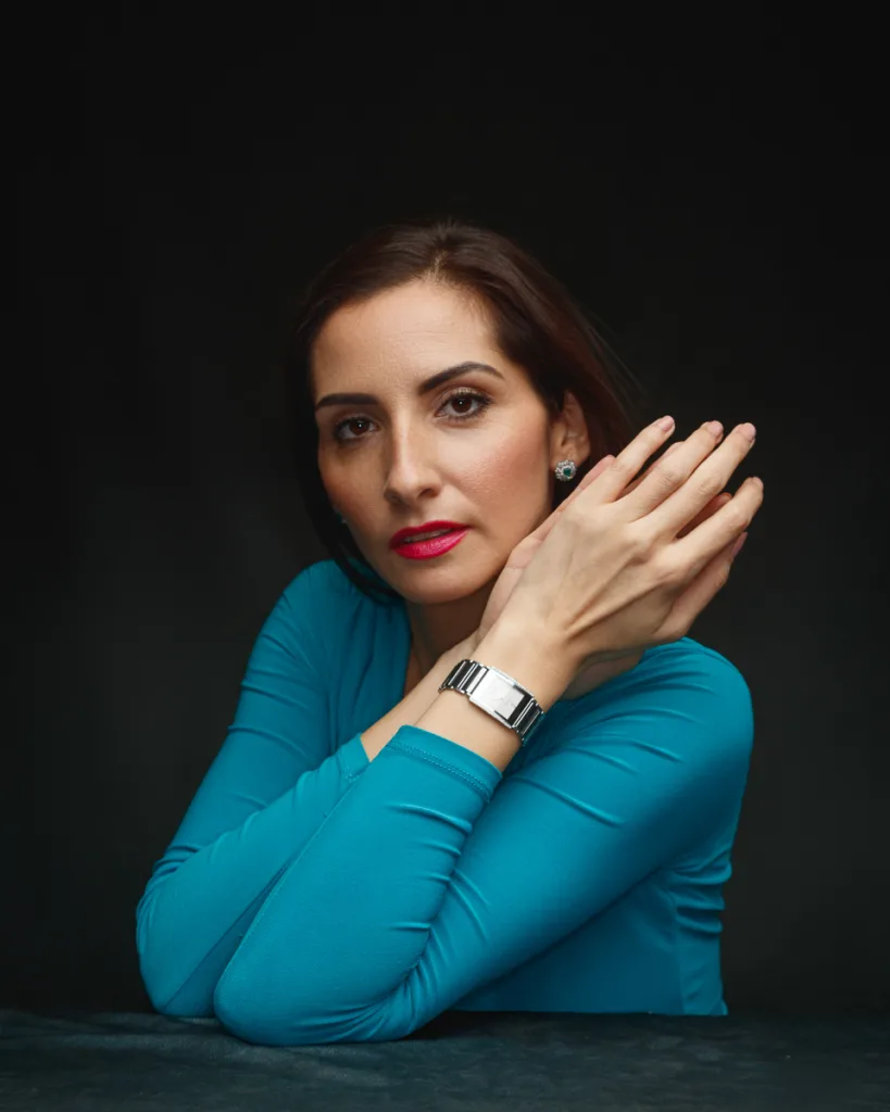

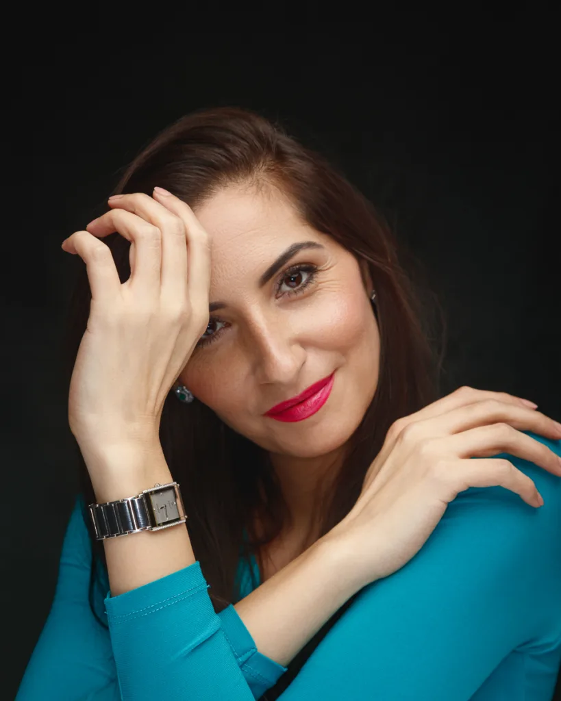

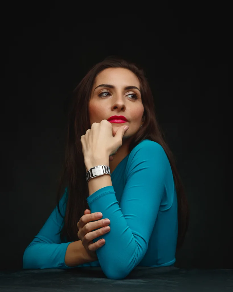
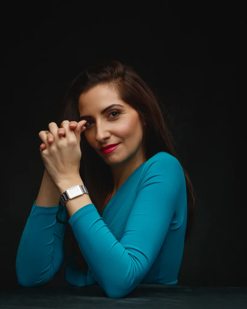
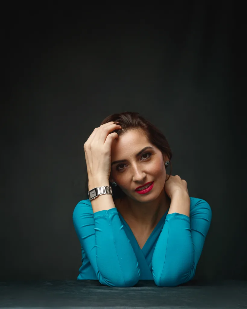
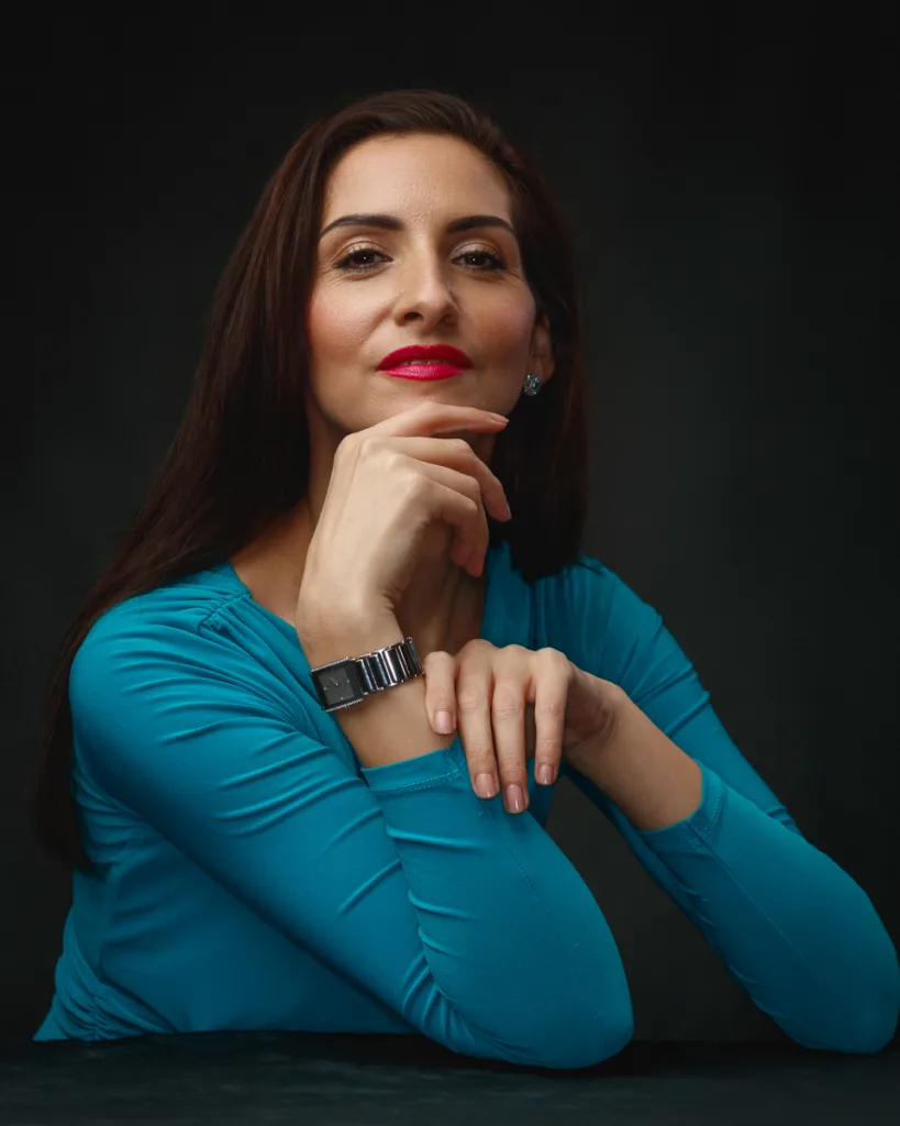
The second look shifts the mood into something modern and minimal. A vivid teal top against a deep charcoal background is instantly graphic.
The watch also changes the geometry of the frame. A rectangular watch reads as sharp and clean. It suits a more modern posing language.
Hair stayed down, smooth, and softly side-swept. That kept the look controlled but not rigid.
Make-up stayed refined. The lip colour leaned pink-red. It added focus without fighting the teal.
Posing choices that suit a rectangular watch
A rectangular watch needs clean lines around it. If the wrist bends too much, the face distorts. If the fingers get tense, it looks awkward.
I worked through poses that create strong arm shapes:
- Forearms stacked gently, watch on the top wrist
- Hand under chin, wrist angled to keep the face readable
- Hand in hairline, elbow lifted, wrist rotated towards camera
- A relaxed smile frame, eyes down, wrist close but natural
This set also had a quieter emotional tone. There are frames with a soft smile and lowered gaze. Then there are more direct portraits with chin lifted and eyes forward.
That mix matters. A portfolio needs range.
Lighting notes for metal and skin in the same frame
Watches can be tricky because metal reflects everything. I kept the light broad and soft, then watched my angles.
The goal was:
- Skin that looks real, with texture intact
- Metal that has clear highlights, not blown reflections
- A background that stays deep and clean
The result is a set that feels contemporary, with a clear luxury-product edge.
If you want to see how Rado positions its design language, the brand’s main site is a good reference: https://www.rado.com/
Look 3: The Suffolk Fedora, cream knit, and a warm brown story
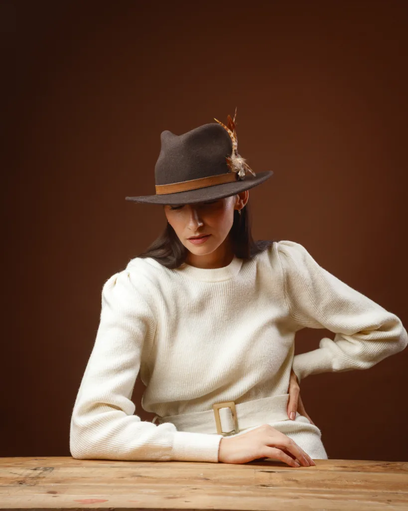


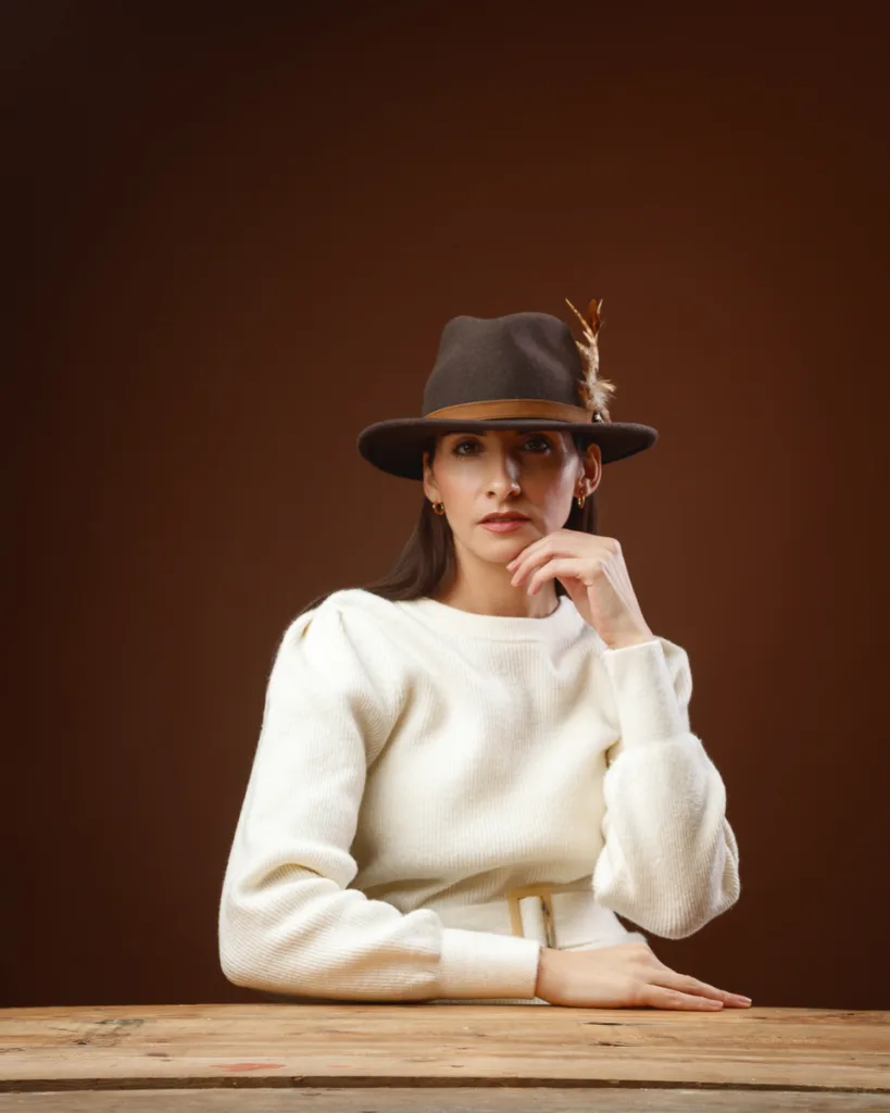
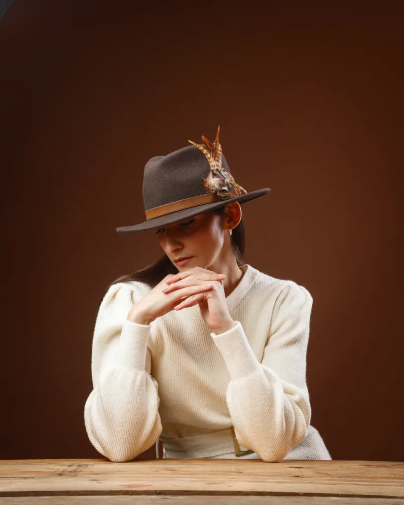
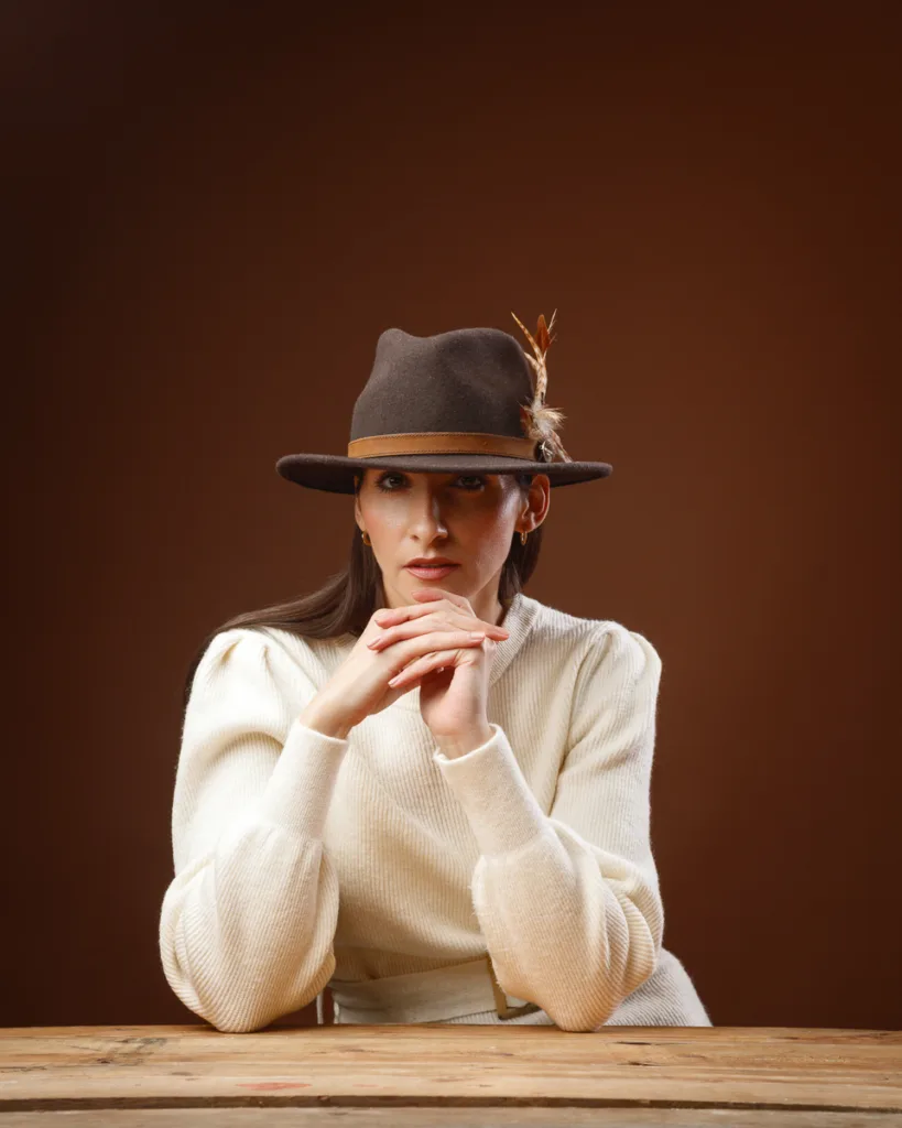

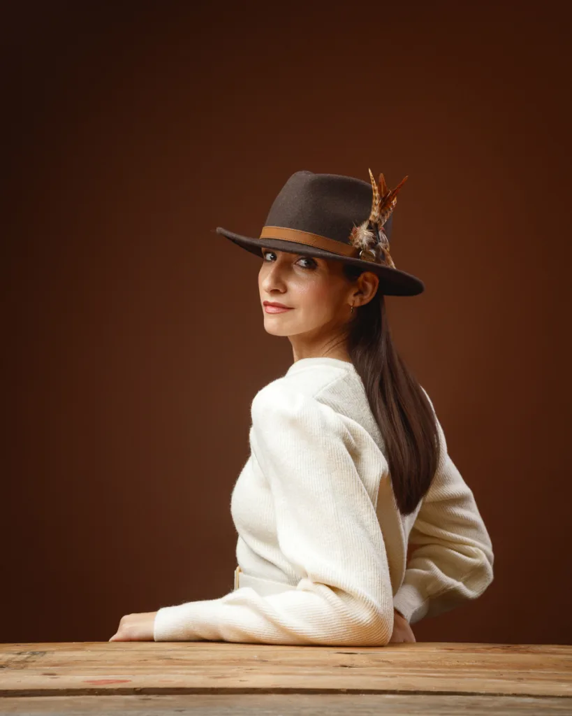

The third look is where the session turns into heritage styling. The hero piece is “The Suffolk Fedora” in Dark Brown (Bronze Feather) from Hicks & Brown.
This hat has presence. The brim shape is strong. The feather detail adds height and texture. It reads well in both close portraits and wider frames.
The set was kept warm and simple:
- Rich brown background
- Rustic wooden tabletop
- Cream rib-knit jumper with softly structured shoulders
- Matching belt with a rectangular buckle
The palette feels autumnal and calm. It also feels very British in tone.
Hicks & Brown’s own brand pages give useful context on the hat style and finish: https://hicksandbrown.com/
Why the brim shadow matters
A fedora brim casts a shadow line. That changes the mood instantly. It can feel cinematic, quiet, and reflective.
I leaned into that.
Instead of bright, open-eye portraits, we worked with:
- Downcast eyes and softened expressions
- Slight turns that keep the hat outline clear
- Hands that frame the brim and feather detail
This created a story-led set. It looks editorial, not like a simple “hat photo”.
Texture is the real subject in this look
This look is a texture study:
- Felt hat
- Feather detail
- Rib knit fabric
- Wood grain from the table
Controlled studio lighting is perfect for this. It brings out texture without harsh contrast.
Look 4: The Suffolk Fedora with burgundy tailoring and lace detail
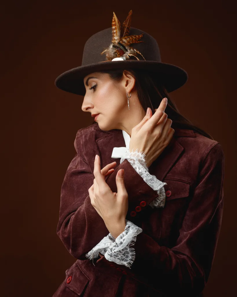

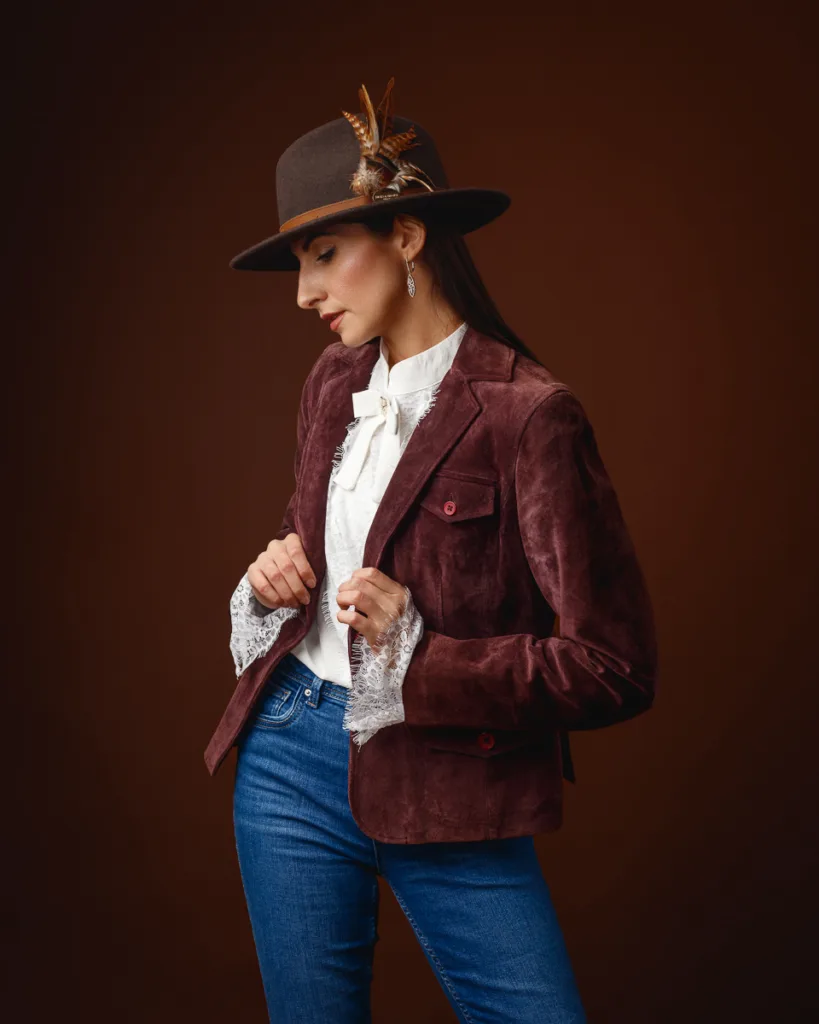
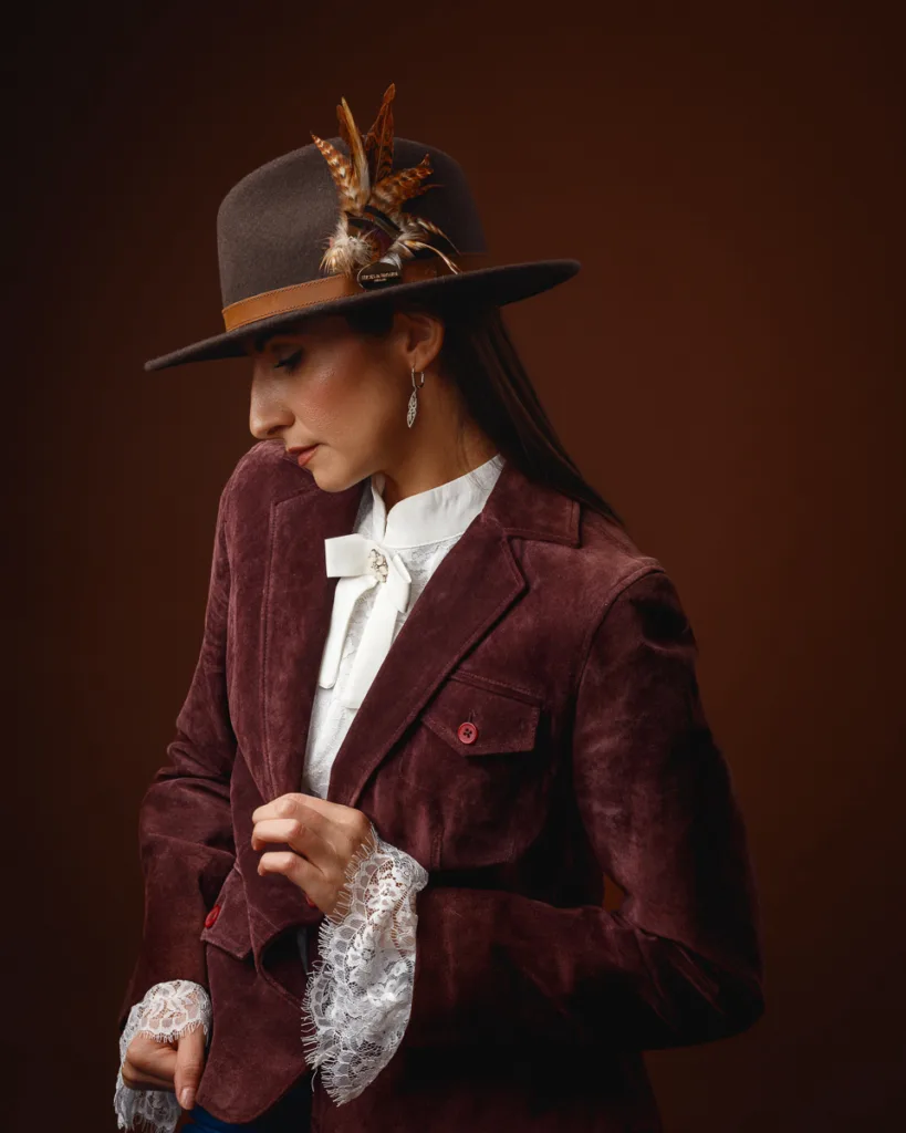


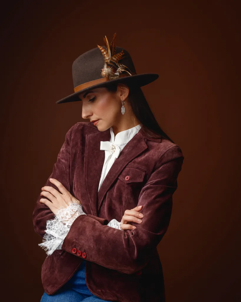
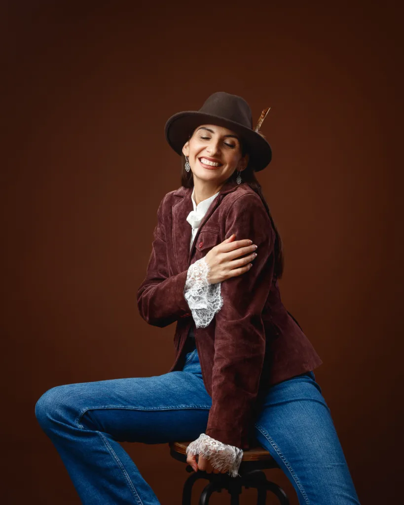
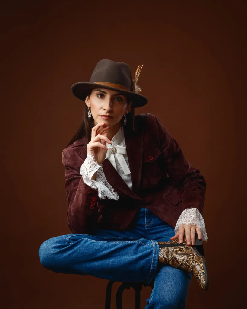

The final look keeps the same hat, but shifts the wardrobe into tailored country styling with a feminine edge.
The outfit combined:
- A burgundy suede-effect jacket with structured lapels and matching buttons
- A white blouse with a neat bow at the collar
- A pearl-style brooch securing the bow
- Lace cuffs that soften the jacket
- Mid-blue denim and snake-pattern ankle boots
The styling lands between classic heritage fashion and editorial portraiture. It feels wearable, but it still has theatre.
Jewellery stayed restrained. Drop earrings added detail in close-ups, without stealing attention from the hat and collar line.
What stands out visually in this set
A few things really carry these frames:
- Strong profile work: the brim and feather create a clean outline
- Colour harmony: brown backdrop, burgundy jacket, white blouse, dark hat
- Gestures at the collar: hands touching collar and lapel feel natural here
- Layered textures: felt, suede-effect fabric, lace, and denim
This look also benefits from variety in crop. Wide shots show full styling. Tight crops focus on the hat detail, collar, and facial profile.
My lighting approach for the full session
I kept the lighting controlled and soft throughout the shoot. The exact setup shifts based on background colour and wardrobe, but the guiding rules stay the same.
The core lighting goals
- Keep skin texture real and flattering
- Create a gentle contour on the cheekbones and jawline
- Avoid harsh shine on mesh fabric and metal watches
- Keep backgrounds smooth and even
That last point matters. A clean background is only clean if it stays even.
Why I prefer soft light for editorial portraits
Soft light gives you space. You can work faster because small changes in pose still look good. It also handles product reflection better, which is key for watches.
Harder light can be stunning, but it is less forgiving. For this shoot, soft light suited the brief.
The posing language that held the set together
When I say “posing language”, I mean the repeating shapes that make a gallery feel like one piece of work.
In this session, the repeatable shapes were:
- Hands framing the jaw, ear, and hairline
- Wrists turned to present the watch face naturally
- Profiles that show clean nose and jaw lines
- Shoulders angled to create neck length and elegance
- Elbows placed to form triangles and negative space
Quick posing checklist for watch-led portraits
If you photograph watches on a person, this list helps:
- Keep fingers soft, never clawed
- Rotate the wrist slightly towards the camera
- Watch for tension in the thumb joint
- Avoid bending the wrist too far back
- Use forearms as leading lines, not blocks
It sounds small, but these details change everything.
Colour choices and why they matter for product-led portrait work
This shoot used strong colour blocks: red, teal, and warm brown. That is not random. It is a clean way to guide attention.
What each colour did in the session
- Red: drama, confidence, classic beauty cues
- Teal: modern energy, clean contrast against skin and metal
- Brown: warmth, heritage mood, texture-friendly background
Each colour also changes how metal reads. Gold accents pop on red. Silver tones pop on charcoal. Warm browns flatter felt and feather detail.
If you want a simple primer on colour theory basics, Adobe’s colour resources are a good starting point: https://color.adobe.com/create/color-wheel
How I think about “editorial” versus “commercial” in a studio
People often separate editorial and commercial, but in practice they overlap.
For me, the difference is mostly in intent:
- Commercial asks, “Can you see the product clearly?”
- Editorial asks, “Does this feel like a story you want to stay with?”
This shoot aimed for both.
The watches are visible and clean. The hat looks crisp and tactile. But the images still feel like portraits first. That is the point.
Image selection tips for a set like this
If you are building a gallery from a multi-look shoot, selection matters. You need variety, but you also need rhythm.
I tend to look for:
- One strong profile per look
- One direct portrait per look
- One softer moment per look, eyes down or smile
- One wider frame that shows styling context
- At least one image where the product is crystal clear
That gives a balanced set that works for web, social, and portfolio use.
Closing thoughts on working with Margita
Margita was a pleasure to photograph. She works with real control in her expression and hands, which is essential for editorial posing. That made it easy to build a set that feels polished but still human.
What I like most about this shoot is how distinct each look feels, while the gallery still reads as one piece of work. The red and black watch look is bold. The teal set is modern and clean. The fedora looks warm and story-led. Together, they form a tidy visual narrative.
If you want to take anything from this post, it is this: when you keep the light consistent and the posing intentional, you can change styling wildly and still create a cohesive body of work.
Referenced brands and resources used in this shoot:
- GUCCI: https://www.gucci.com/
- Rado: https://www.rado.com/
- Hicks & Brown: https://hicksandbrown.com/
- Colour wheel tool: https://color.adobe.com/create/color-wheel
Commercial photography
Need photography for your business?
Photography for businesses across Suffolk, planned around how you will use it: premises, teams, products, events and PR. See what is involved and get a quote.