
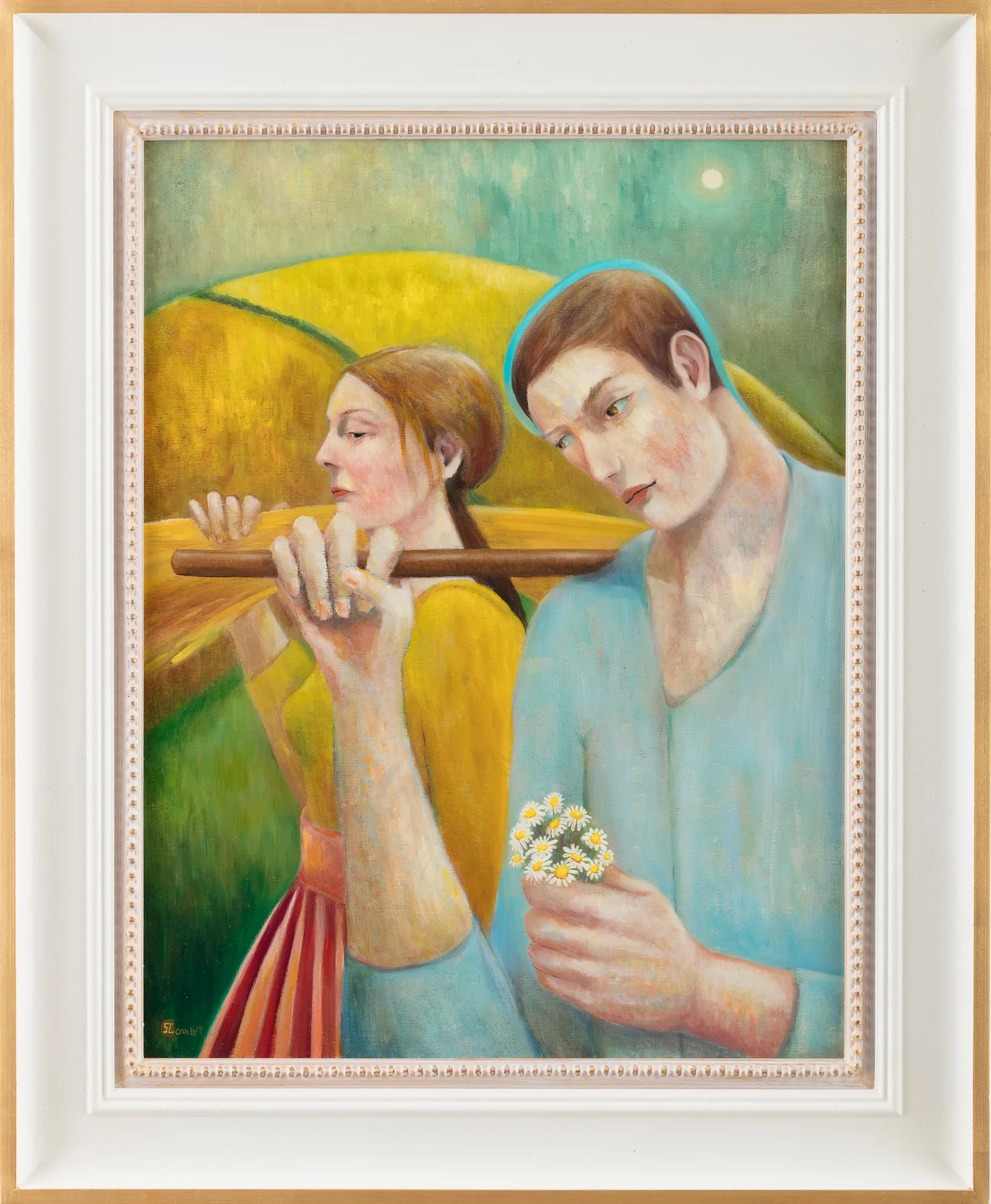
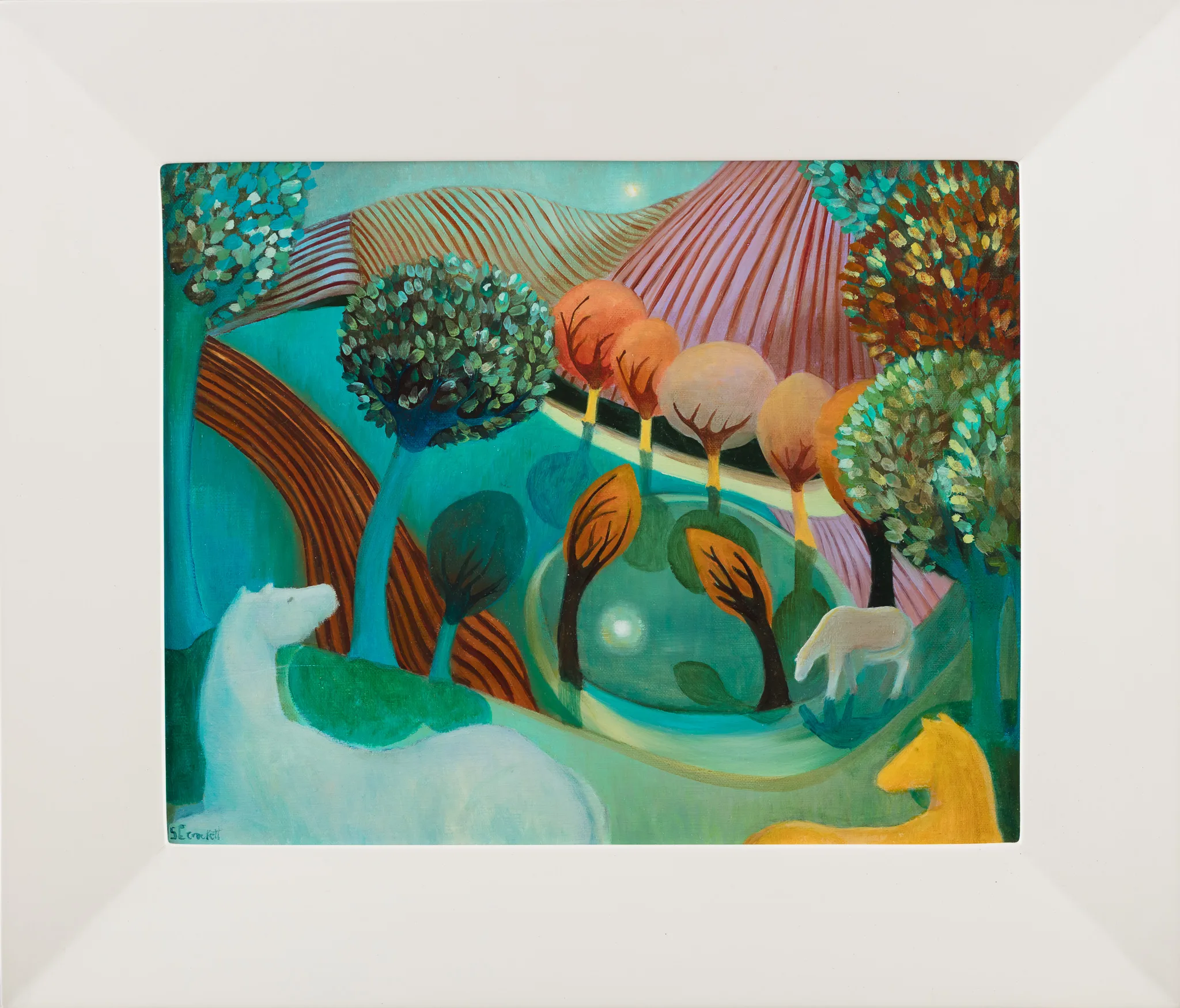
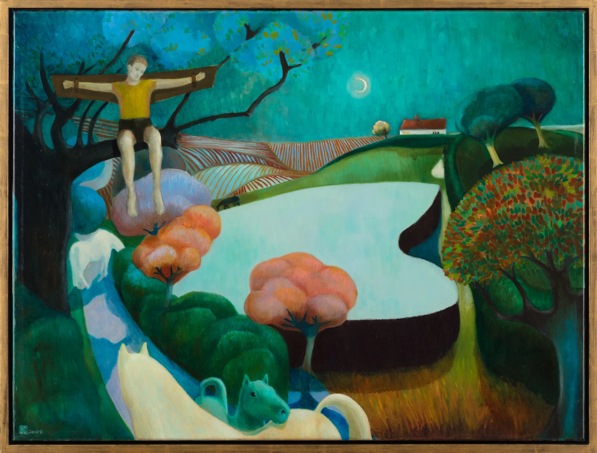
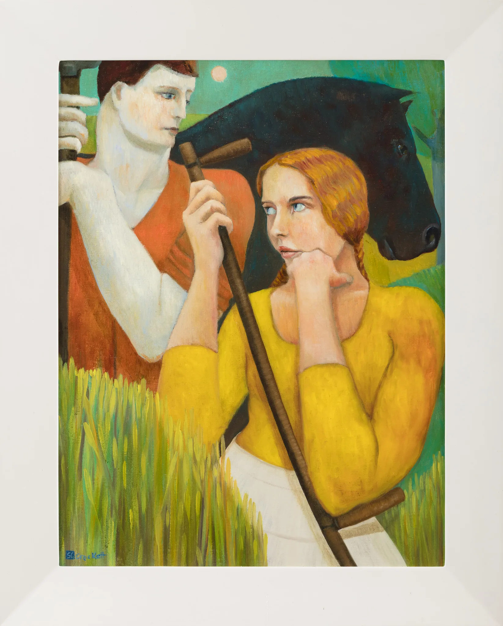
I recently had Sophie Crockett come to the studio at Bentwaters to have a selection of her paintings photographed.
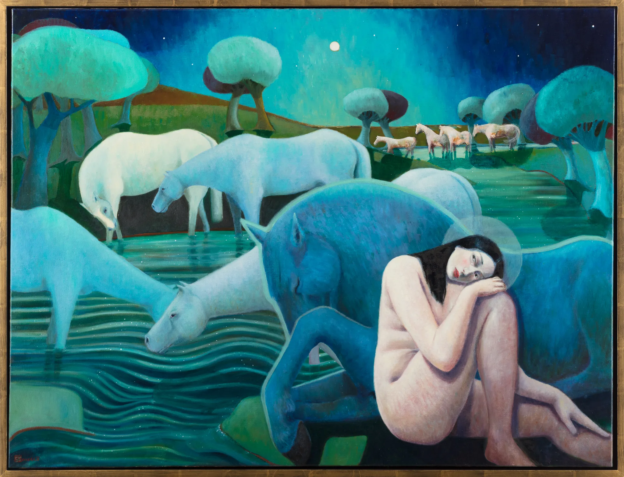
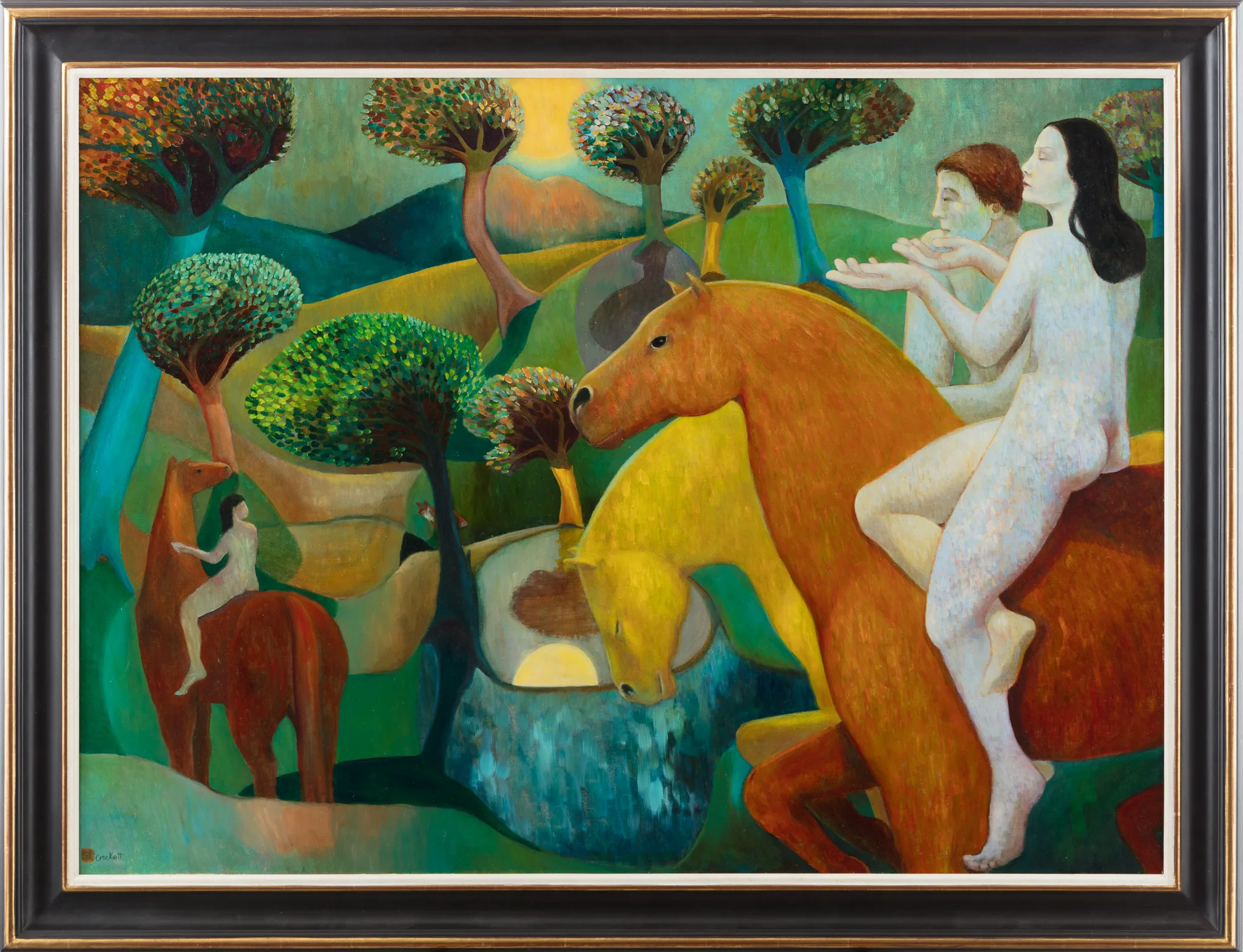
Sophie is a professional artist local to me, and I was genuinely taken by the work she brought in. Her paintings have a strong sense of visual identity, with figurative subjects, horses, stylised trees, countryside, symbolic details, and a rich use of colour. There is a dreamlike, narrative quality to the paintings that makes them very interesting to photograph.
That said, this post is not really intended as a feature about Sophie specifically. It is more about a conversation I seem to have quite often with artists, makers, and creatives who come to me after trying, sometimes for a long time, to photograph their own work.
Most of them arrive with the same frustration.
They have tried using a camera phone. They have moved the painting around the house. They have waited for better daylight. They have stood near windows, tried different rooms, adjusted angles, retaken the same image several times, and still ended up with photographs that do not properly represent the original artwork.
That frustration is completely understandable. Camera phones are very good now, and for many everyday uses they are more than capable. The issue is not that phone cameras are poor. The issue is that photographing artwork accurately is not the same as taking a normal photograph.
With fine art photography, especially when the images are intended for a catalogue, archive, website, print reproduction, or professional presentation, consistency matters. Colour matters. Exposure matters. Shape matters. The process becomes much more technical than many people expect.
Why Photographing Paintings Is Harder Than It Looks
A painting is a physical object. It has texture, colour, tone, brushwork, surface quality, and often subtle shifts that are easy to lose in a quick photograph. When an artist looks at their own work, they know exactly what it should look like. They know the colour relationships, the darker passages, the delicate highlights, and the feel of the piece.
The problem is that cameras do not automatically understand any of that.
A camera phone is usually making a series of decisions on behalf of the user. It will adjust exposure, contrast, colour, saturation, sharpening, white balance, and sometimes perspective without the person taking the photo fully realising it. In many everyday situations, that is helpful. When photographing a painting, it can become the reason the final image feels wrong.
The other main problem is changing the light.
A lot of artists understandably try to photograph their work at home. They might place a painting near a window because the light looks soft and natural. That can work for some simple reference images, but daylight changes constantly. A cloud passes over, the colour temperature shifts, the strength of the light drops, and suddenly, the next painting is being photographed under different conditions from the previous one.
Mixed lighting makes this even more difficult. A painting might be lit by daylight from a window on one side and warm domestic lighting from another direction. To the human eye, that may not seem too obvious at first, but to a camera, it can create colour contamination that is very difficult to correct afterwards.
That is often where the frustration builds. The artist is not doing anything foolish. They are just trying to do a technically controlled job in an uncontrolled environment.
Why Consistent Lighting Matters for Fine Art Photography
When I photograph paintings in the studio, I want the situation to remain as consistent as possible. The lighting should not change from one painting to the next. The camera position, exposure, white balance, and overall working method need to be controlled.
This is one of the main differences between photographing artwork and many other types of photography.
With portrait photography, headshots, commercial photography, or personal branding photography, I may make creative decisions about light, mood, contrast, expression, posing, or atmosphere. There is interpretation involved. With fine art photography, the priority is different. My job is not to reinterpret the painting. My job is to reproduce it as accurately as I can.
That means I am looking for even lighting across the artwork, correct exposure, controlled colour, and minimal distortion. The painting should not look more dramatic because of my lighting. It should not be made warmer, cooler, punchier, or more contrasty because I happen to prefer it that way. It needs to look like the artwork.
This is where the process becomes closer to technical product photography than creative portrait photography. The subject is the artist’s work, not my photographic style.
The Character of Sophie’s Work
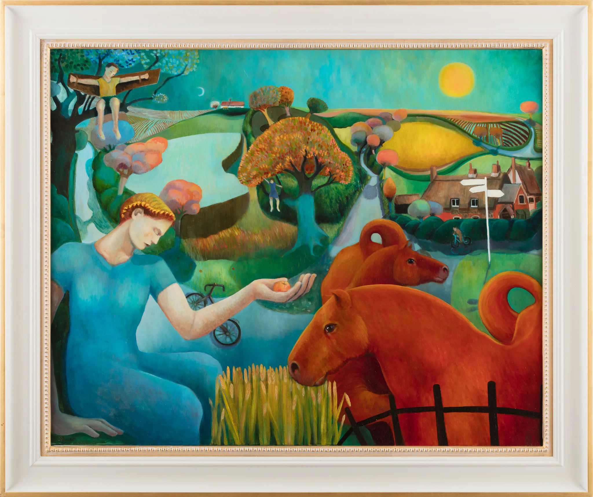
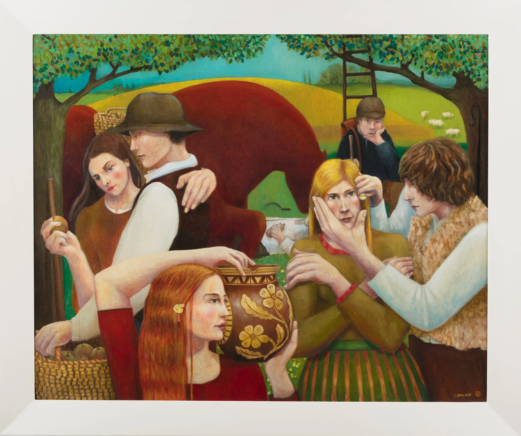
One of the things I enjoyed about photographing Sophie’s paintings was the very clear sense of visual identity in the work. Her paintings have a figurative, dreamlike quality, often combining people, horses, landscape, trees, water, and open countryside in a way that feels both narrative and symbolic.
The colour palette is also a significant part of the work. There are rich blues, greens, warm yellows, oranges, soft flesh tones, and areas of deeper shadow that all need to be handled carefully. These are not paintings where colour accuracy is a small detail. The colour is part of the language of the work.
That makes accurate photography especially important.
If the lighting is uneven or if the white balance shifts, the mood of the paintings can change very quickly. A cooler file may make the work feel flatter or more distant. A warmer file may change the relationship between skin tones, landscape colours, and the painted background. Extra contrast or saturation added by a phone camera can also push the work away from how it actually appears in person.
This is one of the reasons I treat fine art photography as a technical process rather than a creative reinterpretation. Sophie had already made the creative decisions in the paintings. My job was to record them faithfully.
The paintings also contain a lot of subtle detail. Some areas are soft and atmospheric, while others contain more defined figures, animals, gestures, and small compositional elements. That kind of work benefits from a clean, high-resolution file because it allows the viewer to see the painting properly, whether it is being used for a catalogue, an archive, a website, or future print reproduction.
Colour Accuracy Is Not Guesswork
One of the most important parts of photographing artwork is colour accuracy.
I use colour calibration as part of my workflow. This involves using a colour reference chart during the shoot, then using specialist software during the editing stage to correct the colour and saturation. The point of that process is to create a reliable representation of the painting rather than relying on guesswork or personal taste.
That distinction matters.
When I am editing fine art photographs, I am not sitting at the computer deciding whether I would prefer the blue to be a little stronger or the red to feel a bit warmer. That would defeat the purpose. The software uses the colour reference to correct the image as accurately as possible. My role is to photograph the work correctly in the first place, apply the colour calibration process properly, check the exposure, and make sure the image is straight, square, and cleanly prepared.
There may occasionally be a very small exposure adjustment, but I try to get that as close as possible in camera. The aim is not heavy editing. It is accuracy.
This is also why it is important for artists to understand that professional artwork photography is not simply about having a better camera. The camera is only part of the process. The lighting, calibration, workflow, file preparation, and viewing environment all matter.
The Monitor Problem That Many Artists Do Not Expect
One issue that comes up occasionally is monitor calibration.
An artist may look at the finished image on a laptop or desktop monitor and feel that the colour does not look right. That may be a genuine concern, but it is also important to understand that many screens are not colour accurate. A monitor that has not been calibrated can make an image look too warm, too cool, too bright, too flat, too saturated, or too dull.
This is particularly important for artists who are preparing work for catalogues, prints, websites, online galleries, or submissions.
I have to be honest about this when it comes up. If I have photographed the painting under controlled lighting and used colour calibration software, then the colour is being corrected through a measured process. It is not based on my personal opinion. If the image looks different on an uncalibrated monitor, the issue may be the display rather than the file.
I often suggest checking the image on more than one device. In my experience, iPads and iPhones can often give a good out-of-the-box representation compared with many uncalibrated computer monitors. That does not make them a substitute for a properly calibrated professional monitor, but it can help artists see whether the issue is likely to be with one particular screen.
For artists who regularly reproduce or catalogue their work, proper monitor calibration is worth considering. It can save a lot of uncertainty and prevent unnecessary concern over files that are technically correct.
Photographing Sophie’s Paintings at the Studio
Sophie came to me after trying to photograph her own paintings and finding that the results did not come up to the standard she needed. This is something I completely understand. There is a point where trying to solve the problem with a phone or home setup becomes more frustrating than useful.
At the studio, the process was straightforward, organised, and controlled. The paintings were photographed with the intention of producing accurate files suitable for catalogue use. That meant paying close attention to shape, colour, exposure, and consistency across the set.
I also talked through what is involved in the process and, just as importantly, what is not involved. I think this matters because fine art photography can be misunderstood. It is not about applying a creative edit to make the artwork look more appealing. It is about documenting the work properly.
There is a different kind of satisfaction in this sort of photography. I enjoy meeting artists, partly because they are usually very interesting people, and partly because their work often comes with a level of thought and commitment that I respect. The photography itself is careful and methodical, but the conversation around the work is often fascinating.
In Sophie’s case, it was lovely to see the paintings in person and to produce images that gave her a reliable digital version of the work.
File Formats for Artists: JPEG, Web Files, and TIFFs
File format is another practical consideration.
For many artists, a high-resolution JPEG is perfectly suitable for general use. My online gallery allows clients to download full-resolution files or smaller web-resolution versions. This is useful if the images need to be shared without sending large files manually.
The gallery also makes it easier to keep everything organised, particularly when a client needs to access several files or share them with someone else.
Some artists, however, need TIFF files. This is more common when the files are intended for high-resolution print reproduction, large-format output, or certain catalogue and design workflows. TIFF files are larger and are not handled in the same way through my standard online gallery, so they usually need to be supplied separately.
I have had artists come back to me after initially being happy with gallery downloads because they later needed a larger print or a different use case. That is not a problem, but it is useful to know from the start if TIFF files are likely to be needed.
When a Professional Photographer Becomes Worth It
I understand why paying for professional photography can initially feel like an expense that is hard to justify, especially for artists who are already managing the cost of materials, framing, studio time, exhibitions, websites, catalogues, and everything else involved in presenting their work.
Many people only reach out after they have tried to do it themselves and become frustrated.
That is not a failure. It is simply a recognition that accurate artwork reproduction is a specialist task. It needs controlled lighting, correct camera setup, careful alignment, colour calibration, and a consistent editing workflow.
For artists, good photographs of their work can be important for:
Catalogue submissions
Artist websites
Online galleries
Print reproduction
Exhibition records
Portfolio archives
Grant applications
Social media
Press and publicity
Insurance records
Professional documentation
Not every use requires the same file type or level of precision, but the starting point should still be a clean and accurate image.
If the photograph is wrong from the beginning, everything built from that image is compromised. The website image, the printed catalogue, the archive, and the social media post all start from the same flawed reproduction.
Sophie’s Feedback
Sophie kindly shared the following feedback after the shoot:
“I needed some good photography of figurative oil paintings for a catalogue, and after experimenting with an iPhone camera, the minor distortions from a small lens meant that my images never came up to scratch, particularly important for me where colour matching and figures need to be accurate. Using Bob’s services at his studio in Bentwaters was speedy, organised and reasonably priced. The images are totally accurate and easily downloadable. I will be using him again.”
That comment sums up the problem very well. It is not just about colour. It is also about distortion, accuracy, and having files that are easy to use afterwards.
Fine Art Photography in Suffolk
My studio at Bentwaters near Woodbridge gives me a controlled space for this type of work. I photograph a wide range of subjects, including headshots, portraits, personal branding photography, commercial photography, product photography, and model portfolios, but fine art photography has its own distinct process.
It is quiet, careful, and technical.
For artists, the aim is simple: create accurate photographic files that represent the original artwork properly. That might not sound as immediately expressive as a creative portrait session or a commercial branding shoot, but it is important work. A painting deserves to be shown accurately, especially when the person viewing the photograph may never have the chance to see the original in person.
Sophie’s visit was a good reminder of why this service matters. Artists put a huge amount of thought and skill into their work. When that work needs to be photographed, it should be handled with the same level of care.
Product photography
Need your products photographed?
Studio product photography for Suffolk businesses. Packshots, flat lays and lifestyle images for your website, online shop and social media. See the sessions and prices.